How To Design For Android Tablets
More than ever, designers are being asked to create experiences for a variety of mobile devices. As tablet adoption increases and we move into the post-PC world, companies will compete for users’ attention with the quality of their experience. Designing successful apps for Android tablets requires not only a great concept that will encourage downloads, usage and retention, but also an experience that Android users will find intuitive and native to the environment.
The following will help designers become familiar with Android tablet app design by understanding the differences between the iPad iOS user interface and Android 3.x “Honeycomb” UI conventions and elements. We will also look at Honeycomb design patterns and layout strategies, and then review some of the best Android tablet apps out there.
Note that while Android 2.x apps for smartphones can run on tablets, Android 3.0 Honeycomb was designed and launched specifically for tablets. Future updates promise to bring Honeycomb features to smartphone devices, as well as make it easier to design and build for multiple screen types.
For most of us, our first exposure to tablets was via the iPad. For this reason, it’s reasonable to begin comparing the two user interfaces. By comparing, we can align what we’ve learned about tablets and begin to focus on the key differences between the two, so that we can meet the unique UI needs of Android users. Not only will this help us get up to speed, but it becomes especially important when designing an Android tablet app from an existing iPad one.
It’s Just Like The iPad, Right?
While the Android tablet and iPad experience share many similarities (touch gestures, app launch icons, modals, etc.), designers should be aware of the many differences before making assumptions and drawing up screens.
Screen Size And Orientation
The biggest difference between the two platforms is the form factor. Layouts for the iPad are measured at 768 × 1024 physical pixels, and the iPad uses portrait mode as its default viewing orientation.
With Android tablets, it’s a bit more complicated, due to the multiple device makers. In general, there are 7- and 10-inch Android tablets screen sizes (measured diagonally from the top-left corner to the bottom-right), with sizes in between. However, most tablets are around 10 inches.
What does this mean in pixels? A good baseline for your layouts is 1280 × 752 pixels (excluding the system bar), based on a 10-inch screen size and using landscape (not portrait) as the default orientation. Like on the iPad, content on Android tablets can be viewed in both landscape or portrait view, but landscape mode is usually preferred.
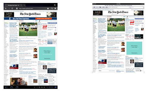
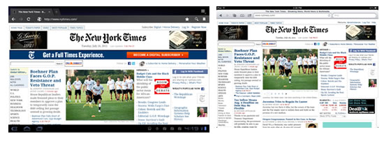
However, with Android, screen size is only the half of it. Android tablets also come in different “screen densities” — that is, the number of pixels within a given area of the screen. Without going into too much detail, designers have to prepare all production-ready bitmaps for three different screen densities, by scaling each bitmap to 1.5× and 2× its original size. So, a bitmap set to 100 × 100 pixels would also have copies at 150 × 150 and 200 × 200. By making three batches of graphics scaled at these sizes, you will be able to deliver your bitmaps to medium, high and extra-high density tablet screens without losing image quality.
For more information on screen densities and preparing graphics for Android devices, refer to my previous article on designing for Android.
System Bar
While iOS makes minimal use of the system bar, Android Honeycomb expands its size to include notifications and soft navigation buttons. There is a “Back” button, a home button and a “Recent apps” button.
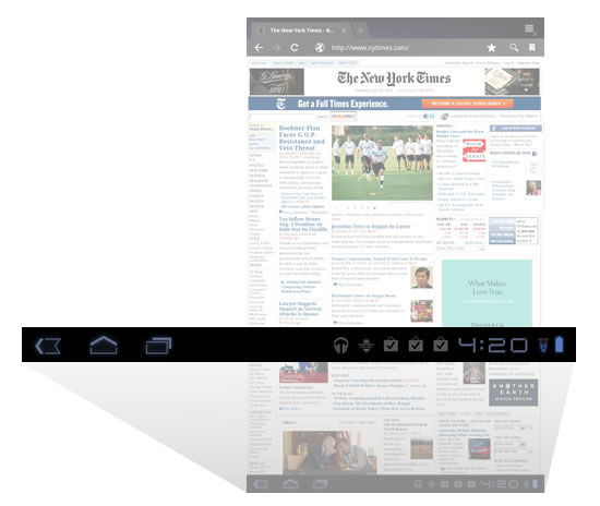
Android Honeycomb’s system bar and buttons are always present and appear at the bottom of the screen regardless of which app is open. Think of it like a permanent UI fixture. The only exception is a “Lights out” mode, which dims the system bar to show immersive content, such as video and games.
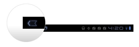
“Back” Button
While the bulkiness and permanence of the Honeycomb system bar might seem an obstacle to designers, it does free up the real estate that is typically taken by the “Back” button in iPad apps. The “Back” button in Honeycomb’s system bar works globally across all apps.
Action Bar
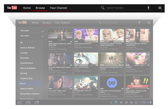
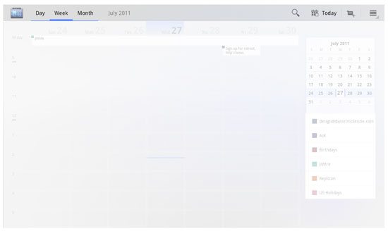
The bulk of the UI differences between platforms is found in the top action bar. Android suggests a specific arrangement of elements and a specific visual format for the action bar, including the placement of the icon or logo, the navigation (e.g. drop-down menu or tabs) and common actions. This is one of the most unifying design patterns across Android Honeycomb apps, and familiarizing yourself with it before attempting customizations or something iPad-like would be worthwhile. More on the pervasive action bar later.
Widgets
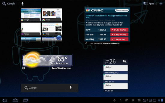
New to iPad users will be Android’s widgets. As the name implies, these are small notification and shortcuts tools that users can set to appear on their launch screen. Widgets can be designed to show stack views, grid views and list views, and with Android 3.1, they are now resizable.
Notifications
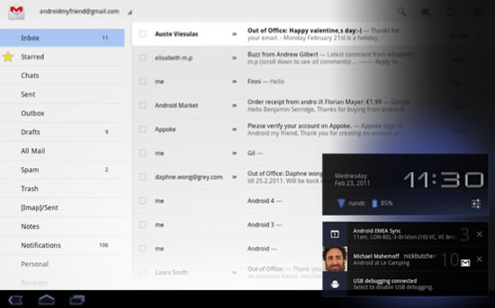
While iOS’ notifications system pushes simple alerts to your launch screen, Honeycomb offers rich notifications that pop up (“toast” we used to call them) in the bottom-right area of the screen, much like Growl on Mac OS X. Custom layouts for notifications can be anything from icons to ticker text to actionable buttons.
Settings
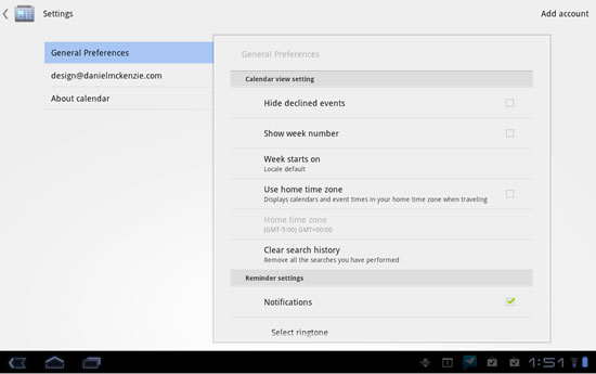
Access to settings in an iPad app are usually presented in a pop-over, triggered by an “i” button; and settings categories are broken up into tables for easy visual identification. Honeycomb has a different convention. It looks more like the iOS’ “General Settings” screen, where the user navigates categories on the left and views details on the right. This is the preferred (and more elegant) way to present multiple settings in Honeycomb.
UI Elements
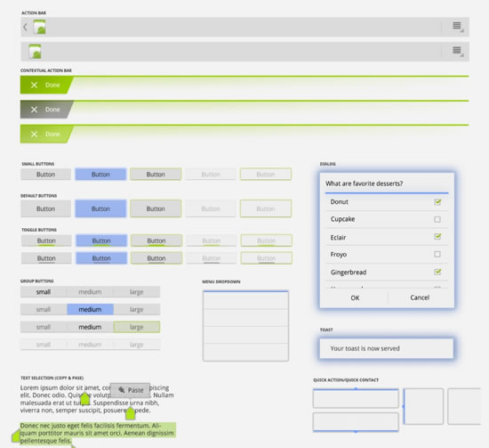
As you can imagine, Android goes to great lengths to do everything opposite from its competitor (that’s called differentiation!). Honeycomb has its own UI conventions, and it now has a new “holographic UI” visual language for such routine actions as picking a time and date, selecting an option, setting the volume, etc. Understanding this UI language is important to building screen flows and creating layouts.
Fonts
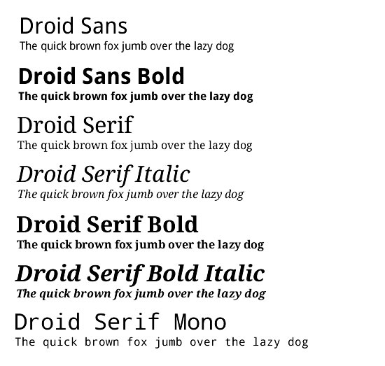
How many fonts does iPad 4.3 make available? The answer is fifty-seven.
How many does Android? Just three.
Yep, those three are Droid Sans, Droid Serif and Droid Sans Mono. But there is an upside. While only these three ship with the platform, developers are free to bundle any other fonts with their apps.
Anything The Same?
Luckily for designers who are already familiar with the iPad, the two platforms have some similarities.
Touch Gestures
Tap, double-tap, flick, drag, pinch, rotate and scroll at will.
Split View And Multi-Pane UI
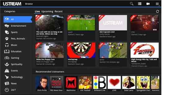
The split view is one of the most common layouts for tablets. It consists of two side-by-side panes. Of course, you can add panes for more complex layouts.
Embedded Multimedia
Both platforms allow embedded audio, video and maps.
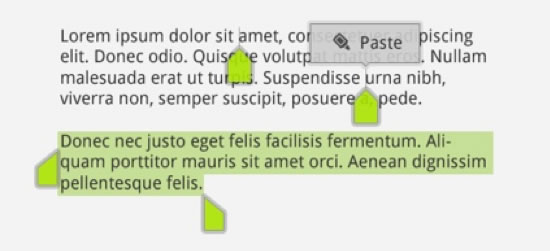
Clipboard
For copying and pasting data into and out of applications.
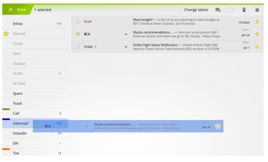
Drag And Drop
Both platforms have drag-and-drop capabilities.
Design Patterns
Honeycomb continues many of the design patterns introduced in Android 2.0 and expands on them. In case you’re not familiar with design patterns, they are, as defined in Android, a “general solution to a recurring problem.” Design patterns are key UI conventions designed by Android’s maintainers to help unify the user experience and to give designers and developers a template to work from. They are also customizable, so no need to fret!
As mentioned, the action bar is the most prominent Android UI component and is the one we’ll focus on here.
Icon Or Logo
The action bar starts with an icon or logo on the far left. It is actionable; by tapping on it, the user is directed to the app’s home screen.
Navigation
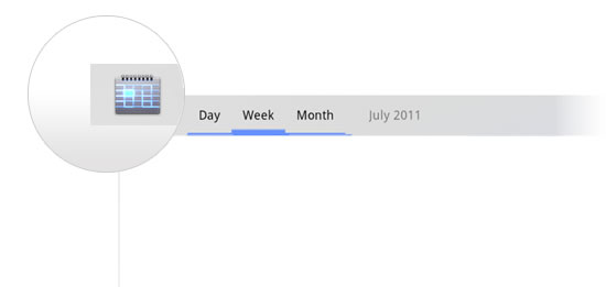
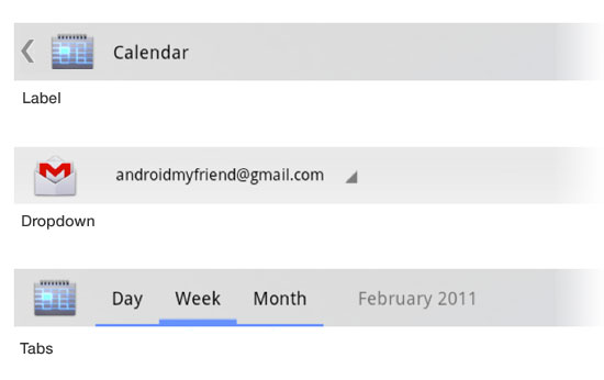
Next, we’ll typically find some form of navigation, in the form of a drop-down or tab menu. Honeycomb uses a triangle graphic to indicate a drop-down menu and a series of underlines for tabs, which typically take up most of the action bar’s real estate.
A left arrow button might also appear to the left of the icon or logo or the label, for navigating back or cancelling a primary action.
Common Actions
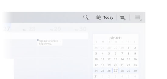
Common actions, as the name implies, gives user such things as search, share and an overflow menu. They are always positioned to the right of the action bar, away from any tabs.
Overflow Menu
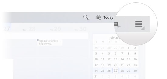
The overflow menu is part of the common actions group and is sometimes separated by a vertical rule. It is a place for miscellaneous menu items, such settings, help and feedback.
Search
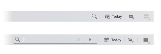
Search is also a part of the common actions group. Unique to search is its expand and collapse action. Tap on the search icon and a search box expands out, letting you enter a query. Tap the “x” to cancel, and it collapses to its single-button state. This is a space saver when many actions or tabs need to be shown.
Contextual Actions
Contextual actions change the format of the action bar when an item is selected, revealing options unique to that item. For example, if a photo app is displaying thumbnails, the action bar might change once an image is selected, providing contextual actions for editing that particular image.
To exit the contextual action bar, users can tap either “Cancel” or “Done” at the far right of the bar.

Tablet Layout Strategies
Using Fragments and Multi-Pane Views
The building blocks of Honeycomb design are “Fragments.” A Fragment is a self-contained layout component that can change size or layout position depending on the screen’s orientation and size. This further addresses the problem of designing for multiple form factors by giving designers and developers a way to make their screen layout components elastic and stackable, depending on the screen restraints of the device that is running the app. Screen components can be stretched, stacked, expanded or collapsed and shown or hidden.
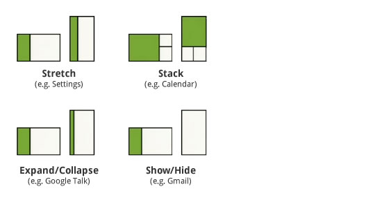
What makes Fragments so special? With a compatibility library, developers can bring this functionality to Android smartphones going back to version 1.6, allowing them to build apps using a one-size-fits-all strategy. In short, it enables designers and developers to build one app for everything.
While Fragments may be a term used more by developers, designers should still have a basic understanding of how capsules of content can be stretched, stacked, expanded and hidden at will.
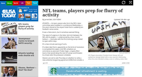
The most common arrangement of Fragments is the split view. This layout is common in news apps and email clients, where a list is presented in a narrow column and a detailed view in a wider one.
Another way to present a split view is to turn it on its side. In this case, the sideways list Fragment becomes a carousel, navigating horizontally instead of vertically.
Orientation Strategies
While Fragments are great for applying one design to multiple screen sizes, they are also useful for setting orientation strategies. Your screen design might look great in landscape view, but what will you do with three columns in a narrow portrait view? Again, you have the option to stretch, stack or hide content. Think of Fragments like a bunch of stretchy puzzle pieces that you can move around, shape and eliminate as needed.
A Word About Animation
The Honeycomb framework allows designers and developers to use a variety of animation effects. According to the Android 3.0 Highlights page, “Animations can create fades or movement between states, loop an animated image or an existing animation, change colors, and much more.” Honeycomb also boasts high-performance mechanisms for presenting 2-D and 3-D graphics. For a good overview of what Honeycomb is capable of, check out this video.
Learning from Example
Android tablet apps are still a relatively new space, and some brands are only beginning to test the waters. Below is a list of apps for inspiration. You can download any of them from the Android Market or Amazon.
YouTube
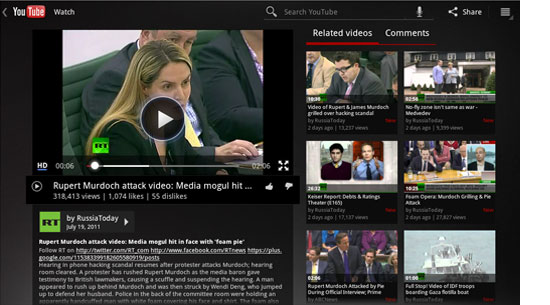
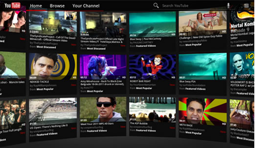
Naturally, Google’s YouTube app for Honeycomb is exemplary, showcasing all of the design patterns and UI elements discussed above. To get a good feel for Honeycomb, download this app first and take it for a spin.
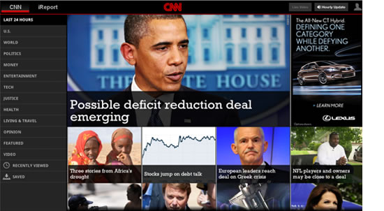
CNN
The CNN app makes good use of touch gestures (including flicking to view more content), the split view and fonts! A custom font (Rockwell) is used for news headlines.
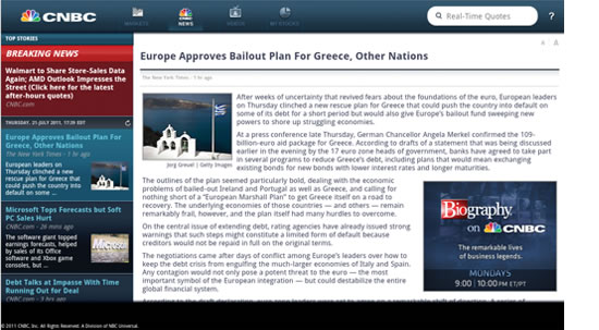
CNBC
Another good news app, with animation (the stock ticker tape) and rich graphics and gradients. CNBC has one of the most visually compelling apps.
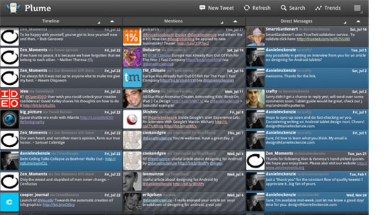
Plume
With its three-column layout, Plume is a good example of how layouts might need to be changed dramatically from landscape to portrait views.
FlightTrack
A data-heavy app done elegantly. Includes nice maps, subtle animation and standard Honeycomb UI elements.
Common actions, as the name implies, gives user such things as search, share and an overflow menu. They are always positioned to the right of the action bar, away from any tabs.

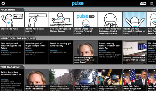
Pulse
What else can you say: it’s Pulse for Android tablets! But comparing the Android and iPad versions, which are identical in almost every way, is still fun anyway.
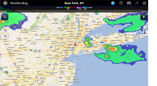
WeatherBug
This was one of the first Honeycomb apps in the Android Market. It makes good use of maps and of the holographic UI for showing pictures from weather cams.
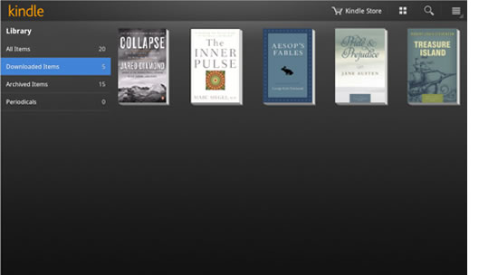
Kindle
Kindle pretty much sticks to the book in using design patterns and Honeycomb UI elements. The outcome is elegant, while staying true to Android’s best practices.
Honorable Mentions
- IMDb
- News360
- USA Today
- AccuWeather
- Ustream
- Google Earth
- Think Space
Online Resources
Video
- Designing and Implementing Android UIs for Phones and Tablets, Google I/O 2011
- Android 3.0 Honeycomb animation demo
Presentations
- Designing and Implementing Android UIs for Phones and Tablets, Google I/O 2011 (PDF)
Blogs
Android Developers
Further Reading
- How To Design For Android
- Mobile Design Practices For Android: Tips And Techniques
- Transform A Tablet Into An Affordable Kiosk For Your Clients


 SurveyJS: White-Label Survey Solution for Your JS App
 Agent Ready is the new Headless


