Mastering Photoshop Techniques: Layer Styles
Layer Styles are nothing new. They’ve been used and abused again and again. Despite their ubiquity, or perhaps because of it, many designers do not yet realize the full potential of this handy menu. Its beauty lies in our ability to create an effect and then copy, modify, export, hide or trash it, without degrading the content of the layer.
Below we present, step by step, several practical techniques to help you refine your designs, increase productivity and reduce layer clutter.
Download the source files (.zip, 1.6 Mb).
The Bump Map Effect
“Wait, what?” you exclaim, “There’s no bump map effect in the Layer Styles menu!” That’s true, but by combining Pattern Overlay and Bevel and Emboss, we can achieve a textured, bump-mapped surface with a controllable light source.
This technique requires two images: one for texture and color, and the other to serve as a depth map. The depth map needn’t have any hue because it determines depth based on a composite value, black being the lowest, white the highest. In some cases, you may be able to use the same image for both, but in our example we’ll use completely different ones.
Step by Step
We’ll start by creating our bump map pattern. Open the diamond-plate.psd file.
Inside you’ll find a number of white shapes on a black background. Create a pattern from this document: Select All (Cmd/Ctrl + A), then “Edit” → “Define Pattern.” Name it “diamond plate bump map” and click okay.

Now, open the start.psd file.
Repeat step 2 to create a pattern from the “patchy gray” layer. This will be used later to add texture to our background.
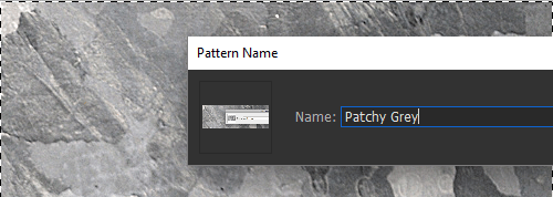
After creating the pattern, delete the “patchy gray” layer. It’s no longer needed.
Use the Rectangular Shape tool to create a shape layer about 20 pixels wider and 20 pixels higher than the canvas. Change the color of this layer to a dark, brownish, chromatic gray.
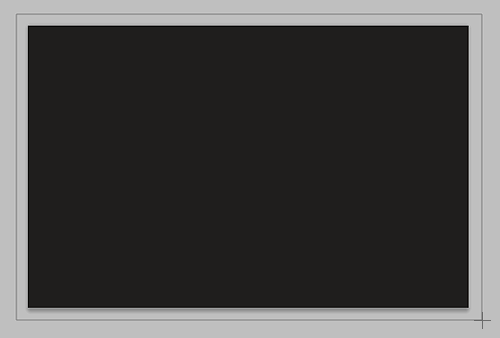
Be sure that the shape layer doesn’t have any Layer Styles already applied to it (Photoshop will often apply the most recent Layer Style automatically). Then, begin the new Layer Style by adding a Pattern Overlay.
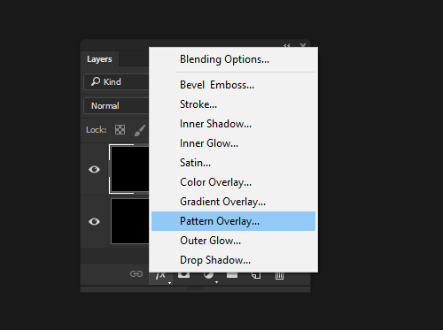
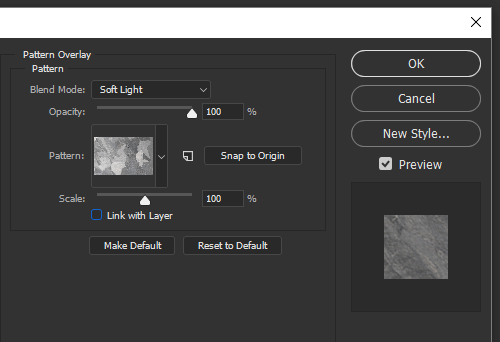
Choose the “patchy gray” pattern from the pattern picker, and change the Blend Mode to Soft Light. This will add the texture to our background layer.
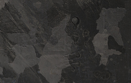
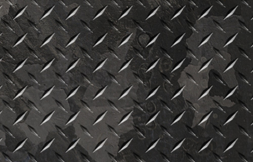
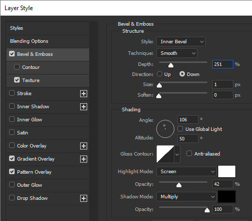
Next, add a Bevel and Emboss, along with the Texture effect. This time, change the Texture effect’s Pattern to the “diamond plate bump map” pattern created in step 2. We now have a grungy diamond plate background.
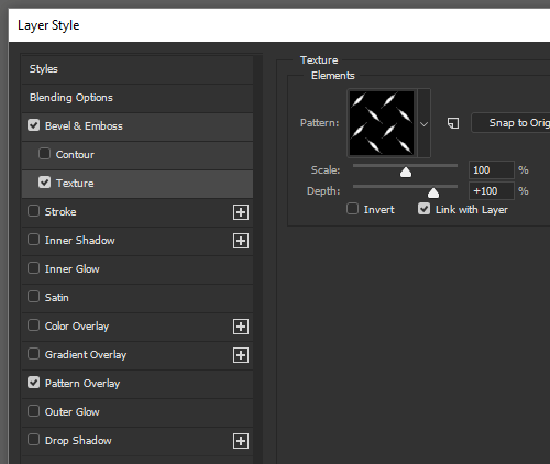
As with most Layer Style effects, the default values are rarely ideal. By tweaking the Bevel Type and Size, Gloss Contour, Highlights, Shadows and Light settings you can achieve some dramatic results.
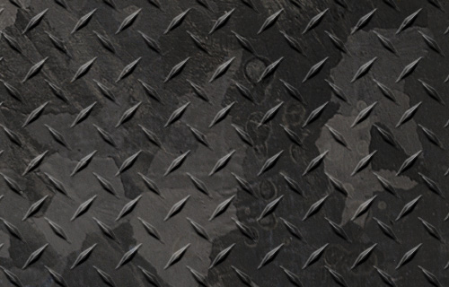
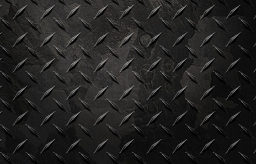
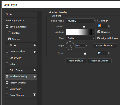
With a few extra effects, you can shape the background layer even more. The example has a Gradient Overlay to simulate reflected light by darkening certain regions of the image.
You may notice that the highlights from the Bevel and Emboss filter all seem to have the same value. This is because the Bevel and Emboss effects are very high on the Layer Style’s stacking order. To darken the highlights that lie outside our main light source, simply paint a Layer Mask using the Brush tool.
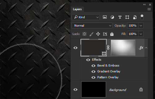
We now have a textured, bump-mapped background that is completely dynamic; everything about it can be modified easily from within the Layer Styles menu. Consolidating complex imagery into one dynamic layer like this can reduce layer clutter dramatically and allows you (and whoever else may be using the file) to easily find and modify things. Now, let’s move on to creating our icon.
3-D Modeling
By combining some interior effects, we can use the Layer Styles menu to create simulated 3-D objects: great for icons, buttons and other interface objects. We’ll now model the base of the round icon in the example image using a single layer.
Step by Step
Begin by creating a circular shape layer with a rich red fill.
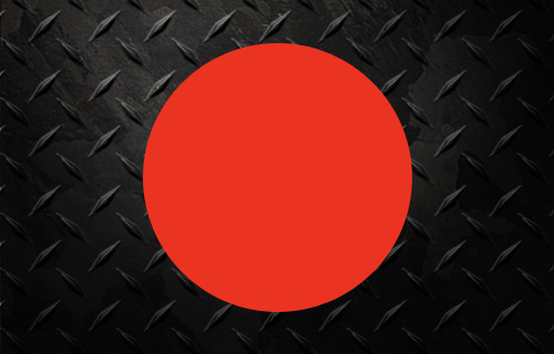
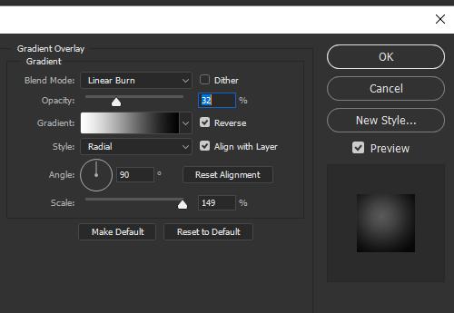
As is often the case when modeling a 3-D shape, let’s begin by adding a Gradient Overlay to our Layer Style. A white-to-black Radial-styled gradient set to Linear Burn works best for our implementation. Be sure the white area of the gradient is at the origin.
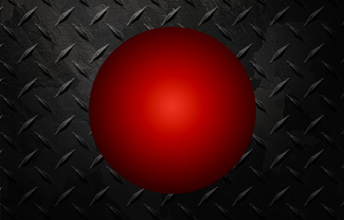
We now have a dramatically shaded sphere with a head-on light source. By decreasing the opacity of the gradient, we can flatten the shape to a more concave button.
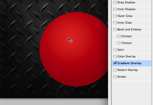
Let’s also move the direction of the light to the upper-left. While leaving the Layer Style menu open, move the mouse over the image itself (the Move Tool icon should appear). Simply click and drag the epicenter of the gradient to the upper-left of the shape layer.
While Bevel and Emboss may seem like more logical tools, you can often get a cleaner, more customizable beveled look by using a combination of other effects. First, add a black Inner Glow, set to Multiply. Adjust the Choke, Size, Opacity and Contour until you have a softened edge inside the shape.
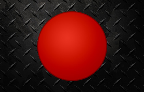
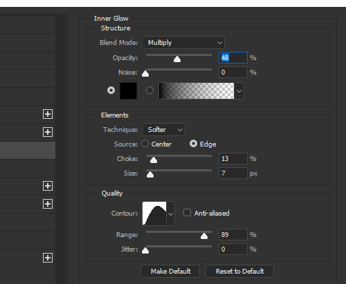
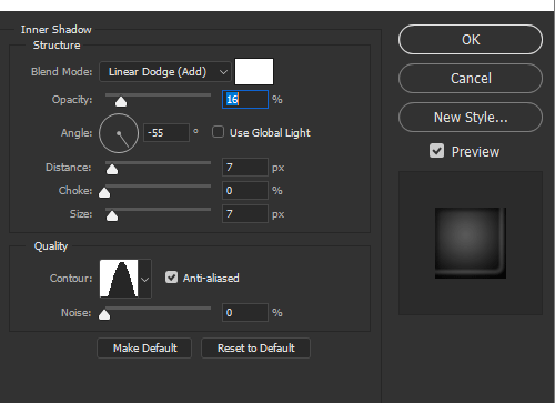
Like for any well-rendered spherical surface, we have to add some reflected light in our shadow region. This is easily achieved with the Inner Shadow effect. Change the color to white and the Blend Mode to Linear Dodge. Adjust the angle so that it appears in the lower-right of our shape. Tweak the Contour, Distance, Size and Opacity to create a subtler effect.
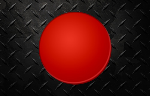
To enhance the feeling that the shape is part of the document’s “environment,” we can add some effects to interact with the background. Drop Shadow is usually the easiest tool to use for this. Massage the settings until everything feels right.
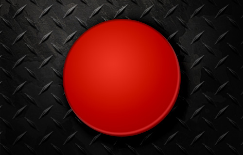
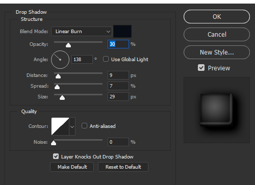
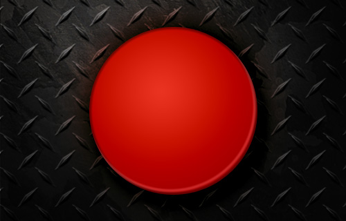
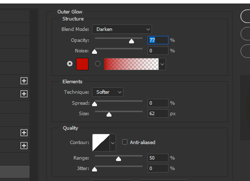
Using the Outer Glow effect, we can simulate the reflected red light that our background image would absorb if this were an actual setting. Change the glow’s color to a darker red, and change the Blend Mode to darken. Again, work with the Size and Opacity settings to create the desired effect. This is one of those effects that, when used correctly, no one should notice because it just looks natural.
Please notice that Layer Style gradients can’t be dithered, which can make them lower quality than their Gradient Layer and Gradient Tool counterparts (— Marc Edwards).
Diffuse vs. Specular Light
Now, our icon reflects a simulated diffuse light, which gives it the look of a matte-finished surface. If you prefer a glossier appearance, you can easily create a specular highlight using (what else?) Layer Styles.
Step by Step
Duplicate the current shape layer (Cmd/Ctrl + J).
Clear the new layer’s Layer Styles: right-click the layer in the Layers palette and select “Clear Layer Style.”
We also need to modify the shape of the layer to give the reflected light a sharper edge. Using the Direct Selection Tool (A), select the shape path in the layer’s vector mask. Copy it (Cmd/Ctrl + C) and paste it (Cmd/Ctrl + V) above the current path. Change this path’s mode to Subtract from shape area (-). Then move the shape down and to the right to create a crescent shape. You may also want to make the negative shape larger to create a more natural inside curve: simply Free Transform (Cmd/Ctrl + T) and then scale the shape up.
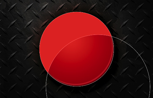
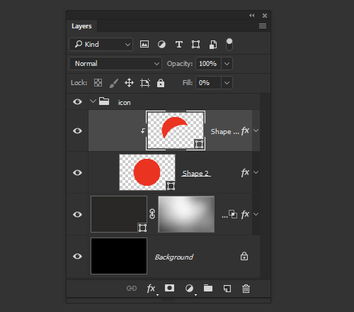
Because we need this layer only for its Layer Styles, we can set its Fill Opacity to 0%. We also want this layer to inherit the Layer Styles of the underlying layer, so create a Clipping Mask on the new layer (Cmd/Ctrl + Option + G).
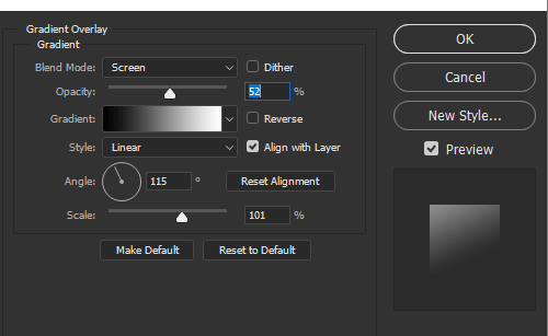
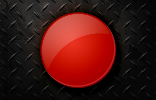
Now, begin the Layer Style with a Gradient Overlay. Use the default black-to-white gradient, and set the Blend Mode to Screen. Knock the Opacity down to about 50%, and change the angle to about 115°. You may need to change the positioning of the gradient, which you can do by clicking and dragging inside the document window, just as you did in the 3-D modeling section.
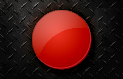
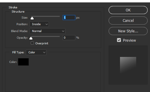
This is a good start for the highlight, but it still looks somewhat unnatural. Using a transparent inside stroke, we can shrink the perimeter of the interior effects. Add a Stroke effect to the layer and drop its opacity to 0%. Change the position to Inside, and work with the size slider until the highlight begins about where the darker inner glow ends on the underlying layer (the example image uses 5 pixels).
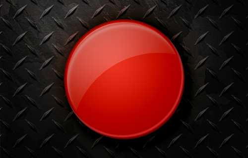
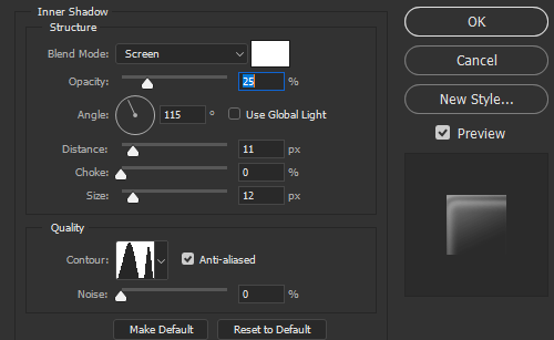
To add a more dynamic look to your highlight, you can add a white Inner Shadow set to Screen with a custom contour. Tweak the distance and size settings to finish off the effect.
X-Ray Vision
Step by Step
To create the die-cut type inside our icon, we could turn the text layer into a shape layer and use the paths to mask away areas from the base. However, this would result in degenerated content; we would no longer be able to modify the type. Instead, we’ll simulate a mask using the Knockout Blending Option. This will also allow us to apply custom effects to the cut-out area.
Create a new Type Layer with the text “fx”, and position it within the circular base. The example uses 120 point Garamond Bold Italic.
Drop the Fill Opacity to 100%.
Begin your Layer Style by adding an Inner Shadow. Increase the size, and increase the opacity to about 90%. You may also want to modify the distance and contour to your liking.
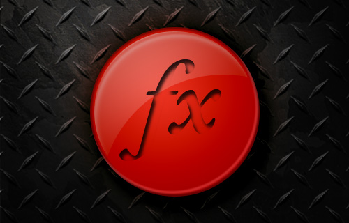
We now have the beginnings of a die-cut effect, except that the text still shows the base below it. To fix this, go to the Blending Options section in the Layer Styles menu. Change the Knockout from None to Shallow (this setting samples pixels from the layer directly beneath the current layer’s group). Because our text layer doesn’t belong to a layer group, it samples instead from the Background layer. (Using a Deep Knockout would always sample from the Background layer, regardless of the layer’s group.)
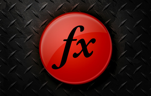
To get the text layer to sample from our diamond plate layer, start by clicking “Okay” to close the Layer Style menu. Select the text layer and both of the buttons that make up the base, and group the layers (Cmd/Ctrl + G). As you can see, the “fx” shapes are now drawing pixels from the textured layer directly below the new layer group.
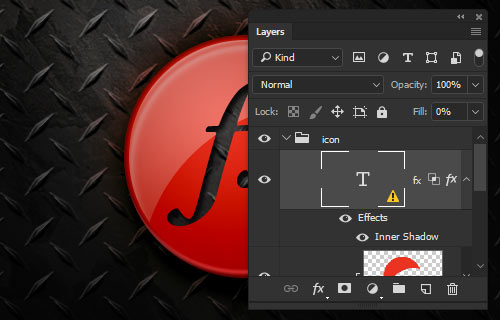
The knockout effect is very convincing, but the type still feels detached from the base. Let’s add a beveled effect to simulate the surface quality of the base. Start by adding an outside Stroke with a size of 2; then drop the opacity to 0%. This doesn’t achieve anything but is necessary for the next step.
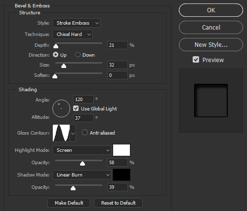
Now add a Bevel and Emboss effect. Change the Style to Stroke Emboss and Technique to Chisel Hard. This will apply the bevel’s lighting effects within the stroke area created in the step above. Modify the settings to achieve a subtle and smooth edge.
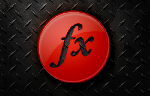
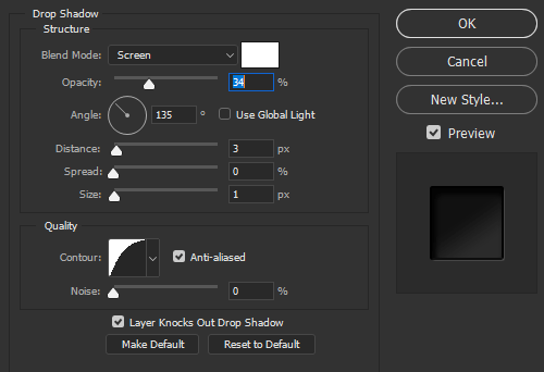
Let’s take the bevel one step further by adding a thin specular highlight to the bottom-right edges of the shape. We can use a white Drop Shadow effect, set to Screen, to add a bright highlight just at the edge of the bevel. You’ll want to modify the distance and size to give the highlight a sharp edge.

Finish off the Layer Style with more shading within the die-cut letters by adding a simple black-to-white Gradient Overlay, set to Multiply.

Quick Tips
Despite frequent misuse, the Layer Styles menu really is a powerful tool that every designer should learn to work with. Not only does it provide a level of speed and control not easily found through other means, but it provides invaluable flexibility.
Our example shows how a multi-dimensional icon and a completely dynamic background can be consolidated within four simple Shape layers, allowing them to be easily modified, reused and repurposed throughout your designs. Below are a few extra tips to remember when working on your next project.
Effects Stacking Order
You may have noticed sometimes that an effect isn’t visible when another effect is being used. For example, a Color Overlay seems to override a Gradient Overlay. This is because of the Layer Styles Stacking Order. Just as with the Layer’s Palette, one layer will cover another that is lower down in the stacking order.
Unfortunately, the Layer Styles menu doesn’t allow you to rearrange the order of effects. One way around this (even if you sacrifice the ability to edit) is to use Create Layers, which turns all of your Layer Style effects into actual layers that you can move.
Interior Effects Stacking Order:
- Stroke
- Bevel and Emboss
- Inner Shadow
- Innger Glow
- Satin
- Color Overlay
- Gradient Overlay
- Pattern Overlay
Exterior Effects Stacking Order:
- Stroke
- Outer Glow
- Drop Shadow
- Non-Color-Specific Styles
Though not always possible, you may want to use black, white and grays for your effects. Using monochromatic colors in conjunction with the proper Blend Mode allows you to create styles that are non-color-specific, meaning you can modify the color of the actual layer, and your Layer Style will update appropriately.
Scaling Effects
There may be times when you’ve created a Layer Style that looks great at the original size, but when the shape is increased or decreased, your beautiful style is destroyed. Fortunately, Photoshop provides a method to adjust styles that are out of whack. Simply choose Layer → Layer Style → Scale Effects, and then input the percentage you need.
Inconspicuous Menu Options
A number of hidden commands are available to you from within the Layer Styles menu. Depending on the effect, you will have access to either the Hand tool or the Move tool by simply mousing over the document window. The Hand tool allows you to move the document around just as you would outside the Layer Styles menu, and the Move tool repositions the current effect and updates the settings automatically.
When using the Move tool, you can still access the Hand tool by holding the space bar. While using either of the tools, you can zoom in and out by holding Space + Cmd or Space + Option respectively. Don’t forget, as with most other menus in Photoshop, holding “Option” will change the “Cancel” button to a “Reset” button, allowing you to undo any changes.
Thanks to Marc Edwards and Ricardo Gimenes for their assistance in editing the article.
Further Reading
- Mastering Photoshop: Unknown Tricks and Time-Savers
- Useful Adobe Photoshop Techniques, Tutorials and Tools
- 70 Beauty-Retouching Photoshop Tutorials
- Photoshop Plugins and Filters A-Z


 SurveyJS: White-Label Survey Solution for Your JS App
 Agent Ready is the new Headless

