New Approaches To Designing Log-In Forms
For many of us, logging into websites is a part of our daily routine. In fact, we probably do it so often that we’ve stopped having to think about how it’s done… that is, until something goes wrong: we forget our password, our user name, the email address we signed up with, how we signed up, or even if we ever signed up at all.
These experiences are not just frustrating for us, but are bad for businesses as well. How bad? User Interface Engineering’s analysis of a major online retailer found that 45% of all customers had multiple registrations in the system, 160,000 people requested their password every day, and 75% of these people never completed the purchase they started once they requested their password.
To top it off, visitors who are not logged in do not see a personalized view of a website’s content and recommendations, which reduces conversion rates and engagement. So, log-in is a big deal — big enough that some websites have started exploring new designs solutions for the old problem.
Is This You?
Gowalla’s sign-in form (below) looks pretty standard: enter your user name or email address and your password, and then sign in. There’s also help for those of us who have forgotten our password or are new to the website. In other words, all of the most common log-in user-interface components are accounted for.
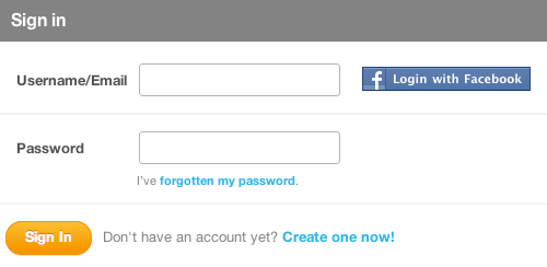
But Gowalla has taken the time to include a few more components to help people log in with more confidence if their first attempt hasn’t worked. If you attempt to sign in with a user name (or email address) and password that do not match, the website not only returns an error but returns the profile image and user name of the account you are trying to sign into as well:
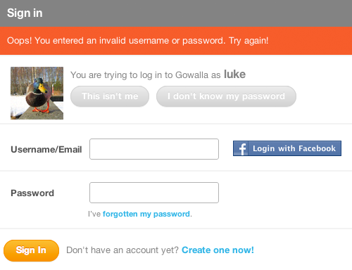
Including a profile picture provides instant visual confirmation: “Yes, this is my account, and I may have forgotten my password,“ or “No, this isn’t my account, so I must have entered the wrong user name or email address.” In either case, Gowalla provides a way to resolve the problem: “This isn’t me” or “I don’t know my password.”
The Q&A website Quora takes a similar approach, but it doesn’t wait until you are done trying to sign in before providing feedback. Quora’s log-in form immediately tells you if no account is associated with the email address you have entered, and it gives you the option to create a new account right then and there:

If the address you have entered does match an account on Quora, then the account’s profile image and user name will appear to the right of the log-in form. This confirmation is similar to Gowalla’s but comes right away instead of after you’ve submitted the form.

Instant Sign-In
Quora’s log-in form also includes an option to “Let me log in without a password on this browser.” Checked by default, this setting does just what it says: it eliminates the need for you to enter a password when re-logging into Quora. All you need to do to enter the website is click on your profile picture or name on the log-in screen.

To go back to the standard log-in screen, just click the “x” or “Log in as another user,” and then you can sign in the hard way: by entering your email address and password.
While one-click sign-in on Quora is convenient, it doesn’t really help you across the rest of the Web. For that, many websites are turning to third-party sign-in solutions.
“Single-sign-on” solutions such as Facebook, Twitter, OpenID and more have tried to tackle log-in issues by cutting down on the number of sign-in details that people need to remember across all of the websites that they use. With these services, one account will get you into many different websites.

Logging in this way is faster, too. When someone connects their Facebook or Twitter account to a website, they simply need to click the “Sign in with Facebook (or Twitter)” button to log in. Of course, they need to be signed into their Facebook or Twitter account in order for it to work with one click. But with 50% of Facebook’s 750 million active users logging into Facebook on any given day, the odds are good that one click is all it takes.
You can see this log-in solution in action on Gowalla (screenshot below). A Gowalla user who has connected their Facebook account needs only to click on the “Log in with Facebook” option in order to sign in — provided they are already signed into Facebook, of course. If they’re not signed into Facebook, they’ll need to do that first (usually in a new dialog box or browser tab). After doing so, they will be instantly redirected to Gowalla and logged in.

New Log-In Problems
But with these new benefits come new problems — usually in the form of too many choices. When faced with multiple sign-in options on a website, people do one of the following:
- They remember the service they used to sign up (or that they connected to their account), and they log in instantly. This is the best case scenario.
- They assume they can sign in with any third-party service (for which they have an account), regardless of whether they have an account on the website they are trying to log into. The thought process for these folks goes something like this: “It says I can sign in with Facebook. I have a Facebook account. I should be able to sign in.”
- They forget which service they used to sign up or if they used one at all, and thus hesitate or fail to log in.
To make matters worse, if someone picks the wrong provider, instead of signing in to the service they’re trying to use, they might end up signing up again, thereby creating a second account. While a website can do its best to match accounts from different services, there’s no completely accurate way (that I know of) to determine whether a Twitter and a Facebook account definitively belong to the same person.
So, while third-party sign-in addresses some problems, it also creates a few new ones. In an attempt to solve some of these new sign-in issues, we’ve been experimenting with new log-in screen designs on Bagcheck.
Our most recent sign-in screen (below) is an attempt to reduce confusion and prevent the types of errors I have just described — admittedly, though, at the expense of one-click sign-in. In this design, people are required to enter their user name or email address to sign in. We use instant search results to match their input to an existing user on the website, so someone needs to type only the first few letters of their name to find their account quickly. This tends to be much faster than typing an entire email address. But because more than one person is likely to have the same name, we provide the ability to sign in with an email address as well.
Once someone selects their name or enters their email address, then their options for signing in are revealed. No sign-in actions are shown beforehand.
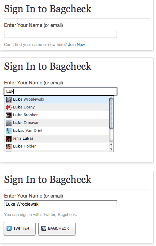
True, in this design people can no longer sign in with one click, because the sign-in buttons are not visible by default. But this may be a trade-off worth making, for the following reasons:
- We keep people signed in until they explicitly sign out. So, hopefully people will rarely need to go through the sign-in process. Remember: the less people need to log in, the fewer sign-in problems you’ll have!
- The added amount of effort required to sign in is small: just start typing your name and select a search result, or enter your complete email address, and then click the sign-in button. It’s not one-click, but it’s not a lot of work either.
- Trying to sign in with an account provider that you have not set up on Bagcheck is no longer possible, because the log-in buttons don’t show up until after you have selected your name. This cuts down on duplicate accounts and confusion over which account you have signed up with or connected (especially on different browsers and computers where a cookie has not been set).
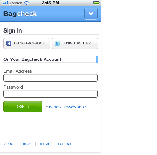
On mobile, however, these trade-offs may not be worth it. Logging into a website on a mobile device by typing is a lot more work than just tapping a button. So, in the Bagcheck mobile Web experience, we’ve kept the third-party sign-in buttons front and center, allowing people to log in with just one tap. It’s just another example of how the constraints and capabilities of different devices can influence design decisions.
Since launching this log-in experience on Bagcheck, we’ve gotten a lot of great feedback and ideas for improving the interactions. Many people have suggested using browser cookies to set a default sign-in option for returning visitors. While this might help people who return to the website using the same browser, we’ve seen many more sign-in issues when people use a different browser or computer. In these cases, a browser cookie won’t help.
Another common question is whether allowing anyone to search the list of Bagcheck users by name or email address reduces security. While this design does somewhat reduce the security of a Bagcheck account (compared to our previous log-in screen design), it’s no worse than many websites that let you sign in with your public user name, like Twitter.
And because all Bagcheck profile pages are public, users can be searched for on Google and on Bagcheck itself. Despite this, we’ve seen a bit of increased concern over this same search capability being on the sign-in screen. So, if you’re thinking about trying this design, make sure your profile pages are public, and be aware that people may still be a bit sensitive about it.
We’ve All Got Email
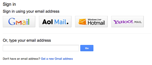
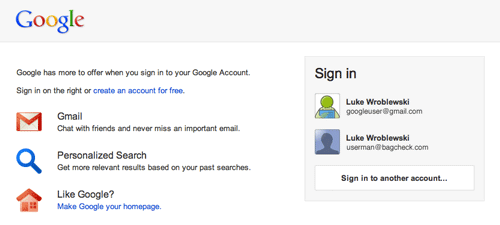
Although signing into a service with one’s name may be too new for some people, logging in with an email address is common practice for most. Using a solution that brings together a lot of the ideas outlined in this article, Google’s Identity Toolkit and Account Chooser allow people to sign in across the Web using just their email address:
When multiple accounts have been accessed in the same Web browser, each account is listed as a sign-in option, making account selection easier. If you want to try out this sign-in solution, you can opt in on Google’s website or implement it on your website with Google’s Toolkit.
The Little Things Matter, Too
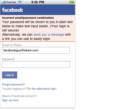
The Bagcheck and Google examples we just looked at try to rethink log-in pages in big ways. But not all sign-in innovations need to be so comprehensive. Even small changes can have a big impact. For example, I mentioned earlier that inputting text precisely on mobile devices can be harder than on full keyboard computers. Coupled with obscured password fields, this can make logging into a website on a mobile device a challenge.
Facebook’s mobile Web experience tackles this in a small but useful way. If you enter an incorrect password when trying to sign in, the website will change the password field to plain text so that you can actually see your input. Facebook also offers an alternate way to log in, using your email address or phone number (screenshot below). It’s a small enhancement but one that can go a long way on mobile.
It’s Not Over
As these examples illustrate, even the most common interactions on the Web (like logging in) could benefit from new ideas and design improvements. Not every idea I’ve walked through here will become part of all the log-in forms we encounter on the Web — chances are none of them will. But without trying, we’ll never know.
So, if you have some new ideas for signing in or any other Web interaction we’ve come to take for granted, try them out and let the rest of us know what you’ve learned!
Online Resources
- “Web Form Design: Filling in the Blanks” Everything you need to know about designing effective and engaging Web forms.
- “Killing Sign-Up Forms” Solutions for engaging people on websites without asking them to fill in a bunch of input fields.
- “Text Input on Mobile Is Hard, But…” … people enter text all the time on their mobile devices.
- Google’s Internet Identity Research Public information from Google on projects in the identity space.
Further Reading
- Innovative Techniques To Simplify Sign-Ups And Log-Ins
- Web Form Design Patterns: Sign-Up Forms
- Better Password Masking For Sign-Up Forms
- How To Log In To WordPress Using A Social Network


 SurveyJS: White-Label Survey Solution for Your JS App
 Agent Ready is the new Headless

