Improving The Online Shopping Experience, Part 1: Getting Customers To Your Products
Amazon turned sweet sixteen this year, and, by extension, so did online shopping as we know it. As online shopping has grown over the past 16 years, so have user needs and expectations related to the online shopping experience. Setting up shop online is easy, but creating an experience that satisfies target users is a different story altogether.
In the traditional journey of a purchase, commonly depicted as a funnel, a business loses potential customers as they move closer to the purchasing stage. While this is natural and expected, improving the user experience can reduce this loss by removing unnecessary barriers to shopping online.
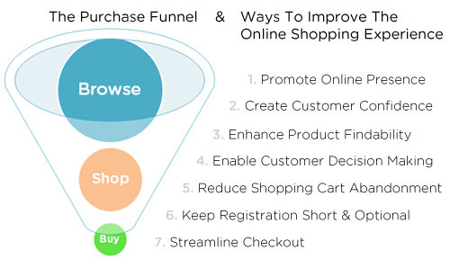
The guidelines, techniques and best practices in this two-part series address common user experience issues on e-commerce websites. They are intended as a starting point; books have been written on many of these topics, and a few are recommended at the end. Improving the user experience requires a good understanding of your users and their goals on your website. Use that lens as you read through, to see which of the techniques will improve the online shopping experience for your users.
This first part covers the upper part of the funnel: getting customers to your website and helping them find your products. Part 2 will address the lower part of the funnel: guiding customers through the decision-making process and check-out.
Promote Your Online Presence
Make it easy for customers to find your website by using a combination of online and offline marketing tactics. Analytics will show you how users are coming to your website — for most websites, search engines and other online referrals, including social media, play a big role. What these reports will not show you are missed opportunities, such as customers ending up on your competitors’ websites instead of yours because of their search keywords.
- Analyze your website and the websites of key competitors to compare how you rank on the search terms used by your target users and to identify areas for optimization. Personas, which are representative profiles of target users, can be used as a tool for search marketing efforts, helping you to identify and prioritize keywords, offers and features and to create targeted landing pages. Digital consultancy Roundarch has an example of a keyword persona that it uses when working on search engine optimization (SEO) for Avis.
- If your business is selling in a competitive market, supplement your SEO efforts by buying relevant keywords for paid placement alongside search results, using services like Google AdWords and Microsoft adCenter.
- Create business profile pages on services such as Google Places, Bing Business Portal and Yahoo Local: these will be highlighted in search results and on location-based social networking services. In addition to your business name, include your physical address, phone number, URL and hours of operation.
- Use email campaigns to attract new customers and draw previous customers back to your website. In a recent Forrester study, retailers ranked email as having the highest return on investment (ROI) among their marketing efforts, including paid search, affiliate marketing and Facebook marketing.
- Create, join or support communities and social networks related to your products or related to issues that your product addresses. An example is Aspirin manufacturer Bayer’s involvement in and sponsorship of the Strong @Heart community on Facebook.
- Go where your customers are; these days, that includes social networks. Companies are experimenting with Facebook ads and check-in coupons, offering promotions on their Facebook walls, and tweeting time-limited deals to their followers. Although companies such as JCPenney and 1-800-Flowers.com have set up Facebook storefronts, their ROI is questionable in value.
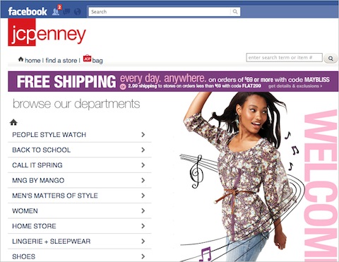
JCPenney’s Facebook storefront allows users to shop on the social network. - Use a short, simple, intuitive and memorable Web address, and secure alternate spellings (
walmartandwal-mart) so that users can get to your website even if they misspell your name (jcpenny,jcpenney,jcp). - Increase visibility in search engine results using SEO techniques, including picking the right keywords and creating keyword-rich and search-friendly page URLs, titles, headings, tags and content. SEO is not a dirty acronym if done the right way. Trying to fool search engines may work for a while, but you will eventually be penalized, as JCPenney and Overstock recently discovered.
- Feature the URL prominently offline: in printed material, while people are on hold on the phone waiting for service or support, in offline advertising and promotion, and in brick-and-mortar stores where appropriate. Quick Response (QR) codes give smartphone users quick access to a website, a sub-section or a particular page without having to type in a long address.
Instill Confidence In Customers
Instill confidence and trust in customers by prominently displaying clear policies, trust certificates, security badges and contact information. Customers are cautious when asked for personal information, and rightly so, with news of hacked websites being so common. Even established brands that customers recognize and trust can use these techniques to reinforce confidence.
- Looks matter, and your website’s design is often the first impression that a customer will get of your business. Creating a professional-looking website is easy and inexpensive, so get the basics right and make a good first impression. This includes designing for accessibility and especially ensuring that your website renders well on mobile devices.
- Highlight security on secure areas of the website to remind customers that their information is safe; even though browsers have small built-in indicators to show secure areas, reiterate it on the page. Amazon does this through its sign-in button; other websites display a padlock icon near the log-in area.
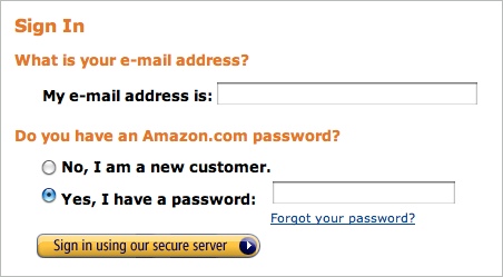
Amazon’s sign-in button reinforces a sense of security. - Clearly state your business practices (including privacy, security and return policies), and make them accessible from every page. Don’t make users hunt for this information; rather, present these links contextually where appropriate (for example, display a link to your privacy policy near the email-address field).
- Visible contact information instills confidence, even if the customer does not have to use it. Offer contact options and alternatives: even though Amazon does not publicize its customer-service phone number, it makes up for it by offering excellent support via email, chat and call-backs.
- Lesser-known brands should do all of the above, as well as instill confidence by displaying trusted third-party certification and affiliations. These include trust certificates (e.g. TRUSTe), security badges (e.g. VeriSign), accreditation (e.g. BBB) and ratings (e.g. Bizrate).

Instill confidence with trusted third-party certification and affiliations.
Enhance Product Findability
Enable customers to quickly find and discover products by offering robust search and navigation. Customers will not always start on your home page — a search engine or QR code could drop them many levels deep on your website — but good navigation and search should help them find their bearings.
- Create a strong foundation through distinct product categories and user-centric labels that help users explore other areas of the website. Involve users in the design process by conducting exercises such as card-sorting to understand their mental model and to create an architecture that is intuitive to them.
- Mega-menus can be used to expose multiple category levels without making users drill down. See Econsultancy’s article “25 E-Commerce Mega-Menus Dissected” for more examples. Keep in mind, though, that mega menus aren’t a panacea, they also require profound usability considerations.
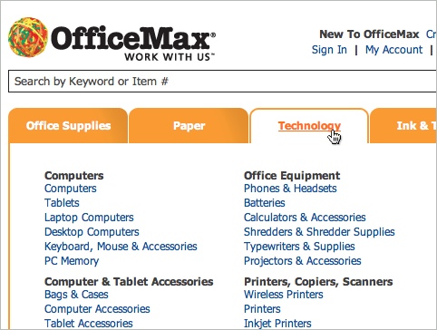
OfficeMax’s mega-menus facilitate the scanning of categories. - Breadcrumb navigation enables customers to identify where they are on your website and helps them backtrack or broaden their search results if needed.
- Keep the search box consistently in the same location across the website. Customers expect it to include a text field, followed by a button labeled “Search,” usually in the top right of the screen.
- Accept colloquial synonyms and common misspellings as search keywords, and match results accordingly. On Amazon, a search for “iTouch” brings up the iPod Touch, and a search for “polar bear book” (as information architects so lovingly call it) brings up Information Architecture for the World Wide Web (which happens to be a great resource that looks closely at many concepts mentioned in this section).
- Help users get faster and more relevant search results. Predictive type-ahead options help users select the appropriate term before running a search. Providing related search terms helps with typos and more common alternatives.
- Display results based on relevance, but give users the options to refine, filter, compare and sort results based on various criteria and to control the number of results displayed at a time.
- Display a summary of key product information in the search results to speed up identification and selection. In addition to the name and image that the user expects, provide pricing, availability, ratings, shipping details and other relevant information.
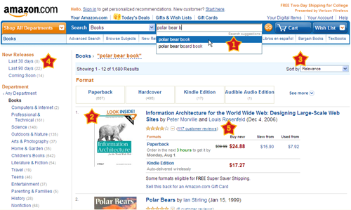
The search results for “polar bear book” on Amazon, which include: (1) predictive type-ahead; (2) tolerance for synonyms; (3) sorting options; (4) filtering options; (5) summary of key product information (ratings, reviews, formats, pricing, availability).
Stay tuned for the second part, which will focus on guidelines and techniques to help customers make purchasing decisions and to guide them through the check-out process.
Further Reading
- Search Engine Optimization: An Hour a Day, third edition, Jennifer Grappone and Gradiva Couzin
- Search Analytics for Your Site: Conversations With Your Customers, Louis Rosenfeld
- Information Architecture for the World Wide Web: Designing Large-Scale Web Sites (aka the polar bear book), Peter Morville and Louis Rosenfeld
- Neuro Web Design: What Makes Them Click?, Susan M. Weinschenk
- How to Create Selling E-Commerce Websites, Smashing Magazine
- Designing Search: UX Strategies for eCommerce Success, Greg Nudelman
- Selected Usability & User Experience Guidelines, a hand-picked collection of the most useful Smashing Magazine’s articles on Usability and User Experience.
Further Reading
- Part 2: Guiding Customers Through The Buying Process
- A Little Journey Through (Small And Big) E-Commerce Websites
- Usability Study: Shopping For Bedsheets – How Hard Could It Be?
- 15 Common Mistakes in E-Commerce Design


 Agent Ready is the new Headless
 SurveyJS: White-Label Survey Solution for Your JS App


