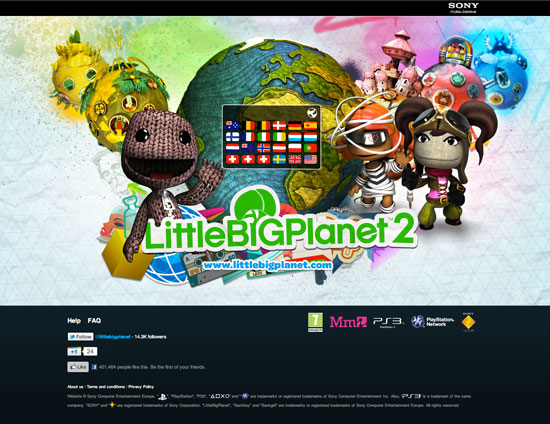
How To Design Global Applications For Children
The entire process of designing digital applications comes with many challenges and decisions. For the majority of projects, you will be designing in somewhat familiar territory. But what happens when you have to design something to be used by hundreds of children around the world? How do you accommodate your design for kids of different ages and backgrounds? What special challenges emerge, and how can they be overcome?
For a project of this scale, the design process we follow might require modifications. These modifications would be to accommodate the needs of younger age groups and would shape the entire length of the project, from user research, brainstorming, interface design and interaction design all the way to the final stages of usability testing and user support.
First Things First: International Research With Children
The first questions to answer when creating applications for children in varied graphical and cultural contexts are:
- What are the most important markets for the application?
- How should we address these markets in terms of cultural differences and age groups?
Creating a single digital product that appeals to the whole world is almost impossible, but we can narrow down and classify the types of audiences we are working with through user research.
Conducting user research with children is a topic of its own, and we need to consider even more factors when the research is international. But the point here is to try to work with children from the different market groups as much as possible.
In doing this, aim for the following:
- Work with researchers who speak the children’s native language (even if the kids are familiar with a second language), to put them at ease during the research sessions. This is especially important when working with children up to 13 years of age, and it gets more flexible with teenagers.
- If the budget allows, have members of the design team attend the research sessions and visit where the kids are mainly located, even if they don’t speak the local language. This will help the team better understand the children’s mental models based on culture and demographics.
- When iterating and testing with users in different parts of the world, some research companies and teams are keen to use forums, message boards or online communities, which facilitate Web-based research panels and which give the team easy access to a high number of users. These platforms are sometimes part of major applications, such as online gaming communities and virtual worlds, but they are often created specifically for the purpose of testing and sharing concepts with select users, who would access them confidentially with approved user names and passwords. These tools are very effective when the basic ideas are in place and can be tested in an interactive prototype, and when the kids are above seven years of age (or, if younger, aided by their caregivers). Examples of online research techniques can be found at Touchstone Research, which has a long history of working with kids and teens in digital interactive spaces.
It’s All In The Details
When planning the interface of a global digital product, designers need to be aware of how the layout will change when the content is translated, or whether a separate application will be developed for every region in the world that the company wants to cover.
If text will be used for navigation labels and some content sections, agree on some basic copy with the team, and then wireframe a few sections in the languages that will most likely need to be specially accommodated in the layout. Translators, developers and designers can work together on wording that can be translated with the least variation in layout; this will aid the designers in creating appropriate UI elements.
On Nickelodeon’s Neopets, for example, the main navigation bar looks busier when translated into German and might be more difficult to scan. In general, Neopets has a lot of elements to scan, but the change in its look and feel does not warrant a different layout. The point here is that a combination of differences in labeling, text block length and cultural expectations can make it necessary to design special interfaces for some regions of the world, and these needs can be identified early on during the user research and wireframing process.


What Language Do You Speak?
Usually the first (and perhaps most obvious) challenge that emerges when working with international audiences is that not everyone speaks the same language. Universal applications need to overcome this barrier in order to provide the best experience to visitors.
When working with children as our primary audience, we need first and foremost to identify the age group we are working with and the level of their motor, social and cognitive skills.
For example, most children under six years of age are unable to read, or are just starting to identify simple words, so text-based navigation is irrelevant at this age. Meanwhile, older children who are becoming more proficient in reading would not be able to navigate applications written in other languages (even if they are being raised in bilingual households), because they are still in the process of decoding their mother tongue. These restrictions can extend all the way to the teenage years and adulthood, depending on the language(s) that the person has been exposed to.
To address this challenge, most websites for kids change the language automatically by tracking the user’s computer and IP address location. This enables the website providers to deliver a seamless experience to young users who might not be able to change the language by themselves. Still, most global applications also provide functionality to change the language manually.
Lego, for example, opts for a widget at the top of the screen that allows users to change their language and region. This widget remains in the same location and retains its look and feel throughout all of Lego’s product websites.
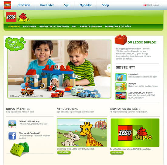
Lego Duplo assumes that a parent or caregiver will be helping the child navigate the initial screens of the website. Therefore, actions like changing the language and finding products, games and model ideas might initially be performed by the adult and could include whole paragraphs of text.
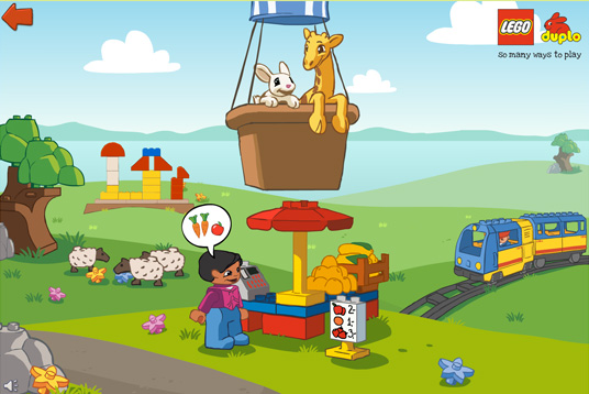
But once users reach the sections designed specifically for preschoolers, Lego reduces the text or eliminates it altogether and provides interactivity based solely on graphics:
Moving on to older children, Sony’s Little Big Planet is also a graphics-based website, but it introduces more text-based navigation and prompts users to choose their language before browsing any content. Most children in this video-game demographic are able to read in their native tongue and to choose the language by themselves (or at least ask a parent to do it for them if needed):
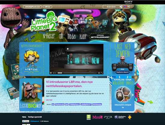
Note that Little Big Planet maintains the same layout for different languages, while keeping brand names and common Web-related words in English, such as “store” and “media.” No matter how common a word is to us adults, we always need to check whether kids will understand its meaning and, moreover, whether they welcome text in foreign languages.
Another interesting approach is taken by Panwapa, a Web-based application developed by Sesame Workshop and the Merrill Lynch Foundation. Its goal is to teach young children about other cultures. The options for changing the language are at the bottom of the page and are powered by radio buttons:
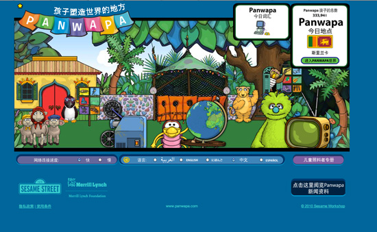
While a child who cannot yet read wouldn’t be able to navigate this feature, the interesting thing is that the characters speak in the selected language once it is changed. Most preschool websites rely heavily on sound and character narration to create an immersive experience, and Panwapa has made an effort to reproduce this same experience for children in other countries and cultures.
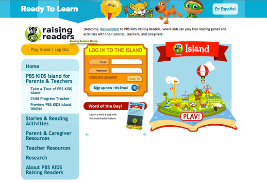
The PBS Kids websites are aimed primarily at US-based families and schools, a significant portion of which moves seamlessly between English and Spanish. The log-in and parents area of PBS Island addresses this need by placing a big link in the top-right that reads, “En Español”:
Content providers on other platforms address language barriers in different ways. For example, most software applications and video games are shipped in different languages to be sold in stores or online portals.
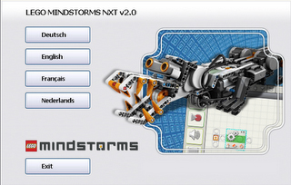
Some software, such as Lego Mindstorms NXT, ships in only one version, but users are prompted to choose their language when installing:
In previous versions of MIT’s free graphical programming software, Scratch, users could change the language using the main toolbar in the application:
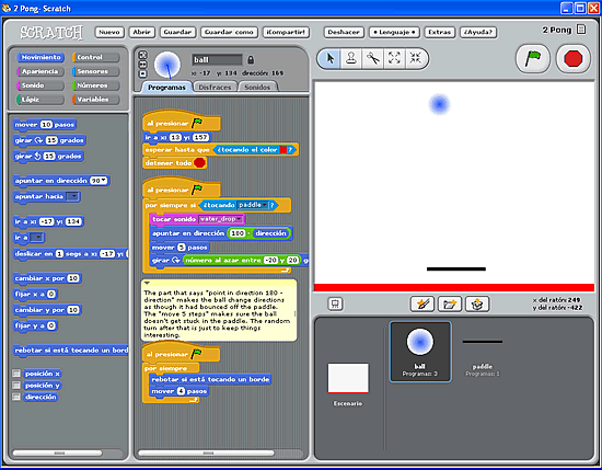
Note however, that these software programs are designed for children who are above 12 years of age, generally able to understand the installation process, proficient in reading and computer-savvy.
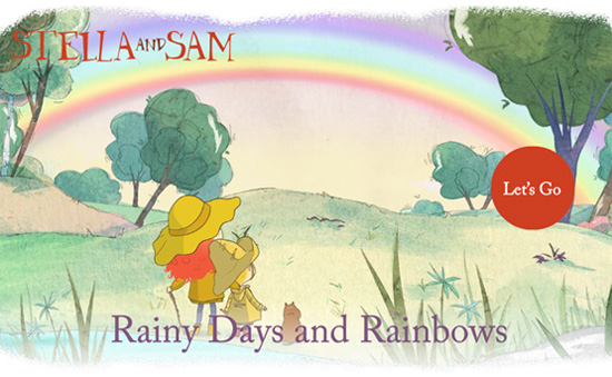
In the mobile space, globalization for children needs to be explored more thoroughly, because most apps cannot be considered large scale. That being said, some developers have experimented with including different languages in order to attract more users in countries where the majority of the population speaks two or more languages. Such is the case with Rainy Days and Rainbows, an iPad app developed by Canadian company Zinc Roe in English and French versions.
The company Duck Duck Moose has experimented with exposing familiar nursery rhymes to children in foreign languages. This can be seen in its Wheels on the Bus iPhone and iPad app, where users can choose the language in which they would like to hear a song.
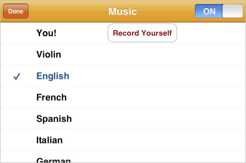
The two examples cited above were designed for young children, and so their language functionality has been relegated to the secondary level, away from the main navigation for kids. The language features are meant as a bonus for the parent or caregiver to discover for their child as they interact with the app.
To end this section on language differences, consider some important points drawn from Jakob Nielsen’s study on website usability and children in Israel and the US:
- Text should not be the main form of navigation in an application unless you are designing for proficient readers and are able to translate the content into their native language.
- Visual presentation is crucial. Icons, images and graphics should be of high quality and universally understood, and they should make the interface self-explanatory.
- Clear navigation is one of the most difficult things to achieve when designing for international audiences, especially children. Most kids will understand traditional activities like coloring without needing to read text, but the path they take to find those activities needs to be carefully designed and presented.
Addressing Cultural Differences
Different Products for Different Cultures
The creators of the applications above address language differences by devising methods to identify the user’s location and language preferences (usually referred to as internationalization). Other companies prefer to create applications that not only overcome language barriers but that offer a more personalized experience for the user based on where they live and how digital media is consumed in their culture (usually referred to as localization).
Large corporations are usually the ones that take this approach, establishing design teams in different parts of the world that are able to create and maintain complete digital products on site.
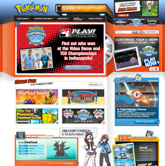
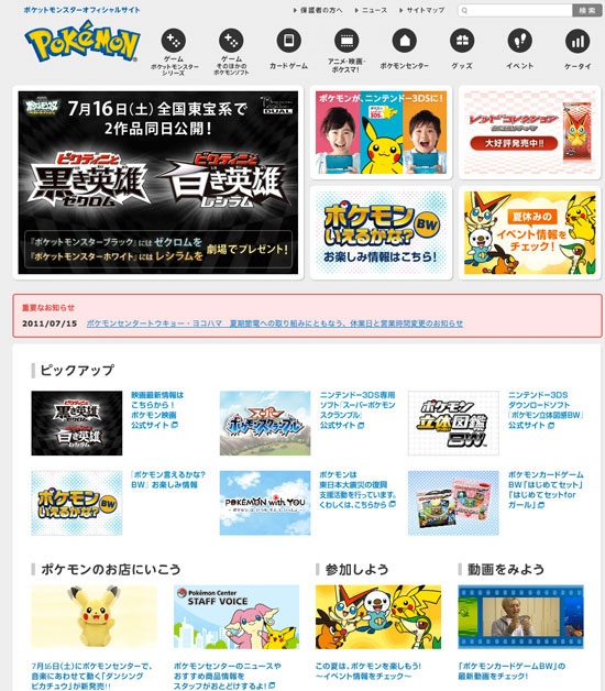
An interesting example of this is the Pokemon website, which has one interface for English-speaking countries, but is completely different in layout, color palette, icons, main content and navigation for Japanese audiences:
Use of Color and Imagery
When designing for international audiences, be sensitive to the significance of certain colors and images in different cultures. Knowing the idiosyncrasies of every culture is impossible, but a thorough process of global user research and usability testing can shed some light on how users respond to your visual elements.
Children’s websites in particular will usually be colorful and inviting, so keep an eye on your color palette. For example, white generally symbolizes cleanliness and purity in Western cultures, but in some East Asian cultures it is associated with death and mourning. You might need to reconsider dressing a character in white, unless they are a universally recognizable professional, such as a doctor, nurse or laboratory worker.
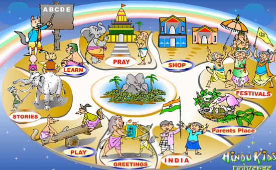
The same principle applies to images, such as those of animals and places that have a special meaning in certain cultures but that might not be well understood by children when seen out of context. An interesting example of this is Hindu Kids Universe, which shows little animals in traditional Hindu clothing and participating in Hindu-related activities. This website was designed for Hindu children, and it could be perceived differently by children in other cultures.
Local Conventions
Also, make sure that your conventions are understood by the majority of users in a locality. For example, humor should be appropriate to your audience. Preschoolers might laugh at absurd scenes (a dog flying, or someone wearing shoes on their hands), while older kindergarteners might appreciate slightly more sophisticated jokes (“Knock, knock”), riddles and silly scenes.
Final Thoughts
While this article provides guidelines on developing global digital products for kids, almost every sub-topic could be explored more deeply. The relevance of some of these points depends on the scale and type of project you are working on. The goal here was to introduce basic considerations for creators of children’s interactive media.
Hopefully, you now feel more inclined to explore these areas further. More importantly, you might now be more curious and adventurous and be better able to see not only through the eyes of a child, but through a world different than your own.
Additional Resources
- “The Impact of Cultural Diversity on Web Site Design,” Jack Cook and Mike Finlayson
- “Consider Your International Audience,” Larisa Thomason
- “Designing Websites for an International Audience,” Lexolution
- Design Inspiration An inspirational blog, with a lot of examples from around the world. Written by Jan Chipchase, executive creative director of global insights at Frog Design.
- Childhood development resources, Scholastic
Further Reading
- Best Practices For Web Design For Kids
- Designing Websites For Kids: Trends And Best Practices
- Designing For Kids Is Not Child’s Play
- Designing Web Interfaces For Kids


 Agent Ready is the new Headless
 SurveyJS: White-Label Survey Solution for Your JS App
