Improving The Online Shopping Experience, Part 2: Guiding Customers Through The Buying Process
Part 1 of “Improving the Online Shopping Experience” focused on the upper part of the purchase funnel and on ways to get customers to your website and to find your products. Today, we move down the funnel, looking at ways to enable customers to make the decision to buy and to guide them through the check-out process.
Enable The Customer To Decide
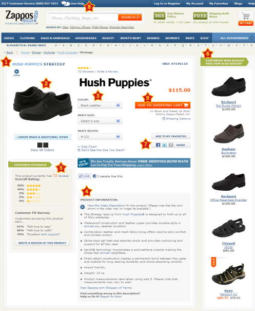
Inform and reinforce the customer’s buying decisions by offering in-depth product information. The content on product pages should be relevant and should give the customer a virtual feel for the product. Ensure that your website addresses the key elements of a product page, listed below.
- Product name
Product names should contain relevant keywords to help customers find and identify the right product. For a product such as a book, information about the author and edition is required. - Images
Use clear product images, with alternate views. Where appropriate, allow customers to zoom in, see different color swatches, or spin the product around with a 360° view. The product page for a book could get away with an image or two, but apparel should offer most of these options. - Video
Static images are not always sufficient to present a product. Video is a good way to showcase complex products that need detailed explanation or a “how to” demonstration. - Pricing and availability
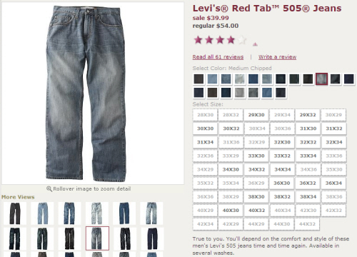
Clearly list the price and availability. When products have variations (for example, different capacities for a hard drive, or different colors for shoes), make it easy for users to identify size and color combinations that are in stock (see the screenshot for Kohl’s below). And provide sizing charts to avoid surprises and returns later. If your business also has brick-and-mortar stores, allow users to check in-store availability online. - Description
Give customers a clear understanding of your products by providing detailed descriptions, with text and multimedia. Descriptions should be simple, clear and jargon-free. Consider tablet and mobile users by providing alternatives to Flash and Java content, and don’t require mouse hovering to access essential information. - Customer ratings and reviews
Unbiased and unedited ratings and reviews by customers will help visitors make up their minds about products that they may not be familiar with (for example, customer reviews suggesting to buy half a shoe size larger for a better fit will help others not make the same mistake). Many users look up ratings and reviews when they are in stores, not only at their desk, so make ratings and reviews easily accessible from mobile devices. - Suggestions of related products
These could be complementary products (for example, a USB power adapter when the customer is buying an iPod Touch), alternative products (different styles, models or versions) or recommendations based on other people’s purchases (“Customers who bought this also bought…”). Whatever their nature, they should be relevant and valuable to the user, not just an attempt to sell more. - Tools
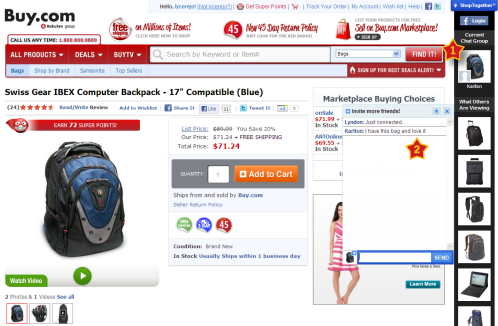
Give users ways to save and share pages on the website. Businesses commonly do this through wish lists, “Email this page” features, and social sharing and bookmarking. Speaking of social, companies such as Buy.com (see screenshot below) and Wet Seal are experimenting with social shopping, allowing users to shop with their Facebook friends. - Contact information
Make it easy for customers to reach you when they need help. - “Add to cart”
Last but not least, make the call to action clear and prominent, to ensure that customers know how to check out.
Reduce Shopping-Cart Abandonment
Customers abandon their shopping carts for numerous reasons, many of which can be prevented by improving the experience.
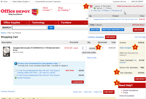
- Make the shopping cart always visible and accessible, and display a summary of items in the cart, keeping check-out a click away. As basic as this sounds, some websites still don’t enable customers to get to their shopping cart without adding something else to their order.
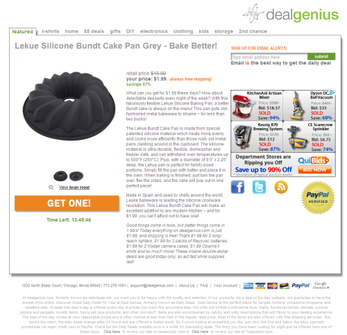
- A persistent shopping cart is important. Users who leave the website without completing their purchase should see their items in the cart when they return. If the user is logged in, the cart should also persist across devices, allowing them to seamlessly continue shopping anywhere and anytime.
- Using the customer’s address or ZIP code, show taxes, shipping options and costs, delivery estimates, and the total cost, thus avoiding last-minute “cart shock.”
- Give users the ability to update their shopping cart without having to go back to the product page.
- If you offer promotional discounts or coupons, give users the option to redeem them without making others feel like they are missing out on savings. Let users know how they can get these discounts (“Sign up for our weekly newsletter to get a discount on your next purchase!”).
- Offer contextual support to answer questions that shoppers may have regarding when their items will arrive, your return policy, and how to contact live help through a phone number, call-back or chat. Display this information in a sidebar, on the shopping-cart page or in a small pop-up window, so that users do not lose the context of where they are.
Keep Registration Short And Optional
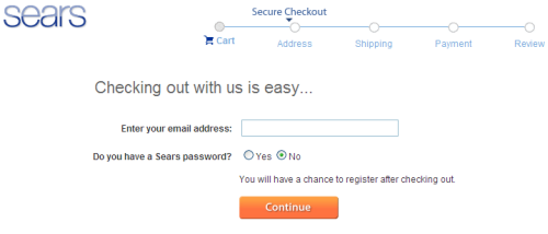
Make the registration process optional and short; forcing registration is one of the main reasons why users don’t complete purchases. If you still need convincing, “The $300 Million Button” should drive the point home.
- When the check-out process starts, allow registered customers to log in, and provide easy ways for them to recover forgotten account information.
- Allow new customers to check out without registering. At the end of the check-out process, give them the option to register and save their information for future use. By this time, they will be motivated to simply create a password in order to avoid typing all of that information the next time.
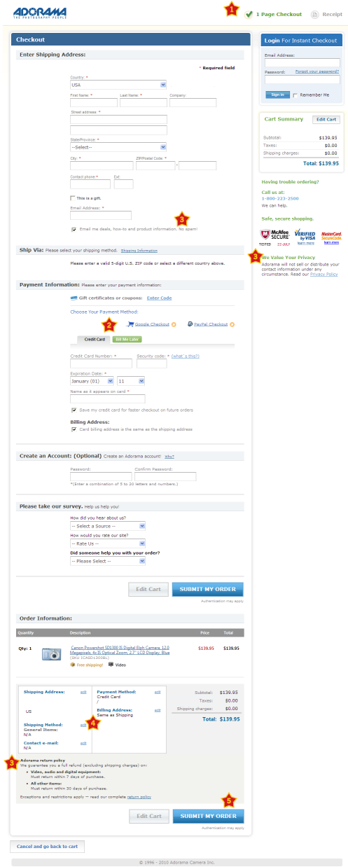
- Simplify and minimize the information required during the check-out and registration processes, by logically grouping the most important information first, and putting optional information towards the end. Some retailers, like Adorama, have got their check-out process down to one page.
Streamline Check-Out
Streamline the check-out process with relevant recommendations, a progress indicator, an order summary and confirmation.
- Relevant recommendations can be a valuable reminder to customers as they check out. Like product suggestions, recommendations at check-out should be relevant and useful to the customer, instead of a way to try to sell anything and everything. Buying the same noise-cancelling headphones from Buy.com and Amazon resulted in very different recommendations, as shown below.
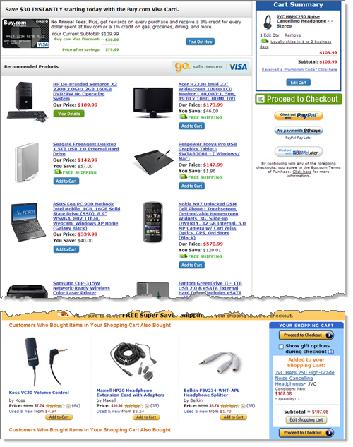
- “Enclose” the check-out process by removing the header, navigation and footer. This will minimize distractions and guide the customer through the last few steps to complete their purchase.
- Use a progress indicator to show customers where they are in the process. “Three steps completed. Just one more to go!”
- Give users a choice of payment methods. If users prefer not to give their credit-card information, allow them to pay by PayPal, Google Checkout or another trusted local payment option. Make sure the third party displays the total amount to be charged before asking for any payment information.
- Link to your policies in context: link to the privacy policy when asking for an email address, and a link to the security policy near the credit-card fields. This relieves users from having to hunt for these policies and also instills confidence.
- When displaying the summary page of their order, allow customers to verify (and change, if necessary) the details before confirming the order. This is also a good place to restate the estimated delivery dates so that they can change the shipping method if desired.
- The final call to action that directs users to complete their purchase (“Place order”) should be prominent. Don’t lose customers at this stage by presenting other options to them.
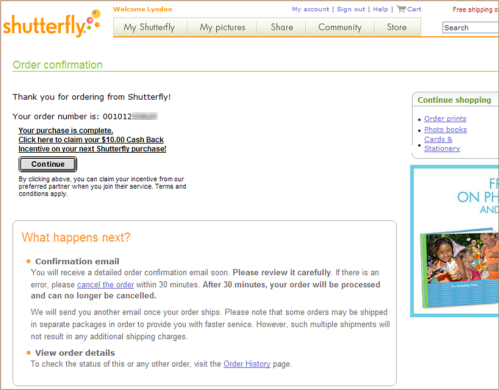
- Once the order has been placed, display a confirmation page, with the order number, saving and printing functionality, and a summary of the customer’s next steps or options. The order confirmation page for Shutterfly, a photo publishing website, not only tells users what their next steps are, but also displays timelines for the fulfillment of their order and contextual links to the next steps.
- If your website allows new customers to check out without registering (as suggested above), then that would be a good time to ask them whether they would like to select a password to create an account and save their information for next time. Highlight some of the benefits of creating an account, so that registering at this stage becomes a no-brainer.
Take Action
Congratulations on making it through the 50 techniques in this two-part series. But this is just the beginning. If you kept your users in mind as you read through this article, you may have already identified areas in your online shopping experience that could be improved. Some of these, like presenting contextual links, are quick fixes, while others, like improving findability, will take weeks or months to implement.
When making changes, measure the impact of the changes using analytics, multivariate or A/B testing, and usability testing (see the further reading below). Improving the online shopping experience not only will make it easier for users and satisfy them more, but will increase your bottom line!
Further Reading
- Improving The Online Shopping Experience, Part 2: Guiding Customers Through The Buying Process)
- Multivariate Testing 101: A Scientific Method of Optimizing Design
- The Ultimate Guide to A/B Testing


 Celebrating 10 million developers

 Register Free Now
 SurveyJS: White-Label Survey Solution for Your JS App


