16 Pixels
16 Pixels for body copy. Anything less is a costly mistake.
I know what you’re thinking. “Did he just say 16 pixels? For body copy? Obnoxiously big! 12 pixels is ideal for most websites.”
I’d like to persuade you otherwise.
As usability expert Oliver Reichenstein says in “The 100% Easy-2-Read Standard”:
“[16 pixels] is not big. It’s the text size browsers display by default. It’s the text size browsers were intended to display… It looks big at first, but once you use it you quickly realize why all browser makers chose this as the default text size.”
In this article, I’ll explain why 16 pixels should generally be the minimum size for body copy in modern Web design. If I don’t change your mind, perhaps you could chip in at the end and let me know why.
You see, in most cases, if you’re building websites with the font size set between 10 and 15 pixels, you are costing your clients money. And I aim to prove it.
Readership = Revenue
If you’re building a website for someone — even yourself — chances are its purpose is to make money.
Perhaps it’s to sell a product directly, or to offer a service, or just to generate leads. Whatever the case, it’s a business asset, and ultimately it has to generate a return on investment. It has to fulfill a revenue goal.
So, every element should be designed to achieve that goal. Including the copy. Especially the copy — because the copy is what convinces visitors to do whatever it is you want them to do on the website.
Think about it. If you don’t explain what people should do, or why they should do it, then they certainly won’t. And the only way to tell them is with text. And text means reading.
Important Facts About Reading
There are some particular findings that are pivotal to issues such as readership and readability and comprehension, which is really what body copy is all about. If people won’t read it, or if they can’t read it or understand it, then what’s the point of having it?
- At age 40, only half the light gets through to the retina as it did at age 20. For 60-year-olds, it’s just 20%.
- Nearly 9% of Americans are visually impaired, meaning their vision cannot be completely corrected with lenses.
- The distance at which we can read letters is a common measure of both legibility and reading speed. The greater the distance, the higher the overall legibility and comprehension are considered to be. The biggest factor that determines how far this distance can increase is font size. Seen any billboards lately?
- Most people, when sitting comfortably, are about 20 to 23 inches from their computer screens. In fact, 28 inches is the recommended distance, because this is where vergence is sufficiently low to avoid eye strain. This is much further than the distance at which we read printed text — most people do not hold magazines at arm’s length!
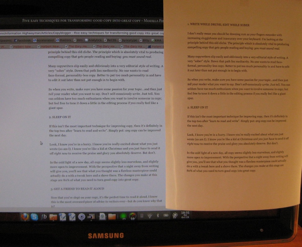
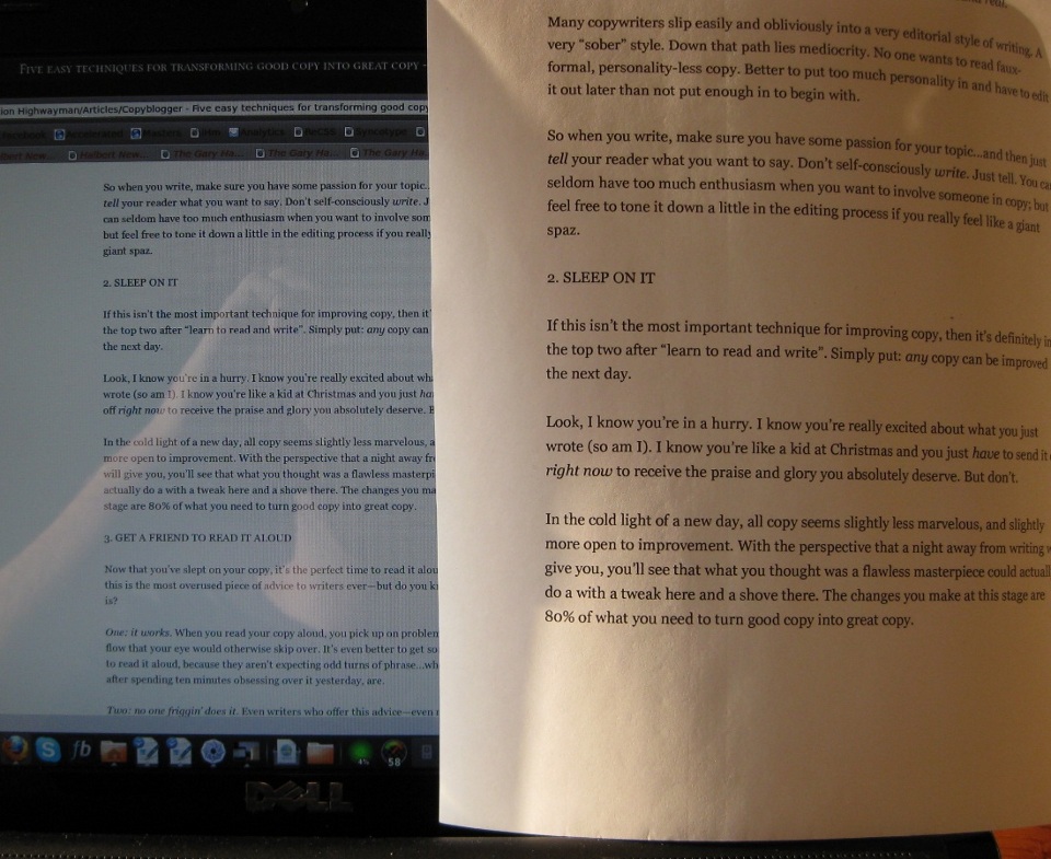
- 16-pixel text on a screen is about the same size as text printed in a book or magazine; this is accounting for reading distance. Because we read books pretty close — often only a few inches away — they are typically set at about 10 points. If you were to read them at arm’s length, you’d want at least 12 points, which is about the same size as 16 pixels on most screens:

16-pixel text displayed on a 24-inch screen, next to 12-point text printed on paper.

- In a 2005 survey of Web design problems, bad fonts got nearly twice as many votes as the next contender, with two-thirds of voters complaining about small font sizes. If you think the situation has improved since then, think again. I randomly sampled some new blog designs on SiteInspire and found that the average font size for body copy was a measly 12 pixels. Some designs even used a minuscule 10 pixels. And none were over a weaksauce 14 pixels. Similarly, if you randomly sampled offerings on the popular Elegant Themes and ThemeForest, you’d find that every single theme sets the main content at just 12 or 13 pixels.
Fact: Most Web Users Hate The “Normal” Font Size
With this research in mind, let me ask: how many of your client’s readers are around 40? Because they have to work twice as hard to read as 20-year-olds. If they’re closer to 60, they have to work four times as hard.
Almost 1 in 10 of your readers also has trouble with their eyes. Of the rest who don’t, most will still have to strain to read text smaller than 16 pixels, even if they don’t notice that they’re doing it. (How often do you find yourself hunching over the screen?) And that’s if they’re leaning close, which they would likely find awkward and unergonomic. Their natural sitting position will be at least an arm’s length from the screen!
In short, for the average Web user, reading most websites is not unlike taking an eye exam.
The harder your text is to read, the less of it will get read — and the less of what is read will be understood. 10 pixels is essentially pointless. 12 pixels is still much too small for most readers. Even 15 pixels will turn off visitors who might have otherwise converted.
Thus, we can conclude that if you want the maximum number of people to read, understand and act on your text, then you need to set it at a minimum size of 16 pixels.**
“But Users Can Zoom”
“If you code it right, people with vision issues can always use the Option and + keys to enlarge the text.”
Thus spake one Web designer in a discussion I had on this very issue.
Not so. The users who will most need to adjust their settings usually don’t know how. And the users who do… well, they’ll probably just take the easier path by hitting the “Back” button. It goes without saying that we shouldn’t take our clients’ money and then design websites for them that will make their visitors uncomfortable. Our personal tastes are not more important than best practices in usability.
Web design is not about what designers like. It is about what users want and what will best achieve our client’s goals.
If the objective of a client’s website is to achieve some revenue goal, then our role as designers is to come up with something to achieve that goal as effectively as possible. Picking a font size that we know most users will struggle to read, a font size that will reduce readership, a font size that will ultimately cost conversions, is not good choice.
In print, type as small as 8 points is an ideal compromise between readability and cost, because you have to pay for every millimeter you use. On the Web, you pay nothing for using more space — provided that readers find your copy compelling, of course. What you do pay for is readers finding your compelling copy so hard to read that they click away instead of converting.
So, the question is, are you prepared to cost your clients money for the sake of what looks good to you?
16 Pixels Is Not Big
Our tastes and aesthetic preferences as designers are a lot more malleable than we think. What “looks good” to us is largely the result of what we’ve seen other designers doing and what we’ve come to expect.
Unfortunately, most of the websites we’ve seen are packed with tiny copy, because once upon a time screens were tiny, and so designers matched them with tiny text — but no one got out of the habit.
This article is used to be set in TeX Gyre Schola at 19 pixels. I picked this size because 16 to 18 pixels looked too small to me: as I sat back comfortably in my chair, 28 inches from the screen, I found myself squinting to see it. If I’d used Georgia or Verdana, 16 pixels probably would have been fine: they were designed with a larger x-height and so display better on screen.
Now, check out the footer just below and see whether you don’t hunch forward automatically, screw up your eyes and furrow your brow. That’s 12 pixels for ya. And if you still disagree after that, tell me why in the comments.
Bnonn is the author of a series of free videos on creating websites that capture readers and turn them into customers. Known in the boroughs as the Information Highwayman, he helps people sell more online by improving their copy and design. When he’s not knee-deep in the guts of someone’s home page, he is teaching his kids about steampunk, Nathan Fillion, and how to grapple a zombie without getting bit.
Further Reading
- 8 Simple Typography Tips For Your Designs
- 10 Principles Of Readability And Web Typography
- The Perfect Paragraph
- How To Apply Macrotypography For A More Readable Web Page


 Register Free Now
 Celebrating 10 million developers

 SurveyJS: White-Label Survey Solution for Your JS App


