The S.M.A.R.T. User Experience Strategy
I was a competitive road cyclist for four years. My bikes were good, but my race results were much less impressive. Instead of medals and trophies, all I had to show for it were shaved legs and a farmer’s tan.
Regardless, on the road to becoming a competitive athlete, I followed a rigorous training plan with concrete goals. These goals were specific, measurable, attainable, realistic and timely. With this training plan, I was able to quantitatively and qualitatively assess my progress and adjust my routine to match.

In the years since, I’ve hung up my racing jersey and replaced it with a designer’s hat. While wearing this hat, I (and many others) have been told to “create a good user experience.” We’ve heard this in creative briefs, project kick-off meetings and critiques. It may have been a bullet point in a PowerPoint presentation or uttered by someone trying to sell a client or company on the value of their services. But there’s a fundamental problem with stating that your goal is to “create a good user experience.”
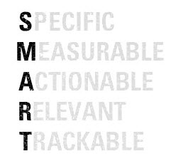
It’s not specific, directly measurable, actionable, relevant or trackable. Thus, it will create disagreement and disorganization, sending many projects into chaos. However, we can avoid this by using S.M.A.R.T. goal-setting criteria when defining user and business goals.
Bad Vs. Good Methodology
Before we get started, let’s look at how a poor methodology can derail an entire project.
There was once a project to redesign a significant section of a company’s website. This section introduced visitors to the brand’s history and technology, and analytics indicated that customers who visited this section had a much higher conversion rate. Stakeholders believed that improvements to the content and navigation could result in even higher conversions. This was seen as a golden opportunity to increase sales by improving the awareness and presentation of the brand’s story. Thus, a complete project to redesign this section of the website was born.
Here is a summary of the project from the stakeholders’ perspective:
- High-level project goal.
Increase conversions and sales. - High-level project strategy.
Leverage the history and technology section of the website. - High-level project tactic.
Improve the content and navigation of the section to increase user engagement, better communicate the benefits of the products, and drive users into the conversion funnel.
Unfortunately, rather than communicate this to the design team, the goal for this redesigned section of the website was presented as follows:
“Create a good user experience.”
Sigh. There’s that phrase again.
The Problem
The designers were given a nebulous tactic masquerading as a goal. This meant that they had minimal understanding of the true objective of the project, which put them in a poor position to understand the problem and to hone the strategy and tactics to solve it.
To make matters worse, the lack of well-defined high-level goals, strategies and tactics made it difficult for the designers to define the architecture of the experience, in turn making it nearly impossible to set user goals and business goals for every page that needed to be designed.

To make a long story short, the designers spent four months working through unsuccessful concept pitches and design revisions. The concept behind the designs constantly changed, and the content and features failed to support a cohesive user story. Meanwhile, designers and stakeholders had different expectations of what this section of the website was meant to accomplish, so solutions rarely satisfied both parties. Nobody knew the needs of the user, and the needs of the business were but a neglected thought in the shadow of “creating a good user experience.”
After these four months, there was zero progress. Not only was the project’s situation dire, but the lack of approved and delivered work was eroding the team’s morale. With no concrete user or business goals to satisfy, the team aimlessly pursued a “good user experience.” It was like being told to drive but not given a destination.
The Solution
I was subsequently pulled into this team as the project and design lead. My first priority was to bring awareness and understanding of the high-level project goals, and then lead the team through a comprehensive exercise to document the user goals. Although we didn’t have access to detailed user studies and customer information to create data-driven personas, we did our best with anecdotal experiences, competitive analyses, and website analytics to create user goals for each page. We then worked with the cross-functional teams to understand the business goals and KPIs.
Using these goals, I led the designers to write thorough content and feature requirements. The benefit to this approach was that all content and features were made to serve documented user or business goals. This encouraged product simplicity and reduced scope creep. These goals and requirements were then reviewed and refined with all stakeholders. Once expectations were universally understood and accepted, the team proceeded to create the architecture, interactions and designs.
This comprehensive methodology took less than three months. But the magic is not the methodology itself, but the discipline to identify concrete goals that satisfy five basic criteria.
UX S.M.A.R.T. Goal Criteria
As I mentioned earlier in my competitive cycling example, my improvement as an athlete was based on goals that each met the five criteria of the S.M.A.R.T. goal-setting technique:
- Specific,
- Measurable,
- Attainable,
- Realistic,
- Time-based.
This technique can be applied to documenting the criteria for user goals and business goals:
- Specific,
- Measurable,
- Actionable,
- Relevant,
- Trackable.
With these criteria in mind, what would be considered a S.M.A.R.T. goal?

S.M.A.R.T. User Goal Examples
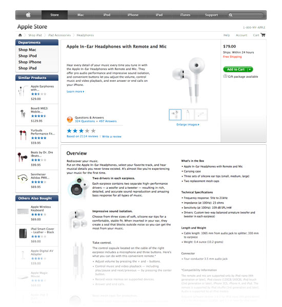
Let’s use the product detail page for a fictional e-commerce website to illustrate. A product detail page is a page on which shoppers can learn more about a product for sale and add it to their shopping cart. It typically includes images of the product, the price, a description, and an “Add to Cart” button. Here is an example from a well-known fruit company:

Based on a competitive analysis of many e-commerce product detail pages (and on personal experience from working with and studying how consumers make purchasing decisions), here are some user goals for the product detail page of a fictional e-commerce website.
Primary user goal (UG1):
I want to learn more about this product’s design, features and specifications to determine whether it fits my budget, needs and preferences.
Secondary user goal (UG2):
I want to purchase this product.
These goals meet the UX S.M.A.R.T. goal criteria because they are:
- Specific.
By stating exactly what the user needs to accomplish, these goals help us maintain scope and stay focused on designing content and functionality that is critical to our user’s success. - Measurable.
For the primary goal, we can measure clicks to determine how users are engaging with the content. Alternatively, one-on-one interviews or customer surveys could provide qualitative insight into whether your content is relevant to the user’s interests. For the secondary goal, we can measure the percentage of visitors to the page who click “Add to Cart.” - Actionable.
Because the goal is specific, we can readily identify content and functionality that satisfies the user’s goals. In this example, because users want to learn more about the product’s design, large product images should be included. - Relevant.
These goals are appropriate for a product detail page, but not for a return policy or terms and conditions page. By keeping the goals highly relevant, the content and features that we introduce to satisfy those goals will be relevant, too. - Trackable.
There’s no point being measurable if the data cannot be tracked over time. This is essential to determining the immediate, short-term and long-term success of our design and its future iterations.
In contrast, here’s a DUMB user goal:
“I want a Web page that’s easy to use. (i.e. I want a good user experience.)”
That’s not a witty acronym, and it doesn’t hide the fact that this user goal is not specific, measurable, actionable, relevant or trackable. It fails all five criteria because it fails the first: specificity. A good user experience has many facets, and without targeting a specific aspect of the page or product experience, there’s no action (strategy and tactic) to address it. If a goal is not actionable, then it has no reason to exist because there is no end towards which effort and action can be directed. Similarly, if the goals are not measurable, then there is no way to gauge the successes or failures of our actions, and subsequently no way to understand the product’s performance over time.
S.M.A.R.T. Business Goal Examples
UX S.M.A.R.T. goal criteria can also be applied to business goals. They are particularly relevant because businesses are run by numbers: number of clicks, number of customers, number of dollars, the list of measurable metrics continues. So, let’s take real-life business goals for the same product detail page of our e-commerce website as an example:
Primary business goal (BG1):
“We want to increase the ratio of add-to-carts to page views for the product detail page to x%.”
Secondary business goal (BG2):
“We want to increase cross-sells to y% of total add-to-carts.”
Just like the preceding user goal examples, these business goals meet the UX S.M.A.R.T. goal criteria because they are:
- Specific.
By stating exactly what metrics the design needs to affect, these goals help us maintain scope and stay focused on designing content and functionality that will put us in a position to hit our targets. - Measurable.
For the primary goal of increasing conversions, we can measure the number of page views and how many resulted in an add-to-cart. For the secondary goal of increasing cross-sells, we can measure the number of clicks on cross-selling products. - Actionable.
Because the goals are specific, we can create more targeted strategies to accomplish them. For the primary goal of increasing add-to-carts, this could mean making the content on the page more relevant to users’ goals, or something as simple as improving the success of the add-to-cart button. For the secondary goal of increasing cross-sells, this could entail changing the visibility of cross-selling items (assuming we have already done a good job of selecting which related products to promote). - Relevant.
The relevance of this goal depends on the high-level objectives of the project. If the objective is to reduce the number of customer support calls each day, then this goal might not be relevant. But if the objective is to increase total sales revenue across all products, then it is very relevant. - Trackable.
We can count the number of page views and add-to-carts over an extended period of time.
By contrast, here’s a dumb business goal for the product detail page:
“I want to make more money.”
This is a poor business goal because it’s not specific and might not be relevant to this page at all. There are many ways to make more money, and without specificity in the strategy to accomplish this, creating a successful plan of action will be much more difficult. Remember, if a goal is not actionable, then it has no reason to exist because there’s no end towards which effort and action can be directed.
UX S.M.A.R.T. Goals Applied
So, now we understand the criteria behind well-defined S.M.A.R.T. goals and have applied them to the user and business goals for the product detail page of a fictional e-commerce website. How can we use this to our advantage as we move forward with the architecture and design of the page?
Associated Content And Feature Requirements
Because the goals we’ve defined are specific and actionable, we are able to propose content and features that directly satisfy them. Let’s revisit the four high-level goals of our product detail page and attach appropriate requirements to them.
Primary user goal (UG1):
“I want to learn more about this product’s design, features and specifications to determine whether it fits my budget, needs and preferences.”
Content and features required to satisfy this goal:
- Relevant images that represent the product as a whole;
- Relevant images (such as enlarged views and alternate angles) that show the product in detail;
- General description that provides a brief overview of the product’s purpose and benefits;
- Specifications that are relevant to consumers of this product type;
- Product variations or options (such as color, size);
- Selling price.
Secondary user goal (UG2):
“I want to purchase this product.”
Content and features required to satisfy this goal:
- Selector for product variations or options;
- Customer satisfaction guarantee (such as return policy, privacy policy);
- Quantity selector;
- “Add to Cart” function.
Primary business goal: (BG1):
“We want to increase the ratio of add-to-carts to page views for the product detail page to x%.”
Content and features required to satisfy this goal:
- Reference user goal 1,
- Reference user goal 2.
Secondary business goal (BG2):
“We want to increase cross-sells to y% of total add-to-carts.”
Content and features required to satisfy this goal:
- Related products that the user might also be interested in (for example, if the user is looking at the detail page for a small digital camera, recommend a small case to put it in).
Because everything must serve a documented goal, scope creep during the project’s lifecycle is reduced. This is not to suggest that content and features beyond these goals cannot be included. Components such as global navigation or a site-wide search box might be required even though they are not the purpose of the page. Determining what belongs on a page is admittedly not as black and white as these example might lead one to believe.
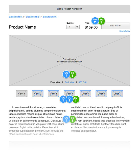
That said, setting content and feature requirements based on S.M.A.R.T. goals does help to determine the visual hierarchy of information on the page. This is extremely helpful during the wireframing stage.

As we can see in the above annotated wireframe, the content and features that satisfy primary user and business goals (labelled UG1 and BG1) are more prominent in scale and placement than those that satisfy the secondary goals (UG2 and BG2).
Now, having applied S.M.A.R.T. goals across the planning and architectural phases of a project, we can see the benefits of this UX strategy, as follows:
- Goals are specific, measurable, actionable, relevant and trackable.
- Because the goals are specific and actionable, we can attach appropriate content and feature requirements to each one. Because the goals are relevant, these requirements are relevant, too.
- The hierarchy of the content and features is determined by the hierarchy of the goals that they are attached to. This informs the architecture of the wireframes.
With these benefits in mind, we can begin to understand how this positively affects other stages in the project’s lifecycle:
- Wireframes with well-informed structures and content are solid foundations on which to design higher-fidelity mock-ups.
- Because the goals are measurable and trackable, we can determine the success of the design during testing, learn from it, and make improvements in subsequent iterations.
Ultimately, these all contribute to our ability to understand the problem and craft an appropriate strategy and tactic to solve it. Our discipline in gaining focus in the earliest stages of a project will determine our ability to maintain focus when designing the functional aspects of the product at the end.
Conclusion
A great user experience is the result of setting concrete goals that meet both user goals and business goals. Unfortunately, I have seen many teams kick off a project with nothing more than a goal of, “Let’s create a great UX!” While a noble thing to strive for, it’s not specific, actionable or measurable. It contributes nothing to the planning or design phases, and it is the UX equivalent of a motivational high-five.

Banksy once said:
“Artwork that is only about wanting to be famous will never make you famous. Fame is a byproduct of doing something else. You don’t go to a restaurant and order a meal because you want to have a shit.”
Likewise, a good user experience is the byproduct of many brand, product, design and development decisions. As designers, we must collaborate with our clients and ensure that we thoroughly understand the needs of their business and target audience. Only then can we be empowered to create appropriate strategies and tactics to achieve them.
So, don’t try to “create a good user experience.” Create a S.M.A.R.T. one.
Additional Resources
- “Locke’s Goal-Setting Theory,” MindTools A brief overview of Dr. Edwin Locke’s research on goal-setting and motivation, explaining how goals provide a major source of motivation and improve employee performance.
- “What Does Usability Mean: Looking Beyond ‘Ease of Use’,” Whitney Interactive Design Explains how user needs can be translated into user goals and requirements that are specified within a range of acceptable values.
- “Defining Actionable and Business-Driven KPIs,” Kaizen Analytics Explains how to define actionable business-driven KPIs based on business goals.
Further Reading
- Thirteen Tenets Of User Experience
- Fixing A Broken User Experience
- Pragmatic UX Techniques For Smarter Websites
- Is Responsive Web Design Is Your Only Mobile Strategy?


 Agent Ready is the new Headless


 SurveyJS: White-Label Survey Solution for Your JS App


