Redesigning The Country Selector
However, when conducting a large session of user testing on check-out usability (which we wrote about here on Smashing Magazine back in April 2011), we consistently found usability issues with the massive country selector drop-downs. Jakob Nielsen reported similar issues as far back as 2000 and 2007 when testing drop-downs with a large number of options, such as state and country lists.
So, this past summer we set out to redesign the country selector. This article focuses on the four design iterations we went through before arriving at the solution (free jQuery plugin included).
Further Reading on SmashingMag:
- Form Inputs: The Browser Support Issue You Didn’t Know You Had
- UI Patterns For Mobile Apps: Search, Sort And Filter
- Useful Ideas And Guidelines For Good Web Form Design
First, let’s take a closer look at the usability problems of traditional drop-down country selectors.
The Usability Issues
Drop-downs cause usability issues when used for country and state selectors for several reasons. Here are six:
- Lack of overview Seeing more than 20 uncategorized options can be bewildering, and country drop-downs often offer hundreds of options (according to ISO 3166, there are 249 countries).
- Unclear sorting When shown a massive list, the first thing users do is figure out the sorting logic. But because country drop-downs often include the three to five most popular options at the top, the sorting logic is unclear at first glance.
- Scrolling Issues Multiple problems are related to scrolling large drop-downs. If your mouse cursor is outside of the drop-down, you will most likely scroll down the entire page, hiding the drop-down options from the screen. In other browsers, however, the drop-down will actually scroll as long as it has focus, likely leaving you with erroneous data.
- Inconsistent UI The UI of drop-downs differs from browser to browser and OS to OS. The drop-down will not only look different, but will also work differently. For example, on a Mac, Safari forces you to hover on two arrows to scroll up and down, whereas Firefox provides a traditional scrollbar. Now grab your smartphone, and suddenly the UI has dramatically changed again.
- Lack of context Mobile devices have very limited screen real estate, which means you have less page context when scrolling, and actually finding the option you’re looking for takes longer.
- Breaking the flow Nearly all users — even those who otherwise tab through forms — will use the mouse when interacting with a drop-down, thus slowing their progress.
It All Adds Up
These usability issues are all minor interruptions that don’t occur every single time someone interacts with a drop-down country selector. But they all add up, and together with other minor usability issues on your website, they will degrade the overall user experience — ultimately leading to abandonments.
With this in mind, we set out to redesign the standard drop-down country selector. Below are the four design iterations we went through.
Iteration 1: Typing Vs. Scrolling
The easiest way to get rid of the hundreds of options and the issues related to scrolling is to simply replace the drop-down with a text field — letting the user type their country. This works only if the user knows what to type, because there would be no recognition effect (this would never work for shipping options because the user would have to guess the names of the options). But a country selector is a good candidate for a text field because it is fair to assume that every user knows the country they reside in.
Okay, so we’ve got a text field. While good for usability, it’s bad for the courier who has to deliver a product. The drop-down offered a limited number of options, whereas the text field offers infinite (the user can type whatever they want). In order to restrict the input to values (i.e. countries) that our back-end system can handle, the text field needs to auto-complete and accept a restricted set of options. This will enable us to 100% accurately map the text-field input to the countries that our back-end system (and courier) recognize.

Today, most Web users are familiar with auto-complete functionality. Google has used it for its search field since 2008 (and as an experimental feature since 2004).
Iteration 2: Typos And Sequencing
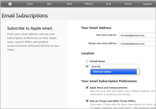
By replacing the drop-down with an auto-complete text field, we’ve introduced a new problem. While the user can be expected to know the name of their own country, they can’t be expected to know what our back end calls it. If the user lives in the US and makes an omission, such as “nited states,” or decides to type only part of the name, such as “America” (instead of “United States of America”), then no correct results would appear:

Apple’s country auto-complete field requires you to spell the name 100% correctly and in the right sequence.
This is because a typical auto-complete field will be looking for values that are not only spelled correctly, but typed in the right sequence.
Numerous Web services — and especially e-commerce stores — are geographically restricted, and international users are well aware of this. Even big websites such as Amazon, Hulu and Spotify have serious geographical limitations on some or all of their services. While someone from the US will probably expect their country to be supported, an international user who cannot find their country might abandon your website before detecting their typo.
In short, the country selector has to account for omissions and sequencing. We achieve this by simply enabling loose partial matching:

Iteration 3: When The Netherlands Isn’t Called “The Netherlands”
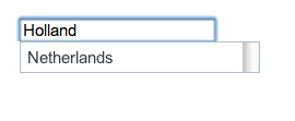
We’ve now taken care of typos and sequencing, but there’s yet another problem. Some country names have multiple widely accepted spellings; for example, the Netherlands is sometimes referred to as Holland. Geographically, they are the same, but the average person would say that they vacationed in “Holland,” whereas the Dutch themselves would typically spell it “Nederland.”

When we require the user to type a country name, we must consider all common spellings. This includes synonyms, local spellings, common abbreviations and country codes. A typical auto-complete (and drop-down as well) would fail when charged with all of these spellings, such as mapping USA to United States, or Schweiz, Suisse, Svizzera and Svizra to Switzerland, or DE to Germany.
From a usability point of view, this is unacceptable because these are common spellings, and people will often type them into auto-complete fields.
In our redesigned country selector, we’ve added the possibility to map multiple words to a given value:

Iteration 4: When “United States” Is More Common Than “United Arab Emirates”
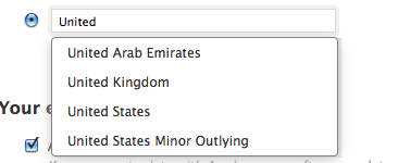
Typing “United” into the auto-complete country selector on Apple’s website gives you the following list:

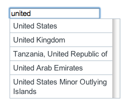
This list is simply sorted alphabetically. But because we don’t have to scroll through a long list anymore, there’s little reason to sort the list alphabetically. A more natural sorting order would be by popularity. Apple might want to prioritize United States, followed by United Kingdom and United Arab Emirates. Whereas a British newspaper may want to put United Kingdom first.
To accommodate for this, all values (countries) could be given a weight. By default, all would be equal, and then each website could then apply their own weighting for their most popular countries:

Solution: The Redesigned Country Selector
The solution is a redesigned country selector that addresses the issues of drop-down country selectors. It handles typos, various spelling sequences, synonyms and prioritized options.
The technically correct term for this would be something like an “auto-complete text field with loose partial matching, synonyms and weighted results.” That’s a bit long, so I’ve simply dubbed it the “Redesigned Country Selector” — you can try the demo here.
For those of you who own or work on a website with a country selector, I’ve decided to open-source the code. It is a simple jQuery plugin for the progressive enhancement of drop-down menus (i.e. your current country drop-down), turning them into advanced auto-complete fields in modern browsers. It comes with instructions and an FAQ.
Update: As many commenters have noted, the sorting logic on the original demo wasn’t all that “logical.” We have now changed it so the first letters of the country name are ranked higher (e.g. typing “Ca” now returns “Canada” at the top instead of “American Samoa,” and “In” returns “India” instead of “United States,” and so on) as many of you have suggested. Thanks for the feedback – you can follow the project on GitHub to be notified about future improvements.


 SurveyJS: White-Label Survey Solution for Your JS App


 Celebrating 10 million developers
 Register Free Now


