An Extensive Guide To Web Form Usability
Contrary to what you may read, peppering your form with nice buttons, color and typography and plenty of jQuery plugins will not make it usable. Indeed, in doing so, you would be addressing (in an unstructured way) only one third of what constitutes form usability.
Why Web Form Usability Is Important
The ISO 9241 standard defines website usability as the “effectiveness, efficiency and satisfaction with which specified users achieve specified goals in particular environments.” When using a website, users have a particular goal. If designed well, the website will meet that goal and align it with the goals of the organization behind the website. Standing between the user’s goal and the organization’s goals is very often a form, because, despite the advances in human-computer interaction, forms remain the predominant form of interaction for users on the Web. In fact, forms are often considered to be the last and most important stage of the journey to the completion of goals.
Let’s clarify this last point by discussing the three main uses of forms. As Luke Wroblewski states in his book Web Form Design: Filling in the Blanks, every form exists for one of three main reasons: commerce, community or productivity. The following table translates each of these reasons into the user and business objectives that lie behind them:
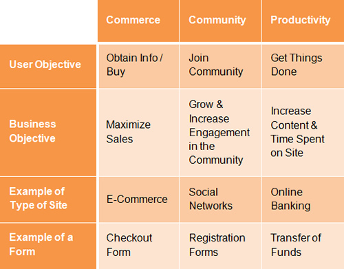
Thus, the relationship between forms and usability have two aspects:
- Forms can make a website usable or unusable, because they stand in the way of the user achieving their goal;
- Forms need to be usable in order to help the user achieve that goal.
This post will focus on the second point, because a usable form will naturally contribute to the overall usability of the website, hence the first aspect.
The Six Components Of Web Forms
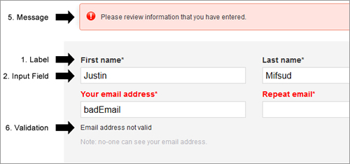
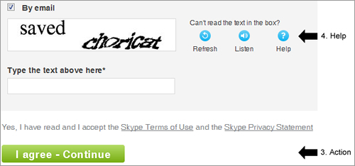
Web forms are a necessity and often a pain point for both designers and users. Over time, users have formed expectations of how a form should look and behave. They typically expect Web forms to have the following six components:
- Labels
These tell users what the corresponding input fields mean. - Input Fields
Input fields enable users to provide feedback. They include text fields, password fields, check boxes, radio buttons, sliders and more. - Actions
These are links or buttons that, when pressed by the user, perform an action, such as submitting the form. - Help
This provides assistance on how to fill out the form. - Messages
Messages give feedback to the user based on their input. They can be positive (such as indicating that the form was submitted successfully) or negative (“The user name you have selected is already taken”). - Validation
These measures ensure that the data submitted by the user conforms to acceptable parameters.
Tackling Usability Via Three Aspects Of Forms
Despite differences in layout, functionality and purpose, all forms have three main aspects, as noted by Caroline Jarrett and Gerry Gaffney in their book Forms That Work: Designing Web Forms for Usability:
- Relationship
Forms establish a relationship between the user and the organization. - Conversation
They establish a dialogue between the user and the organization. - Appearance
By the way they look, they establish a relationship and a conversation.
For a form to be usable, all three aspects need to be tackled. Let’s look at each aspect in turn to figure out how to make a form truly usable, along with practical guidelines that you can easily follow.
Aspect 1: The Relationship
“No man is an island,” the 17th-century English poet, satirist, lawyer and priest John Donne once said. Indeed, human beings thrive on relationships, be they amorous, friendly, professional or business. A form is a means to establish or enhance a relationship between the user and the organization. When done badly, it can pre-empt or terminate such a relationship.
With this in mind, a number of principles emerge:
- Relationships are based on trust, so establishing trust in your form is critical. This can be achieved through the logo, imagery, color, typography and wording. The user will feel at ease knowing that the form comes from a sincere organization.
- Every relationship has a goal, be it love and happiness in a romantic relationship or financial gain in a business relationship. Ask yourself, what is the goal of your form?
- Base the name of the form on its purpose. That name will inform users what the form is about and why they should fill it in.
- Just as in a relationship, getting to know the other person is essential. Get to know your users and always consider whether the questions you’re asking are appropriate and, if so, whether they are timely. This will instill a natural flow to your form.
- Knowing your users will also help you choose appropriate language and remove superfluous text. And it will help you craft an interface that balances your needs and the user’s.
- Do not ask questions beyond the scope of the form. In a relationship, you would become distrustful of someone who asked questions that were out of place. The same thing happens online. Consult with relevant stakeholders to see what information really is required.
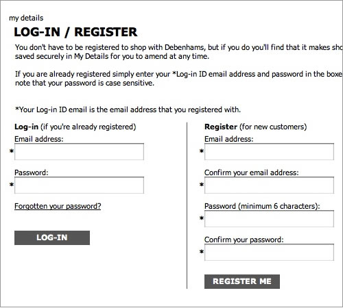
- Sudden changes in behavior or appearance will make users edgy. Likewise, never introduce sudden changes between forms or between steps in a form.
Aspect 2: The Conversation
A form is a conversation. And like a conversation, it represents two-way communication between two parties, in this case, the user and the organization. In fact, the user has filled out the form in order to initiate communication with the organization.
For instance, with a social network, a user would fill out a registration form to inform the organization that they would like to join. In inviting their request (whether automatically or manually), the organization would ask the user a number of questions (in the form of labels), such as their first name, last name, email address and so forth. Upon acceptance (or denial), the company would inform the user of the outcome, thus completing the communication process.
Viewing forms from this perspective yields some useful guidelines:
- As mentioned, a form is a conversation, not an interrogation. Aggressive wording in labels will make users feel edgy, and (if they do not leave) they will most likely give you the answers that you want to hear, rather than the truth.
- Order the labels logically, reflecting the natural flow of a conversation. For example, wouldn’t it be weird to ask someone their name only after having asked a number of other questions? More involved questions should come towards the end of the form.
- Group related information, such as personal details. The flow from one set of questions to the next will better resemble a conversation.
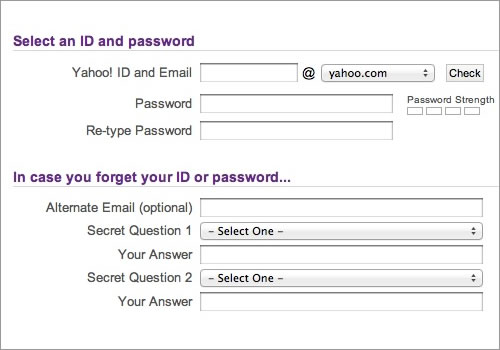
Yahoo’s registration form effectively groups related content through purple headings and fine lines. 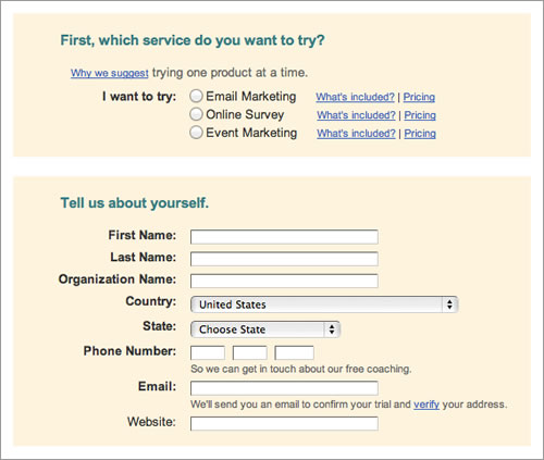
While Constant Contact groups related content, it separates the groups too much, which could confuse the user. - As in a real conversation, each label should address one topic at a time, helping the user to respond in the corresponding input field.
- The natural pauses in a conversation will indicate where to introduce white space, how to group labels and whether to break the form up over multiple pages.
- In any conversation, people get distracted by background noise. So, remove clutter
such as banners and unnecessary navigation that might distract users from filling out the form.
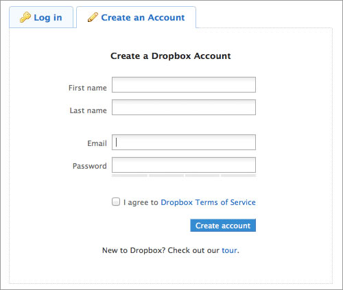
Dropbox provides a fine example of what a registration form should look like. The white space is effective, and the page uncluttered.
Aspect 3: The Appearance
The appearance or user interface (UI) is central to the usability of a Web form, and there are several guidelines for this. To simplify the discussion, let’s group them into the six components presented earlier.
1. Labels
- Individual words vs. sentences
If the purpose of a label is simple to understand, such as to ask for a name or telephone number, then a word or two should suffice. But a phrase or sentence might be necessary to eliminate ambiguity.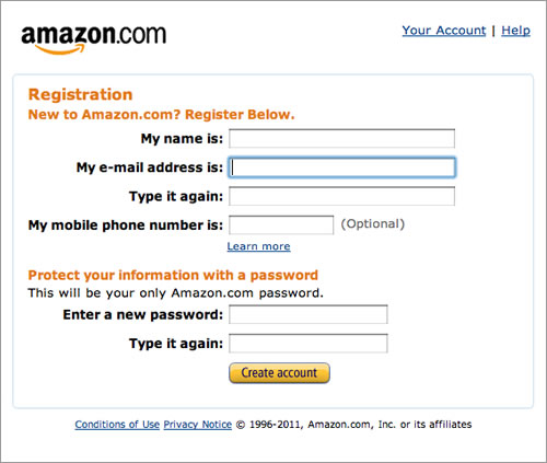
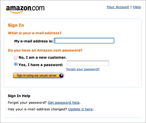
Amazon’s registration form contains full sentences, whereas individual words would have sufficed. - Sentence case vs. title case
Should it be “Name and Surname” or “Name and surname”? Sentence case is slightly easier — and thus faster — to follow grammatically than title case. One thing is for sure: never use all caps, or else the form would look unprofessional and be difficult to scan.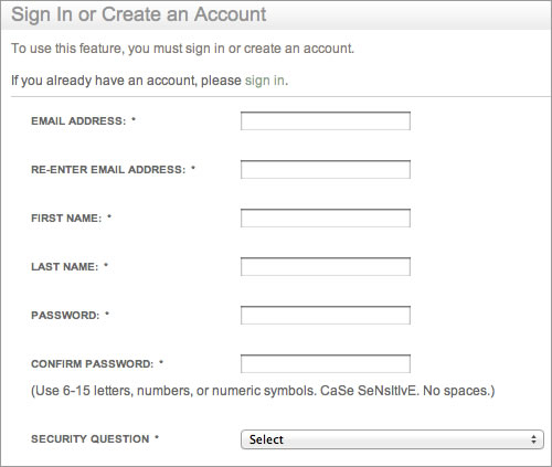
See how difficult it is to quickly scan the labels in Barnes & Noble’s registration form? - Colons at the end of labels
UI guidelines for some desktop applications and operating systems such as Windows recommend adding colons at the end of form labels. Some designers of online forms adhere to this, primarily because old screen readers mostly rely on the colon symbol to indicate a label. Modern screen readers rely on mark-up (specifically, thelabeltag). Otherwise, the colon is a matter of preference and neither enhances nor detracts from the form’s usability, as long as the style is consistent. - Alignment of labels: top vs. left vs. right
Contrary to common advice, above the input field is not always the most usable location for a label. It’s ideal if you want users to fill in the form as fast as possible. But there are times when you’ll want to deliberately slow them down, so that they notice and read the labels attentively. Also, keeping a long form to a single column and making users scroll down the page is better than breaking it up into columns in an attempt to keep everything “above the fold.” Each style of alignment has its advantages and disadvantages: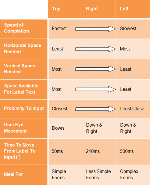
*Times retrieved from “Label Placement in Forms” by Matteo Penzo. 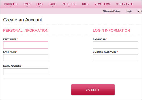
Forms should never consist of more than one column. Notice how easy it is to ignore the column on the right here on Makeup Geek (not to mention the note about “Required fields” at the bottom).
2. Input Fields
- Type of input field
Provide the appropriate type of input field based on what is being requested. Each type of input field has its own characteristics, which users are accustomed to. For instance, use radio buttons if only one option of several is permitted, and check boxes if multiple choices are allowed. - Customizing input fields
Do not invent new types of input fields. This was common in the early days of Flash websites, and it seems to be making a comeback; I have seen some odd input fields implemented with jQuery. Simple is often the most useful. Keep input fields as close to their unaltered HTML rendering as possible.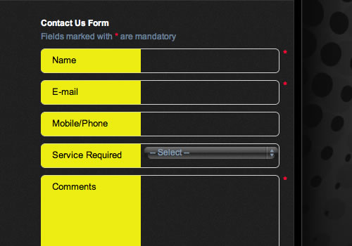
Altering the interface of input fields will confuse users. - Restricting the format of input fields
If you need to restrict the format of data inputted by users, then at least do so in a way that won’t irritate users. For example, instead of displayingMM/DD/YYYYnext to a text field for a date, consider using three drop-down fields or, better yet, a calendar control. - Mandatory vs. optional fields
Clearly distinguish which input fields cannot be left blank by the user. The convention is to use an asterisk (*). Any symbol will do, as long as a legend is visible to indicate what it means (even if it’s an asterisk).
3. Actions
- Primary vs. secondary actions
Primary actions are links and buttons in a form that perform essential “final” functionality, such as “Save” and “Submit.” Secondary actions, such as “Back” and “Cancel,” enable users to retract data that they have entered. If clicked by mistake, secondary actions typically have undesired consequences, so use only primary actions where possible. If you must include secondary actions, give them less visual weight than primary actions.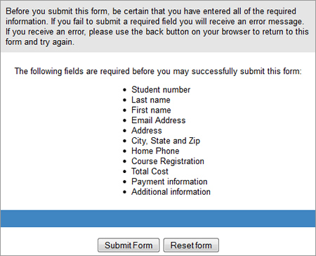
Not clearly distinguishing between primary and secondary actions can easily lead to failure. The above action buttons are found at the end of a lengthy form for enrolling in St. Louis Community College. Just imagine pressing the “Reset Form” button by accident. - Naming conventions
Avoid generic words such as “Submit” for actions, because they give the impression that the form itself is generic. Descriptive words and phrases, such as “Join LinkedIn,” are preferred.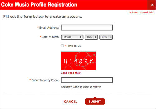
Although Coca-Cola correctly gives more importance to the primary action button, it settles for the generic word “Submit.” “Register with us” would have been more helpful.
4. Help
- Text to accompany forms
Your should never have to explain to users how to fill out a form. If it does not look like a form or it’s too complicated to fill out, then redesigning it is your only option. Accompanying text should be used only where needed, such as to explain why credit card data is being requested or how a birth date will be used or to link to the “Terms and conditions.” Such text tends to be ignored, so make it succinct and easy to read. As a rule of thumb, do not exceed 100 words of explanation (combined). - User-triggered and dynamic help
Rather than include help text next to each input field, show it only where required. You could show an icon next to an input field that the user can click on when they need help for that field. Even better, show help dynamically when the user clicks into an input field to enter data. Such implementation is becoming more common and is relatively easy to implement with JavaScript libraries such as jQuery.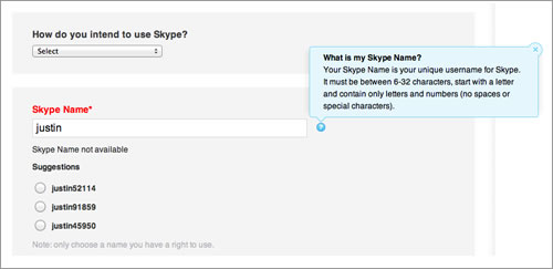
Skype’s registration form contains both user-triggered help (the blue box that is triggered by clicking the question mark) and dynamic help (the suggested user names).
5. Messages
- Error message. This notifies the user that an error has occurred, and it usually prevents them from proceeding further in the form. Emphasize error messages through color (typically red), familiar iconography (such as a warning sign), prominence (typically at the top of the form or beside where the error occurred), large font, or a combination of these.
- Success message. Use this to notify users that they have reached a meaningful milestone in the form. If the form is lengthy, a success message encourages the user to continue filling it out. Like error messages, success messages should be prominent. But they should not hinder the user from continuing.
6. Validation
- Only where needed
Excessive validation is as bad as its complete absence, because it will frustrate users. Restrict validation to confirming key points (such as the availability of a user name), ensuring realistic answers (such as not allowing ages above 130) and suggesting responses where the range of possible data is finite but too long to include in a drop-down menu (such as a country-code prefix). - Smart defaults
Use smart defaults to make the user’s completion of the form faster and more accurate. For example, pre-select the user’s country based on their IP address. But use these with caution, because users tend to leave pre-selected fields as they are.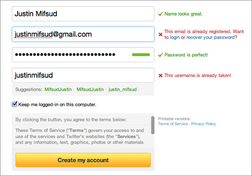
Twitter’s registration form uses both dynamic validation (for the name, email address, password and user name) and smart defaults (“Keep me logged in”).
Conclusion The Beginning
The word “conclusion” is not right here. Let this be your starting point to take what I have written about and apply it to your own forms. The good news is that there is much more to say about all this; you can find an abundance of resources on each point made here. For starters, three books are listed below that inspired me when writing this post. As I stated at the beginning, taking shortcuts by only tweaking the UI will not make your forms more usable. What more can I say? The theory is now with you. Go get your hands dirty.
Further Reading
- Forms That Work: Designing Web Forms for Usability, Caroline Jarrett and Gerry Gaffney
- Eyetracking Web Usability, Jakob Nielsen and Kara Pernice
- Web Form Design, Filling in the Blanks, Luke Wroblewski
Related Reading on SmashingMag:
- Useful Ideas And Guidelines For Good Web Form Design
- Forms On Mobile Devices: Modern Solutions
- Form-Field Validation: The Errors-Only Approach
- 10 Useful Usability Findings and Guidelines


 Agent Ready is the new Headless


 SurveyJS: White-Label Survey Solution for Your JS App

