How To Transform The Minds Of Clients
Ah, the love of a client. That is indeed what we all seek as professionals, is it not? If we lived in a utopia, then that’s all there would be. Openness. Honesty. Passion. Flowing in both directions, client to service provider and vice versa. We want our clients to be right behind us in our ideas and open to new ones. In order for this to happen, there has to be trust.
Further Reading on SmashingMag:
- Designing With Your Clients
- Meeting Your Client for the First Time
- How To Deliver Exceptional Client Service
- Keys To Better Communication With Clients
So, what tools do freelance designers and small agencies have at their disposal not only to get a client on board with their ideas, but to inspire them and encourage buy-in from other stakeholders in the client’s company? We’ll take a look at few of them in this article.
Getting a Win-Win
Getting a win-win is when you deliver solutions that address the client’s business problem. The client should respond to your ideas with respect, placing their trust in ideas that they may not immediately identify with, and turning down ideas they intuitively know will not work. We must be able to respond with the same respect and trust, allowing some of our ideas to fall by the wayside and letting others shine.
Keep in mind that challenging opinions is OK, especially ones that are bound to fail. In this type of relationship, both parties handle tension objectively, putting aside personal feelings, to complete the goal. Indeed, this well-oiled platform allows for the creation of amazing work. So, how does a win-win transpire? It transpires through actions, research and delivery.
Actions: Engaging Your Clients
The way that the teams from the client and agency engage with each other is critical. First and foremost, be what you want your client to be. If you want them to be honest, be honest. If you want them to be passionate, show your passion. They may not immediately reflect your enthusiasm, but they will feel it, and over time it will reinforce your efforts. This is Client Relations 101 and should not be ignored.
Often, though, this honesty, enthusiasm and passion aren’t enough. One of the stakeholders might have wanted another contractor to win the bid, or a variety of other issues might prevent the relationship from maturing. At this point, get the client to stop thinking about any perceived shortcomings, and get them to think objectively about the problems they’re facing, with you as the catalyst for solving them.
When we come across a resistant client, we look to customer insight as the means to help the client focus on the user and the business problems that need to be solved. By discussing these in a controlled, test-driven environment, the biases of both the client and agency are eliminated, and the issue becomes how to objectively solve the problems together.
Research And Customer Insight: The Objective Problem-Solving Approach
Before diving into ways to use customer insight to guide a project, I’ll go over the types of research methodologies and testing protocols that my firm commonly uses. These include ethnography (a research method from the social sciences that involves field research and up-close observation in the user’s environment), heuristic evaluation (a form of usability inspection, in which usability specialists judge whether each element of a user interface follows a list of established usability heuristics), focus groups, surveys, prototyping, usability testing, user interviews and more.
These methodologies yield valuable data, and from this data we can build persuasive artifacts to convince the client of strategies that we know have a high probability of success in the real world. In addition to customer research, stakeholder interviews can be invaluable in highlighting, and gaining consensus on, the scope of UX engagement.
Some of the research methods described above can be extensive and could require the client to commit some of their budget. But conducting research up front to understand customers and what they want is less expensive than spending time and money correcting a solution after it has launched. If the client does not have a budget that supports social science research, then light inexpensive testing can be performed. Nothing is wrong with heading to the nearest coffee shop, finding five to ten people in your target demographic and asking them contextual questions or giving them a run-through of a proposed solution. This is generally enough to make a case for change.
Case in Point
My company was recently hired by Boeing Commercial Aviation Services, the services arm of Boeing, to help transform its customer portal, MyBoeingFleet.com. As part of this transformation, we conducted a large ethnographic research project. It was a huge endeavour, with more than 150 users interviewed around the globe. Though large in scale, it gave us valuable insight into Boeing’s users, enabling us to identify challenges within its existing customer portal. Once we obtained the data, we analyzed it in detail and created a series of artifacts to help the Boeing team clearly understand what we had learned. These artifacts and deliverables also served to convince the Boeing team of our capabilities and expertise, as well as help sell the project to key internal stakeholders.
Upon completion of the ethnographic study, we created a document called SUDA, or “system, user and domain audit.” This comprehensive document detailed the results of the ethnographic research, transferred knowledge of fundamental UX processes, and compiled our findings into persuasive artifacts. This was then presented to all major stakeholders. Two primary artifacts in the SUDA helped to convince our clients and other stakeholders not only to trust us, but to become our champions: those artifacts were the personas and customer journey maps.
These deliverables are a turning point in translating the user research into design. In addition, you will need to develop other artifacts, including wireframes, which must be thoroughly understood before any design work begins.
Personas
Personas are artifacts commonly produced by agencies that perform research. They are key tools for creating empathy among everyone involved in the project. They consist, by definition, of an archetype that represents the needs, behaviors and goals of a particular set of users.
One of my favorite examples of personas is the diptychs of Jason Travis. While not typical personas, which are generally accompanied by a textual explanation of the archetype, they still convey a user’s state of mind through the objects they carry. In order to build something for someone, you must first put yourself in their state of mind; this is one of the definitions of empathy. In the diptych below, you can quickly gauge how the person might think based on what they are carrying. A tremendous amount of information is conveyed through these objects.

One of the diptychs of Jason Travis.
The challenge in developing personas for the Boeing project was the sheer scope and number of users. It could have easily led to 30 different archetypes, which would have been too many for the stakeholders to consume. To make our findings more digestible, users were divided into four major groups based on their activity or goal with the portal. Each group received one to five personas, based on real users. This was incredibly useful, because it enabled our team not only to construct a general archetype, but to expand on subtler aspects of the archetype through actual users. In the end, we had four archetypes, and nine total users to support those archetypes.
With these personas, we could attach a face to the actual navigation flows and interactions in Boeing’s customer portal. Our goal was to elicit empathy in our client and get them to feel the precise emotions their users felt so that they’d be willing to change the product for the better. To accomplish this, we chose to demonstrate the flows through customer journey maps.
Customer Journey Maps
Customer journey maps are graphs that demonstrate a user’s level of confidence and patience when performing various touch points in an interaction flow. Data is provided from an interview in which the user is guided through a particular task. As they move through the flow, we ask them how they feel at key intervals. For instance, if they are being guided through a shopping flow, we would let them perform the actions required, but when they click the “Buy now” button, we would ask how they feel about the process so far. They might be very frustrated or at relative ease. These feelings are then recorded, which gives us an emotional rhythm we can graph over time. Displaying the emotional journey in this way makes it easy for clients to understand, and it sometimes reveals shocking pain points.
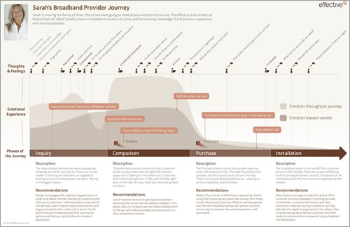
An example of a customer journey map.
For Boeing, the journey maps were eye-opening. By getting a visual representation of the emotional state of their customers, the client suddenly understood how important planning the user experience is to the product development process — and not only for the development phase, but for overall customer service as well. Presenting these and all of the other findings in the SUDA enabled us to begin tackling the design phase objectively, hand in hand with the client.
Delivery: Design And Interest Curves
There is a cognitive science theory called the “aesthetic usability effect.” It states that functional objects that look appealing inspire confidence in users, imparting in the users a higher tolerance for faults, a higher likelihood of overcoming learning curves and a slew of other benefits over less appealing alternatives. This is true even if the objects are actually harder to use! The theory also applies when you present your ideas and solutions to a client. Once you’ve prepared your materials, it is time to present them to the client. The more appealing the delivery, the more likely the solutions will be accepted.
Delivery is a critical moment in the transformation of a client’s attitude. If at all possible, make it face to face, and bring any executive-level sponsors from your company with you. With Boeing, we took our time to make sure that what we presented was visually appealing and well organized. Paying close attention to delivering the content builds trust; sloppy work will only work against your objective. Because most of you are designers, I am sure your presentations are incredibly visually appealing, but how do you construct your content so that it has the most impact? My advice: use interest curves.
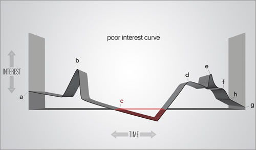
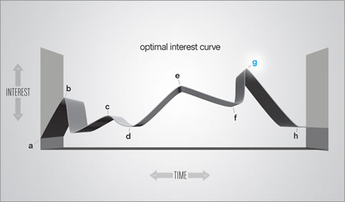
Interest curves set the timing, or pace, of when to introduce various moments into your presentation. Take the following curve:
This shows interest points over time. It is also a poor interest curve. Now look at an optimal interest curve:
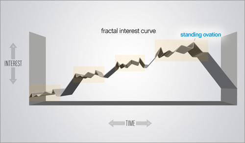
You can see that you want to start off the presentation with something that immediately captures the attention of the audience. From there, slowly build to a climactic point (for us, that would be the journey maps), and end the presentation quickly thereafter. This will keep the audience simmering for more, and it generally leaves a great impression. This type of curve can be found in many forms of entertainment, from rock concerts to movies, and, for whatever reason, our minds are tuned to this pacing of interest. To create further interest, these curves can be embedded within each other, as the following graph demonstrates:
The point is, keep the client hooked with undulations of interesting moments, and make those moments grow in intensity until you impress your final point deep into their subconscious.
For The Win: Actions, Research And Delivery
Through your actions, by gathering customer insight and by creating meaningful, engaging visuals and deliverables that support your strategy, not only will you have concrete data to inform your designs and the project’s direction, but you’ll likely achieve that win-win. Getting clients on board with your recommendations translates to a more productive, successful project for everyone.
Good luck in transforming the minds of your clients!
(al)(fi)


 Agent Ready is the new Headless
 SurveyJS: White-Label Survey Solution for Your JS App