Extracting Logos Using Levels In Adobe Fireworks
In all the years that I’ve been using Adobe Fireworks, I have always had to perform one task in every project: remove the background from a logo. Most of the time, it’s because the client doesn’t have the original raw file that their previous designer used to create their company’s logo, or because I need to work with a bunch of affiliate logos that I downloaded from the Web and not all of them have transparency information.
With a rectangular or elliptical logo, I just trace over it with a shape and turn it into a mask. But when tracing a mask is impractical (as with complex shapes or text-based logos), I used to follow a method that I devised for extracting logos in Adobe Fireworks that doesn’t rely on the dreaded Magic Wand tool.
Further Reading on SmashingMag:
- Sketch, Illustrator or Fireworks?
- Switching From Adobe Fireworks To Sketch: Ten Tips And Tricks
- The Present And Future Of Adobe Fireworks
- The Power of Adobe Fireworks: What Can You Achieve With It?
This method took advantage of a few Live Effects to remove the background and retain the logo form. It was simple, but also primitive: it worked perfectly only when the contrast between the logo and background was already ideal and the logo form had only one color. Otherwise, I ended up with jagged edges.
I have since much improved the process of handling multi-colored logos and non-white backgrounds; it works best on solid-colored text and shapes with clear outlines. Because it involves Fireworks’ awesome features and tools, this method is a quick and easy solution that you can incorporate in your Web and interface design workflows.
And yes, still no Magic Wand tool.
Let’s Begin!
To start off, fire up Adobe Fireworks and load your logo image on the canvas. In the example below, I created a three-color logo text, surrounded by a blu-ish hue, on a canvas with a transparent background.
Create a back-up of the image by selecting it using the Pointer tool (V on the keyboard), cloning it (Shift + D, or in the menu Edit → Clone) and hiding it (L, or View → Hide Selection). You will need this back-up near the end of the process, but for now, keep it hidden.

Place the logo image on the Fireworks canvas.
Tip: You can also use Duplicate (Ctrl/Cmd + Alt/Opt + D, or Edit → Duplicate) instead of Clone to copy the image. The difference is that Duplicate offsets the position of the copied object by 10 pixels down and 10 pixels to the right, whereas Clone creates the copy in the same exact position as the original object.
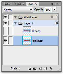
The original image and hidden back-up in the Layers panel.
Step 1: Breakdown
To be able to deal with the different colors of the logo separately, we first need to break the logo down into “pieces,” one foreground color per piece. Use the Pointer tool to select the logo image, and use one or more bitmap selection tools (Marquee or Oval Marquee (M), Lasso or Polygon Lasso (L) — set the Edge to “Hard” in the Properties panel) to select a piece of the logo. Make sure the piece you select has only one color (not counting the image’s background). Cut and paste the selected piece (Ctrl/Cmd + X, and then Ctrl/Cmd + V) to separate it from the rest. Do this for each piece; cancel the Marquee selection (Ctrl/Cmd + D or Esc, or in the menu Select → Deselect) and switch back to the Pointer tool (V) if you need to select the logo image again.
Tip: Double-click on an image object to quickly switch from Pointer tool to Marquee tool.
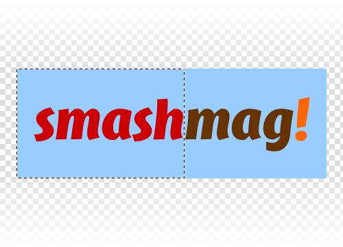
Select a piece of the logo.
In our example, I’ve used a (rectangular) Marquee, but you can use the Oval Marquee for circular or elliptical selections, and the Lasso or Polygon Lasso for irregular shapes.
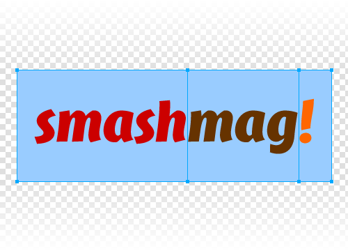
Cut up the logo into pieces.
If your logo has only one color, skip this step and treat the whole image as your only piece.
Step 2: Desaturate
Select all of the pieces of the logo image using the Pointer tool, and apply a Hue/Saturation filter (in the Properties panel, go to Filters: [+] → Adjust Color → Hue/Saturation…). Drag the Saturation slider all the way to the left (-100) to reduce the logo to grayscale. Make sure that Lightness is set to 0 and that Colorize is unchecked before clicking “OK.”
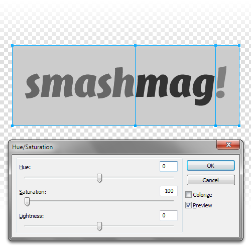
Desaturate all pieces.
A Note on Filters
Adobe Fireworks features two almost identical sets of filters: one in the application menu and another in the Properties panel (the Live Filters).
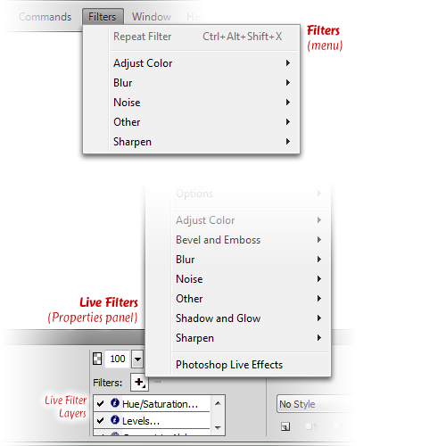
Filters menu vs. Live Filters in the Properties panel
Filters applied using the application menu are “destructive,” in that they can’t be undone by any other means except Undo (Ctrl/Cmd + Z, or in the menu Edit → Undo). Furthermore, target vector objects (shapes and text) need to be converted into bitmap objects before they can work their magic, which makes editing the original object harder. To adjust the effect of the filter that you just applied, you will need to undo that step and reapply the filter.
To maintain the ability to easily edit an object and its filters’ properties, always use the Live Filters in the Properties panel. This way, you can make changes to the original object, and the filters will adjust automatically. You will also be able to change a filter’s settings at any time, or disable or remove the filter, without adversely affecting the other filters.
Step 3: Levels
What makes this newer method different is the use of the Levels filter (as opposed to the Brightness/Contrast filter of the older method) to push the dark grays into pure black and the light grays into white, while maintaining the smooth edges of the logo’s curves.
Select one piece of the logo image using the Pointer tool, and apply a Levels filter (in the Properties panel, go to Filters: [+] → Adjust Color → Levels…). In the Levels dialog, set the Channel drop-down to “RGB” (which is the default). Below the histogram under Input Levels, move the left and right arrow sliders to change the intensity of the dark and light areas of the image piece, respectively. Make sure that the Preview checkbox is checked, so that you can see your changes in real time. Move the left arrow slider just enough to the left to get the logo part to show up completely black, but not so far left that the edges of the logo become jagged. The same goes for the right arrow slider: move it right to get a pure white background. You can leave the center slider untouched. Click “OK” to apply the filter.
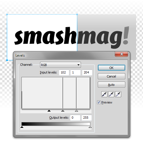
Apply the Levels filter to each piece.
You can check the accuracy of your filter values by bringing up the Info panel (Shift + Alt/Opt + F12, or in the menu Window → Info) and hovering over the black area to obtain its RGB color value. The RGB values should all be set to 00; otherwise, go back to the Levels dialog and readjust the slider.
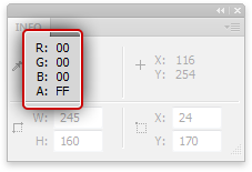
Use the Info panel’s RGBA reading to check the color values.
Do the same for the white area, this time setting all three RGB values to FF in the color reading.
You can further fine-tune the levels by changing the number values in the left and right text boxes in the Input Levels dialog, which correspond to the left and right sliders in the visual graph. Increase the value of the left text box to darken the dark-gray areas until all three RGB values are set to 00 in the Info panel; decrease the values if the edges of the logo become too jagged. The inverse is true for the right text box. This allows you to get pure black and white colors, while keeping the edges of the logo as smooth as possible.
Repeat the whole process in step 3 for all other image pieces.
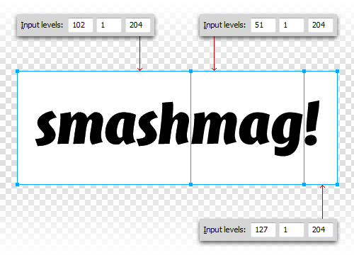
Pieces with different settings in the Levels filter. Notice the same rightmost value across all instances, corresponding to the same background color.
Bonus side effect: If your original logo image has compression artifacts, this step could greatly reduce them.
Step 4: Alpha Transparency
Once all of your image’s pieces have been “leveled” into black and white, use the Pointer tool to select an image piece and apply a “Convert to Alpha” filter (in the Properties panel, go to Filters: [+] → Other → Convert to Alpha). Doing this step separately per piece is important because each piece has a different setting in the Levels filter. If you were to apply a new filter to all pieces at once, Fireworks would equalize the settings for all of the other filters present.
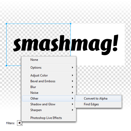
Apply a “Convert to Alpha” filter to each piece.
In this step, you will again be able to check for the accuracy of your settings for the Levels filter; if the black area of an image piece is not completely black, it will show up as slightly transparent once the Alpha filter is applied. (This is where the checkerboard background of the canvas comes in handy.) Also, if the background is not completely white, you’ll see it faintly after converting the image piece to alpha.
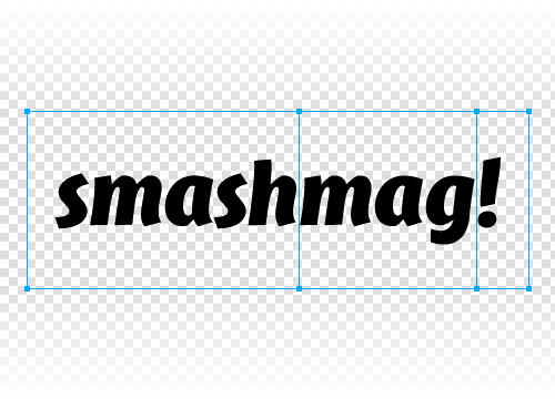
Applying the “Convert to Alpha” filter to all pieces.
Step 5: Recolor
At this point, you have successfully extracted the logo form from its background. The next step is to bring back the original colors. To do this, open the Layers panel (F2, or in the menu Window → Layers), and look for the object that you hid at the beginning of this tutorial. Click on the visibility box at the left end of that object to make it visible again. Nudge it down so that it’s below the processed logo pieces and in clear view. Use the Pointer tool to select an image piece and apply a Color Fill filter (in the Properties panel, go to Filters: [+] → Adjust Color → Color Fill). In the Color Fill settings, click on the color swatch, and sample the corresponding color from the original logo image. Do the same for all other image pieces.
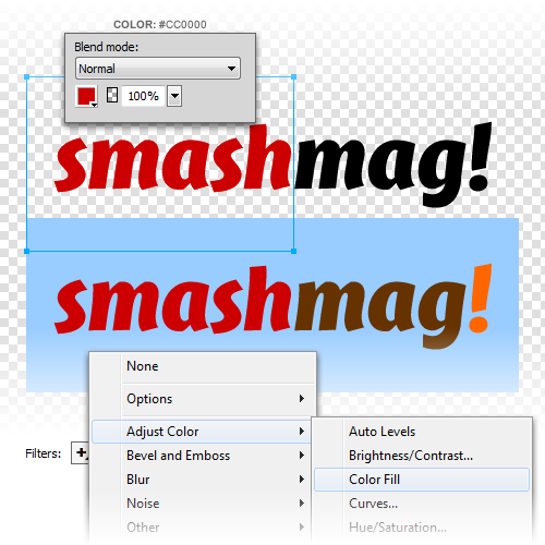
Apply a Color Fill filter to the first piece, picking the color from the original logo image.
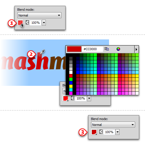
To sample a color for the Color Fill filter: 1. Click on the color swatch in the filter dialog, 2. Click on the part of the image whose color you want to sample, 3. The color swatch will update with the new color.
Step 6: Convert To Symbol
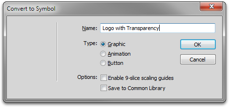
Once you have recolored all of the pieces, select the original logo image with the Pointer tool and hide it (Ctrl/Cmd + L, or in the menu View → Hide Selection). You can also click on the eye icon of that object in the Layers panel to hide it. Select all of the image pieces using the Pointer tool, and convert them into a symbol (F8, or Modify → Symbol → Convert to Symbol…) before using it in your layout, so that new filter changes affect the new logo as a whole.
If you wish to make changes to the objects inside the symbol, you can do one of the following:
- With the instance of the symbol selected, go to Modify → Symbol → Edit Symbol;
- Right-click on the instance of the symbol, and select Symbol → Edit Symbol;
- Double-click on the instance of the symbol.

All logo pieces recolored and converted into a Symbol.
Taking It Further
You now have a version of the logo that you can set against any type of background: solid, gradient, textured or tiled. You can even use it as a bitmap mask over a photo, pattern or gradient if you want a different look. To do this, you’ll need to flatten the logo symbol first (Ctrl/Cmd + Alt/Opt + Shift + Z, or in the menu Modify → Flatten Selection), but you can always bring back your final logo by dragging an instance of the symbol from the Document Library panel (F11, or Window → Document Library) onto the canvas.
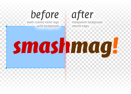
The final result.
If you are feeling adventurous, you could try turning it into a vector object using the Magic Wand tool first (W) and then running the “Convert Marquee to Path” command (Select → Convert Marquee to Path). Your mileage may vary, though: “Convert Marquee to Path” doesn’t always play well with complex shapes, but you can always tweak the vector paths that are created by that command until they match the logo.
(al) (mb) (vf)
Downloads
Need a sample to study? Download the sample archive for this tutorial (ZIP file, 57.6 KB), containing the Fireworks PNG (created in Adobe Fw CS5).
Further Reading
- “Rapid Fire #8: Extracting Logos,” SixThings My original method for extracting logos.
- “About Live Filters,” Adobe Fireworks CS5 Help All about Live Filters.
- “Symbols,” Adobe Fireworks CS5 Help Working with the Symbols feature.
- “Select Pixels,” Adobe Fireworks CS5 Help A rundown of the different pixel-selection tools.
- “Working with masks in Adobe Fireworks,” Adobe Devnet An excellent video tutorial (by Jim Babbage).
Smashing Is Looking For Experts On Fireworks, Photoshop & Illustrator
As our crafts mature, so do our tools. Fireworks, Photoshop and Illustrator are powerful tools that we, as designers, use on a regular basis. Fireworks is surely more flexible for Web at times (and UI/screen design in general), since it is dedicated specifically to the Web designer’s needs. And yet, it is underrated by many. We should all indeed be more open to try out new and different tools and share the techniques and our experiences with the community.
We’d love to cover more articles on Fireworks, Photoshop and Illustrator explaining useful techniques, tips and “lessons learned” from professional designers. So, if you:
- Have a solid knowledge of at least one of these tools,
- Have a solid experience in design (especially Web/screen/mobile),
- Have a couple of articles published on any of the tools mentioned,
- Or perhaps have even released some extensions or tools for Fireworks, Photoshop or Illustrator…
Then please drop us an email at ideas@smashingmagazine.com. Please include details about your experience, examples of your work, links to your articles and your article ideas (at least two). Of course, all authors get paid :-)
We look forward to hearing from you!
— Smashing Editorial Team


 Agent Ready is the new Headless


 SurveyJS: White-Label Survey Solution for Your JS App