Designing The Well-Tempered Web
As technology evolves, so does the art and craft of Web design. New technology creates new challenges, which require new solutions. Often we’re working in uncharted territory, where the solutions demanded really are new. Other times, we’re faced with problems of a more universal nature, problems that have a history.
Given the limited history of Web design, we have to look beyond our immediate domain for answers to the more challenging questions. We do this all the time when we draw on the rich history of graphic design and visual arts. But we’re not limited to sibling disciplines. If we can identify the abstractions and patterns that constitute our challenges, we can look to any source for guidance. We can look to a seemingly unrelated field, such as psychology or music. We can even look to an episode from the early 18th century about Johann Sebastian Bach.
Further Reading on SmashingMag:
- Responsive Web Design: What It Is And How To Use It
- Design Process In The Responsive Age
- Designing For A Hierarchy Of Needs
- Fixing A Broken User Experience
In this article we’ll look at what Bach has to do with modern Web challenges – Particularly the challenge of designing for devices with diverse attributes and capabilities.
Bach And “The Well-Tempered Clavier”
In 1722, Bach put together a book of solo keyboard works intended as a collection of educational pieces for young musicians. The book contained 48 pieces — a prelude and fugue in every major and minor key. Now a staple of the Western canon, it’s regarded as one of the most important works in the history of Western music. He named the book The Well-Tempered Clavier.
To appreciate the historical significance of the work, you have to understand that in Bach’s day the notion that one might play keyboard music in all keys was unorthodox. It was a matter not of philosophy, but of physics: a fixed-pitch keyboard instrument could be in tune only with a selection of keys at a time. In the tuning systems of the era, playing in tune in all 12 major keys was simply not possible.
While the laws of physics can be tough to bend, human perception moves fairly easily. The solution was to redefine what it meant to be “in tune.” By adjusting certain intervals so that they deviated just slightly from perfect intonation, a tuning system was produced that allowed one to play reasonably in tune in all keys. This practice of compromising granular qualities for the greater good of the system is called temperament.

Opening measures of the first Prelude of Bach’s Well-Tempered Clavier. (Image credit: Wikipedia)
The name of the alternative tuning system made famous by Bach and The Well-Tempered Clavier is, unsurprisingly, “well temperament.” Today, most intonation in Western music is based on “equal temperament.” The methods are different, but the goal is the same: to make each of the keys slightly imperfect so that all of the keys can be used. It’s like utilitarianism for acoustics.
What This Has To Do With UI Design
Probably the most exciting development in Web design in the last few years has been the shift to designing for multiple devices. It’s no longer just about how a website functions in two different browsers, but about how it functions on various devices with completely different characteristics: different screen sizes, different capabilities, different use contexts, different interfaces.
Although responsive design and device-specific websites enable us to tailor designs for diverse experiences, there will still be times when we have to make universal decisions — and when we do, the metaphor of well temperament can be helpful.
The application of this concept to UI design is straightforward: in order to deliver a good experience for a range of devices, we have to allow for occasional imperfections in individual interfaces. We have to make little compromises here and there to make sure that our design travels well to other environments.
Touch-First Design
A common example of well temperament in action is the effect that touch interfaces have had on recent desktop website designs.
As a pointing device, a finger, being much larger than a mouse, requires a larger touch target than what’s required by a mouse cursor. So, to ensure usability, interactive elements need to be bigger. As interactive elements increase in size, other things need to increase in size to maintain balance. This leads to an aesthetic characterized by generous margins and padding.

The new Gmail design has a lot of white space and extra padding on buttons and is very touch-friendly, even though it’s a desktop design.
The rise in popularity of the iPad, which bridged the gap between touch interfaces and desktop screen sizes, is what accelerated the influence of touchscreens on desktop interface design. If you look at recent redesigns of major products such as Gmail and Twitter or browse CSS galleries, you’ll see that design on the Web is starting to look a little different. Things look more… plumpish. There’s more white space, buttons have more padding, things in general feel bigger. Of course, other factors are at play, such as the steady increase in desktop screen sizes.
What we end up with is a design that might afford too much space for a mouse but an appropriate amount of space for a finger. We allow for a slight deviation from the norm in one experience in order to better support all possible experiences.
It’s important to note that making a UI touch-friendly in this way also results in a UI that might be more useable for mouse-and-desktop users. A button that’s easier to touch is often easier to click. By erring in the direction of usability, we get the bonus of improved performance of the design in its original desktop context.

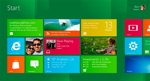
Microsoft’s Metro design language is inspired by a touch-first approach to interaction design.
Universal Design via Responsive Design
Although much of the discussion on responsive design tends to focus on techniques of responsiveness, responsiveness itself is never the goal. It’s a means to an end. The design responds in order to do something else. That something else might be to supply different content, to serve low-bandwidth images, or to adapt the layout for better presentation on smaller screens. That something else might also be a goal of providing a universal experience to a large number of different devices.
Riding the responsive design train to arrive at universal experience design, we’re likely to pass through some form of well temperament. A great example of this — and an excellent example of responsive design in general — is the Boston Globe’s website.

The Boston Globe is a shining example of responsive design on a large-scale website.
This responsive strategy enabled a single design to adapt to any device that a reader might use to read The Boston Globe (even the Apple Newton!). But this wasn’t just a feat of front-end engineering. Accompanying the media queries and JavaScript wizardry was a simple malleable design that lent itself to adaptation.
This is a tempered design. While the minimalism might be purely stylistic, I suspect that if it had been a desktop-only design, we’d have seen more gloss and embellishment. There would have been a longer runway on which to perfect the experience for a single-use context. But instead, the designers made little trade-offs to produce something that could be transposed to all possible environments — something that could play in all 12 keys.
Mobile-First Design
The preceding examples were concerned more with graphic design, but the concept of temperament can be applied to product design, user experience, information architecture — almost any other area of design. Let’s look at product design and the idea of designing for mobile first.
If you’re designing for mobile first, then you’re already working with tempered design. By starting the design process with mobile and building a product around the demanding constraints of the mobile environment, you’re obligated to focus on the most essential elements of the product. As Luke Wroblewski writes:
So, when a team designs mobile first, the end result is an experience focused on the key tasks users want to accomplish, without the extraneous detours and general interface debris that litter today’s desktop-accessed websites. That’s good [for the] user experience and good for business.
When these design decisions extend beyond the mobile experience to define the overall product, then the design takes on a form of temperament. The latest redesign of Twitter (i.e. “New Twitter” or “New new Twitter”) demonstrates some of these principles.

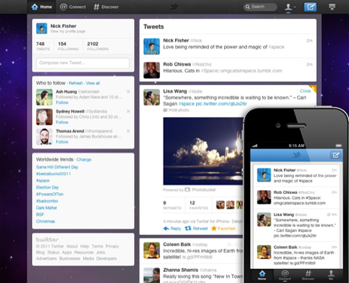
New Twitter has a simplified design and a consistent experience across devices.
One of the objectives of the Twitter redesign was to give users a consistent experience across computers and mobile phones. Achieving a consistent look and feel is a UI challenge, but achieving a consistent overall product experience is a deeper challenge. In both cases, designing for mobile first puts us on the right path.
Something I found interesting about the Twitter redesign was the influence that the mobile experience had on the product’s overall design. For example, aside from the tweet button, all of the actions have been organized under four tabs: “Home,” “Connect,” “Discover” and “Me.” It’s a simplification that plays wonderfully on a small screen. Four items fit perfectly in the tab bar.
On the desktop website, other features have been added, but the simplicity established in the mobile version carries over. Although the desktop version has plenty of room — both pixel-wise and figuratively — for more complexity, the design is restrained, tempered, to ensure a universal multi-device experience.
Beware Of Wolves
In the natural tuning systems that predated the standardization of well and equal temperament, notes of the out-of-tune intervals that were played simultaneously produced a harsh and howling sound. Musicians had a great name for this: they called it a “wolf.”
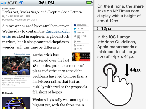
Applying this idea to interface design, we can think of a wolf as a visual or interactive element designed for one experience that breaks down to some degree when transposed to another. Think of the times you’ve struggled to finger-tap a small link that was made for a mouse cursor, or had to read tiny text on a mobile screen, or, on a touch device, used an interface that relied on hover states. Wolves in the UI.

These article present links that are designed for interaction with a mouse. When viewing on a touchscreen mobile device, their usability is greatly impaired.

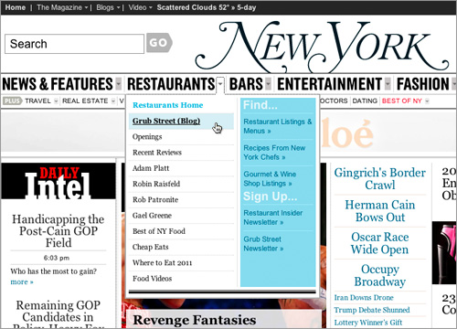
New York Magazine provides useful and well-designed drop-down navigation menus — but only if you’re using a mouse.
Closing Thoughts And Practical Tips
Again, it’s true that responsive design and device-specific experiences can offer us a way around many of these problems. If we can tune the size of a button to a particular environment, then we don’t have to accept blunt, across-the-board treatment. But the number of devices we have to support will only increase, and customizing for every possible scenario could quickly become unreasonable.
Even if we are able to provide perfectly tailored design at the execution level, there is still value in thinking about tempered, universally accessible design at the conceptual level.
Additionally, just because we can tailor design to particular experiences doesn’t mean that users will not carry expectations over from one experience to another. The boundaries might blur whether we like it or not.
Tips and Things to Keep in Mind
- Think responsively. Even if you’re not implementing a full responsive design, simply thinking in responsive terms goes a long way to achieving usable universal design.
- Think touch-first. A button sized for a fingertip will always work for a mouse cursor. But a button sized for a mouse cursor will often be too small for a fingertip. Designing for touch first ensures that your website or application translates well to other contexts.
- Think universally. “Test early, test often” the saying goes. In your design process, think early and often about how your design will function on various devices.
- Think mobile-first. Starting your design with mobile focuses you on what really matters to your users. By maintaining focus on the essential features, achieving a consistent experience across devices will be much easier.
- Be careful with interaction behavior that is not supported universally across interfaces. Hover states don’t function the same on touch devices. Touch gestures can’t be performed with a mouse. It doesn’t mean we can’t use these things, but we have to be aware of their limitations.
In The End…
Bach believed that people should be able to write and play in any key they wish. He argued for it by writing beautiful music that compelled the world to agree. He designed for the system he wanted.
We want our users to have great experiences with our websites and applications on any device they choose. We want our work to be as usable and accessible as possible.
What will you design?
Other Resources
You may be interested in the following related resources:
- The Well-Tempered Clavier, Book I, played by Glenn Gould, Rdio
- Audio examples comparing different tuning systems, The Pyxidium
- “Wolf Interval,” Wikipedia
- “Multi-Device Web Design: An Evolution,” Luke Wroblewski
- Responsive Web Design, Ethan Marcotte
- “Non Hover,” Trent Walton


 SurveyJS: White-Label Survey Solution for Your JS App
 Agent Ready is the new Headless


