Redefining Hick’s Law
Hick’s Law has always been a popular reference point for designers. You’ll find it cited in the endless lists of basic laws and principles that all designers should be familiar with. Given our assumed comfort level with this design cornerstone, I am surprised to see so many people getting it wrong.
Further reading on Smashing:
- Infinite Scrolling: Let’s Get To The Bottom Of This
- 6 Design Principles To Evaluate Your Product
- How To Change User Behavior With UX Design And Psychology
- Improving Reviews And Testimonials Using Science-Based Design
- Get the Scrolling Right
- Advanced Navigation With Two Independent Columns
- Takeaways From Mobile Web Behavior
- How I Built The One Page Scroll Plugin
What we think we understand about Hick’s Law as it pertains to Web design is oversimplified and incomplete. We need to more deeply investigate what Hick’s Law can do for Web design. In the end, we will see why this design principle is undervalued, and we will see how we have been designing incorrectly for the user’s decision-making process. In order to get there, we need to look at our current approach to Hick’s Law and why it’s wrong.

A mess of different size labels for clothing hooks. (Image: außerirdische sind gesund)
An Incomplete Definition
As it stands today, most discussions of Hick’s Law focus on a narrow portion of Web design. Traditionally, the law is used to encourage designers to limit options in navigation, lists and interactive options. Whether it’s used against drop-down and fly-out menus with too many options or pages with too many links, Hick’s Law has primarily been a counterweight to sprawl.
While the idea does have merit (massive menus really are a bad idea), it is incomplete. Why do we restrict Hick’s Law to navigation? Hyperlinks are the driving force of the Internet; they take us from one page to another and drive the action on the page. So, applying Hick’s Law should begin there. Limiting the number of links and buttons in front of users should simplify their decision-making process, enabling them to move about the Web with minimal stress and delay. But is this the end all and be all of Hick’s Law?
A Better Perspective
If we stopped here in our study of Hick’s Law, we would miss out on a lot of value. Why do we focus so much on links and clicks? While these factors do drive the user experience, they aren’t the only factors that users take into account when navigating a design. We have to remember that Hick’s Law did not come about with the invention of the Internet. Hick’s research simply shed light on how a website’s options affect the speed and ease of the user’s decision making. This makes for a pretty broad scope, because we aren’t measuring physical responses or the role that technology plays, but rather the mental processes that lead to making a decision.
So, let’s step back and consider the thought process that users go through and how many levels of decision-making a Web design can consist of. For example, instead of just regarding each link in a navigation menu, sign-up form or toolbar as its own option, we should consider the process of interacting with the navigation a decision of its own. For that matter, any given design contains a whole array of top-level “options” that demand decisions of the user.
In choosing whether to read an article, navigate to a new page, fill out a log-in form or perform a search, the user has to mentally process several options before making even a single click. Are they interested in the content on this page? They might decide to skim the headlines to see what stands out to them. Perhaps they are shopping for something. Before even hitting the “Add to cart” button, they have to choose between making the purchase, looking at product details and reviews, and shopping around for something else.
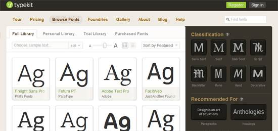
When browsing fonts on Typekit, the user has many more decisions to make than simply picking a font.
With all of these options available, it would seem that crunching the numbers and determining how many choices are possible would paralyze any user into indecision and make any website unusable. Clearly, this isn’t the case. So, what is it about a good design that enables users to decide and act, without being overwhelmed by too many choices? Better yet, can we measure and reproduce these factors in our design work every day?
Reapplying Hick’s Law
In order to properly apply Hick’s Law to Web design, we must approach a design the way our users do: in phases.
The first phase occurs before the website even launches. While we would never want to design based on an assumption of what our user base is looking for, visitor will rarely happen upon your website without some sort of preconception of what they are going to see. Barring the occasional hijack, most first-time visitors enter a website by clicking a link that includes a description, title or search result that hints at the content they will see. Returning visitors probably have an even better idea of what they will be running into. It is rare that a user enters a website with no clue of what it is about.
This preconception among users about content and experience is a great reason to follow a content-first design approach. Of course, this approach also happens to be entirely justified. In an age of search-engine placement and social advertising, many users are landing on content-heavy pages, not just home pages driven by calls to action. So, the first decision point is about content consumption. The human mind has trouble choosing between several options unless one clearly stands out as the best. When you water down a design with widgets and secondary content, you reduce the value of the primary content and force a harder decision on the user. The process of eliminating distracting options has to start here and should be carried on throughout the design process. The more choices we eliminate, the more enjoyable the experience will be.
Looking past the primary content, what happens when content comes in large data sets, such as a list of recent posts, product suggestions or thumbnails? It’s here that the designer can really prove their worth. We have all seen designs that lack structure, spacing and consistency. The content gets lost, or the user gives up entirely when they aren’t given the tools with which to make confident decisions. Building a great experience has a lot to do with how we empower the user’s decision-making process through these practices. When we apply our skill sets to drive users to a particular action on a page, we are counteracting the lag or complete mental shutdown that is caused by a complicated decision-making process.
Is minimalism your thing? Then a splash of color or carefully arranged negative space goes a long way to breaking down the top-level decisions that users have to make. If you find yourself painting or spacing out elements haphazardly on the page, then it’s time to reconsider the number of options on the page and choose the ones that are most important.
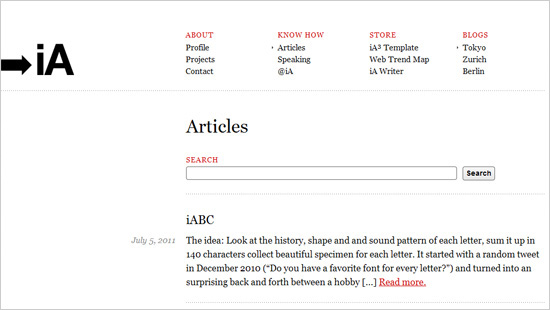
The less color we use, the more powerful it becomes.
When dealing with rich designs and content-heavy websites, patterns are your best friend. When users are in scanning mode, their eyes will key in on consistency, so your designs should be visually consistent in the right way. Are your headings different enough from your titles to be instantly recognizable as secondary or tertiary content? Always fall back on the principles of art and look at how the design uses line, shape, color and spacing. Variations in these things draw the user’s attention, while consistency breeds familiarity and easier decision-making. Pushing Hick’s Law to the core of this thought process forces us to think twice about our reasons for visually emphasizing certain elements.
When we design in patterns, we instill assumptions and behavioral patterns in our users as well. The Web has some global design patterns that help users make decisions. When text is blue and underlined, users understand they can click on it and get sent to a related resource. Similar patterns can exist within the confines of a single design. If we place a texture behind a headline, the user will associate the two things; the next time the user sees the texture, they will expect to see an element in front of it that carries the same weight or meaning as the headline they first saw. Distributing these patterns throughout a design helps users make choices based on previous experience.
What We Do With Words
Perhaps you haven’t heard the news: people don’t really read websites. Users don’t read content until they are motivated and enabled to do so. So, we need to take titles seriously and use imagery in the right way. Graphics and images are a huge draw, especially on pages loaded with text. When used correctly, they can make an otherwise heavy page easier to decipher, thus connecting users to the content they care about more quickly.
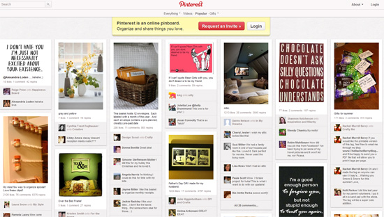
Thanks to design patterns and support of image thumbnails, Pinterest can load a lot of content.
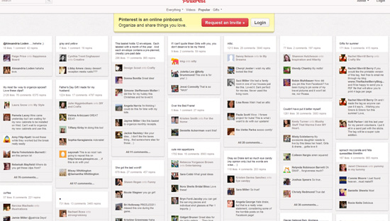
Take away the images, and the design suddenly becomes unusable. This highlights the importance of using images properly.
Designing With Hick’s
The only way to get any real value out of Hick’s Law is to marry it with the design principles that we know and love. I challenge you to incorporate Hick’s Law into the highest levels of your design process. When you set up wireframes, look past the trees of “Link 1, Link 2, Link 3…” and see the forest of decisions that you are putting in front of users. (Cutting this forest down is totally fine.)
Prototyping stuff out? Don’t just worry about how many times to use a call-to-action style. When you group elements or space them out or change the background color or apply a texture, you are setting off a section of the design and potentially laying another choice on users. This is why design is not just about decorating the page or making a button stand out. We must respect the power of design to draw attention and, thus, strictly limit the number of decisions that we burden users with.
The Web is a wonderful place to specialize, and a lot of websites out there do a fine job of delivering a very limited scope of options to users in fine style. This level of focus is made possible by zeroing in on a core set of behaviors that are easily targeted by a consistent set of design patterns. This often has the desirable side effect of being great for mobile-first responsive design.
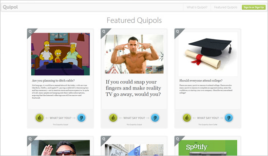
Quipol focuses on doing one thing really well, which limits decision overload for users.
Where’s My Magic Number?
So, how many choices can we expect users to be able to manage before slowing down? The answer will always be relatively few. Some of the best designed and most popular websites limit options to just a few. On Google, we can log in, search or try our luck. On the Quipol page above, we can vote, log in or sign up, learn about this new service, or see more polls. The options on Twitter’s home page have lowered over time, being whittled down to simple sign-up and log-in forms.
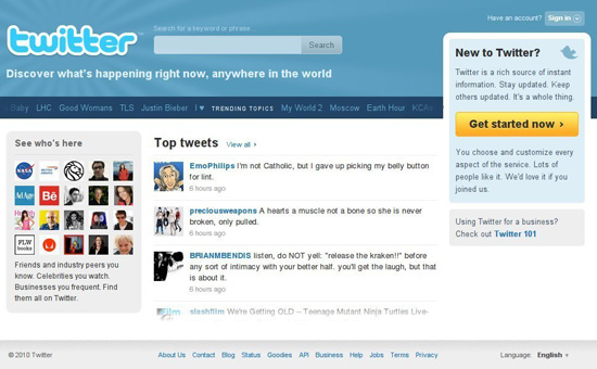
Not long ago, Twitter presented a lot of choices on the home page.
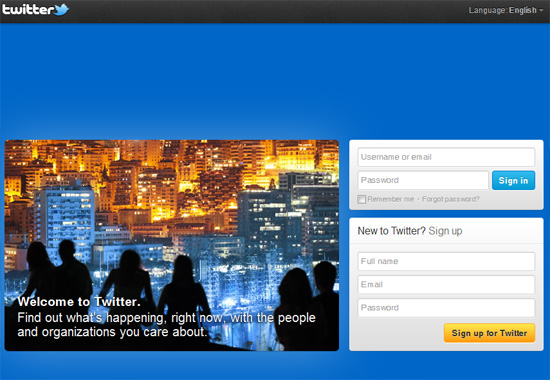
The new design sharply reduces these decision points and exhibits greater focus.
This is a huge design challenge that demands a lot of thought, testing and revision. The process of minimizing options for users without impairing functionality is not an exact science and no easy task. It requires studying our users’ behavior patterns and making tough decisions about what to do about such things as advertising, business-derived feature creep and actions such as logging in and signing up (which empower users but distract from the content). As we can see with Twitter, this is an evolving art form. As Twitter continues to grow in popularity, more and more users are landing on its home page already knowing what goes on there. This empowers Twitter’s design team to lower the noise that results from having to educate new users on the service.
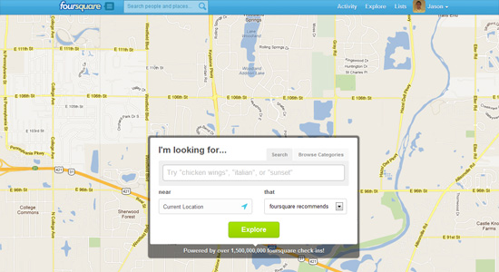
The “Explore” feature on Foursquare packs limitless possibility into a simple set of options.
Foursquare has also done a great job of providing a powerful tool without overwhelming users with choice. In less capable hands, Foursquare’s “Explore” feature could easily host dozens of filters, restrictions and settings to tinker with. Instead, the visitor is encouraged to use the service simply by typing what they want in the input field and hitting the only button on the screen. This simplicity is made possible by a few things. First and foremost, the core premise of the service is all about the here and now. Foursquare knows its users are interested in what’s right around them, because the service has always been about sharing and exploring your immediate surroundings; so, defaulting the search area to the user’s current location is a safe bet. Secondly, over a billion data points yield a lot of power. With such a large a set of information, Foursquare can do a lot behind the scenes to make educated guesses about what its users are really interested in.
Making Sense Of It All
So, how does rethinking Hick’s Law outside of its traditional design context make us better designers? It’s all about the process. It irks me when a client asks me to make something pretty or to put a “magic touch” on some content. Design has always been about so much more than that, and a huge part of it is making the experience effortless for users.
As we’ve seen in the examples of well-executed design above, websites take different routes and devise different solutions, but the goals are the same. When we apply principles such as Hick’s Law beyond the narrow scope of navigation sets, we start to see the power of eliminating distractions for users. Slimming websites down to one or two clear options makes for a beautiful experience and sets a lofty goal for the designer.
We can’t always eliminate all confusion for our busy, distracted users, but we can ease their pain by limiting the options that they have to mentally process. When we view chunks of content as decision-making points, it becomes clear just how much we ask of visitors. Each option is an opportunity to evaluate its importance in the design. Designers who force users to decide between only meaningful and clear options are the ones who deliver an effortless user experience. And when the experience is effortless, everyone wins.
Related Resources
- “Thinking of Interfaces as Sets of Jobs,” Ryan Singer
- “The Obvious, the Easy, and the Possible,” Jason Fried
- “Decision Architecture: Designing for Decision-Making,” Colleen Roller


 SurveyJS: White-Label Survey Solution for Your JS App
 Agent Ready is the new Headless
