Finger-Friendly Design: Ideal Mobile Touchscreen Target Sizes
In darts, hitting the bulls-eye is harder to do than hitting any other part of the dartboard. This is because the bullseye is the smallest target. This same principle can also apply to touch targets on mobile devices.
Smaller touch targets are harder for users to hit than larger ones. When you’re designing mobile interfaces, it’s best to make your targets big so that they’re easy for users to tap. But exactly how big should you make them to give the best ease of use to the majority of your users? Many mobile developers have wondered this, and most have turned to the user interface guidelines provided by the platform developer for the answer.
Further Reading on SmashingMag:
- Are Touchscreen Tablets Effective Design Tools?
- Designing For The Elderly
- A Guide To Designing Touch Keyboards
- Guidelines For Mobile Web Development
What the Mobile Platform Guidelines Say
Apple’s iPhone Human Interface Guidelines recommends a minimum target size of 44 pixels wide 44 pixels tall. Microsoft’s Windows Phone UI Design and Interaction Guide suggests a touch target size of 34px with a minimum touch target size of 26px. Nokia’s developer guidelines suggest that the target size should be no smaller than 1cm x 1cm square or 28 x 28 pixels.
While these guidelines give a general measurement for touch targets, they’re not consistent with each other, nor are they consistent with the actual size of the human finger. In fact, their suggested sizes are much smaller than the average finger, which can lead to touch target problems for users on mobile devices.
Small Touch Targets Lead to Big Problems
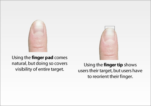
Small touch targets make users work harder because they require more accuracy to hit. Users need to reorient their finger, from finger pad to fingertip, to hit the target with clear visual feedback. Using the finger pad would cover the entire target, making it impossible for users to see the target they’re trying to hit. Users use the fingertip to hit small touch targets because it gives them the visual feedback they need to know that they’re hitting their target accurately. But when users have to reorient their finger, it slows their movement down, and forces them to work harder to hit their target.
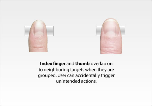
Not just that, but small touch targets can lead to touch errors. When small touch targets are grouped near each other, users can accidentally hit neighboring targets and initiate unintended actions. This is because the user’s finger overlaps on to the neighboring buttons. And if pressure is not carefully applied in the right spot, it’ll trigger the wrong action. It’s easy for users to make these errors with their index finger. But it’s even easier for them to make these errors if they use their thumb, because their thumb is much larger than the target. Sometimes users will tilt their thumb sideways and use the thin side to hit a small touch target. But this is a lot of unnecessary work.
Thumb use among mobile users is popular. Some users won’t always have two hands free when they’re on their mobile device. Many prefer the convenience of using only one hand and their thumb. Users shouldn’t have to switch from using one hand to two hands, or from their thumb to their index finger to hit a target accurately. And more importantly, the size of a target shouldn’t cause them to make touch errors. Small touch targets make things harder for users, where a finger-friendly target does not.
Pixel Width of the Average Index Finger
An MIT Touch Lab study of Human Fingertips to investigate the Mechanics of Tactile Sense found that the average width of the index finger is 1.6 to 2 cm (16 - 20 mm) for most adults. This converts to 45 - 57 pixels, which is wider than what most mobile guidelines suggest.
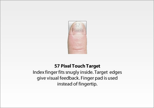
A touch target that’s 45 - 57 pixels wide allows the user’s finger to fit snugly inside the target. The edges of the target are visible when the user taps it. This provides them with clear visual feedback that they’re hitting the target accurately. They’re also able to hit and move to their targets faster due to its larger size. This is consistent with Fitt’s Law, which says that the time to reach a target is longer if the target is smaller. A small target slows users down because they have to pay extra attention to hit the target accurately. A finger-sized target gives users enough room to hit it without having to worry about accuracy.
Pixel Width of the Average Thumb
There are many users who use their index finger to tap mobile targets. But there are just as many users who use their thumb as well. The big difference with the thumb is that it’s wider than the index finger. The average width of an adult thumb is 1 inch (2.5 cm), which converts to 72 pixels.
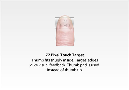
For users who use their thumbs, 72 pixels does wonders. They’re easier and faster to hit because they allow the user’s thumb to fit comfortably inside the target. This makes the edges visible and easy to see from all angles. This means that users don’t have to reorient their thumb to the very tip to see it hit the target. Nor do they have to tilt their thumb to the side to hit it. One tap with their thumb pad is enough to do the trick.
A Target Size Study for One-Handed Thumb Use on Small Touchscreen Devices found that user errors declined as the target size increased. Users were able to tap the target faster without having to make intentional physical accommodations to increase accuracy such as reorienting the thumb, which would have slowed performance.
Another study on Touch Key Design for Target Selection on a Mobile Phone also found that the number of errors decreased as the touch key size increased. In addition, it was provided that the larger the touch key size, the higher the success rate and pressing convenience.
Finger-Sized is Ideal, But Not Always Practical
As many benefits there are to using finger-sized targets, they’re not always practical in every situation. On a mobile device, you’re working in a limited space. This means when you have many finger-sized targets together, they can take up more space than your screen can afford. However, when you have a few finger-sized targets together, that’s when you can fit them all on your screen without trouble. You will need to measure the size of your screen and touch targets to know exactly how big of a touch target you can afford. If you can’t afford finger-sized touch targets on your interface, use the guidelines the mobile platform gives you instead.
Finger-sized targets are much easier to apply on a tablet than a mobile device because there is more screen space available. You can use them liberally without the fear of taking up too much space and improve tablet usability instantly. However, mobile devices are where users have the most trouble hitting touch targets. And that’s where finger-sized targets are needed the most. The challenge for designers is to figure out how to make the most of finger-sized targets on the mobile screen. This might require using less touch targets than you normally would. But this is a plus because it forces designers to keep their navigation simple and minimal.
Thumb-Sized Targets for Gaming Applications
Another thing to think about is when to use a thumb-sized target over an index finger-sized one. It’s difficult to know whether most of your users will use their thumbs or index fingers on your application. However, if your application is a game, it’s likely most users will use their thumbs to play instead of their index fingers. This is why thumb-sized targets are particularly useful for gaming applications. By making your game control targets thumb-sized, users can play the game with better handling and control. They’re able to see the game control targets as they move their thumbs, and the game will feel more adaptive to them.
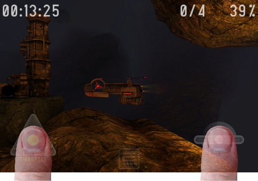
Gyro13 Steam Copter Arcade has larger touchscreen targets
It is without a doubt that matching your touch target sizes to the average finger size improves mobile usability for many. Whether your application is a game or any other, touch targets are designed for users to tap. If the user has to take their attention away from using your application to the way they move, orient or arc their finger to tap a target, it degrades their experience of your application. With this new-found insight, you can create applications that are truly finger-friendly. Finger-friendly design isn’t reserved for the few. It’s a new design standard for mobile applications to follow everywhere.
(al) (fi)


 SurveyJS: White-Label Survey Solution for Your JS App
 Agent Ready is the new Headless
