Why Should We Design Emotional Systems?
Before the very first page of a book has been read, you’ve already analyzed it in countless ways without even noticing. The paper stock, the thickness of the binding, the aroma, the color of the type and even the texture of the cover; the very character of the book is being dissected by the hand and eye at every moment.
In this brief second there is a dialogue between the reader and the object. This conversation is subtle and complex, but for most people it is entirely subconscious. This is because we rarely think about these things — we feel them instead.
Further Reading on SmashingMag:
- Not Just Pretty: Building Emotion Into Your Websites
- Excellent Book Covers and Paperbacks
- When Typography Speaks Louder Than Words
- Optimizing Emotional Engagement In Web Design Through Metrics
Before this dialogue can take place however, the ideas of the author must be given shape. By examining the relationship between the form of the book and the information contained within, we can begin to understand how these visual and sensory components work, but it will also teach us how to create long-lasting emotional bonds that we’ll want to keep forever.
Lost In Translation
I recently read The Greatest Show on Earth by Richard Dawkins. His book explores the wonder of evolution and scientific discovery and also goes into explicit detail as to how these ideas better our society and affect our perspective of morality and philosophy. But its uncomfortable size and shape as well as its flimsy typesetting gives the book characteristics of apathy and exhaustion.
The object reveals much about the world in which it was made: a heartless, ignorant and illiterate world, filled with people that viewed the author and the reader as a stepping stone to the top of the New York Times bestseller list.
And yet, these aesthetic and ergonomic failures are more than skin deep as they interfere with the relationship between writer and reader. Dawkins’ evidence seems less empirical, less established and somehow less wonderful, as the book miserably fails to explain the poetry of its content.

Notice how jarring and uncomfortable it is as these glossy, brightly colored pages sit next to ordinary blocks of text.
Dawkins’ argument is damaged by these cluttered, noisy and mistreated illustrative pages. Whilst he describes the wonderful and unique beauty of life, his ideas feel ordinarily ugly. The images to the left of the spread, their jarring and chaotic arrangement, the tension built by their seemingly random position, fail to reflect the ideas of wonder, beauty and order that the writer so eloquently describes.
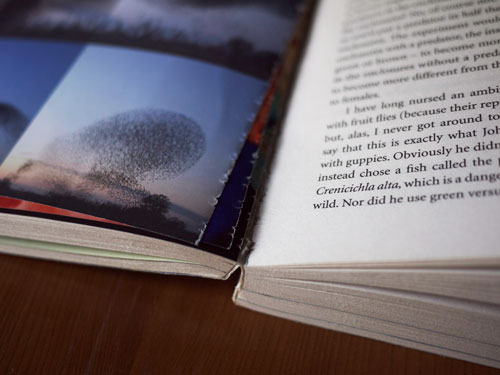
The ideas contained within have lasted centuries, yet this book has barely lasted a single reading.
Walk into any large, commercial bookstore and you’ll see thousands of books treated in a similar way — each with layer upon layer of unnecessary information that conflicts with the intent of the author. Something crucial is destroyed in this journey as the object disrupts vital information on transit.
To understand why these books are not working, we must first examine how information passes from writer to reader.
The Journey
For centuries, the book was a tool that existed for a single purpose; to transfer information from one mind to another. Although much has changed, there will always be a problem with this form of communication, and in our reliance on systems to safely relay data.
In bookmaking these systems are traditionally enforced by a publisher, as they have complete control over the quality of the binding, the typographic details, the use of color and the overall physical identity of the idea. All of these visual and sensory elements combine to produce the system by which the idea is given form. However, as in the case of the majority of books out there, this system poisons and infects it.
These systems comprise of an immense number of components, such as the combination of typefaces, the paper density, the use of color, the printing method, the measure, the width of margins, and other typographic details. But the problem with these systems is that they are incapable of reflecting the ideas of the writer with the form of the book. They act as a barrier that the information must travel through to be able to find the reader.

Cheap paper, bad typesetting and an awkward binding cause confusion and disrespect to the author’s ideas. But if we understand how these elements work together we can make systems that provide useful signs to the reader, and also manage to safely transport the ideas of the writer at the same time.
Emotional Information
When a visual component accurately represents the ideas of the writer, it becomes a source of emotional information. This aids in the transferral of ideas, and promotes and persuades the reader that the content is worthy of their precious time.
It’s more than just a pretty cover, visual pun or marketing gimmick that creates emotional information. It’s everything from the size of the type to the texture of the page, because these components not only help to explain the content of the book but also continue to engage and stimulate the reader throughout.

The Vintage Classics edition of As I Lay Dying is almost lifeless, whereas Trevor Baum’s redesign provides the reader with an emotional experience as they must carry this dying woman in their hands, much like the characters in the novel.
A system can bind the ideas of the writer to the form of the book with these carefully chosen elements, but it’s when the form and the idea become inseparable that unique relationships begin to emerge.
Take for example Do You Know What It Means to Miss New Orleans? that was published by the Chin Music Press back in 2008. The book is focused primarily on the aftermath of Hurricane Katrina and the impact it had on the music, economy and spirit of the city.
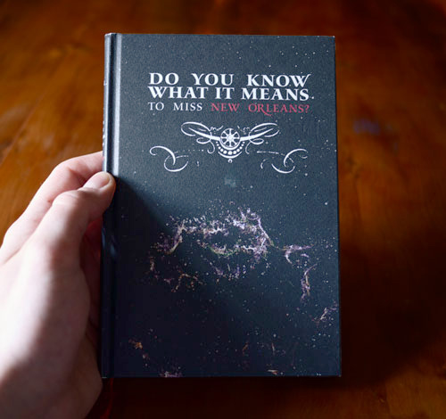
The physical elements of the book act as a rhetorical device, directing the reader with subtlety and charm.
Nineteenth century engravings flourish beside carefully set blocks of text and each page has been lavishly printed on high quality paper. These components, amongst many others, combine to create a distinct sense of pace that sets itself apart from legions of other books. The idea of the book and the form of the book become one — they merge into an emotional cornucopia that is impossible to ignore.
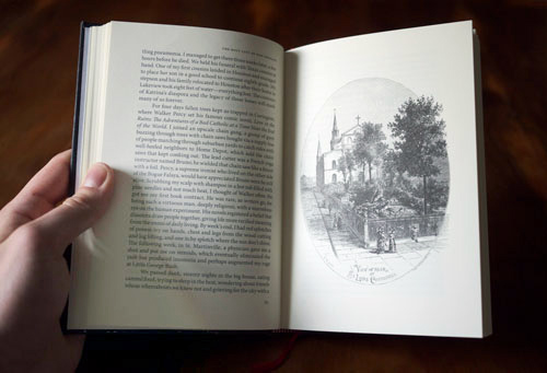
The texture of the page, the subtle typographic details and the distinctive illustrations implies a specific tone and atmosphere.
This is emotional information and it coerces the reader to take notice of the subject and to read each page with as much attention and focus as those that designed and published it.
Another book that provides the reader with emotional information is the Book of war, mortification and love. The author, Ruud Linssen, investigates why people suffer voluntarily whether it be for love, war, religion or art. The blend of fiction and non-fiction, and the haunting accounts of depression and loneliness are only reinforced by the physical elements of the object.
The text also acts as a specimen for the typeface Fakir. This dark blackletter eloquently explains the subject and forewarns the reader of the book’s ghostly nature. It is even printed with the author’s own blood, the ink on the cover blends into the background as if the words are shaking with anxiety.
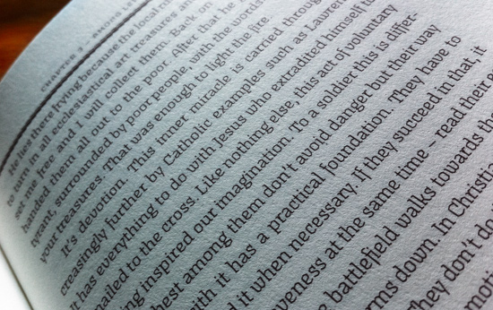
Texture, ink, type: three dimensions of emotional data that captures the spirit of the writer’s intent.
It’s these extra pieces of information, these tangible components of a unique sensory and visual language that must be pieced together in order to accurately reflect the author’s ideas. It is the format, the texture, and the combination of the printed word and the weight of the object that ignites this special relationship, and aids in the transfer of information between writer and reader. Ideally, these extra pieces of information provide the reader with the unspoken history, idea and argument of the book. Without them, the conversation between the book and the reader would be less interactive and engaging.
Of course, not every book can feel like Do You Know What It Means to Miss New Orleans?, or Book of war, mortification and love – but then why should they? Each book should be treated as a unique problem requiring a distinct and innovative solution.
Emotionless Systems
This is the problem with the current state of ebooks. As e-readers split content numerically or into ‘real’ turning pages they impersonate the form of the book, whilst disregarding the unique nature of the writer’s ideas. This gives us books that all feel and look the same.
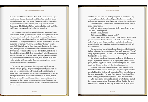
The Picture of Dorian Gray by Oscar Wilde and Shit My Dad Says by Justin Halpern look and feel the same, but are different in every meaningful way.
The system disregards the writer almost entirely; all ideas have the same graphic character, tone and appearance. But just as unique and brilliant writers follow a certain pattern and rhythm within their work, so too must the visual and sensory elements of a system. This indicates to the reader that the content is one of a kind and worthy of their precious time, but these systems are also capable of creating emotional experiences that can entertain, persuade, teach and inspire.
So the problems on screen are very similar to that of the problems on paper: the system is acting as a barrier into the author’s ideas.
Why Should We Design Emotional Systems?
In a perfect world we would share ideas through a semipermeable membrane; we would absorb ideas via osmosis and send them around the world as casually as we breathe. Sadly, we cannot do this. Instead, we have systems set in place to communicate. The problem is that these systems are failing us. They are hurting us. They are making beautiful things boring and are getting in between us and the ideas that we need.
This is not about nostalgia or the glorification of a particular medium. This is about information, and how best to communicate the content as a visual and sensory device. These systems have an obligation to not only safely and quickly transfer data, but also to make us care.
Of course, this is subjective and very little of this article goes into the specifics as to how to create emotional experiences, but this is because each idea requires a different visual and sensory tone. Some books require explosive typography and thick paper to feel revolutionary, others require a softer and more delicate tone to feel calm or charming.
The form of the book is merely a tool, a sometimes wonderfully beautiful and effective tool, but a tool nonetheless. It is the ideas within that give us wonder, and these tools must be built for their purpose if they are not to be thrown away, lost or forgotten.
We can embed within these systems a lasting piece of our culture if only we are willing to change the way we think. So instead of us asking the question, “How do these things look?” perhaps we should rather be asking, “How do these things feel?”
Further Reading
- The Crystal Goblet The classic essay by Beatrice Warde on the art of printing, still applicable to book and Web design today.
- Designing for Emotion The lead UX designer at MailChimp, Aaron Walter, discusses how emotion can be used in interfaces.
- On Book Design Richard Hendel examines how and why books are designed in the way that they are.


 Celebrating 10 million developers

 Register Free Now

 SurveyJS: White-Label Survey Solution for Your JS App

