Techniques For Overcoming Poor CSS Support In Email
Unlike most Web browsers, email clients have not yet united in support of HTML email standards, resulting in poor CSS support for email.
Inconsistent support for images in email clients has thus motivated us to experiment in a code editor and to develop the following techniques.
Further Reading on SmashingMag:
- How To Optimize Email Newsletters With CSS
- Design and Build Email Newsletters Without Losing Your Mind
- Email Newsletter Design: Guidelines And Examples
- Building And Sending HTML Email For Web Developers
Technique 1: HTML Gradients
Creating gradients for the Web is very simple with repeating background images and tools that produce cross-browser-compliant code, such as Ultimate CSS Gradient Generator. A gradient for email requires a much different approach, due to the lack of support for background images in some email clients.
Using gradients in email is possible without repeating background images or CSS3. It can be achieved entirely in HTML with pixel planning, table-cell background colors and appropriate cell widths and heights.
How to Begin an Email Template With Gradients
Because designing and developing for email requires an awareness of the limitations of email clients, as opposed to standards for Web browsers, we should start with a review of CSS support in email.
Emails are coded using tables, so we have to create design sketches and Photoshop mock-ups with table-based layouts in mind. Keep it simple, and have a clear idea of where to position the gradients and how they will behave (say, if we want a gradient to expand horizontally to fit the viewport’s width).
How Gradients for the Header, Box Shadow And Footer Differ
- The header gradient will expand horizontally on either side of the header image according to the browser or device’s width. So, if the viewport’s width is wider than the width of the header image, the gradient will fill the extra space. Using percentage widths of 33%, 34% and 33% for three columns makes this possible.
- The box-shadow gradient will have a fixed width and a flexible height depending on the content’s height, which will vary from email to email.
- Similar to the header gradient, the footer gradient will also expand horizontally according the browser or device’s width, but it will not have an image in the center.
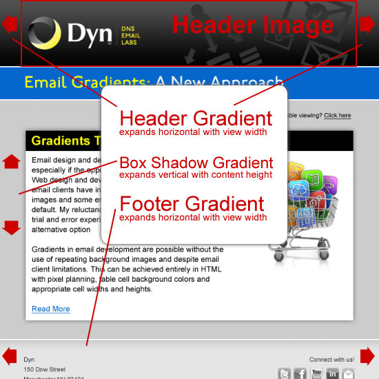
Behaviors of the header, box-shadow and footer gradients.
Plan Pixel by Pixel: Sample Colors, Record Colors and Note Number of Repeating Colors
Colors need to be sampled and recorded to recreate the gradient in HTML. Because the HTML header gradient will appear on either side of the header image, the HTML colors will need to match the colors in the header image. Sample colors from the actual optimized image, not the PSD; optimizing an image for the Web and reducing the file’s size using a tool like ImageOptim could change the color values slightly from the PSD.
The header image is the maximum recommended width of the email (600 pixels wide) by 120 pixels high. Open the optimized header image in Photoshop and zoom in 3200%. Use the Eyedropper tool to sample the color values for each pixel from top to bottom. Record the color values in a text editor, and note the number of pixels if color values repeat. Sample colors directly from the PSD for the box-shadow and footer gradients, since they don’t need to match any optimized images. Record the footer gradient colors just as you did the header gradient.
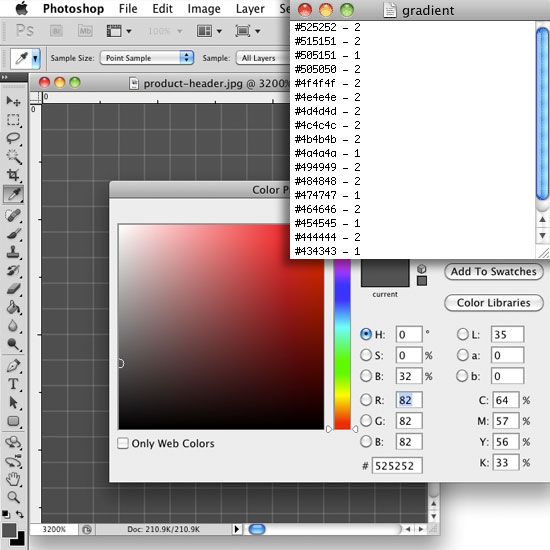
Zoom in, gather and record color values using the Color Picker tool in Photoshop.
Curveball Corners
The box-shadow gradient isn’t all gradient. The gradient lies between the four corners, which can also be recreated in HTML. Use the Color Picker to determine where the gradient ends and the corner begins. Sample and record colors as you did for the gradient portion of the box shadow. Use a spreadsheet for the corner portion of the box shadow to record color values and the pixel position. Sampling and recording only one corner and one side of the gradient is necessary because the color values are the same for all four.
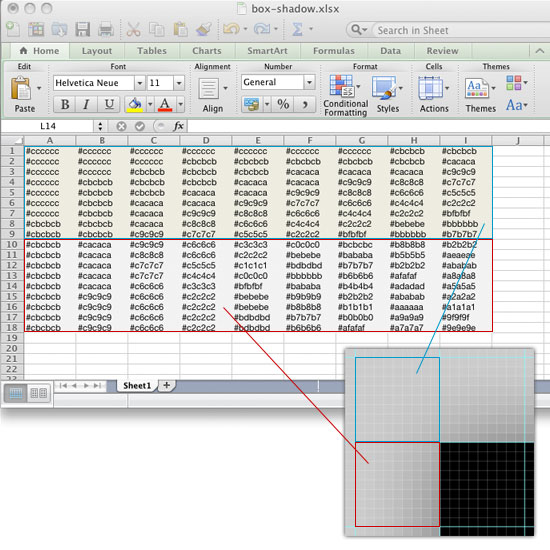
Record the pixel position and color values for one corner in a spreadsheet. Use this data to create all corners in HTML by flipping the order of the color values.
Save all files with the color data for later reference when www.
Temporary Tricks to Make Coding Easier
Add temporary cell padding and a width of 100% to the table to make cells easier to select in the design view in Dreamweaver. Add background colors to distinguish corners for easier merging.
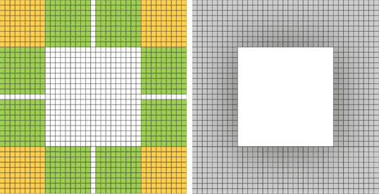
Left: Temporary colors and padding distinguish corners and cells for easier www. Right: Add color values and merge center cells.
How to Code the HTML Gradients
Copy and paste the recorded color values into the <tr> tags as background colors. Add heights to the <td> tags by referring to the repeating pixel numbers, and then merge the center cells from the end of the gradient up. This merged <td> cell is the place to add the header image.
<tr bgcolor="#525252">
    <td height="2" width="33%"></td>
    <td rowspan="95" width="34%">Header image will go here</td>
    <td width="33%"></td>
  </tr>
  <tr bgcolor="#515151">
    <td height="2"></td>
    <td></td>
  </tr>
  <tr bgcolor="#505151">
    <td height="1"></td>
    <td></td>
  </tr>
  <tr bgcolor="#505050">
    <td height="2"></td>
    <td></td>
  </tr>
  <tr bgcolor="#4f4f4f">
    <td height="2"></td>
    <td></td>
  </tr>
To code the HTML corners, refer back to the spreadsheet for the values of the corner colors. Copy and paste them into the appropriate <tr> tags. The background colors from one corner can be applied to all corners by flipping the order of the color values vertically and/or horizontally.
Fixed heights and widths will keep the cells from expanding. Apply cell heights and widths only to those cells that need defining. For example, in the box-shadow gradient, add heights to the cells of the first column only, excluding the one center cell that represents the gradient. This will allow the gradient to expand vertically depending on the content’s height. Add widths to all cells of the first row only. The middle cell of the first row needs to be wider in order to hold the nested table of content.
Once all heights, widths and colors have been added, remove the temporary cell padding, 100% table width and non-breaking spaces.
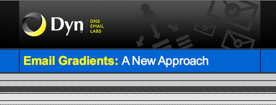
The design view in Dreamweaver, showing the main table complete with header and footer gradients.
Here are some pros and cons to the HTML gradient technique.
Pros
The results are clear. This technique renders consistently well for the vast majority of email clients without relying on images or background images, which have inconsistent CSS support. This means that more people will be able to view the design as intended, without having to change their email settings to display images. It also gives the designer more creative freedom and makes consistent branding possible where gradients exist. And remember, not all gradients have to be as complex and time-consuming as the header and box-shadow gradients in this article. These are included to show different examples and to demonstrate how they can be accomplished. The footer gradient covered here is fairly quick and easy.
Cons
This technique does have potential drawbacks. It can be labor-intensive and require additional code, which could increase the file’s size; this will depend on the number of colors in the gradient itself and the number of gradients in the email template. HTML gradients might not be practical for everyone; an alternative technique that uses background images is worth checking out.
Technique 2: Plan Padding As Rows And Columns
When it comes to padding for email, planning and coding the padding using rows and columns with widths and heights is key. This technique renders better and more consistently in email clients than inline margins, CSS padding or cell padding.
Drag and Count
In Photoshop, make sure to turn on the rulers, which makes adding guides possible. Drag guides vertically and horizontally over the PSD mock-up to define sections for content, images, padding, etc. Once the columns and rows are clearly defined, count them and insert the table accordingly.
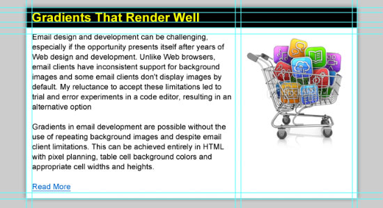
Use guides in Photoshop to figure out the number of columns and rows for the content table.
Merge With Care and Check Your Wide Load
Use temporary cell padding to make merging easier. Merge cells to create distinct sections as defined by the PSD guides and to eliminate extra code where possible. Keep track of cell widths after each merge so that all cells, merged or not, add up to the total fixed width of the table. Remember to remove the temporary cell padding when the table is complete.
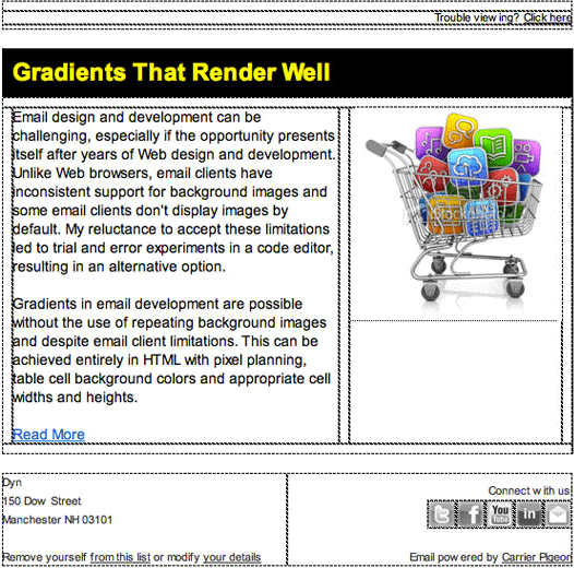
Four tables merged, with appropriate cell widths and heights applied.
How to Avoid Unintended Extra Cell Padding
Eliminating white space between <td> tags is important. Some email clients create additional padding from white space, which will ruin the gradient by blowing up the cells’ heights. Non-breaking spaces should also be avoided for similar reasons across all email clients.
Remember to paste only HTML code into the HTML view of a WYSIWYG window. Don’t paste HTML code into the visual view of a WYSIWYG window. The WYSIWYG editor will add unwanted code to HTML, such as non-breaking spaces, which will cause inaccurate results, ruins margins, etc. It can also drive a developer who is trying to debug the code insane.
Tools to Test Email Templates
Check the HTML template throughout the coding process locally in a browser. Another helpful resource is Fractal, which validates HTML emails across all major clients and fixes known email quirks. The last step is to test for cross-client compatibility. Litmus provides email previews across 30+ email clients, spam filter tests and email analytics. I use Carrier Pigeon, which uses a Litmus rendering feature.
Final Result Among Different Email Clients
HTML gradients and padding render consistently across the following email clients and browsers:
- AOL Mail (Internet Explorer and Firefox);
- Apple Mail 4;
- Gmail (Internet Explorer and Firefox);
- Hotmail (Internet Explorer and Firefox);
- Lotus Notes (8 and 8.5);
- Me.com (Firefox);
- Outlook (2000, 2002/XP, 2003, 2007, 2010);
- Thunderbird (2.0 and 3.0);
- Yahoo Mail (Internet Explorer and Firefox).
Lotus Notes (6.5 and 7) is the only email client that does not display gradients correctly.
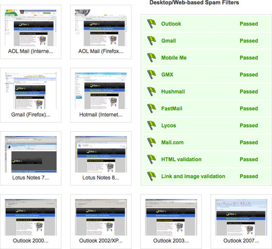
A sample of inbox previews and spam reports.
Resources
- The Email Standards ProjectThis collective works with email client developers and the design community to improve Web standards support and accessibility in email.
- “Applying Background Images To Your Email Newsletters,” Ross Hodgekiss, CampaignMonitor
- “Design and Build Email Newsletters Without Losing Your Mind (and Soul),” Mathew Patterson, Smashing MagazineThe information you need to plan, design and build an HTML newsletter that renders well and that is actually useful to recipients.
- “Complete Guide to CSS Support in Email” (PDF), CampaignMonitor
- “How to Code HTML Email Newsletters,” Tim Slavin, SitePointA practical and comprehensive how-to article.


 SurveyJS: White-Label Survey Solution for Your JS App
 Celebrating 10 million developers


 Register Free Now

