Gridpak: The Responsive Grid Generator
This article is the fifth in our new series that introduces the latest, useful and freely available tools and techniques, developed and released by active members of the Web design community. The first article covered PrefixFree; the second introduced Foundation, a responsive framework; the third presented Sisyphus.js, a library for Gmail-like client-side drafts and the fourth shared with us a free plugin called GuideGuide. Today, we are happy to present Erskine’s responsive grid generator: Gridpak.
In the near 18 months since A List Apart published Ethan Marcotte’s article Responsive Web Design much has changed in the way we approach our design process. The new responsive attitude described in the article embraces device agnostic design, flexibility and the undefined canvas. Whilst John Allsopp’s A Dao of Web Design laid the foundations for change, Ethan’s article—alongside a maturation in technologies and a coinciding mass movement towards mobile browsing—really set the scene for a new design ethos.
The Problem
Challenges and problems inevitably arise when adopting new ideas and ways of working. One of the main stumbling blocks we found as an agency was in efficiently and cost-effectively implementing one of the fundamental ingredients of responsive design: a flexible grid based layout.
This is what our typical design and development cycle for creating a responsive website with a flexible grid system used to look like:
Create 3 or 4 different sized grids by hand in Fireworks to use as a reference in the wireframing/design stage.
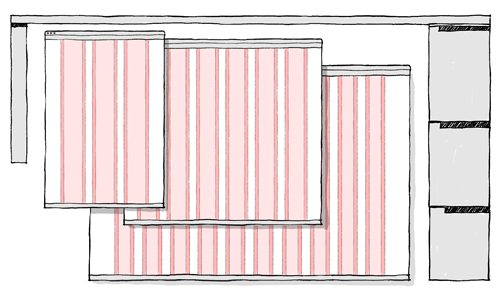
Create multiple grids, for desktop, tablet and phone.Recreate the same grids with crude and often clunky browser extensions (mentioning no names) or write some JavaScript that would allow us to overlay our grid layers (exported as semi-transparent PNGs) in the browser.
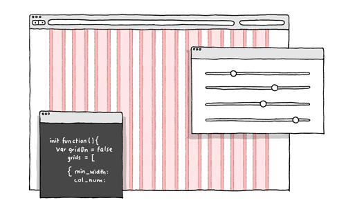
Recreating the same grids in the browser.Write LESS stylesheets which cut down on the maths, but still required all the base values and formulas for calculating grid widths.
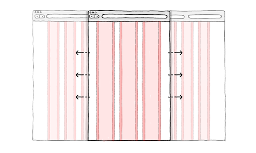
Calculating percentage widths and writing CSS in order to make our website and grid responsive.
There were 2 crucial drawbacks to this approach:
- It took a long time to measure up grids, create them in static graphic format, then produce long lines of LESS.
- We couldn’t visualise the grids responding (sweet irony) until they were built.
At that time, most of the responsive frameworks forced you into a corner: you were required to use a pre-determined number of columns, gutters, padding and breakpoints. We felt that this undermined the ethos of a methodology that was by it’s very nature flexible.
We also felt that existing generators lacked the visual feedback that we required: we were desperate to see how our grids would react when squeezed and stretched in order to inform our decisions.
Solution
So one afternoon, dissatisfied as much with our own process as we were with the available solutions, we began to put pen to paper with the ultimate goal of creating a responsive grid generator that would:
- Offer true flexibility:
The interface allows the user to adjust the amount of columns in each grid, the inner padding and gutter width in either pixels or percentages, and where the breakpoints of the grid occur. - Allow the user to visualize a responsive grid system:
The user can switch between and edit their grids in real-time using the tab system. They can see immediately how their grids react. - Streamline the design and development process:
Gridpak outputs all of the file formats necessary to make a quick start to a responsive project. They are easy to extend, reference, or just throw away if not required. The file formats come neatly packed inside a small .zip file that includes:- PNG overlays of each grid the user has created for use in their graphics program of choice.
- A HTML demo file.
- A CSS file complete with appropriate media queries and predefined presentational classes.
- LESS, SCSS and SASS files for the same purpose, but with the added power of variables and mixins.
- A JavaScript snippet that allows the user to overlay their responsive grid in any browser using the “G” key.
- A readme.txt file with some more in-depth documentation.
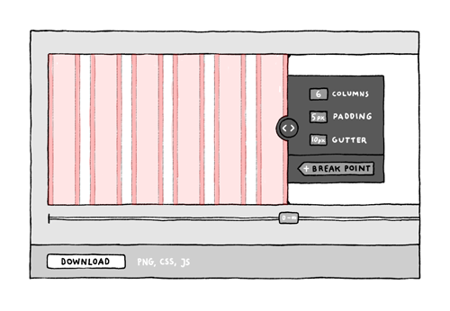
The simple interface makes is easy to visualize, create and edit your responsive grid system.
Stylesheets
Gridpak is not really meant to be a framework. Although its stylesheets will work “right out of the box”, they are meant to be plucked and pruned into your own stylesheets and methods of working. That’s why they only contain information which is essential for your grid system.
We had a niggle with media queries on grid based layouts when the number of columns changed between breakpoints. To solve this problem, we eschewed the use of “span_x” in our class names in the markup, preferring to use semantic naming like “news_item”. We then added our semantic class names to gridpak.css, right next to their counterpart:
.span_1, .span_2, .span_3,
.news_item {
    margin-left:2%;
    padding:0 1.5%;
    ...
}

.span_6,
.news_item {
    ...
}
In this way, our markup isn’t coupled to the CSS nor are the elements to the breakpoints. It’s a far more scalable way of doing things. Implementation is very much open to interpretation, and we look forward to seeing how people apply it to their own projects.
Gridpak uses media queries, box-sizing and background-clip properties (although there are ways to use it without these queries.) These CSS3 properties are supported in all new browsers, as well as IE8 but we would recommend using a polyfill or detection service such as Modernizr to handle the degradation.
### Help Us Help You
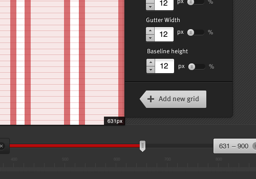
Coming soon: Baseline functionality and an ability to edit the position of the breakpoints after you have created them.
We know Gridpak is not a one-stop, cure-all panacea—it was never designed to be. Like all tools it has limitations, but we believe it is a useful part of the responsive designer’s armory. As the field evolves further we will undoubtedly see a proliferation of similar tools and approaches. People will ultimately choose the ones that work best for them and fitting to their workflows.
Since the launch, we’ve added important features like the ability to adjust gutter widths and column padding in percentages as well as in pixels. With our next release we’ll introduce a more flexible approach to allow the creation of a wider range of asymmetrical grids... but we can go much further. That’s why we’ve open sourced the Gridpak codebase on Github. We’d love to see it become a truly collaborative effort where people get into the code and make their own improvements.
Feedback
We hope that Gridpak will grow and evolve over time, so we’d really welcome your feedback and input. You can send feature requests to gridpak@erskinedesign.com or @gridpak on Twitter. We also have a Trello board where you can comment on and vote for features, or even just keep an eye on what we’re currently working on. We, at Erskine Design, have found Gridpak to be a great resource for our day-to-day client work, so we hope you enjoy using it as much as we do... and we do.
Written by Sam Quayle.
(jvb) (il)


 SurveyJS: White-Label Survey Solution for Your JS App
 Agent Ready is the new Headless


