A Closer Look At Font Rendering
The Web font revolution that started around two years ago has brought up a topic that many of us had merrily ignored for many years: font rendering. The newfound freedom Web fonts are giving us brings along new challenges. Choosing and using a font is not merely a stylistic issue, and it’s worth having a look at how the technology comes into play.
While we cannot change which browser and OS our website visitors use, understanding why fonts look the way they do helps us make websites that are successful and comfortable to read in every scenario. Until recently, there were only a small handful of “Web safe” fonts we could use. While offering little variety (or means of expression), these fonts were very well-crafted and specifically adjusted—or even developed—for the screen, so there was little to worry about in terms of display quality.
Further Reading on SmashingMag:
- Avoiding Faux Weights And Styles With Google Web Fonts
- Taking A Second Look At Free Fonts
- Improving Smashing Magazine’s Performance: A Case Study
- The Ails Of Typographic Anti-Aliasing
Now that we have a great choice of fonts that can be used on websites, it becomes clear that the translation of a design into pixels is not something that happens naturally or consistently. OS makers apply different strategies to render how typefaces are displayed, and these have evolved greatly over time (and still continue to do so). As we now look closer at fonts on screen more than ever before, we realize that the rendering of these glyphs can differ significantly between systems and font formats. What’s more, it has become clear that even well-designed fonts may not look right on Windows if they are missing one crucial added ingredient: hinting.
This article presents the mechanisms of type rendering, how they were developed, and how and why they are applied by the various operating systems and browsers—so that when it comes time to choose a font for your next project, you know what to look out for to ensure the quality of the typography is consistently high.
Rendering Strategies

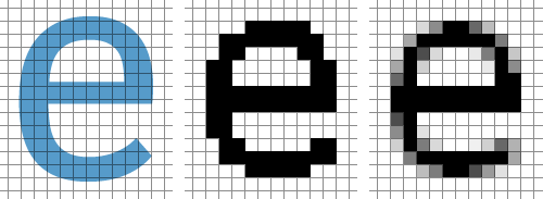
Ideal shape, black-and-white and grayscale rendering
Rasterization
In digital type, characters are designed as abstract drawings. When a text is displayed on screen, this very precise, ideal shape needs to be expressed with a more or less coarse grid of pixels. As screens turned from mere preview devices for printing output into the actual medium we read in, more and more sophisticated rendering methods were developed in order to make type on the screen easy and pleasant to read.
Black And White Rendering
The earliest method of expressing letter shapes was using black and white pixels, sometimes referred to as bi-level rendering. Printers are still based on this principle, and thanks to their high-resolution, the result is a very good representation of the design. On screen, however, the small number of available pixels does not transport the subtleties of the drawn shapes very well. And although we might not be able to see the individual pixels, the steps found in round contours are noticeable.
Grayscale Rendering
In the mid-1990’s, operating systems started employing a very smart idea. Although screens have a rather low resolution, they can control the brightness of each pixel. This allows more information to be brought into the rasterized image.
In grayscale rendering, a pixel that is on the border of the original shape becomes gray, its brightness depending on how much it is covered by the ideal black shape. As a result, the contour appears much smoother, and design details are represented. The type on screen is no longer merely about being legible—it has its own character and style.
This principle—also called antialiasing—is the same that is used when photos are resampled to a lower resolution. Our eyes and brain interpret the information contained within the gray pixels and translate it back into sharp contours, so what we perceive is fairly close to the original shape. A similar effect is at work when a relatively coarse newspaper image that can appear nicely shaded if we hold it far enough away (or similarly, in the art of Chuck Close). Recently, Gary Andrew Clarke took this to the extremes with his “Art Remixed” Series.
Subpixel Rendering
![]()
Apparently colored pixels increase the resolution.
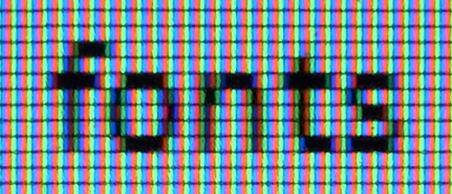
The third generation of rendering technology is characterized by apparently colored pixels. If we take a screenshot and the edges appear red and blue when enlarged, then we know that we are looking at subpixel rendering.
On LCD screens, the red, green and blue subpixels that control the color and brightness of the pixel are located side-by-side. Since they are so small, we don’t perceive them as individual colored dots. Having a closer look at the “red” pixel marked by the white dot reveals the strategy: all subpixels are switched on or off individually, and if the rightmost subpixel of the “whitespace” happens to be a red one, then the corresponding full pixel is technically red.

Subpixel rendering on an LCD screen.
The benefits of this technique become clear if we desaturate the image. Compared to plain grayscale rendering, the resolution has tripled in horizontal direction. The position and the weight of vertical stems can be reflected even more precisely, and the text becomes crisper.
Current Implementations
For the display of text, almost all browsers rely on system rasterizers. When looking at Web font rendering, the key distinction we have to make is the operating system. However, there are differences between the browsers in terms of the support given to kerning and ligatures, as well as the application of underline position and thickness, so we cannot expect perfectly identical rendering in all browsers (even on one platform). What’s more, on Windows, the browser can have the font rendered by either of the system technologies—GDI or DirectWrite.
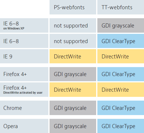
Before we look at these in detail, lets first get an overview of where each one is to be used:

Rendering modes used by Windows browsers.
Windows
On Windows, the font format has a significant impact on the rendering. The crucial difference is between PostScript-based and TrueType-based fonts, and not the way these are brought into the browser—JavaScript vs. pure CSS, raw fonts vs. “real” Web fonts, etc. We will see identical rendering as long as the underlying font is the same.
File formats can give us a clue as to what underlying rendering technology is being used, although it’s best that one doesn’t completely rely on the naming conventions. For example, EOT and .ttf files will always contain TrueType, whereas .otf fonts are typically PostScript-based. But then there’s the wrapped format WOFF, which can contain either “flavor” of font format. So we don’t know which one it contains (and therefore, what kind of rendering may be used), just by looking at the file name. Unless you’re using EOT or .ttf files, and can be sure it’s a TrueType, more investigation when purchasing fonts is always recommended.
TrueType and PostScript fonts differ in the mathematics used to describe curves—something that rasterizers don’t care about too much—it only makes a difference for the type designer when editing the glyph shapes. What is more relevant is the different approach to hinting. PostScript fonts only contain abstract information on the location of various elements of each letter (and rely on a smart rasterizer to make sense of this), whereas TrueType fonts include very specific low-level instructions that directly control the rendering process. Curiously, however, the effective differences in rendering are not due to these differences in concept, but rather stem from Microsoft initially deciding to apply their new rendering engine only to TrueType fonts.
Windows: TrueType Fonts


TrueType font rendering with Windows grayscale.
On Windows XP, text is rendered as grayscale by many browsers. Although not as crisp as the subpixel rendering used by Mac OS, the letters are nicely smoothed and look great in large sizes.


TrueType font rendering with Windows GDI ClearType.
ClearType is Microsoft’s take on subpixel rendering. It was first made available for GDI, the classic Windows API. Although available in Windows XP, it is not used by all browsers. In Windows 7 and Vista, ClearType is the default, which makes it the most widely used rendering technology (if we were to consider all internet users). However, it is important to note that this applies only to TrueType-based Web fonts—GDI-ClearType is not applied to PostScript-based fonts.
One curious property of this rendering technology is that along with adopting the advantages of subpixel rendering in horizontal direction, Microsoft gave up smoothing in vertical direction entirely. So ClearType is effectively a hybrid of subpixel and black-and-white rendering. This results in steps within the contour, which is particularly noticeable in large sizes. These jaggies at the top and bottom of the curves are unpleasant, but unavoidable—even the best hinting cannot make them disappear.
For type in large sizes, ClearType is a step backwards in rendering quality. The gains in horizontal precision are not significant, while the rough contours spoil the overall result.


TrueType font rendering with DirectWrite.
The future is bright, at least in terms of Windows font rendering. In DirectWrite (the successor of GDI), Microsoft added vertical smoothing to ClearType. This new rendering mode (so far used by Internet Explorer 9), gives us smooth and precise rendering in all sizes. The main difference to Mac OS that remains is that it still tries to align contours to full pixel heights, which leads to even better rendering given that the font is well-hinted. What’s more, DirectWrite allows for subpixel positioning, which gives the characters exactly the spacing that they have been designed with, improving the overall rhythm and evenness of the texture.
Windows: PostScript Fonts


PostScript font rendering with GDI grayscale.
In GDI-based browsers, PostScript-based Web fonts are displayed in grayscale. Unlike the prevalent GDI-ClearType, this gives smooth contours. And unlike TrueType hints, PostScript hinting is easier to create, even automatically.


PostScript font rendering with DirectWrite.
DirectWrite not only gives smoother outlines, it also applies subpixel rendering to PostScript fonts. Unlike TrueType rendering, however, it allows for more gray pixels in order to reflect stroke weights more realistically. That makes it well-balanced, and similar to Mac OS rendering.
At some point in the future—browser makers and users will not switch as quickly as we wish—DirectWrite will succeed the older Windows rendering methods, and we will indeed be spoilt for choice between TrueType- and PostScript-based Web fonts.
Windows: Unhinted Fonts


Unhinted font rendered with grayscale.
In the old Windows grayscale mode, completely unhinted fonts look surprisingly good. Since the font does not “align itself” to full pixels via hinting, and the rasterizer does not enforce this either, we have a rendering that is similar to that of iOS. Unfortunately, unhinted fonts are currently not an option, as the next example shows:


Unhinted TrueType font in GDI-ClearType rendering.
As noted in many discussions on Web font rendering quality, GDI-ClearType is extremely dependent on good hinting. Horizontal strokes have to be precisely defined by means of hinting, otherwise they might be rendered in an inappropriate thickness. Even in larger sizes, hinting is crucial. Unhinted fonts will show “warts” sticking out where contours are not correctly aligned to the pixel grid, like in the example above.


Unhinted font rendered with DirectWrite.
In DirectWrite, unhinted PostScript and TrueType-based Web fonts show virtually the same rendering. Text fonts of either flavor will still need good hinting in order to keep the strokes crisp and consistent. Display fonts may even get away with sloppy or no hinting, since this does not show much in large sizes.
Mac OS X


Font rendering in Mac OS X.
On Mac OS, all browsers use the Quartz rendering engine. TrueType and PostScript fonts are rendered in exactly the same way, since hinting—the biggest conceptual difference between the two formats—is ignored. The subpixel rendering on Mac OS is very robust, so this platform is typically the one we need to worry about the least. The rasterizer doesn’t try to understand the strokes and features that make up a font, as everything is represented by more or less dark pixels. Since the letter shapes are not interpreted, they cannot be misinterpreted. Quartz rendering is reliable because it doesn’t try to be smart. As a side note, Apple does seem to apply some subtle automagic to enhance the rendering, but this is entirely undocumented and beyond our control.
In some cases, however, this leads to less-than-ideal results. In the above example, the large size “T” has a fuzzy gray row of pixels on top because the theoretical height is not a full pixel value, and Mac OS does not force its alignment. Unfortunately this cannot be controlled by the font maker. However, the blurriness occurs only in certain type sizes. So typically, choosing a slightly different font size fixes the problem. With a bit of trial-and-error, one can find a type size that looks comfortable and crisp.
Another difficult-to-control phenomenon is that on the Mac, type tends to be rendered too heavy. This difference is most noticeable in text sizes, where the same font can look a bit “sticky” on Mac OS while appearing almost underweight on Windows.
iOS


Font rendering in iOS.
The rendering on iOS follows the same principles as on Mac OS—the main difference is that it currently does not employ subpixel rendering. The reason might be that when the device is rotated, the system would have to re-think and update the rendering because the subpixels are physically oriented in a different way, and the makers wanted to minimize CPU use.
Conclusions
Website visitors use a great variety of systems and browsers. Some are not up-to-date, and sometimes it’s not even the user’s fault, but rather a company’s policy to stick with a certain setup. My personal opinion is that we should try and give them the best rendering we can, instead of blaming OS makers, or demanding users to switch to better systems.
On Mac OS and iOS, we hardly have any control over the rendering, which is acceptable (since it’s generally very reliable). One problem is that fonts generally render too heavy. Maybe some day, Web font services can improve the consistency by serving slightly heavier or lighter fonts depending on the platform.
On Windows, hinting matters—especially for TrueType-based fonts (the only Web fonts Internet Explorer 6–8 will accept). Apart from that, one significant control we have over the rendering is the choice between TrueType and PostScript. Except for very well-hinted fonts in smaller sizes, the latter is equal or superior in rendering, and easier to produce. Even though DirectWrite is making Windows rendering more pleasant, it will not remove the necessity to provide well-hinted fonts.
Practical Application: Improving Display Font Rendering
Some Web font providers (such as Typekit or Just Another Foundry), have started serving display fonts in PostScript-based formats.


JAF Domus Titling in different rendering environments.
While the GDI ClearType jaggies are unavoidable for IE 6–8, all other scenarios produce nice, smooth results. This also means that we will still need fonts that have decent TT-hinting—the browser share of IE6–8 is still too big to deliver fonts that don’t at least render in a clean fashion.

Bello—by Underware on Typekit—served as PostScript-based Web fonts (right), which gives smoother rendering than TrueType (left).
Typekit has also started to implement a hybrid strategy by serving display fonts as PostScript in order to trigger smoother rendering in Windows GDI. This requires some decisions to be made on the basis of visual judgement.
“How do you define a display font?”, you may ask, and it is indeed difficult to draw the line. Some of the foundries offer high-quality, manually hinted TrueType fonts that look great in text sizes (and it would be a pity to lose this sophistication by converting them to PostScript). Some text fonts may well be used in very large sizes. So ideally, we would have to offer them in two different formats. However, increased complexity of the UI (as well as back-end handling) have so far kept us from doing this.
Future Developments
More and more type designers are becoming aware of the technical issues that arise when fonts are used on the Web, particularly TrueType hinting. As the Web font business grows, they are willing to put some effort into screen-optimizing their fonts. In the near future, we will hopefully see a number of well-crafted new releases (or at least updates to existing fonts).
With increasing display resolutions— and more importantly, improving rasterizers—we will slowly have to worry less about the technical aspects of font rendering. GDI-based browsers will certainly be the boat anchor in this respect, so we won’t be able to use TrueType fonts that aren’t carefully hinted for yet another few years. Once this portion of Web users has become small enough, the process of TrueType hinting (which is time-consuming and requires considerable technical skills), becomes less crucial. While most Web fonts currently on the market are TrueType-flavored, I am expecting that the industry will largely switch to PostScript, which is the native format nearly all type designers work in (the fonts that are easier to produce).
Other Resources
- DirectWrite Text Rendering in Firefox 6, Mozilla Blog
- JAF Domus Titling as Web font, Just Another Foundry
- New from Typekit: Improved font rendering on Windows, Typekit Blog
- The Benefits Of OpenType/CFF Over TrueType, Typblography
(jvb) (ac) (il)
Note: A big thank you to our fabulous Typography editor, Alexander Charchar, for preparing this article.


 JavaScript Form Builder — Create JSON-driven forms without coding.
 Get a Free Trial
 Register for free today!
 Try if for free!

