How To Choose The Right Face For A Beautiful Body
What is it that makes a typeface into a text font, instead of a font for larger sizes? The answer differs slightly, depending on whether one aims for print or Web-based environments.
Nevertheless, there are certain features that most good text faces have in common. Familiarity with these helps to select the right fonts for a given project. This article presents a few criteria to help the process along.
Further Reading on SmashingMag:
- Tools And Resources For A More Meaningful Web Typography
- Space Yourself
- Whitespace Characters in Unicode & HTML
- Balancing Line Length And Font Size In RWD
Some of today’s most successful typefaces were designed to excel in very specific areas of use: Frutiger grew out of airport signage, Georgia and Verdana were among the first mass-market fonts created for on screen reading, FF Meta was conceived as a telephone book face, and even the Stalwart Times New Roman was tailored for the pages of the London Newspaper The Times. Many typefaces are also often fine-tuned for using in certain sizes.
It should be noted that in this article, when “text” is mentioned, it is in discussion of body text, or running text (in other words, text at a similar size to what you are probably reading right now, rather than much larger sized words).
Features Of A Good Text Typeface
The features outlined in this article are those that type designers keep in mind while developing new typefaces. It’s important to realize that these aspects of typeface design are different from the text treatment a graphic designer employs while laying out a book page or website—no matter what a typeface’s inherent rhythm and niceties are, setting a text is still something that must be done with great care in respect to readability. There are problems that good fonts themselves cannot solve—whether or not a text sings on the page or screen depends on factors like the width of the column, the amount of space between each line, the contrast between the foreground/background and a number of other factors.
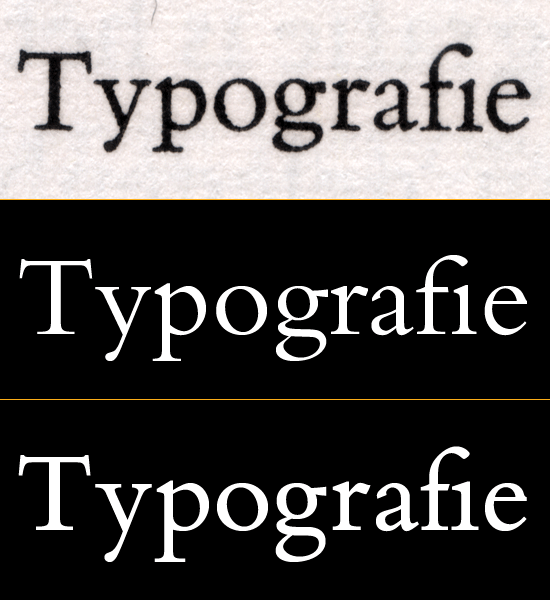
Above, Bembo over the years: this typeface was a favorite of many book designers throughout the 20th century. At the top of the image is a scan of the original Bembo typeface, printed with letterpress. The digital version of the typeface—Bembo, seen in the middle, is too light for ideal text in print. A newer digitization was published in 2002—Bembo Book, seen at the bottom. This font is much darker, and is a better representation of the original Bembo idea. However, the middle version is still very elegant, and may still be used well in sub-headlines.
Every typeface has its own inherent rhythm, created by the designer who made the font. With typefaces that are intended for use in body text, it is primarily this rhythm that will make the typeface readable. But there are additional factors that go into the making of a good text face: the space between the letters, the degree of contrast in the letters’ strokes, as well as the x-height and relative size of the whitespace inside of the letters. Not every typeface that works well in text will apply all of these factors in the same way, but all good ones will have many of these features in common.
1. Stroke Contrast
When it comes to typefaces, the term “monolinear” is used to describe letters that appear to be designed with a consistent stroke thickness. Monolinear typefaces are low-contrast typefaces. Stroke contrast can be a helpful feature in small text sizes, but it is not paramount that a text face appears to be monolinear. Indeed, many newspapers employ high-contrast fonts; the question that must be considered is just how thick the thin strokes in high-contrast typefaces are.
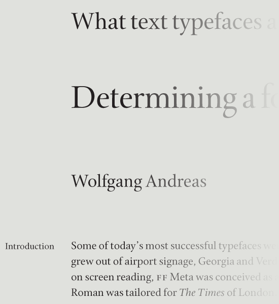
The images in this section show different ends of the contrast spectrum: the Cycles types shown above are serifed, with a good deal of contrast. Sumner Stone’s Cycles typeface is an excellent choice for book design as its letter forms combine clarity with a rather high degree of stroke contrast and an almost timeless appearance. Five separate “versions” of Cycles are used in the above image; each block of text is set in its own optically-sized font.
Below, Avenir Next—also a great text face—is from another style of letter, and has very little contrast. I wouldn’t split good typefaces up into good contrast and bad contrast groups. Rather, some typefaces have a degree of contrast—be it too high or too low—that makes them less suitable for use in text. There is no definite rule on how much or how little contrast impacts a text face’s legibility. However, it is clear that both no contrast and excessive contrast can have adverse effects.
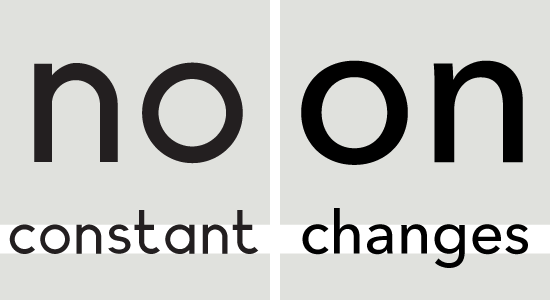
Geometric sans serif typefaces often appear to be monolinear stokes; their letters seem not to have any stroke contrast. In order to achieve this effect to the max, type designers have always made slight optical corrections. To look monolinear, a geometric sans needs some degree of thinning. In the image above, Planeta (left) is compared with Avenir Next (right). Both typefaces are more recent additions to the geometric sans category than stalwart faces (like Futura), or classic display designs (like ITC Avant Garde Gothic). Planeta has no visible stroke contrast, which must be a conscious decision on the part of its designer. While this does give it a unique style, it makes the face less suitable for text than Avenir Next, which is actually not as monolinear as it appears at first glance.
2. Optical Sizes
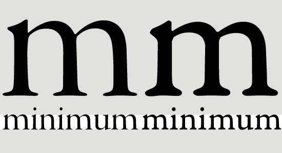
The Garamond Premier typeface family features different versions of each font. These variants are tailored for use in a certain size range. Above, the Display font (left) is compared with the Caption font (right). The Display font is optimized for texts that will appear in very large point sizes, while the Caption font has been optimized for very small text.
In her book Thinking with Type, Ellen Lupton writes:
“A type family with optical sizes has different styles for different sizes of output. The graphic designer selects a style based on context. Optical sizes designed for headlines or display tend to have delicate, lyrical forms, while styles created for text and captions are built with heavier strokes.”
The intended size of a text should be considered when selecting the typeface: is the typeface you want to use appropriate for the size in which you need to set it? Does the family include optical sizes (that is, different versions of the typeface that are tailored specifically for use at different sizes)? As with each of the factors mentioned in this article, the size at which a font is set can make or break your text.
In many ways, it is easiest to see the qualities necessary for good text faces by comparing potential selections with “display” faces. Like the term “text,” “display” refers to the size at which a specific font may best be used. In print media, as well as in many screen and mobile-based applications, the term “display” is often analogous with “headlines.” If a typeface that you are considering looks more like something that you might like to use for a headline, it won’t be the best choice for body text.
In the comparison image below, the Garamond Premier Display font has a tighter rhythm than the Caption font—not as much space is necessary between letters when they are set in large point sizes. Why should one consider type families with optical sizes, anyway? Well, as users bump up the point size of digital fonts, the space between letters increases in equal proportion. This inter-letter space slowly becomes too large, and makes a text feel like it is breaking apart. When a proper text font is set large, it may require some tighter tracking. Typeface families that offer optically-sized variants of their styles play a helpful role here.
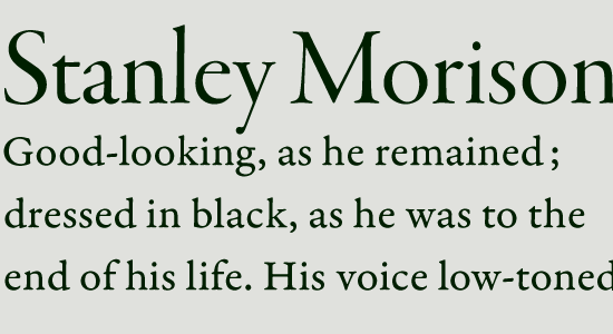
In the image above, the first line of text—“Stanley Morison”—is set in the Garamond Premier Display font, while the lines of text underneath it are set in Garamond Premier Caption. Each font is balanced for its size, and they also harmonize well with one another. In another image (below), these fonts have been switched: the headline is now set in the Garamond Premier Caption font, and the text in the Garamond Premier Display. The letters in the Caption face look too clumsy when they are set so large, while the Display fonts’ letters appear uncomfortably thin in a “text” setting.
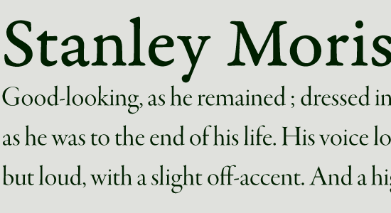
The amount of stroke contrast visible in caption-sized fonts is much lower than in display-sized fonts. If the Garamond Premier Display font (from the above image) was rendered in a smaller point size, its thin strokes would begin to break apart, making the text unreadable. But this would not occur with the Caption version.
Garamond Premier Caption can robustly set real text, even in poor printing conditions. How well a font will render in small sizes on screen depends on the operating system and applications in question. Font formats themselves also play a role; in certain environments, TrueType fonts with “hinting” information may vastly improve on screen display (see the “Hinting” section at the end of this article).
3. x-Height
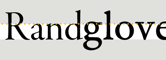
Garamond Premier’s Display face (above left) is shown next to the Caption face (above right). Both fonts are set at the same point size. The Caption face features a much higher x-height than the Display font.
Many successful text faces feature high x-heights; this means that the ratio of the central vertical area of lowercase letters—the height of the letter x, for instance—is large when compared to the length of the ascenders and descenders. Depending on its design, a text face may have a low x-height and still be quite legible. But the benefit of incorporating a large x-height in a design is that it maximizes the area of primary activity.
A high x-height may also prevent some letters, like the a or the s, from appearing to become too dark; these two letters have three horizontal strokes inside the x-height space, which is a very small area in text sizes. In order for letters to maintain clarity and understandability, they must have a consistent rhythm, as well as include large, open forms.
4. The Spaces Inside of Letters
The images below illustrate just a few of the intra-letter spacing elements that should be understood and considered when choosing which typeface to choose for your body text. In order for the white spaces inside of letters to remain visible in small sizes, it is necessary for their counterforms to have a certain minimum mass, proportionally.
Counters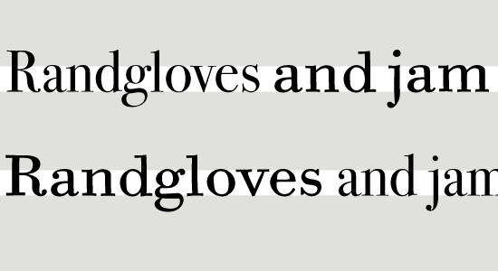
The image above shows text set in two members of the ITC Bodoni family: ITC Bodoni Seventytwo and ITC Bodoni Six typefaces. In the first line, “Randgloves” is set in a size mastered for 72pt display (ITC Bodoni Seventytwo), while “and jam” is in the Caption size (ITC Bodoni Six). These words are reversed in the second line. Note how the enclosed white space in the top portion of the e changes between the display and text optical sizes.
Apertures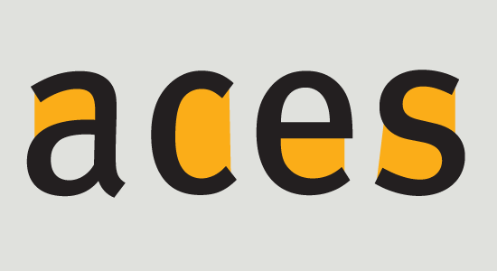
“Apertures” are the gateways that whitespaces use to move in and out of the counterforms of a typeface’s letter. The above image highlights the wide apertures in four letters from Erik Spiekermann’s FF Meta typeface. These allow for the typeface’s letterforms to feel more open. In certain sizes and settings, wide apertures—and the large counterforms that are their result—will make a text more readable.
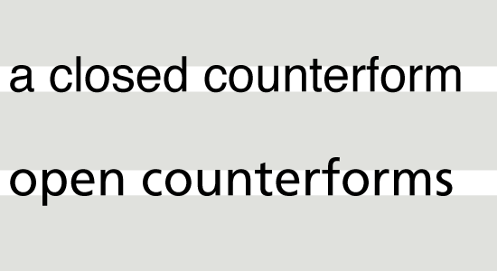
The top line of the image above is set in Helvetica, and the bottom line in Frutiger. While the counterforms inside the letters of these two typefaces are similar in size, Helvetica’s apertures are much smaller. Because of this, white spaces inside of Helvetica’s letters and between Helvetica’s letters are much more closed off from each other than in a typeface with more open counters—like Frutiger.
Other counterforms and problematic letters worth remembering include the c; if the apertures of a, e, s are very open, the c should follow this same route. Then there are lowercase letters like a, e, g, s that often have rather complex shapes—specifically, they each feature several horizontal strokes inside a small amount of vertical space. How do their forms relate to one another? How large is the typeface’s x-height? Do the ascenders and descenders have enough room, particularly f and g? Do the counterforms inside of roundish letters (e.g., b, d, p, q, o) have the same optical size and color as those inside of straight-sided letters like, h, n, m, and u? How different from one another are the forms of the capital I, the lowercase i and l, and the figure 1? Can the 3 and the 8 be quickly differentiated from each other? How about the 5 and the 6?
5. Kerning
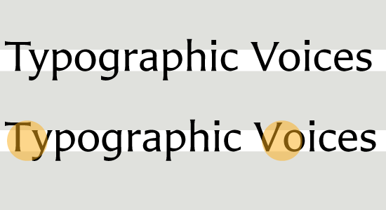
In the sample above, kerning has been deactivated for the second line. The gaps between the letters T y and V o are too large when compared with the amount of space between the other letters in the text. The typeface used in the image is Carter Sans.
Despite the popular misuse of the term in graphic design circles, “kerning” does not refer to the spacing values to the left and right of the letters in a font. Rather, fonts contain a list of kerning pairs to improve the spacing between the most troubling lettering combinations. The importance of kerning in a font is the role it may play in maintaining an optimal rhythm. Just as kerning describes something much more specific than a typeface’s overall spacing—or the tracking that a graphic designer might apply to a text—kerning is not the rhythm of a typeface itself, but an element that may strengthen a typeface’s already existing rhythm. Not every typeface design requires kerning, and there are typefaces on the market that indeed may have too many kerning pairs—a sign that the basic letter spacing in the font could have been too faulty in the beginning.
6. Consistent Rhythm Along the Line
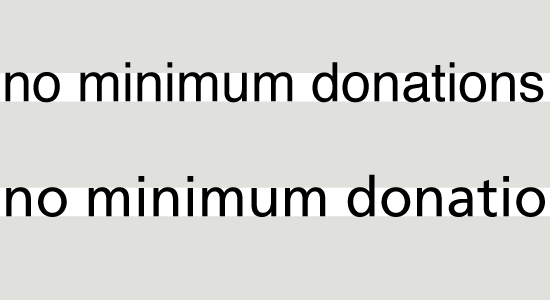
In the image above, compare the spaces between the letters of the Helvetica typeface (first row) with Frutiger’s (second row). Frutiger is a more humanist design, featuring a slight diagonal axis in its letters; many of them look similar to Helvetica’s, at least at face value. However, the space between Helvetica’s letters is much tighter.
While most of the images in this article feature typeface families that include Optical Size variants, many commonly used typefaces on the market today do not offer these options. This is why it is helpful to be able to identify text typefaces based on their features, rather than just on their names in the font menu. As mentioned earlier, it is primarily the typeface’s rhythm that dictates the readability of a block of text.
Take Frutiger and Helvetica, which are both commonly used in text, especially for corporate communication—Neue Helvetica is even the UI typeface in iOS and MacOS X 10.7. Yet, despite its popularity, Helvetica is not very effective as a text typeface; its rhythm is too tight. By rhythm, I’m not referring to tracking—or any other feature that a designer can employ when typesetting—but the natural flow of space between letters, and within them as well. Frutiger is a much more open typeface—the spaces between its letters are closer in size to the white spaces inside of the letters than in the case of Helvetica. Like all good text typefaces, Frutiger has an even rhythm—space weaves in and out of the letters easily.
7. Caveat: Signage Faces
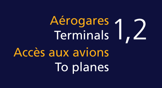
To round off my discussion on text typefaces, I’d like to briefly mention some fonts that are often shown in rather large sizes: fonts for signage. Interestingly, many signage typefaces have design features very similar to typefaces created for very small applications. The Frutiger typeface, based on letters that Adrian Frutiger originally developed for the Roissy airport in Paris (now named after Charles De Gaulle), is quite legible in small sizes precisely because it is a good signage typeface. Despite their size, signage fonts serve a rather different purpose than Display fonts.
Additional Elements To Consider
After considering the criteria mentioned above, the next question that often comes up is, “does this font have oldstyle figures, or small caps and ligatures, etc.?” A font’s letters might look really great in text, but if they do not include additional elements and features, their use is somewhat minimized. I avoid using fonts with small character and feature sets where I can, because I feel that the lack of these “extras” may break the kind of rhythm I aim to achieve.
1. OpenType Features
Once you’ve established a consistent rhythm by setting your text according to the correct size and application, it would be a pity to inadvertently break that flow. Large blocks of tall figures or capital letter combinations do just that.
Even in languages like German, where capital letters appear at the start of many words, the majority of letters in a text planned for immersive reading will be lowercase letters. Every language has its own frequency concerning the ratio of “simple” lowercase letters like a c e m n o r s u v w x z to lowercase letters with ascenders or descenders—b d f g h j k l p q y. In international communication, language support is a key consideration when choosing a font, and other character set considerations may especially play a role.
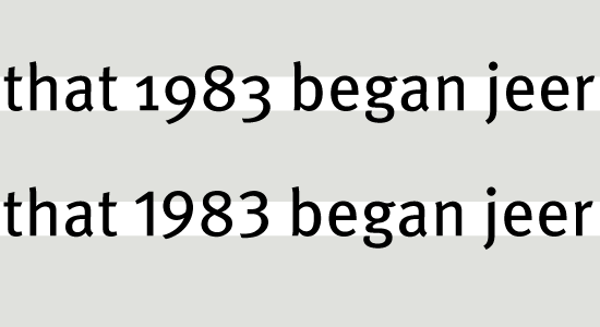
Traditionally, the style of figures used in running text also have ascenders and descenders. These figures—often called oldstyle figures or text figures—harmonize better with text than the “uppercase” lining figures. These so-called lining figures either align with the height of a typeface’s capital letters, or are slightly shorter. It is no surprise that, when shipping the Georgia fonts for use onscreen and online, Matthew Carter and Microsoft made the figures take the oldstyle form. Many other typefaces that have long been popular with graphic designers, like FF Meta (seen above), also use oldstyle figures as the default style. In my opinion, lining figures are best relegated to text set in all-caps.
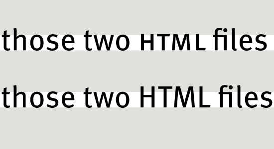
Long all-caps acronyms—like NAFTA, NATO, or USSR—also create an uncomfortable block in the line for the reader. Setting these letter-strings in small caps helps reestablish a specific typeface’s natural rhythm in reading sizes, as may be seen in the first line of the image below (set in Erik Spiekermann’s FF Meta).
Along with common ligatures like fi ff fl, small caps and the many figure options are the most common OpenType features found in quality text fonts. Aside from having both lining and oldstyle figures, OpenType-functionality can enable a font to include both tabular and proportionally-spaced figures, numerators and denominators for fractions, as well as superior and inferior figures for academic setting. Additional OpenType features (such as contextual alternates or discretionary ligatures), are more powerfully noticed in display sizes, and in some cases can even be distracting in text.
2. Hinting
The display of text on screen, particularly on computers running a version of the Windows operating system, may be fine-tuned and improved with the help of size-specific instructions inside of the font file. These instructions are commonly referred to as “hints.” A TrueType font (or a TrueType-flavored OpenType font), is capable of including hinting. However, not every font manufacturer goes to the effort of optimizing the onscreen appearance of its fonts for Windows—even those fonts specially created for use in text sizes.
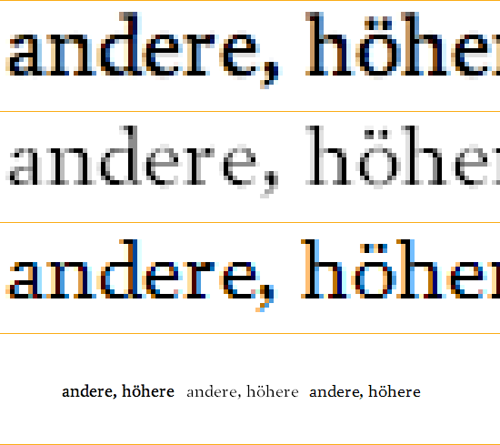
All of the text in the above image is shown in the same font: Prensa, set at 18 pixels. The lowest row shows this at actual size in three different onscreen rendering environments. In the enlargements, the top row shows a close-up of rendering in Safari on MacOS X, which ignores the hinting data in fonts. The second row shows rendering in Internet Explorer/WindowsXP (Grayscale only, for this sample). The third row is from a ClearType environment—in this case, from Firefox on Windows7. Prensa is a typeface designed by Cyrus Highsmith at the Font Bureau; the Web font is served by the Webtype service.
Recommended Typefaces For Readability
Aside from the typefaces already mentioned in this article and its images, here is a small selection of faces that I personally enjoy at the moment. Even though lists of “favorite” typefaces are about as useful as lists of favorite songs or favorite colors, I am happy to pass my subjective recommendations along. No doubt that as new projects arise, my list of favorites is likely to change, too. I do think that these typefaces serve as great starting places. Some are also just from cool friends whose work I dig. Alongside each selection, I mention whether this choice is currently available for print only, or if there is a Web font version, as well. Don’t forget: the typefaces that you pick in the end should depend on your projects, their audience, and the content at hand.

Arnhem is a no-nonsense high-contrast oldstyle-serif face. It is a contemporary classic for newspaper and book setting, designed by Fred Smeijers and distributed via OurType. Available for print and Web.

Benton Sans is a Tobias Frere-Jones performance of Morris Fuller Benton’s News Gothic genre. Designed for Font Bureau, it is not only a great typeface for small print in newspapers, but one of the best-rendering text faces for the Web as well. Available for print and Web.

Ibis is another Font Bureau typeface, designed by Cyrus Highsmith. This square serif family is also no stranger to cross-media text-setting. Ibis works just as well whether you use it in print or on screen. Available for print and Web.

Ingeborg is modern serif family from the Viennese type and lettering powerhouse, the Typejockeys. Like any proper family should, Ingeborg has optically-sized variants for text and display settings. The display versions of the typeface can get pretty far out, too! Designer Michael Hochleitner named this typeface after his mother. Available for print and Web.

Fred Smeijer’s work in contempory type design is so significant that he gets two shout-outs in my list. His Ludwig type family takes a nod from 19th century grotesques, but he does not try to sanitize their quirky forms, as so many type designers had tried to do before him. Available for print and Web.

This is one of the typefaces that I’ve designed. I’m somewhat partial to Malabar. Available for print and Web.

Martin Majoor’s FF Scala Sans has been my top go-to typeface for almost 15 years. It mixes well with the serif FF Scala type, but it’s also really great on its own. Available for print and Web.

Of all the typefaces designed by Hermann Zapf over his long career, URW Grotesk is clearly the best. Unfortunately, it has been a little overlooked. URW Grotesk is a geometric sans, with a humanist twist that brings much more life into the letters than this genre usually allows for. Plus, the family is super big. Available for print and Web.

Are you a DIY-fan? Do you like to print with letter press, whether you set your own type by hand, or have polymer plates made? Then check out the typefaces of Emil Rudolf Weiß! His Weiß-Antiqua is an eternal classic. Weiß may have passed away 70 years ago, but his work is still relevant. He was German, so his last name is sort of pronounced like Vice, as in Miami Vice. Available for print and Web.
Conclusion
There are many factors that play a role in typeface selection. Aside from just browsing through the available fonts that they have, or fonts that could be newly licensed for a project, designers regularly spend considerable effort determining the right typeface to complement a project’s content, or the message at hand. Understanding some of the thoughts that go into the making of text typeface—including how a typeface’s letters are fitted to each other to determine a text’s default underlying rhythm—helps lead to better informed decisions regarding what types are indeed apt, and which faces are better suited for other sorts of jobs. After having read this article, I hope you feel more comfortable with this kind of decision making, and that you will know what to look for with a font in the future.
Other Resources
For more information about choosing the right text fonts, you may be interested in the following books and Web resources:
1. Websites
- Better Web Typography With OpenType Features
- Figuring Out Numerals
- Figuring Out Numerals — The Sequel
- The @Font-Face Rule And Useful Web Font Tricks
- The Making Of FF Tundra
- What Should I Look For In A UI Typeface?
- Making Geometric Type Work
2. Books
- Counterpunch: Making Typefaces In The Sixteenth Century, Designing Typefaces Now
- Size-Specific Adjustments To Type Designs
- Thinking With Type
Note: A big thank you to our fabulous Typography editor, Alexander Charchar, for preparing this article.
(jvb) (il)


 Agent Ready is the new Headless
 SurveyJS: White-Label Survey Solution for Your JS App


