Interaction Design In The Cloud
Interaction designers create wireframes in tools such as Adobe Illustrator, OmniGraffle and Microsoft Visio. Originally, these wireframes were primitive shapes drawn to represent various UI elements. Many of us cannot imagine life without them.
There are, however, reasons to consider moving to the cloud to do interaction design. In short, today’s cloud-based tools are:
- Optimized for collaboration,
- Editable anywhere,
- Interactive,
- Published in real time,
- Self-maintaing (the user doesn’t need to update software),
- Payable monthly,
Emailing your old static designs will feel old fashioned once you see what these tools can do. Going a step further, there are tools for the user review process, too. Just upload your ideas, from simple mockups to final layouts, link them together, and share them for comment.

(Image credit: baldiri)
This article walks you through the current selection of cloud-based tools and provides some recommendations. The number of offerings and amount of functionality are pretty vast. For the sake of brevity, we’ll address two functions: prototyping and wireframing. But if you’re intrigued, you might want to explore cloud-based image editing, mind-mapping tools and other UX activities. These tools are already out there, and surprisingly good.
Further Reading on SmashingMag:
- 5 Interaction Design Tactics For Visual Designers
- The Skeptic’s Guide To Low-Fidelity Prototyping
- Content-First Prototyping
- Upcoming Web Design Conferences
Prototyping
For our purposes, prototyping involves uploading images (screens) and linking them together via hotspots. Once these are set up, the prototype is published and available to reviewers for usability testing, commenting or both.
Review criteria Here are the fundamentals that a product should support in order to compete in this space:
- Quick uploading process,
- Support for several source image file formats,
- Easy linking between pages,
- Support for feedback from end users.
Some items aren’t available as of this writing:
- The ability to nudge images in line without having to recreate them;
- The ability to create interactive objects and layer them (such as a menu bar that appears on every page).
InVision
What it does Create your screens in your favorite tool and upload them to InVision. Then add hotspots; a hotspot links to another page. This is great if you live and die by the comp (Photoshop file). For example:
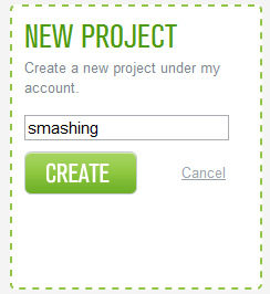
- Create a new project. Think of a project as a collection of previously generated comps that you are going to tie together as a prototype via InVision.
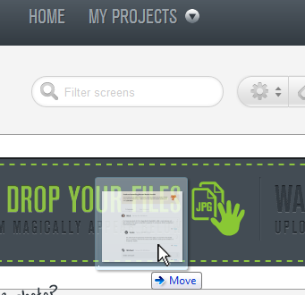
- Upload your files to this new project (the images in this article are PNGs).
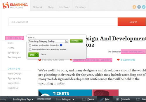
- In “Build” mode, create the hotspots. Basically, you are linking together the prototype. If you have all of the collateral that you need, this will go quite fast — exactly as you’d want it to work.
Observations The application works as advertised. It enables the user to quickly wire up prebuilt comps, wireframes and sketches. The tutorials also explain useful actions, such as creating hotspots that will be the same on multiple pages (these are called “templates” in InVision).
Speaking of templates, they expose both a major advantage and a major disadvantage of this tool: if the uploaded images are not placed perfectly, then the templates will not line up properly. One would want the ability to adjust the x and y coordinates of any image so that they line up perfectly without having to change the source files. On the upside, if you’ve done the prep work right or you’ve made your hotspots large enough, you can fudge this a bit, and the templates really accelerate the build process.
A number of usability issues have made me scratch my head. For example, the first time I tried adding a hotspot to the search input field, the “Link to…” modal dialog was off to the left side of the browser, which made it impossible to save or cancel the dialog. I then tapped the “Update screen” at the bottom of app to refresh the screen. It turns out that in InVision speak, “Update” = “Replace.” I was afraid to refresh the browser because there is no indication of whether the application saves automatically. So, in the end, I switched to “Preview” and then back to “Build.”
Once you’re familiar with the quirks, however, the application is useful. If you’re a designer or want to work offline to generate wireframes, then give this app a hard look.
- Upload process. Drag and drop, or browse the file system
- Supported file formats. JPG, PNG and GIF
- Linking pages. Easier than the others tested because of templates
- User feedback. Easy, nested
- Marquee clients eBay, Google, Intuit, Whole Foods and many others. Very impressive.
You can taste the fruits of my labor. Remember, being online means it’s delivered to whoever, wherever, whenever it’s done. Feel free to add comments.
FieldTest
In spirit, FieldTest (in private beta) serves the same space as InVision. The designer uploads prebuilt comps, wireframes and the like to FieldTest, ties them together, and then publishes them for review. One advantage is that FieldTest leverages device gestures. In short, you can “play” FieldTest prototypes on your iOS, Android or Windows Phone 7 device and have it respond to gestures. Combined with the built-in screen transitions, this is a powerful function for mobile app designers.
As with InVision, screens are grouped into “prototypes” (projects). Including them in a project means that they can be linked to and from other screens. The process is the same, too: create the prototype collateral, link it together via hotspots, and publish it for review. For comparison’s sake, here are the hotspot configurations for the two apps.

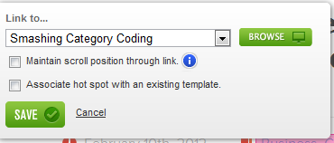
This demonstrates the differences in approach. On the top is FieldTest. It allows a user to choose between gestures (the prototype I built was an iPhone app). The gestures are tap, long tap, swipe, swipe left and swipe right. Multiple gestures can be active for the same hotspot, which is particularly cool and gives a realistic experience of various actions. On the bottom is InVision, whose ace is templates. The author can create a template for several controls that appear together, and they can reuse that template on several screens.
Observations If I were to choose between these prototyping tools, FieldTest would be my choice, largely because I build mobile applications. Having listeners for multiple gesture types makes for a more realistic prototype. If the app were Web-based, then InVision is more mature.
FieldTest still has work to do, though. In the beta, gestures such as up and down are missing. Templating as InVision does is really useful. It streamlines the addition of hotspots. Another area for improvement is in comments, and allowing a prototype’s end user to provide feedback.
There are other usability nits. For example, FieldTest includes a status bar at the top of each screen. I have yet to figure out why someone would want this, and it’s not optional. So, if you take a screenshot on an iPhone, you’ll have to edit it to remove this status bar, only for FieldTest to put it back.
Try it out for yourself on the prototype built for this review. Please note, there is no down gesture, so if you want to try that, gesture from right to left (like when advancing through pictures in iPhoto).
- Upload process. Browse the file system
- Supported file formats. JPG, PNG and GIF
- Linking pages. Fairly easy
- User feedback. Enables gestures on the device, which is great.
- Marquee clients. In private beta
ClickDummy
ClickDummy is another competitor in this space and has the same process as the others. The user uploads materials and then links them together through hotspots. The link function is a “tool” contained in a drawer (i.e. a UI element that slides in and out from one side of the screen).

Observations This drawer seems innocent enough, but it creates unnecessary hurdles for the user. In an attempt to simplify the problem, it has added confusion and multiple steps to an easy process. How? The user has to toggle between this tool drawer and the page-picker drawer a lot. The page picker also has to be overloaded in order to provide both functions (selecting a page, as in navigation, and selecting a page, as in a hotspot target).
A second issue: the website says that the user can drag and drop images onto the pages drawer. This doesn’t work in my (Chrome) browser. It instead replaces the current page with the image. After a panicked “Backspace,” the user is restored to their project but has lost their location and has to start over.
Another point: this all-important drawer is closed when the app launches. It took about five minutes to determine that the app was working, and this after weeks of looking at apps in this space.
Lastly, unlike both of the apps reviewed above, this one has no compelling feature that makes the additional effort worth the time. In future, hopefully, the addition of some product differentiation, combined with a rework of the primary use case, would make this application worth another look.
You can see the output from this exploration for yourself.
- Upload process. Drag and drop, or browse the file system.
- Supported file formats. JPG, PNG and GIF
- Linking pages. Most difficult of those tested
- User feedback. Easy to test, but comments require registration
- Marquee clients. Not provided
Wireframes
Think of a wireframe as a black and white low-fidelity screen mockup. The mockups I create also include call-outs to give the development team additional context.
In the process, the user will create an account, create a project, and then land on a blank screen. The user then drag and drops UI controls (radio buttons, text input fields and so forth) onto the page.
Once the project is saved, a permalink can be given out for people to see your work. If you change a screen, it will auto-magically show your updates the next time that URL is opened (or refreshed) by a team member. This last point is what the cloud is all about: everyone always has the same (i.e. current) version of your work. Changes are instantaneously available whenever the wireframe is saved.
Compared to most offline tools, the library of available objects is focused on low-fidelity UX. Don’t expect to create gradients or to use a pencil tool.
Review criteria Here are some basics that are fairly universal in my experience:
- Robust set of standard UI controls. If the tool doesn’t have off-the-shelf drop-downs, toggles, cover flows and the rest, then creating those controls will require additional work.
- Good as a documentation medium. Plan on your development team using your wireframes to dictate the logic and layout of the application.
- Good for making wireframe clones, templates or whatever you want to call them. Not surprisingly, all of the iPhone wireframes I create have the app’s name at the top. I want to do this on the first wireframe and not have to do it again.
- Responsive. It all takes place in a Web browser. If the application is slower than a locally running application, then your productivity will suffer. Case in point: a year or two ago, I created about 50 wireframes for a project. Each page took a minute to load. To see my changes reflected, another minute. Trust me, this gets old quickly.
- Not written in Flash. “Dear development teams who write these tools: I love Flash, Flex and the rest. Not as much as I love my iPad, however. I want to edit my work across form factors. It’s all drag and drop, right?”
Here’s what you won’t see right away from the tools out there:
- An extensive stencil library or the ability to easily create and reuse stencils. OmniGraffle excels at this. Don’t expect Yahoo to create a stencil library for Mockingbird anytime soon.
- A wide user base. Momentum is building, and there are believers. This is still a minority position and will be for some time. I would say customer support is great, but the more people use these tools, the better the tools will become.
- Font selection. I won’t dwell on this, but you can tell there is still some lively debate about what a wireframe should and should not communicate just by looking at what features are included in any given product.
Balsamiq
As with the prototyping tools, wireframes — or “mockups” in Balsamiq-speak — are organized into projects. From there, things change. Tools like InVision and FieldTest assume that you have created your pages or screens in another tool. In Balsamiq (and Mockingbird, discussed next), the tool is designed for wireframe creation, with extremely limited functionality for prototyping.
- Create a new mockup.
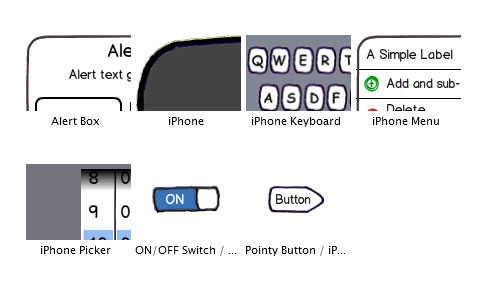
- Drag and drop an off-the-shelf UI control from the ones available.
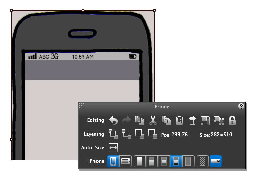
- Configure the control to your needs. This is noteworthy, because Balsamiq provides a number of important options. For example, there is one toggle to put the iPhone in landscape orientation instead of portrait.
- Add the rest of your UI controls; document for the development team; and publish.
Observations Having worked with some other tools, I’ve become a fan of Balsamiq. A great UI control library and easy object configuration are two areas where this tool excels. There are some areas for improvement, though. First, and I’m sure the development team is tired of hearing it, the sketching style is fine for those who understand low-fidelity mockups, but you probably wouldn’t want to show the mockups to your CEO.
A second gripe is that the editing tool is built in Flash, so work is limited to platforms that support it.
On the upside, a few non-obvious pros:
- The icon set is great. I’ve noticed that only one icon is not in the box: Bluetooth. Anything else I’ve needed has been available.
- In addition to drag and drop, there’s a great quick-add feature. After typing in a few characters of the name of a UI control, a filtered list appears, allowing you to add controls quickly.
- Balsamiq has an odd markup language that, once mastered, allows the user to add common things. For example,
+ Add and sub-menu, >translates to:
And here’s the rundown:
- UI controls. More than 70, including iPhone-specific
- Good for documentation? Call-outs are one of the controls; drag and drop them onto the canvas.
- Good at duplicating screens? Yes.
- Responsive? Yes. You will forget you are working in the cloud.
- Written in Flash? Yes.
Mockingbird
Mockingbird is also a wireframing tool, and a good one at that. In some ways, it compares favorably to Balsamiq: Mockingbird’s editor isn’t Flash-based; it uses an unobtrusive font; and adding UI controls is (almost) comparable to Balsamiq.
The process is similar, too. Here’s the outcome:
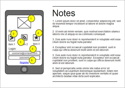
Observations More professional, right? On the surface, it is more polished, but there are some subtle shortcomings. For example, one cannot left-justify text in an input field. Also, I couldn’t get the icons to all be exactly the same size (36 pixels). And so forth.
There are some logistical hurdles as well. Many of the controls are primitive. To add a call-out, like ones in yellow above, you actually have to add two objects: the yellow circle and the black text. And when a control is added via the quick-add function, the filtering text is not cleared, so after every addition, one has to clear the previous query. Put practically, this mockup took about four times as long to create as the Balsamiq version.
- UI controls. Fewer than Balsamiq, and no mobile-specific controls.
- Good for documentation? Call-outs are created with circles and overlaid text.
- Good at duplicating screens? Yes.
- Responsive? Mostly — don’t use Chrome.
- Written in Flash? No.
Mockup Builder
Another entry in the wireframing space is Mockup Builder. Functionally, it lies somewhere between Mockingbird and Balsamiq. It has a fairly good library of controls — in fact, it’s the only cloud-based solution with native Android controls (Ha!). Moreover, I find its aesthetic better than that of competitors.
Like the others, Mockup Builder starts with a blank canvas, and the user drag and drops controls onto the canvas for configuration.
Here’s the mockup created for this review:
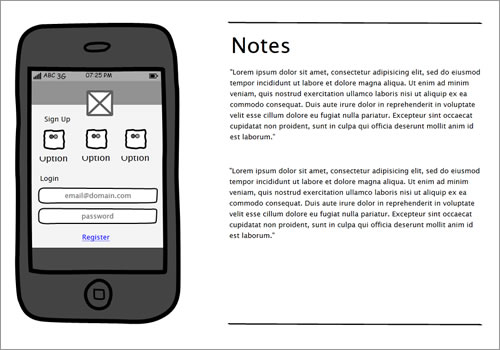
Again, the mockup is fairly clean, but there are some issues: the icons use some funny clipping, and they do not scale properly. The user cannot toggle the various defaults for the iPhone, such as the gray bars at the top and bottom of the screen.
Observations This tool is a little too buggy for everyday use. For example, the notes to accompany illustrations are in Lorem Ipsum text. Also, when copying text from the Web and pasting into a multi-line text area, the text does not wrap to the control’s width — meaning that the text shows exactly one line, and the user has to use the control’s handles to wrap it. I also wanted to show two paragraphs of text but could not figure out how to insert a “Return” in the text.
Another grievance: the tool could use more polish. For example, the screen surface on the iPhone control is narrower than the keyboard, so the user has to resize the keyboard by hand. When that’s done, the “e” is missing in the button. I understand that these are minor, but one would expect these t’s to be crossed off before moving away from a beloved tool like OmniGraffle.
- UI controls. More than the others, including iPhone- and Android-specific ones
- Good for documentation? Call-outs are one of the controls; drag and drop them onto the canvas.
- Good at duplicating screens? Yes.
- Responsive? Yes.
- Written in Flash? No.
Conclusion
Cloud-based tools are now available and well designed for UX work. Many of the features in the offerings above are not available in software running locally on your machine. While this space is still growing, I’ve been working in the cloud for the past two years and cannot imagine going back.
Collaboration is instantaneous, and the tools are optimized for the right activities: wireframing and testing with users. In fact, these apps have several unexpected and delightful features, and you might find yourself walking away from your favorites, too.
Of course, there are valid reasons to avoid working in the cloud. Stay with your old standbys if any of the following apply:
- Your IT department disapproves. This is a hot-button issue. All of these tools protect your information, but this is still worth considering.
- You expect the polish of offline tools. These tools are for early adopters. Still, they are Web applications, so they will evolve. That’s what happens on the Web. You’ll just wake up one morning to find some annoyance removed or a key feature added.
- Your project is big. If you plan on a 200-screen flow, you will feel a steady degradation in performance. That said, I’ve just completed a 70-pager with one of these tools and was just starting to notice some minor falloff.
- You think in terms of “deliverables,” with a complete set of create-once mockups. Many of these tools have coauthoring functionality (if the roles are set up that way). In my experience, however, no one has actually changed anything, even if I wanted them to.
- Your Internet connection is a problem. But that’s not to say that you’ll lose data whenever the network is interrupted.
These could be a deal-breaker for some. But these tools are free to try, and some are so simple that you might get hooked in five minutes (as I did a few years ago). Almost all of the research for this article was done with free trials. Given the ease with which you can try these out, you have every reason to go out and see whether one or more is right for you.
If you have another favorite, we’d love to learn about it. The space is ever changing!


 SurveyJS: White-Label Survey Solution for Your JS App
 Agent Ready is the new Headless

