MUD: Minimum Usable Design
There is a paradox that fits my life. Doesn’t matter what aspect of my life I am talking about because it always seems to apply. Even more so when I think about this paradox and the design of this website and other websites. I really hate this paradox.
“To walk through the woods, you first need to walk halfway through. Then, once you’re in the middle of it, you still need to walk half of the remaining distance, then half of the distance again, and then another half, and you can never successfully make it through the woods.”
This example is based off of Zeno’s paradoxes, which are even more mind-boggling than the one above.
No matter what stage of a design I am in, I am always halfway there. This is why you might find yourself always saying that you need two more weeks to finish up all the details. It will always be two more weeks no matter what, because all you did was get halfway from where you were to where you are trying to go. Using this mentality can wear you down, but if you twist it around a bit, it can be used as motivation to achieve a successful design.
Further Reading on SmashingMag:
- How To Think Like An App Designer
- How To Convince The Client That Your Design Is Perfect
- Following A Web Design Process
- How To Be A Samurai Designer
A Totally Made Up Theory
Let’s use our good ol’ sparring partner Google as an example. You are about to sit down and create the first home page in Google’s history. If you had an infinite amount of time you could tackle any part of the design that you wanted without any worries. But unfortunately life doesn’t give us non-deadlined projects. Because of this, you know the goal that you are striving to achieve—you know what it looks like once you leave the woods, so first, you just have to get halfway there.
If the very first half makes the design at least 50% usable then what would you design first? The logo? The footer? The obvious choice would be the search box and button. In fact, if you design that, then you are probably over 50% of the way through with the design because the website is now usable. It’s good to get that first 50% out of the way, and now you are halfway to your end goal. Some people like to call this working from the inside out.
Next step is to get halfway from where we are now to where we need to be. I think it’s important that we have some kind of branding on the page so people know where to come back to next time they want to search. That means I put the logo on the page. Once I am done with that I’m 75% of the way to my goal. 75% of the way through and how many people in the world would be satisfied with using Google if it had nothing but a logo, search bar and one button on it? I’m betting more than 75%. But if getting 75% of the way towards our goal can please even 75% of our audience, we might be doing a good job.
If you continue on with this process of knocking out half of what you need to do, eventually you will get close enough to your goal where good enough is as good as you are going to get. I know people argue about what good enough means, but if you are 99% of the way to where you are trying to go, then good enough is good enough.
MUD
In the startup community there is a term called minimum viable product.
“A Minimum Viable Product has just those features (and no more) that allows the product to be deployed.”Minimum Viable Product, from Wikipedia
I’m coining the term Minimum Usable Design, and that is when you reach your 50% mark for your design. If you can’t use your design after you have reached 50% (or a person can’t understand at least 50% of what is going on) then you haven’t reached the 50% mark yet.
By no means does this imply that you should show your design to the public at the 50% mark, but you can use it as a way to gauge your progress. Sometimes you need to wait untill you are 99% done before showing your work to a larger audience. There is nothing wrong with striving for perfection, but it depends on your design and audience. Apple does minimum viable product with the limited features on their products, but make up for it with maximum viable design (a new term, crown me king).
An Example
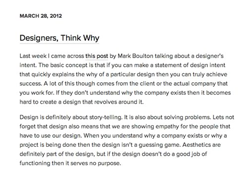
Blog design is a very simplistic example, but lets run with it. On my website, Drawar, the main goal is to get people to read the content. If I can do that, I have achieved my number one goal, and it just so happens that this goal will keep the majority of my audience happy. Because of this, I want to make the content easy to get to, and so I need to know what design will help me get there.

The 50% mark. Not much, but it achieves the #1 goal.
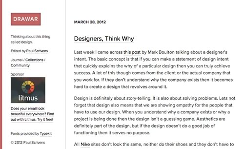
With this design, anyone that comes to my website can read the content. That is 50% of my journey, but now I need to go the other half to reach another subset of people coming to my design. I decide next that there should be some branding on the website so that people can know where they are at and remember the website if they visit it again.
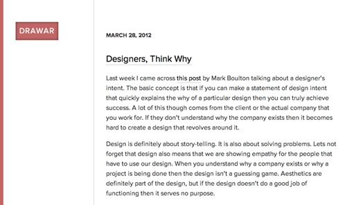
Now when you visit the website you know where you are at, but notice that the additions didn’t take away from the original MUD that I created. From here I can take another halfway point journey by adding links to other sections of the website, and also provide a bit of context about the website they are on.
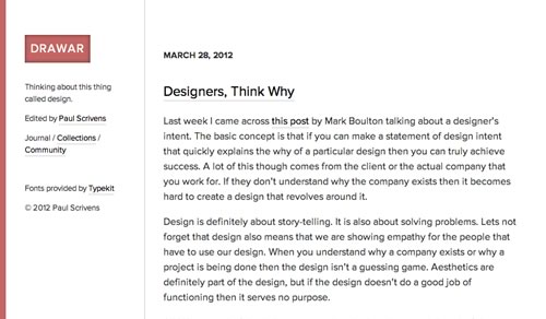
Again, the additions do not take away from the original 50%, so that is a good thing. Time for one more halfway journey before I push the website out, and that would be adding some revenue.

93.75% complete (well, at least to me).
Basically the design is finished, but there are additional things I could add to the design to make it more complete to some people. For example, search, social media widgets, and possibly a blogroll. I’ve set the goals of the design though, so I understand the milestones that I want to achieve.
Design Is Never Finished
Although I’m happy with the end result of the design, it doesn’t mean it will work for everyone that visits. Someone will always want to get more out of a design, and that is why a design will never be able to leave the forest. Fortunately, the more halfway points you knock out in a design, the smaller the subset of people that are still wanting more out of it. Be careful though, because adding too much will take away from the original 50%, which was the main purpose of the design from the beginning.
And don’t think that this only applies to “minimalistic” websites—that is just my style of design, but it applies just as much to the designs that add a lot of flare to their aesthetic. Tweetbot, for example, isn’t any less of a usable design than other Twitter clients in my mind, because it adds a bit more flash to its design elements.
Always aim for the next halfway point and you will get closer and closer to the edge of the forest—but remember that you will never reach the end. Designs can always be improved upon, and therefore will always be unfinished.
Image on frontpage created by Libby Levi.
(jvb) (jc)


 Agent Ready is the new Headless

 SurveyJS: White-Label Survey Solution for Your JS App


