Do Mobile And Desktop Interfaces Belong Together?
The term “responsive design” has gathered a lot of well-deserved buzz among Web designers. As you probably know, it refers to an easy way to dynamically customize interfaces for different devices and to serve them all from the same website, with no need for a separate mobile domain.
It solves one major problem, and very elegantly: how to adapt visual interfaces for mobile, tablet and desktop browsers. But when unifying a website, you have to solve problems other than how it will appear in different browsers, which could make the task much more difficult than you first realize. A solid design has to account for differences in interaction when using mouse pointers and when using touch gestures, as well as the bandwidth constraints on mobile users.
Further Reading on SmashingMag:
- Improve Mobile Support With Server-Side Responsive Design
- Approaches For Multiplatform UI Design Adaptation: A Case Study
- How To Sketch For Better Mobile Experiences
- Authentic Design
You might also have to restructure content according to how much information it makes sense to present on each screen. And the new breed of mobile Web apps that leverage HTML5’s offline capabilities might have to be built much differently than conventional desktop websites. Hopefully, after considering these problems, you should be able to implement a responsive website that is suitable for all devices; but you’ll need a fallback plan if that’s not possible.
This article looks at how a typical responsive website is targeted to mobile handsets and tablets, contrasting it with its desktop-facing sister website. It considers how such a website might also be deployed as a cached HTML5 Web app, and why you might want to do that instead. For various reasons, discussed here, you might decide to target your responsive design more narrowly as a hybrid for smartphones and tablets, keeping it separate from the desktop interface. For those of you who opt for this route, the remainder of the article will explore ways to better integrate the different websites, or Web apps, and how to make it easier for users to learn about the appropriate interface, get to it and stay there.
A Responsive Design For Mobile And Tablet
The BBC recently started rolling out a new version of its mobile news website, which serves as a perfect example of how to adapt an interface very effectively just by detecting the screen’s width. Below is the same page viewed with different layouts targeted for the iPhone and iPad. You can see the interface transform dynamically by viewing it in a desktop browser and resizing the window:
The single-column mobile interface transforms into a multi-column interface more suitable for tablets, with a richer set of navigation options appearing at the top of the screen. While the multi-column interface is a bit more complex, it’s still cleaner and less cluttered than most desktop-facing websites. BBC News, along with similar websites such as the Boston Globe and Smashing Magazine, exemplifies the trend towards “mobile-first” design; i.e. starting with a clean mobile design and progressing upwards as needed, rather than trying to jam a full desktop-style interface into a single column. Most responsive websites rely on CSS media queries that reference screen widths, but they can also respond to specific browser features and exhibit fallback behavior that “progressively enhances” an interface.
These techniques are so easy to apply that you might wonder why not all websites are built like this. It could simply be due to inertia, in which case developers need to do a better job of spreading the word. But the next section explores what may be deeper reasons.
Why Desktop Is Different
The adaptive interfaces referred to above are a healthy development, one that could lead to uncluttered desktop interfaces in the future. Still, there may be times when mobile or tablet interfaces should feature a different set of content than for desktop browsers. For one thing, media queries use up precious bandwidth. The BBC’s desktop design features a much richer set of content around the margins, such as ads and sidebars, which you’d typically exclude from the mobile interface.
Unless you perform feats of conditional loading for various regions on the page, any content that you hide using CSS’s display: none declaration is still served to the browser, perhaps at considerable cost over a mobile network.
A desktop page also features a much richer set of navigation options, especially up in the banner. On many desktop websites, users have drop-down menus to access nested categories in a single move. But in mobile interfaces, each set of navigation options is usually presented one at a time; for example, with iPhone-style sliding drill-down menu panels. You might also have to fix navigation elements to the screen, so that users don’t have to scroll to the top of the page to access them. Imagining how you would consolidate such requirements within a single hybrid website might be fun, but it can certainly get complex. Desktop websites can also rely more heavily on navigation driven by search, which is more difficult to manage with virtual keyboards.
Below is the sort of adapted mobile interface you might encounter in the wild. Those tiny navigation tabs might be fine for a desktop interface, but they are uncomfortably small for a touch interface and should serve merely as visual cues. Increasing their size would only crowd out other screen elements and limit the total number of tabs you could use. In this situation, swiping left and right to navigate the panels would be natural for mobile users. You could certainly add support for touch gestures to a mouse-driven website, but that’s another input mode to account for and to integrate in the interface.
Most of all, mobile users are usually in a different frame of mind than desktop users. We can’t really make any precise assumptions about the context of the device usage, but compared to desktop usage they quite often will be standing up and walking around or driving, and sometimes just scanning their handset or tablet. This might call for less detailed content than what you would use for more focused desktop users. Instead of presenting all of the day’s news items, for example, tracking unread items or the most popular trending items might be more important. Users might also want different content depending on their location. Even viewing a browser in full sunlight calls for a higher-contrast design, with fewer details that would make you stop and squint. Other times, such as when waiting for a connecting flight, mobile users will have more time on their hands and attention to spare. Overall, mobile contexts are far more varied than desktop and laptop contexts.
Even though mobile handsets and tablets are much more varied in size, their similar usage patterns and reliance on touch gestures could make deploying a responsive interface for those devices easier than deploying one that also targets desktop browsers.
Mobile Web Apps Vs. Mobile Websites
Using media queries to adapt an interface is a powerful technique, but we must recognize how superficial it is. It does little to address the particular needs of cached mobile Web apps, which could be built much differently than conventional websites. Consider how the BBC’s website is deployed. Users navigate links to load separate pages, and the overall set of available URLs shifts as the news changes.
A Web app might rely on the HTML5 application cache. A small set of HTML and other files would load once and install in a browser cache, and then populate data dynamically using AJAX. Assuming that you also cache the data, users would be able to open the application and retrieve the news in the absence of a network connection (a common “reading on the subway” scenario), with data updating once the browser detects that it is online again. It’s a much looser system that adapts to the more wide-ranging needs of mobile users.
A cache is implemented as a manifest file that’s specified at the top of the HTML file and evaluated before the rest of the HTML loads:
<!DOCTYPE html>
<html manifest="appcache.php">
<!-- the rest loads conditionally -->
The manifest lists all of the component files that need to be cached. The example above uses PHP to specify the correct MIME type within the markup, rather than as a server configuration option:
<?php header('Content-type: text/cache-manifest'); ?>
CACHE MANIFEST
# version 1.0; change version# or other content to update app
CACHE:
index.html
css/styles.css
js/app.js
img/home.png
img/about.png
img/back.png
The first time you land on the page, all of these files will be cached. After that, they are reloaded from the browser’s cache without ever touching your server. Only by changing the content of the manifest will the files be refreshed from your server. The JavaScript might communicate separately via AJAX, but typically with some sort of fallback for offline use.
This way of structuring a website as a fixed-footprint package of files doesn’t adapt well to more conventional server-driven websites. There would be no point in caching an application whose set of component pages changes frequently, as the BBC’s does with each batch of news.
Web apps are becoming popular because they offer developers a cross-device alternative to native application platforms. Most features of native apps can be implemented as browser-based apps, executing on the client as if the app had been formally “installed” from an app store. Web apps can be accessed on most platforms using icons on the home screen, and they might be set to hide browser controls in order to take total control of the interface. Once a Web app is saved to the home screen, there may be nothing to indicate that it is being implemented as a Web page.
The following lines, placed in the page’s head region, target different devices with different-sized home screen icons, with the precomposed fallback that is supported by some Android browsers:
<link rel="apple-touch-icon" href="img/app_iphone.png" sizes="114x114" />
<link rel="apple-touch-icon" href="img/app_ipad.png" sizes="72x72" />
<link rel="apple-touch-icon" href="img/app_nokiaN9.png" sizes="80x80" />
<link rel="apple-touch-icon-precomposed" href="img/apple-touch-icon-precomposed.png">
The following line enables full-screen Web apps on iPhones. Thus, when the user selects the app from the home screen icon, nothing on the screen would tell them that the app is running in a browser:
<meta name="apple-mobile-web-app-capable" content="yes" />These three features — the application cache, home screen icons and full-screen mode — are what most strongly distinguish mobile Web apps from ordinary Web pages. To get into more details about the Application Cache, make sure to read Jake Archibald’s article Application Cache is a Douchebag on A List Apart.
Traffic Control
For all of the reasons discussed above, websites that were created specifically for certain device classes might be easier to control and optimize. Either forking or consolidating a website has its pros and cons. Having a single access point means that the same URL will serve the content to all devices without the risk of losing context, but with the extra cost of designing and maintaining a structure that fits all needs. Developing separate websites tailored to different device classes means you can focus on highly optimized content, but at the cost of maintaining more than one design. With the latter approach, you might also have to consider ways to maintain context when the user jumps from one interface to the other.
On many websites, if you land on a page with the “wrong” browser, nothing happens. Many websites seem to assume that users are aware of the availability of a separate mobile website and don’t account for the likelihood that they’ve landed on a random desktop-facing page via a Facebook or Twitter link. At the very least, each website should link to its various interfaces, as done at the bottom of many BBC pages:
Alternatively, consider placing such controls prominently at the top of the page, otherwise the availability of an alternative interface might not be obvious. Pages designed for the desktop usually don’t specify a viewport, so they would load with tiny content on mobile devices. The user would have to zoom in to view the page, then scroll to somewhere around the bottom of the page to find the link, if they even thought to look there. Assuming that visitors to your website have just arrived from the planet Neptune is not a bad idea.
The BBC uses another approach, simply redirecting many smartphone browsers from the desktop website to the mobile website. If you decide to navigate back to the desktop website using the link at the bottom of the page, the URL will be appended with a ?mobile, which prevents another redirect from firing. That works during each browsing session but is not saved as a preference.
You could instead prompt users to go to the other website, but be sure not to do so every time they visit, or else it will get annoying. The simple example below is relevant if you host different websites on the same domain. It sends a prompt and uses jQuery to cache the answer as a domain-wide cookie. The matchMedia API offers the ability to test the same set of CSS media queries that you use to assign the layout, but instead calling them from within JavaScript:
function checkRedirect() {
    // media query
    var query = 'only screen and (max-device-width: 800px)';
    // from a page on www.foo.com
    var mobileUrl = 'https://m.foo.com/';
    // does the user already prefer desktop UI?
    if ($.cookie('preferMobile') == 'n') return(false);
    // is app running on a mobile/tablet browser?
    if (!!window.matchMedia && window.matchMedia(query).matches) {
        // has user already stated preference for mobile UI?
        if ($.cookie('preferMobile') == 'y') window.location.href = mobileUrl;
        // get user's preference
        if (confirm('Would you like to try the web app instead?')) {
            $.cookie('preferMobile', 'y', { path: 'foo.com' });
            window.location.href = mobileUrl;
        } else {
            $.cookie('preferMobile', 'n', { path: 'foo.com' });
        }
    }
}
The destination page would have to feature a control to reset the preference. Otherwise, users who change their mind would have no easy way to view the desktop interface without once again being redirected to the mobile interface. If you used the browser’s localStorage feature to cache the preference indefinitely, then its scope would be limited to each host name, rather than available across the entire foo.com domain. So, cookies are still good for something.
Once you’ve refined the basic redirect mechanism, devote some thought to how to retain more detailed context. Otherwise, users might become disoriented when they navigate back to the information they originally expected. If the URL structure for each website is the same, then a contextual redirect is as simple as modifying the host name:
www.foo.com/news/local/041912/police-log/
m.foo.com/news/local/041912/police-log/
If the mobile interface is implemented as a cached Web app, then the information would be passed more like this:
www.foo.com/news/local/041912/police-log/
m.foo.com?category=news&subcategory=local&date=041912&item=police-log
The Web app would then dynamically respond to the query portion of the URL.
Promoting Your Web App
Many websites present splash screens that alert users to a native iPhone or Android app, but there’s no simple way on a Web page to check whether such an app is already installed. There’s also no way to open the app so that the user can view the content they are looking for.
Because they’re basically Web pages, Web apps are easier to integrate with your other Web pages. Matteo Spinelli has a useful “Add to Home Screen” script that tells users how to install the mobile page as a Web app. So far, there is no single Web application-store portal to help users find Web apps to install, so the script might be the best way to raise awareness for now. The script points to the button on each handset that the user needs to press in order to save the Web app. These screenshots show how it looks at the bottom of the iPhone and at the top of the Nokia N9:
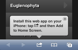

(Source: Let Me Spell It Out for You)
This useful feature can be set to prompt users to install the page only after they have landed on the website more than once.
There’s not yet any reliable way to track how many users follow through and save the page as a Web app. But you could enhance your website with an interesting workaround for the iPhone. If a page is enabled for full-screen viewing and the user saves it as a Web app and then loads it from the home screen, the browser controls will disappear from the interface. At this point, the standalone property will indicate that the user is accessing the full-screen app from the home screen, which you can interpret as a preference:
if (window.navigator.standalone) $.cookie('preferMobile', 'y', { path: 'foo.com' });However, the standalone property is contextual. It returns true when the user loads the page directly from the home screen, in which case the page will have no browser controls. But if the user navigates to the page conventionally within the browser application (such as via a redirect from a desktop-facing page), then the browser controls will still appear and standalone will return false. So, it’s a good way to track interest, although not to track the lack of interest among users who later decide to remove the Web app.
The W3C is formulating a more comprehensive full-screen specification that might fix such problems in browsers. Until then, apply a flexible screen layout to account for visitors who land on the page with or without browser controls.
Conclusion
This article asks whether your desktop and mobile interfaces really belong together and whether they should work as a single client-adapted website. This question has no single answer, but asking it is important. We’ve explored some of the reasons why the answer might be no, particularly if your needs are complex.
But your goal, as a developer with a vision of a unified design and an appreciation of technical elegance, should be to be able to answer yes, having dealt with those issues. Just don’t focus too much on visual design to the neglect of variations in interaction design, information design and underlying deployment. Be prepared if the answer is no. If you find you have to split off your desktop website, find ways to make the overall experience as graceful as possible for users, regardless of whether they land on one of your pages via an external link or via a home screen icon. That’s the whole point of responsive design.


 SurveyJS: White-Label Survey Solution for Your JS App
 Register Free Now
 Try ProtoPie AI free →

