Essential Design Patterns For Mobile Banking
Despite a great deal of mobile innovation, many creators of financial apps still copy their interface patterns from the desktop Web, even though these patterns are not as well suited to the mobile space. Small screens, custom controls, divided attention and fat fingers demand different thinking when designing for mobile.
I previously covered mobile wallet UX considerations in my article “Ultimate Guide to Designing NFC Mobile Apps You Won’t be Ashamed Of.” In this article, we will look specifically at simple mobile transfers of funds from checking to savings accounts, taking what works on the Web and converting it into authentically mobile flows using simple, effective design patterns. Similar analyses and design strategies can be applied to many other areas that involve complex forms, such as mobile e-commerce checkout and social network registration.
Further Reading on SmashingMag:
- Currency Design – Designing The Most Desirable Product
- Testing Credit-Card Numbers In Checkouts
- Getting Started With The PayPal API
- Free PNG Credit Card, Debit Card and Payment Icons Set
We will not name any companies in this article. That is deliberate. If you are looking for company bashing, you won’t find it here. But if you want to know how to make mobile banking work, read on.
Let’s begin with the basic building block: selecting an account. It can be accomplished in two primary ways: via a “picker” (called “spinner” in Android) and via a dedicated selection page (also called “table view”).
Picker/Spinner
For system interactions, many app and mobile website designers start by looking at the desktop Web interface pattern: a form with drop-down menus. Here is a common pattern for me-to-me transfers (i.e. transfers between two of your own accounts, such as checking and savings):

Typical me-to-me transfer via Web form.
The drop-down menu works reasonably well on the desktop Web, assuming the customer has between 1 and about 20 or 30 accounts. Each account can be listed in the drop-down menu by its full name, along with the account balance:

Selecting an account via the Web form’s select control.
How does this translate to mobile? Not very well. Blindly copying the desktop Web is a knee-jerk reaction, and it turns out that it’s mostly unsuccessful, resulting in a subpar experience. Here is why. Instead of the 20 or 30 selections that can be displayed in the drop-down menu, the iPhone’s standard picker control shows only 3 full and 2 partial choices:

Selecting an account via iOS’ picker control.
In Android 4.0 (the latest public Android version, named Ice Cream Sandwich), the situation is slightly better. Instead of the picker, the Android OS uses the spinner overlay, which shows 8 options. Unfortunately, the formatting options are quite limited, and the text area in the overlay is about 20% narrower than the main screen because the spinner is not using the full width of the device. This leads to confusing double and triple wrapping of text and numbers:

Selecting an account via Android’s spinner control.
Interestingly, some online banks use this pattern to display a list of accounts. However, by necessity (and to avoid the confusion of wrapping and truncation on older and smaller low-end devices), they use short codes for account names, such as CHK, SAV and CC1. These abbreviations work reasonably well for text banking, where the short-and-sweet mental model (“C U L8R”) reigns supreme. However, code abbreviations are far from the slick world-class UI elements that consumers have come to expect from their smartphones. Rather, they smack of “dim phones,” BlackBerrys, DOS and enterprise software. Having to remember codes to do mobile banking is a far cry from the experience of playing Angry Birds or shopping on Amazon or Gilt. To create a better experience on mobile, we need another design pattern: a dedicated selection page.
Dedicated Selection Page
A slicker and more usable mobile design pattern for listing accounts than pickers and spinners would be a dedicated selection page (also called “table view”) in which 10 or more account options could be listed comfortably. As Apple’s iOS developer guidelines state, “Consider using a table view, instead of a picker, if you need to display a very large number of values. This is because the greater height of a table view makes scrolling faster.”
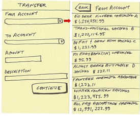
This is how it looks wireframed using the agile, lightweight, sticky-note methodology (see the “References” at the end of this article):

Selecting an account via a dedicated selection page (wireframe).
The advantages of using a dedicated selection page over a picker or spinner include the following:
- Any font and branding you like;
- A platform-independent experience;
- Use the entire width of the page;
- Text wraps as needed, so multiple device profiles can use the page comfortably;
- Display 10 or more options at a time, with comfortable scrolling.
The bottom line is that, with a dedicated selection page, you can easily display the account’s full name and balance.
How could this pattern be used with a form? One popular pattern is a form with dedicated selection pages. Unfortunately, this often creates very long flows.
Form With Dedicated Selection Pages
The idea behind this pattern is simple: copy the standard desktop Web form but use dedicated selection pages instead of pickers or spinners.
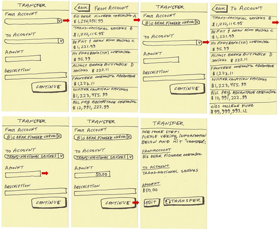
Using this mobile design pattern, our me-to-me transfer flow would look like this:
- Blank form;
- Dedicated page to select the “From” account;
- Back to the form (with the “From” field now filled in);
- Dedicated page to select the “To” account;
- Back to the form (with both the “To” and “From” fields now filled in);
- Fill in the amount, etc., and hit “Continue”;
- Verification page.
Here is the flow wireframed using the agile lightweight sticky-note methodology:

Me-to-me transfer via a form with dedicated selection pages (wireframe).
While this pattern works, it makes the flow quite long: seven pages. Could it be shortened? Absolutely. One excellent mobile-first pattern is the dedicated wizard flow.
Dedicated Wizard Flow
This is an extreme adaptation of the desktop Web form. This pattern works extremely well for short forms because it dispenses with desktop forms entirely, using a dedicated page for each attribute of the form.
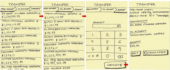
Using this pattern, our me-to-me transfer flow would look like this:
- Dedicated page to select the “From” account;
- Dedicated page to select the “To” account;
- Dedicated page to enter the amount, with a numeric keyboard;
- Verification page.
And here is the flow using the agile methodology:

Me-to-me transfer via a dedicated wizard flow (wireframe).
This pattern works very well for short forms, and it is a great example of Luke Wroblewski’s mobile-first design thinking. The entire flow is accomplished in only four steps. Note that a verification page (allowing the customer to review the entire transaction before tapping the final “Transfer” button) is recommended with this pattern. Note also the use of the breadcrumb pattern, which shows the customer which step of the workflow they are on and how many steps remain. The breadcrumb enhances this design pattern nicely.
Are we done? Should you create a dedicated wizard for every flow on your mobile banking website? Not so fast.
In mobile, nothing comes for free. That includes the dedicated wizard flow, which completely breaks down in longer forms. The basic idea is to have a dedicated page for each element of the form. But if the form has five or more elements, then the flow starts to get too long. Another issue is the inability of this pattern to distinguish between optional elements (such as “Memo”) and required elements (such as “Amount”). With this pattern, each element gets its own entry page with the appropriate keyboard and is likely to be treated as “required”. Even if the customer understands that they don’t need to enter anything, each element requires the customer to at least look at the page and click “Continue.”
So, is there another pattern for a page with five or more elements and many optional fields? I’m glad you asked. One of the most versatile yet underused patterns is the wizard flow with form. And as a bonus, this pattern dispenses with the need for a separate verification page.
Wizard Flow With Form
The idea here is very simple. Start with a dedicated page to select each account, and then show the rest of the fields in a form.
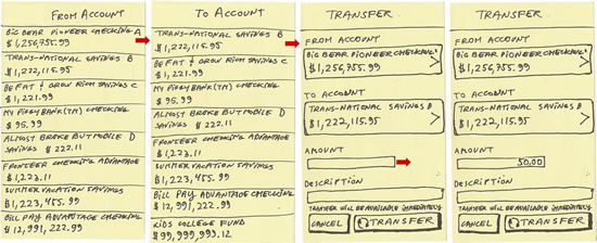
Using this pattern, our me-to-me flow would look like this:
- Dedicated page to select the “From” account;
- Dedicated page to select the “To” account;
- Continue to the form (with both the “To” and “From” fields now filled in);
- Fill in the amount, etc., and hit “Continue”.
Here is the wireframe using the agile methodology:

Me-to-me transfer via the wizard flow with form.
This mobile design pattern combines the best features of Web forms, such as the flexibility of having optional fields and multiple input fields, with the vastly improved usability of dedicated, mobile-optimized selection pages. Another boon is the option to dispense completely with the verification page, because the form page itself acts as an editable verification page. Of course, you could always append a separate verification page if you really must.
Editing is also much easier than with most other patterns. Instead of having to go through the entire flow again, the customer only has to edit the fields that need correction. For example, to edit the “To” account, the customer would tap the corresponding field in the form and be taken to the dedicated “To” account page, and then immediately back to the form, without having to go through the entire “From” account → “To” account → Amount flow again.
Mobile: Thinking Differently
As we’ve seen now, mobile design itself is usually not complicated. In fact, because people will be using your app with fat meaty pointers (commonly called “fingers”) in a stressful multitasking environment (commonly called “life”), a less complicated design is virtually guaranteed to perform better. However, designing for mobile is one of the most sophisticated exercises any of us is likely to encounter. Simply copying successful desktop patterns is usually the worst choice, yet it is the one many designers naturally gravitate to.
Designing for mobile requires thinking differently. Remember that in mobile, each form field requires at least an extra tap to bring up the keyboard, picker, dedicated page or other element to enter data. Instead of a vertical flow to guide the person to the next field, consider using a horizontal flow instead. Look for options and inputs to eliminate. Whenever possible, minimize the number of pages the person has to go through in order to complete the workflow; this will reduce input errors and increase customer satisfaction. Last but not least, make user testing the core of your mobile design process, and be sure to user test everything you design as early as possible.
References
- Rocket Surgery Made Easy, Steve Krug (New Riders: New York, 2010)
- “How to Make Agile Work for Your Mobile Design Project,” (registration required) Greg Nudelman, video from the Mobile Design Essentials Virtual Seminar, DesignCaffeine
- “Ultimate Guide to Designing NFC Mobile Apps You Won’t be Ashamed Of,” Greg Nudelman, DesignCaffeine
- “Mobile First,” Luke Wroblewski
(al) (da) (il) (jc)


 SurveyJS: White-Label Survey Solution for Your JS App
 Agent Ready is the new Headless


