One More Time: Typography Is The Foundation Of Web Design
So what is this question?
What is the secret to Web design?
A tough question and one that might not have an answer. In 2006, Oliver Reichenstein wrote Web Design is 95% Typography. Some people loved it, others were not so amused. If Web design was based that much on typography, then what was the point of learning anything else? All you needed to do is understand the elements of typography and you were good to go.
Further Reading on SmashingMag:
- Massive Collection of Nature Inspired Typography
- Out of This World Typography
- 30 Brilliant Typefaces For Corporate Design
- Weird And Wonderful, Yet Still Illegible
Of course typography doesn’t mean font selection. With the advent of @font-face and services such as Typekit, Webtype, Fontdeck, and Google Web fonts, your skills in typography won’t improve. You can easily create wonderful designs with one font for the rest of your life if you choose to—they had to do it centuries ago and they didn’t have Photoshop sticking things to guides for them. If anything, more font selection will make things worse for you because creativity and beauty become hard to achieves when more options are given to us.
More toys means more fun though, right? If you want to go that route, then by all means go for it. I love to look at the different fonts being used and admire anyone that can successfully pull off using newer fonts for the Web. However, I’ve seen too many times what can happen when development options are given to the masses, and it isn’t pretty (re: Myspace). Instead of having a user agreement it would be cool if Typekit made you read a book on typography before you could begin using a font—the Web would improve tenfold, if that was the case.
I’m not being sarcastic, saying that is all you need to know for a majority of websites. Try going through all of the Web designs that you love, strip out the images and ask yourself “how would that website look with just text and spacing?”. When designers say “text is the interface”, they really do mean it. The iA site is a great example of that.
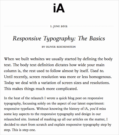
Information Architects is based around strong typography.
One of my all time favorite designs is A Working Library. The site is a showcase of text being the interface. The spacing is just right and the typography is on point.
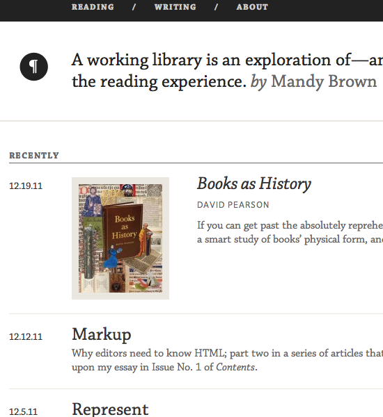
A Working Library by Mandy Brown.
Some people find design like this to be dull and boring, they feel that design should have more pop to it. At the end of the day some extra visual flair might be what separates your design from the rest, but you need to get the first 95% down. The website that you are reading this article on now has done a wonderful job of presenting a visual design that isn’t reliant on images to be beautiful.
Well That Isn’t Hard
It’s possible to create a wonderful design without the use of images at all. I know that sounds crazy, but it is possible. I’m not saying it should be done, but if we can create elegance simply with typography and white space, then why shouldn’t we be able to create greatness when we start throwing in images, videos and other effects?
With the use of images I’m not talking about images that are needed to represent something such as icons, but images that are there for flare. Sometimes a picture is worth at least ten better words than any word you could use, so it’s better to go with an image (but you still need to consider using white space with it).
Here are two more examples of beautiful websites that place a heavy emphasis on typography to control the design. The first is Blake Allen Design and the second is The Harriet Series (both use images to represent their typography, but you get the point).
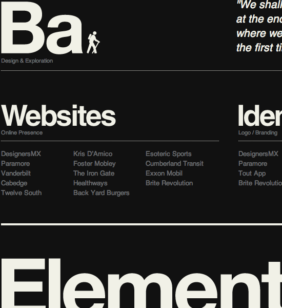
Blake Allen Design uses images, but with great typography.
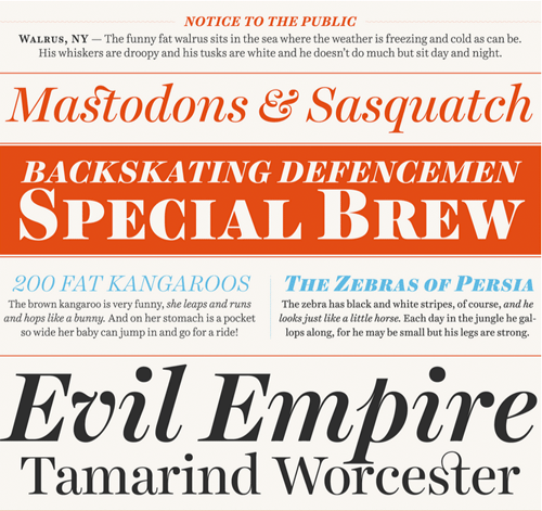
The Harriet Series by OkayType.
What makes the two designs above so interesting to me is that the typography not only guides you along a journey, but it does so with personality. You almost feel as if the typography is an expression of the person that designed it. Blake Allen uses Helvetica which gives the website a Swiss, clean and structured personality. On the opposite side of the spectrum, the Harriet Series website is a bit more playful and experimental—there is beauty in the organized chaos that the typography creates.
For 99% of the designs out there, typography and white space are going to be your underlying foundation. So if you can’t get them right, then the rest of your design has nothing to stand on. Stop worrying about the pop of your design and first worry about how it will stand tall. Once you get that down then you can begin to dress it up.
Clear is a very simple to do list application for iOS devices. While the majority of the excitement around it are the gestures used to control the interface, you will notice that the typography does enough to get out of the way and allow you to enjoy the application. Sure it is nothing more than Helvetica, but what if it was Comic Sans and had bad spacing all around? Great typography doesn’t have to stand out in a good way, but that doesn’t mean it should do enough harm when it stands out in a negative way, either.
Typography In Other Disciplines
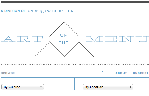
Art of the Menu is a great website on menu design.
The Art of the Menu does a great job of showing the importance of typography in menu design. While a lot of restaurants like to add images and illustrations to their menus to give them a bit more pizzaz, they fail in providing a decent typographical structure that allows you to easily browse through the menu.
If you are a designer you have no excuse to say you can’t come up with a decent design. When you create a design that lacks a strong foundation, anything else you add to it is just going to make it worse. Too many designers attempt to save their designs with fluff without understanding they are pouring gasoline onto the fire. If a design is not enjoyable to read then it is not an enjoyable experience, no matter how many images, colors or sounds you decide to add to it.
Looking to understand typography a little bit better? Not too long ago Smashing Magazine did a comprehensive overview of some wonderful typography tools and resources.


 Register Free Now
 SurveyJS: White-Label Survey Solution for Your JS App
 Celebrating 10 million developers


