Content Strategy & Storytelling
Here you will find posts featuring some of the best articles related to content strategy and storytelling which have been published on Smashing Magazine over all the years.
Quick Overview
- Better User Experience With Storytelling – Part One
- Better User Experience With Storytelling – Part 2
- Quick Course On Effective Website Copywriting
- Five Copywriting Errors That Can Ruin A Company’s Website
- Introducing The 6 + 1 Model For Effective Copywriting (Better Than AIDA!)
- The Art Of Content Marketing
- Content Strategy: Optimizing Your Efforts For Success
- Make Your Content Make A Difference
- Content: A Blessing, A Bubble, A Burden
- When A Thousand Words Is Worth A Picture
- How To Improve Your Branding With Your Content
- 10 Ways To Put Your Content In Front Of More People
- How Content Creators Benefit From The New SEO
- A Craft Of Consequences: Reader, Writer And Emotional Design
- Design With Dissonance
- The Role Of Design In The Kingdom Of Content
- How Disregarding Design Limits The Power Of Content
- Fluidity Of Content And Design: Learning From Where The Wild Things Are
Better User Experience With Storytelling – Part One
Stories have defined our world. They have been with us since the dawn of communication, from cave walls to the tall tales recounted around fires. They have continued to evolve with their purpose remaining the same; To entertain, to share common experiences, to teach, and to pass on traditions.
Today we communicate a bit differently. Our information is fragmented across various mass-media channels and delivered through ever-changing technology. It has become watered down, cloned, and is churned out quickly in 140-character blurbs. We’ve lost that personal touch where we find an emotional connection that makes us care.

Using storytelling, however, we can pull these fragments together into a common thread. We can connect as real people, not just computers. In this article we’ll explore how user experience professionals and designers are using storytelling to create compelling experiences that build human connections.
Better User Experience With Storytelling – Part 2
In the first part of this Better User Experience With Storytelling series, we explored some of the basic structures and story patterns found in myths and religions. We saw how these patterns continued into modern stories such as The Matrix and Star Wars. We also explored some of the basics of bringing storytelling into the user experience process and some places to get started.

Concluding this two-part article, we hear from creative professionals who are leading the way in this relatively new world of combining the craft of storytelling with user experience. We’ll also see how storytelling can be applied to more than just interactive experiences: we find it in everything from packaging to architecture.
Quick Course On Effective Website Copywriting
Many dismiss copywriting as something that ad agency people do. Truthfully, all of us need to pay close attention to copywriting if we want to achieve our business objectives.
The goal of a “regular” text is to inform or entertain. The goal of Web copy (and ideally your website in general) is to get people to do something—to sign up, make a purchase, or something similar. Hiring a professional copywriter can be very expensive, which is one of the reasons why this is a valuable skill to have yourself.

What distinguishes top experts from mediocre players is that the best know more. You can write better copy if you know more about it.
Five Copywriting Errors That Can Ruin A Company’s Website
No matter how brilliant a website’s design, no matter how elegant its navigation, sooner or later visitors will decide whether to take action because of something they read. In the end, the effectiveness with which a website converts visitors hinges on words. If a new website is going to hit all the right notes, its content must be just as well crafted as its design and programming.

However, as you might imagine, there are many ways to go wrong with content in a Web development project. The errors discussed in this article have the potential to undo a website and are issues that I run up against time and time again in my nearly 12 years of producing Web content. Half the battle in avoiding these traps is simply recognizing them: all too often, content is handled as an afterthought, hurriedly completed to meet a project’s deadline.
Introducing The 6 + 1 Model For Effective Copywriting (Better Than AIDA!)”)
AIDA. Attention, interest, desire, action.
If your writing isn’t doing these things, however, then I don’t think AIDA will help you very much, because it doesn’t do enough to explain *how* to do any of these things.
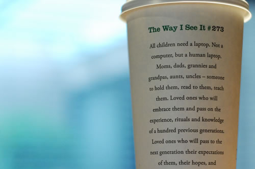
The best way to learn is by example, so let’s look at a promotional failure and see how it conforms to AIDA but still doesn’t work.
The Art Of Content Marketing
A few months ago I went to collect a friend from hospital. Arriving early, I entered the waiting room and noticed in-house magazines stacked by the door. I picked one up, grabbed a coffee and took a seat.
The magazine read like a very long press release, blabbering on about patient-centric care and employee awards. I was quickly bored, so I read from my phone instead. The magazine failed in its purpose.
Effective content marketing holds people’s attention. It gives you a distinctive brand, loyal fans and increased sales. You don’t need a big budget to succeed, which is why good content marketing is the single best way to beat bigger competitors online.
Content marketing used to be about customer magazines and mailed newsletters. Now it covers blogs, email newsletters, eBooks, white papers, articles, videos and more. In this article, you will learn about content marketing techniques that you can apply to your business.
Content Strategy: Optimizing Your Efforts For Success
Content strategy is a beast with many heads, names and trajectories. To approach it is to be sucked in full force. Even so, as crucial as content strategy is, conveying its gravity to a big audience, or to key administrators, is often hard. Being so inherently complex, it’s often easiest to tackle by example.
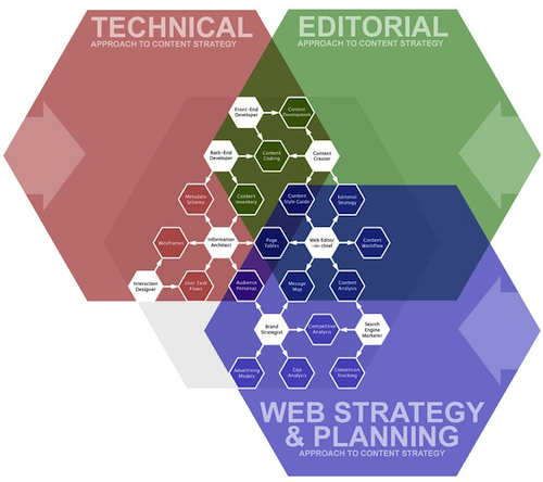
My first job as a Web content writer involved creating a campaign that promoted holiday spending and travel. I came up with clever tag lines that incorporated lyrics from Bing Crosby Christmas jingles. I thought I was doing great work, and when I got an email from my boss to discuss the campaign, I assumed I would get a pat on the back.
Make Your Content Make A Difference
Content, content, content. It’s an obvious part of any interactive experience. In fact, you’ve probably heard content is king, or queen, or some sort of royalty. Yet, content is elusive. Often, you don’t realize your content isn’t cutting it until it’s too late. Does any of this sound familiar? Delayer projects, broken designs, uneven voice or low-performing landing pages.
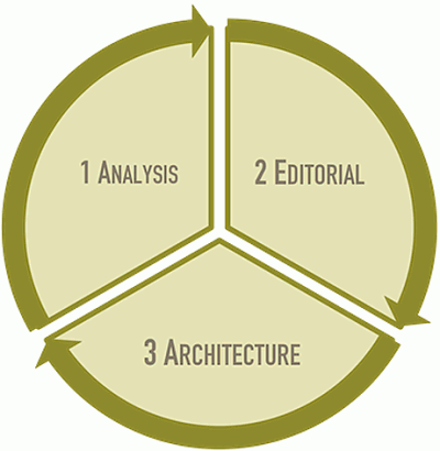
These problems and more are documented extensively, so I won’t dwell on them. What I will dwell on is the solution. But, first, let’s discuss the false ones. Just because someone articulates a problem well does not mean someone knows the solution. That’s when we’re susceptible to a false solution. In my many years of experience, I’ve found these two fake solutions to be very common, very distracting — and very disappointing.
Content: A Blessing, A Bubble, A Burden
Everyone is talking about content. Googling the phrase “content strategy” retrieves almost 50 million results — a clear indicator that interest in content is very much in the zeitgeist. By the time you read this, I expect that number will have grown even higher.

But I also suspect that the substance of the talk would be quite different if content were truly respected. I believe this because the way we talk about content is beginning to sound a lot like the way we talk about money.
When A Thousand Words Is Worth A Picture
Good design speaks for itself, right? Unfortunately, that is rarely the case. Most of us don’t have the privilege of designing for ourselves; we design for clients, clients who have their own taste and ideas, clients who ultimately need to be persuaded on why we’ve made certain decisions. Good design doesn’t speak for itself; it needs an advocate.
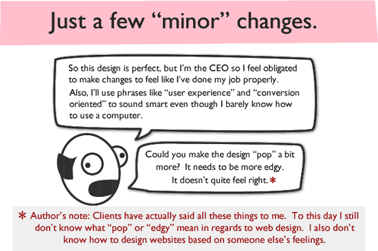
This article examines both why design requires justification and how you can go about providing it in a way that is clear and understandable. While we’ll focus on visual design, the principles described here are applicable to any creative process or endeavor. Indeed, we learned most of these lessons while presenting Web interfaces and prototypes to clients, which took place after the visual designs had been agreed on.
How To Improve Your Branding With Your Content
Branding experts hit the nail on the head when they say that a winning brand conveys why you are your prospects’ only solution. If you can’t achieve that, you should at least convey why you are your prospects’ best solution. Of course, the same logic applies to your clients. So make a compelling claim about your business, product or service, and back it up.
Are you the biggest or most popular provider of your type of product? Do you provide the widest selection of services? Do you leverage strategic partnerships? Create patented technology? Offer convenient locations? Or are you young and small, able to churn out customized solutions swiftly, unlike your much larger and slower competitors?

Define your strengths and leverage them. Purposefully written Web copy that effectively tells your prospects why they should buy from you or your client can make a world of difference on the sales front. In fact, if done right, it can actually disqualify the competition.
10 Ways To Put Your Content In Front Of More People
Which is more important, driving traffic to your website or encouraging as many people as possible to see your content? Believe it or not, they are not one and the same. Too often, we as website owners live and die by Web analytics applications. We fret about bounce rates, unique visitors and dwell time. However, when we focus so heavily on the performance of our website, we miss a fundamental point: we should aim to expose users to our content, not our website. The website is a tool to showcase our content, but it is not the only tool that does this.
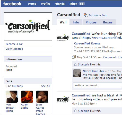
The content matters, not the website. That is why each company provides numerous ways to access its content beyond the website. From Amazon’s affiliate scheme to YouTube’s embed feature, these companies can reach audiences that may never visit their websites.
While the points mentioned below will refine your strategy to deliver content to more people, they can not serve their purpose without an appropriate environment. In the age of social media and the rise of interactive web-applications such as Facebook, Twitter etc. building a community around your website is the most important way to drive traffic and keep the users coming back.
How Content Creators Benefit From The New SEO
Due to big changes in the SEO landscape, designers, photographers, videographers and writers have new opportunities to build their reputation, expand brand awareness and generate more leads. This post describes five important developments that content creators should be aware of, and then we’ll outline several ways to capitalize on them.
A Craft Of Consequences: Reader, Writer And Emotional Design
Before the very first page of a book has been read, you’ve already analyzed it in countless ways without even noticing. The paper stock, the thickness of the binding, the aroma, the color of the type and even the texture of the cover; the very character of the book is being dissected by the hand and eye at every moment.
In this brief second there is a dialogue between the reader and the object. This conversation is subtle and complex, but for most people it is entirely subconscious. This is because we rarely think about these things ?—? we feel them instead.

Before this dialogue can take place however, the ideas of the author must be given shape. By examining the relationship between the form of the book and the information contained within, we can begin to understand how these visual and sensory components work, but it will also teach us how to create long-lasting emotional bonds that we’ll want to keep forever.
Design With Dissonance
You might consider yourself knowledgeable, but you’ve probably never heard of this powerful communication and design technique that I’m about to share. I’m sure you’ve seen it in practice but never knew it was working on you?—?that’s how good it is. I’m here to shed light on this technique so that you can use it as an approach to your design or writing.

See what I did there? I introduced you to dissonance by using the technique itself. If used correctly, it can enhance your approach to design and copywriting in certain projects. Welcome to designing with dissonance!
The Role Of Design In The Kingdom Of Content
If content sits at the top of the food chain, why do we spend so much time talking about the finer points of design? Every day we debate, experiment with and discuss topics that easily fall into the category of aesthetics, enhanced functionality and layout; in fact, relatively rarely do we talk about content. Nevertheless, even though we should concede that content is king in this realm, this doesn’t mean that design should be devalued.
It may seem logical that the user experience lives and dies by how the user relates on an emotional level to the content on a website. But this is not necessarily the case. From a design perspective, our job is to maximize the value of every visitor, whether they love the content or hate it. The role of a UX designer is not always to make everyone feel all warm and fuzzy inside. A rich Web experience could include the emotion of happiness, humor, discontent, sadness, anger or enlightenment. A well-designed website enables us to attribute our emotion to its source and connect us to that environment through a range of senses. A UX designer should understand why and how to utilize the principles and techniques they have learned to support the website’s precious content.
How Disregarding Design Limits The Power Of Content
It appears to be a reader’s market. More written content is freely available than ever before, accessible in just about every format you could imagine. If you want it on paper, you’ve got it. On screen? What size, friend? We can shrink, stretch and stitch it all together every which way because, really, we’re just talking about words here… Or are we?
I decided to see for myself by examining several pieces of content and comparing how they look and function in a variety of incarnations: the printed page, the Web and eReaders. What I found was both encouraging and, for a designer who loves to read and write, slightly troubling. I’ll warn you in advance: there are many examples below, but I think they’re all necessary in order to convey an accurate picture of just what happens to content when we start moving it around. To properly set it up, let’s first briefly look back in history.
Fluidity Of Content And Design: Learning From Where The Wild Things Are
Have you read Where the Wild Things Are? The storybook has fluidity of content and design figured out.
It goes that one night, protagonist Max “wore his wolf suit and made mischief of one kind or another.” He hammers nails into walls, pesters a small dog. Author Maurice Sendak doesn’t explain these hijinks textually for the reader. The mischievous acts are illustrated on the right-hand pages. Readers make the narrative connections for themselves.
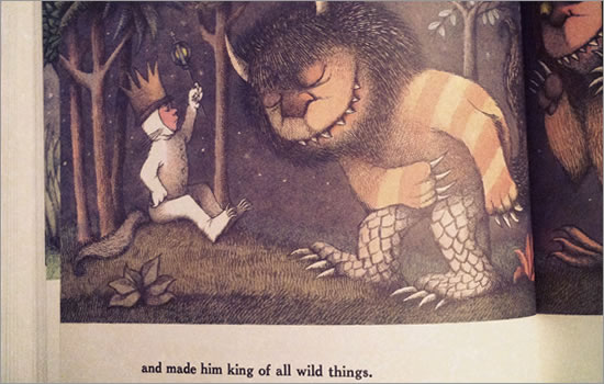
The words and pictures depend on each other for completeness. Web designers can employ the same complementary dependence of graphic and text in their own work. It encourages a sense of belonging and can create strong first impressions, which are often essential to effective Web design. Because Web design is not confined to page-by-page display as storybooks are, we’ve got no excuse for neglecting Curt Cloninger’s assertions that a design “has to somehow be relevant to the content, accurately representing its purposes in the medium,” and that “the content has to be useful to the site’s audience.”
This post explains four strategies for improving fluidity of content and design, and we’ll gauge the effectiveness with which several websites use these strategies, taking special note of what we can learn from Sendak’s Where the Wild Things Are.
Further Reading
You might be interested in the following “Best of” selections as well:
- Usability and User Experience
- Useful Business Advice And Tips For Web Designers
- Learning From The Past: Design Legacies & Arts


 Agent Ready is the new Headless

 SurveyJS: White-Label Survey Solution for Your JS App

