Mobile Prototyping With Axure RP
Validating a design through user testing is necessary for the success of almost any product. And it’s even more critical in the mobile application space, where context and individual devices play an important role in how a product is experienced.
Fortunately, interactive prototyping is a time-tested way to quickly get your design onto a user’s device and into their hands. So, let’s look at why prototyping matters and explore one powerful tool that will enable you to do it quickly.
So, What Is A Prototype?
First of all, let’s define what a prototype is and is not. A prototype is a design artifact for end-user testing and for communicating functionality to business and development stakeholders. It isn’t meant to be a fully functioning entity with live data connections, although sometimes it can be. The best testing prototype has only what you need for your purpose and not a single thing more. The point is to design quickly, test it, fail fast and learn something. This is why you prototype. It’s a low-cost activity that saves you time and substantial expense over the life of a design project.
In this article, I’ll show you how I used Axure RP 6.5 to prototype a theoretical iPhone app for the Chicago chapter of the Interaction Design Association (IxDA). I created this sample prototype recently for an event about design tools run by our local IxDA chapter, but I approached it the way I would in an actual working situation.
If you aren’t familiar with it, Axure RP is a rapid prototyping tool that runs on Mac and Windows and can be used to create interactive prototypes for desktop websites and mobile products without writing any code. Axure costs $589 per user license, which allows you to install it on two computers. I run Axure on a MacBook Pro at work and on an iMac in my home office. Some alternatives are:
- iRise Studio
- Balsamiq (Can be used to create clickable wireframes.)
- Microsoft SketchFlow (If you are in a .NET environment.)
If you are new to Axure, start by learning some of the things you shouldn’t do, such as creating unnecessary text widgets and not naming your prototype’s objects. Have a look at Axure’s own How to Avoid the Top 5 Mistakes When Starting to Use Axure RP.
Getting Started
The first thing you’ll need to do is create a new Axure file.
Setting Up Your Project
For a mobile website or app, just create the prototype’s pages in a smartphone-friendly width and height. If you’re targeting the iPhone, create a page that’s 320 × 480 pixels (or 1024 × 768 if you are designing for the iPad). Because most mobile pages run longer than the height of the device’s screen, focusing on getting the width right is more important. And these widths will work on both Retina and non-Retina iOS displays. Because Axure is a WYSIWYG design tool, you can’t size pages by a percentage of the screen’s width, which would be ideal. Your prototype will not always expand to fill the screen’s width when you flip the device from portrait to landscape orientation, so take that into account if your app will normally be used in landscape mode.
For Android phones, a width of 480 pixels usually works, although I often just create a single 320-pixel-wide version for mobile Web testing on both platforms. This size has displayed correctly on most newer Android phones that I’ve encountered in testing (and some BlackBerry and other devices as well). Because the pixel width of an Axure project is fixed, testing Android phones on a device that you control is easier because of all the different screen resolutions available. But remember that it’s a testing prototype, so don’t worry about making it perfect. If you must test on a user’s device (perhaps because you need access to native apps such as their address book), then test the prototype on a few different versions of Android while you are building it. Use your website’s analytics software to find out what Android versions and handsets are the most popular among your users.
To create a prototype of a native app for Android or iPhone, you can start by adding existing widget libraries to Axure. A list of free and paid widget libraries is maintained on Axure’s website (see the “Resources” section below). If you have access to a visual design resource and need a higher level of fidelity, you can have the resource create tab bars, home screen icons and other widgets. If you are creating a lower-fidelity prototype, then the shapes and objects built into Axure might be all you need.
I usually test higher-fidelity prototypes because I want to see how people interact with buttons, icons and other controls. Testing lower-fidelity prototypes can help you learn whether users share your mental model of the app, but you don’t gain insight into whether a particular icon makes sense to someone who is using the app for the first time.
Having started the project, I needed to set up the basic framework for the prototype.
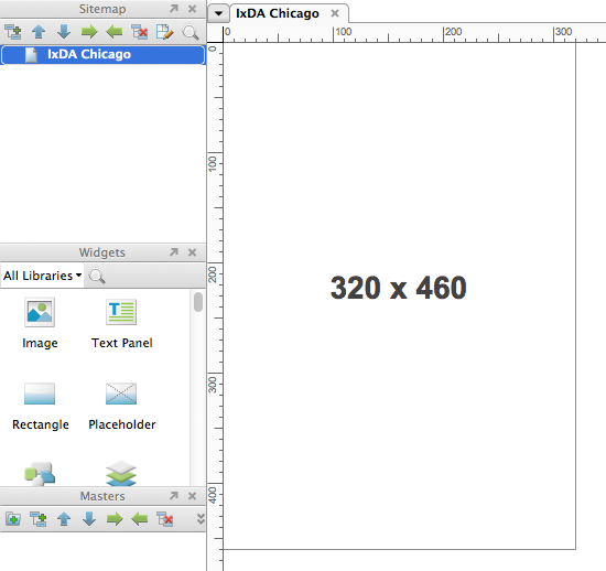
Create Masters For Reusable Components
The first thing I did was create a page header by using a “master,” which is a reusable component that can be added to any page in Axure. Masters are powerful because any change you make to one is reflected in every instance of it in your prototype. I created a 300 × 50-pixel master that would hold the page header for all screens of the app other than the home screen.

Use Dynamic Panels For Multiple Screens And Screen States
The next step was to place a “dynamic panel” named “ContentPanel” on the canvas in the top-left corner, (X = 0, Y = 0). A dynamic panel is a widget that can contain several of what Axure refers to as “states,” which are different views of some portion of the screen based on some user action or the value of a variable. The ContentPanel was 320 × 415 pixels and would hold the contents of the prototype that lie above the iOS tab bar. Dynamic panels are scrollable, so your content can be taller than 415 pixels and will scroll from underneath the tab bar. To keep the scroll bars from appearing, I selected “Never Show Scroll” bars from the “Edit Dynamical Panel” context menu.
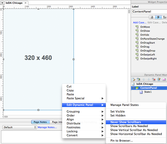
I then created a second dynamic panel called “TabBarPanel” that was 320 × 45 pixels and positioned it beneath ContentPanel. This panel was used to hold the tab bar image, and it brought the total page height to 460 pixels. This left 20 pixels for the iPhone’s status bar, which displays at the top of most iPhone app screens.

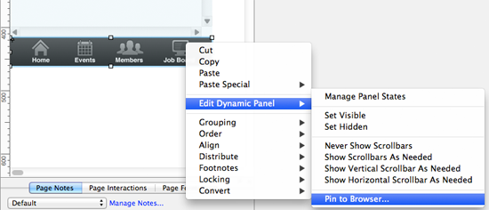
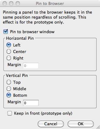
I had to create the container for the tab bar image as a dynamic panel so that I could anchor it to the browser window. When positioning TabBarPanel on the main screen, select Order → Bring to Front from the context menu to ensure that it is never covered by other content.
Always Use Object Names
A note on naming objects: Axure allows you to name all objects that you include in a prototype, and I always try to do so. As your prototype becomes more complex or as more people contribute to its development, these names make objects easier to identify when you have to select an object from a long list. I name my objects using my own variation of Hungarian Notation, so a button’s name would take the form “btnButtonPurpose,” and a text input’s name would take the form of “txtTextInputPurpose”; you would create your own names for the parts after “btn” and “txt,” of course.
Adding Interactivity To Dynamic Panels
Now we need to create some states for the ContentPanel and get to work on the actual screens of the app. Your panel already has one state because that is created automatically and is named “State1.” You can rename a state by double-clicking on its name in the Dynamic Panel Manager, and I prefer doing that in order to keep the prototype more manageable. To create additional states, just select “Add State” from an existing state’s context menu.
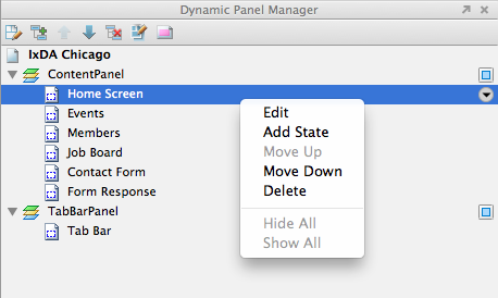
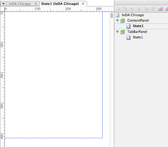
The more States you create, the better you will be able to test different usage scenarios. Because the main goal of prototyping is to learn how people interact with your app, creating only a happy path might not be enough. Create alternative flows when possible if only to see what people try to do with your app. The alternative flow could be as simple as a screen that says, “This page is not working in this prototype,” which still allows you to see what they tapped and to probe them on it (a user tapping on a dead link or button tells you almost nothing).
Once I created the six empty States that I needed for my IxDA prototype, I was ready to tie it all together by setting up the tab bar. To create the tab bar with four buttons, I followed these steps:
- Have a visual designer create a background image of the tab bar and its icons.
- Position the tab bar at the bottom of the main app page,
(X = 0, Y = 416). - Right-click the tab bar, and select
Convert → Convert to Dynamic Panelfrom the context menu (you have to convert the master to a dynamic panel so that you can anchor it to the bottom of the screen). - From the panel’s context menu, select
Edit Dynamic Panel → Pin to Browserto anchor it at the bottom of the iPhone screen. - Double-click “State1” in the Dynamic Panel Manager on the right side of the screen to rename and edit the panel. I called my single state “Tab Bar.”
- In the Tab Bar state of the TabBarPanel, create four borderless transparent rectangles for the button actions, and position one rectangle over each icon.
- Set the OnClick event for each transparent rectangle to “Set ContentPanel state to X,” where X is the name of the panel that you want to display. This is done by launching the Case Editor from the Interactions view of the Widget Properties panel.

X = 0, Y = 0, but I’ve moved it down slightly to show the annotation indicators for the footnotes that you can create in the requirements documentation feature of Axure, which is not addressed in this article.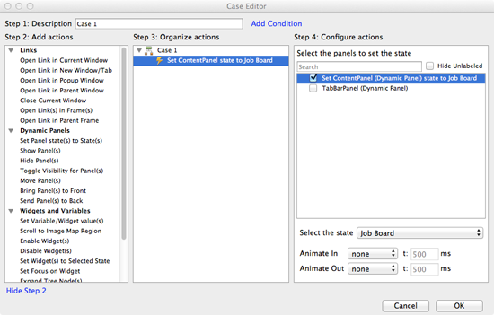
Axure Event Types
You can trigger interactions or set variables in your Axure prototype using the many built-in actions, such as OnClick, OnMouseEnter, OnMouseOut, OnKeyUp, OnFocus, OnLostFocus, OnChange, and OnPanelStateChange. For mobile apps, Axure 6.5 introduced OnSwipeLeft and OnSwipeRight events, which allow you to swipe to the previous and next screens as though you were moving through a deck of cards. Axure’s website maintains pages for basic interactions and more advanced uses of dynamic panels.
Once I had a main page, my dynamic panel states, and my tab bar, I was ready to start building the app’s content.
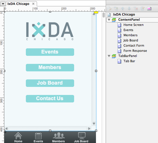
The prototype was almost done at this point. All I had to do was create the other five screens that would be stored in the different states of the ContentPanel. In addition to the four screens reached from the tab bar, the prototype included a contact form and a form response screen.
Focus On Your Forms And Icons
On the Contact Form screen, I wanted to capture the user’s name, email address and textual message and store them in variables for possible later use. The way I did this was to use the “Send Message” button’s OnClick event to store the values from the three fields in three separate variables. I also constructed the message that will display the user’s name and email address on the Form Response screen by connecting text strings and variables in the Case Editor. After capturing the data and preparing the response message, I set the ContentPanel to show the Form Response state. Axure supports chaining events together to create fairly robust screen flows.
If my prototype had multiple Axure pages, I could have used the OnPageLoad event on the Form Response screen to construct the feedback message to the user. But that event is not available to you when you are switching dynamic panel view states. The need to use the OnPageLoad event is one of the factors to consider when deciding how to organize your prototype.
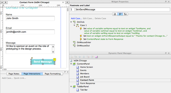
Forms are definitely one of the most important areas of your prototype to test. In showing my prototype to a few people before our IxDA event, I learned that some found it annoying to have to fill out separate fields for their first and last name. Because the purpose of the screen was to send a simple message, there was no need to collect two separate pieces of data. So, I merged them into one field, which also allowed people to enter just a first name if they wished. For every form input that you want to place on a screen, ask yourself whether it is really necessary for the user to complete the task. Anything you can do to reduce the interaction cost will make your app more usable.
Icons are another important area to prototype, and you should aim for the highest fidelity possible with those because you’ll want to test what might ultimately end up in the app. Because icon design is an art form, try to use standard system icons where possible, but be sure to test when you opt for custom icons.
So, at this point, the prototype was complete.
Generating The Prototype
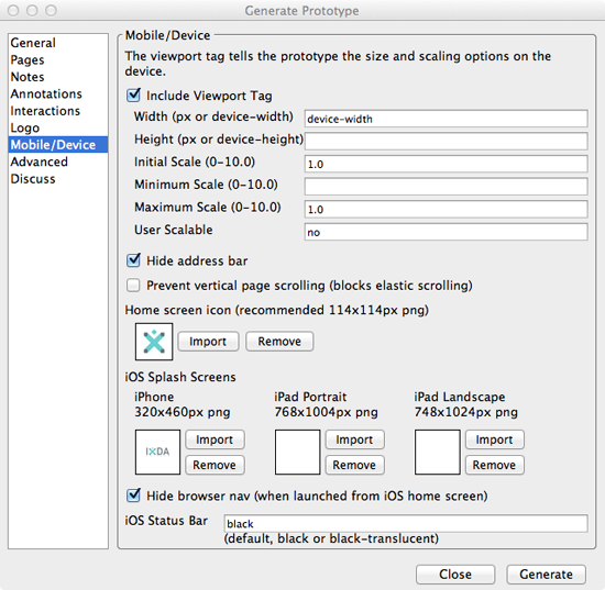
Once I was ready to generate the prototype, I used the Mobile/Device panel of the Generate Prototype dialog to generate the viewport meta tags for iOS and Android. The viewport meta tag is used to make sure that the prototype displays at an appropriate width and is not scaled down to fit the entire page in the mobile browser’s viewport. Even when you’re simulating a mobile app, Axure will generate HTML files that are displayed in the device’s native browser, so correct use of the viewport tag is a must.
These are the viewport meta tags that I generate for handheld mobile prototypes:
iPhone:
<meta name="viewport" content="width=device-width, initial-scale=1.0, maximum-scale=1.0, user-scalable=no" />Android:
<meta name="viewport" content="width=480, target-densityDpi=device-dpi" />Axure 6.5 also has additional options for iOS devices, such as hiding the browser’s address and navigation bars, creating a home screen icon, and creating a splash screen for the iPhone and iPad. Hiding the browser’s chrome and using a splash screen will give your HTML-based prototype the look and feel of a native iOS app.
Now that the prototype is complete, you just need to place the HTML and other files that Axure generates onto a Web server that your in-house device or test participant’s device can access. I usually use Dropbox or a personal Web server for this. You can also use AxShare, a free service from Axure that let’s you host up to 10 prototypes, with discussion features so that your team can work out the final design specifications before entering the build phase. When testing, try to avoid Wi-Fi connections because smartphone carrier networks are usually slower and will give you a more realistic feel for an app’s performance, especially an app for the mobile Web. A slower connection might also cause a test participant to volunteer useful information about how often they experience a slow app and slow Web page response. This contextual information is extremely useful to have when designing your product.
Test It In The Wild
Another essential part of prototyping and testing is doing it in the field. People use their mobile devices on noisy trains, in poorly lit rooms and sometimes with conversations going on around them. Lab-based testing eliminates many of these factors, which can lead to inaccurate interpretations of the test results. One in-field test of mine that always comes to mind was of a guy using a three-year-old BlackBerry in a Starbucks. I really got a feel for how painful every image download was to his overall experience of my mobile website.
Conclusion
As you can see, Axure enables you to quickly create a prototype for a mobile app or website, with no investment in development. By prototyping and testing in the field or in a lab, you can validate your design before ever touching more expensive programming resources. You can also easily update the prototype in the middle of a test cycle to quickly test new findings, something that is harder to do if you are testing with functioning application code or clickable wireframes.
This article touched on just a few of the capabilities of Axure. The tool has many native iOS and Android widgets and form controls that can be used for much more robust native app prototypes. There are also other ways to organize your prototype; the only correct way is to do whatever works best for your project. The important thing is to build the prototype quickly, test it, fail fast, learn and iterate on the design — because that learning is what makes prototyping essential to any successful mobile design project.
Further Reading
- A Deep Dive Into Axure 8: A Comprehensive Review
- Creating Responsive Prototypes With Adaptive Views In Axure RP 7
- Factors In Selecting A Mobile Prototyping Tool
- Mobile Prototyping With Proto.io


 SurveyJS: White-Label Survey Solution for Your JS App
 Agent Ready is the new Headless

