35 Gorgeous PDF Posters: Redesign The Web
Yes, it’s time to announce the winners! A couple of weeks ago we had announced the “Redesign The Web” Poster Design Contest that encouraged you to design a thought-provoking poster. We wanted to encourage everyone to actively get involved in making the Web a more accessible and usable place today.
Among the entries, many have picked up the idea of the globe. We received clean and minimalistic designs, complex artworks, illustrations, inspirational quotes and call-ups, as well as a comic strip. One participant even produced a poster using only HTML5 and CSS3 (including the bleed and trim marks inside the print style sheet).
Yes, it’s about time to redesign the Web and, hence, to redesign the world. We can make the Web a better place. But to do that, we need your help.
We’d like to sincerely thank all the contributors who had taken on this challenge and had sent us their work! Overall, we’ve received over 150 entries, and in a thorough review process, selected 35 of the best entries (which are now presented in the article below). And trust us—it was no piece of cake to choose the best from many excellent poster submissions. Of course, the owner of each poster owns all the copyrights for their artwork.
Winners
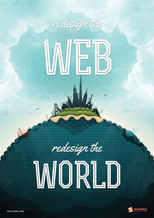
Rafal Tomal — Redesign The Web
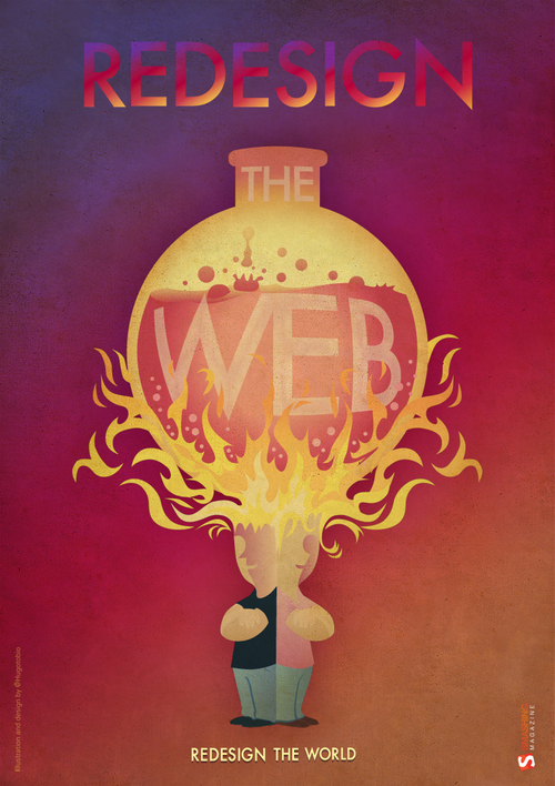
Hugo Tobío — Boiled Web
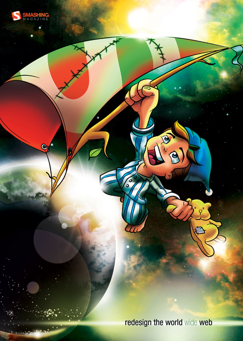
Danae Botha — Limit Is The Sky
“I believe true simplicity is achieved through regressing to a child-like state. It’s about seeing what is really there, as well as all the possibilities available. Deriving joy from the uncomplicated, and rejecting the clutter.”
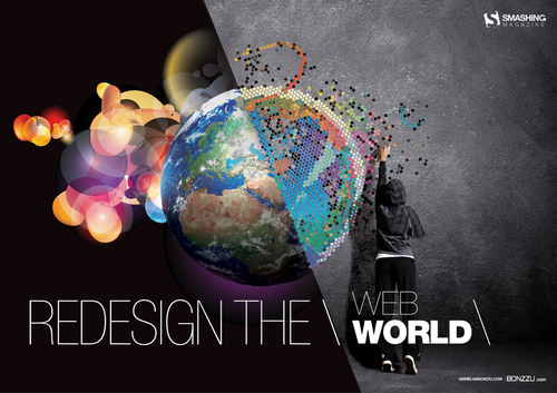
Bonzzu — Webworld
“Redesign the Web one pixel at at time; redesign the world one individual at a time. The gap between digital and analog is disappearing fast and we have the power to change the world for the better.”
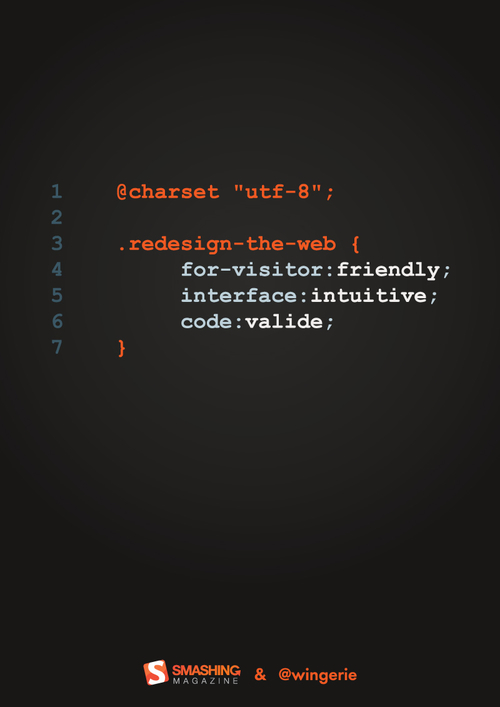
Wingerie Kupfer — Redesign the Web
“It’s simple, but everyone who’s connected to Web development will surely understand the message.”
Congratulations to all the winners of the contest! You should have been contacted already. We sincerely appreciate your time and support!
Below, you’ll find more selected entries submitted by our dear readers across the world for the “Redesign The Web, Redesign The World” contest.
Selected Entries
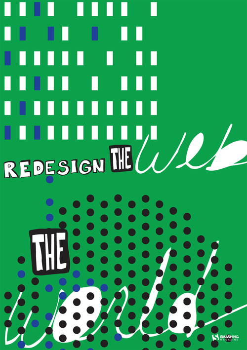
Kimberly Passmore — Rhythmatical
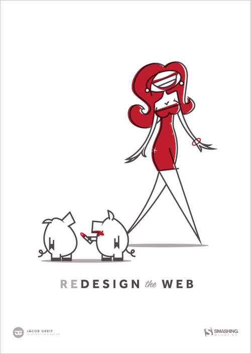
Jacob Greif — Redesign The Web
Maren Katelaan — Redesign The Web II
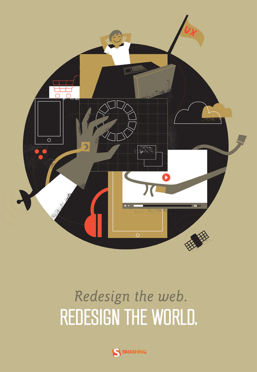
Gautam Bambolkar — Evolution
“We have been evolving right from the day life on Earth began. It’s the human urge to think, ideate, innovate, change, and think again. Initially, we travelled in person to communicate, to share. Then came the revolutionary Web, wherein we achieved virtual communication. Desktops, PCs came into action. Communication changed, people moved, the Earth reshaped. Now we are inside the world of mobiles and tablets; a wireless world indeed! The world is constantly shaping into a new form. Hence, we, the Web transformers, ought to change the way we say things. The need is to redesign the Web, and the world!”
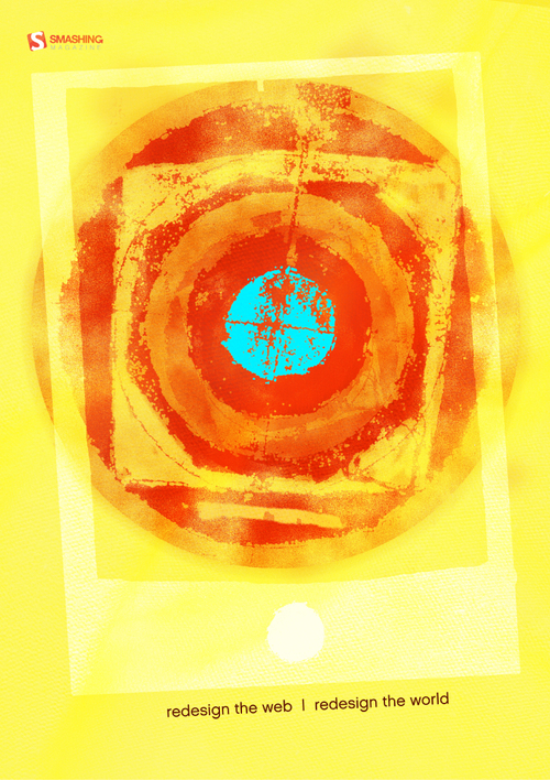
Mark Dewdney — Redesign The Web
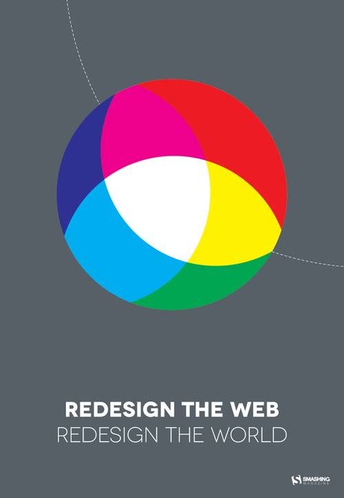
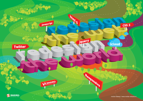
Melda Wibawa — Redesign The Web, Redesign The World
“The Web is like a virtual city, with its streetscapes and furniture. HTML 5, CSS 3, Social Media, etc. form the ‘WEB’ city. This city has to be well organized and designed in order to function well. By redesigning the city we can achieve a better organized world.
REDESIGN THE WEB, REDESIGN THE WORLD.”
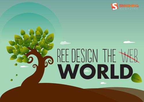
Vidhi Mehta — Redesign The Web, Redesign The World
“My concept behind this design is a ‘tree’ to redesign the Web, redesign the world. Redesigning of the Web involves using greener technologies by working collectively to use elements that will be less hazardous to the environment. If accomplishing this, then I truly believe we have redesigned the ‘world’ by redesigning the Web.
The tree denotes collective working, growth in terms of better design, and that we are all connected to the same root, indicating that we redesign the Web (and hence the world, together). I have modified the red dot in your typography with a green leaf saying “lets begin” to mark the enthusiasm of redesigning the Web.”
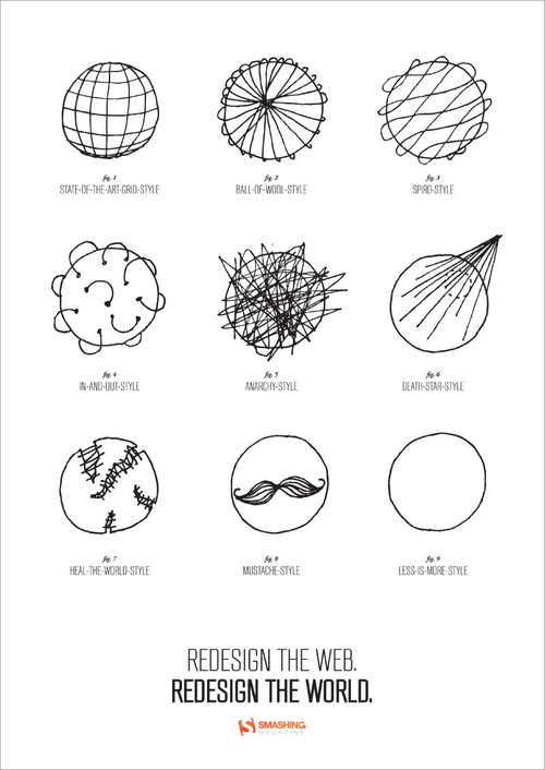
Maren Katelaan — Redesign The Web
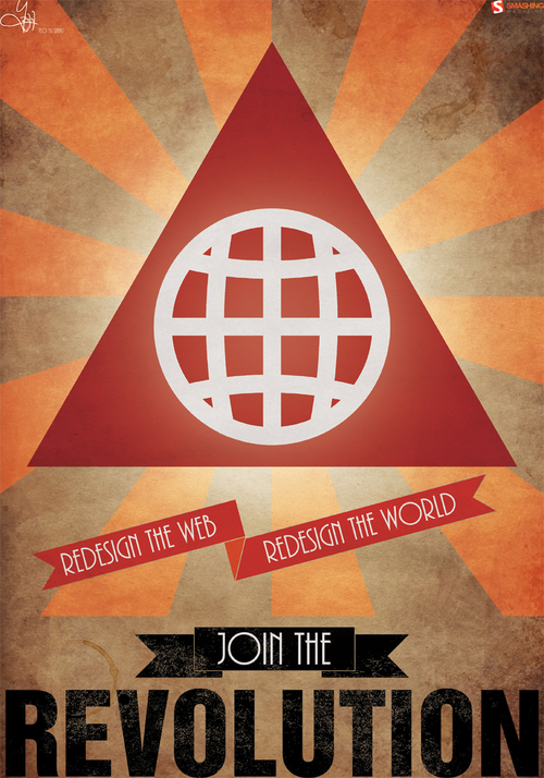
Teo Yu Siang — Join The Revolution
“This poster design—titled Join the Revolution—is inspired by Maoist ‘Red Revolution’ propaganda posters, hence the very texture-rich and grungy, old-world feel. It’s designed to feel distinctly oriental and reek of imperialism—meant to instill a sense of higher purpose and exhilaration in the Web revolution. At the center of the poster, there’s this giant symbol that represents the revolution to redesign the Web and the world—kind of like how the star represents communism. The triangle stands for delta, the mathematical symbol of change, while the globe represents the Web (and the world). Together they form a symbol of change and hope for a better Web—and thus, a better world.”
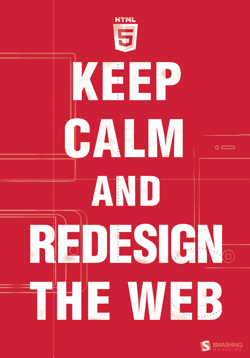
Alexander Katin — Keep Calm Redesign the Web
“I’ve come up with a no-brainer idea—it’s not original, beautiful or unique; the whole thing is just a tribute to the famous British wartime poster.”
Johannes Ippen — Redesign The World
“Instead of designing it in a classic DTP tool, I tried to utilize HTML and CSS. I wanted to create a beautiful layout, and export it with a print style sheet into a print-ready PDF file (including generated bleed and trim marks).
It’s more of an experiment to see if HTML and CSS are already usable for the production of complex editorial/poster designs.”
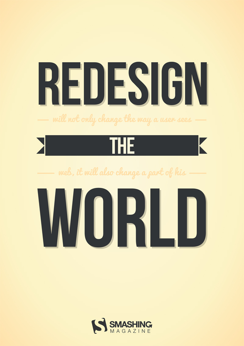
Marko Srdoc — HTML Globe
“Here is my modest design contribution to your Web poster contest.”
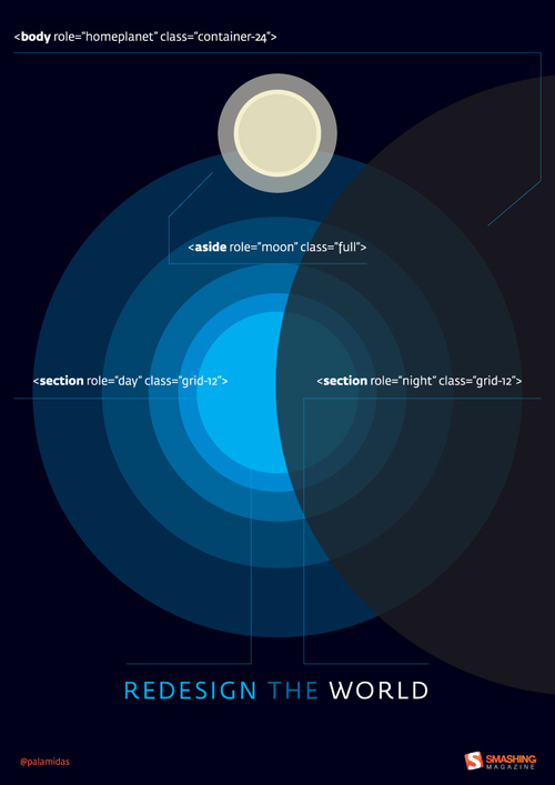
Courtney Starr — Web Wide World
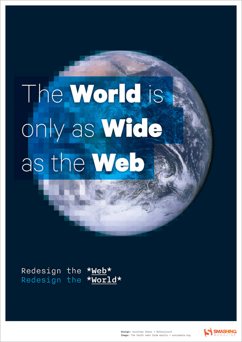
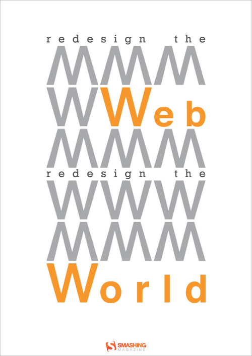
Kevin Riedy — Redesign The Web World
“Yep—that’s Arial, Baby!!
Curious, after it’s all over, how many went with this paradigm.”
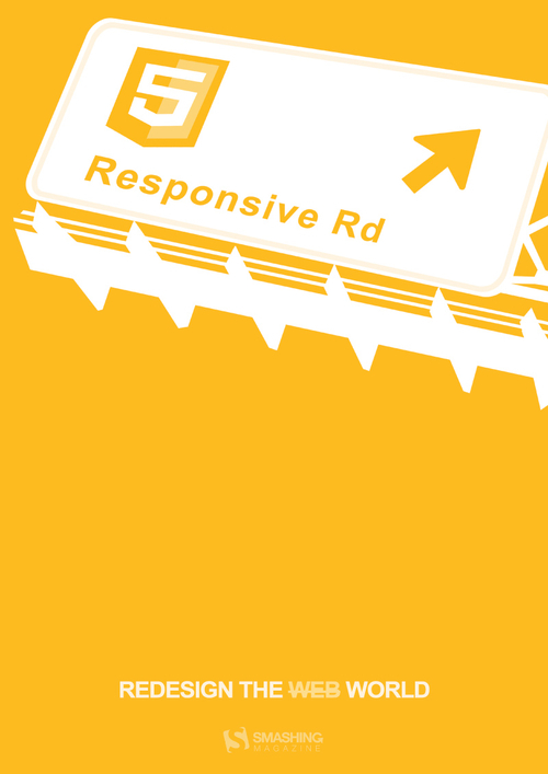
Chris Zappala—Redesign The Web
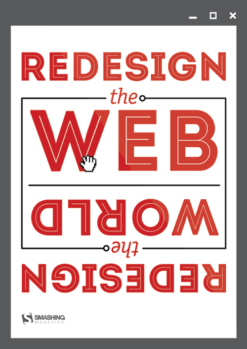
Mecury Brand Mission — W
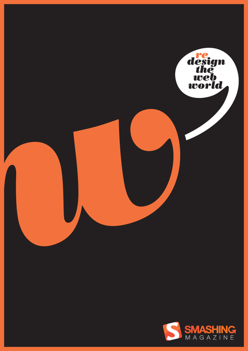
Ian Caie — Flash

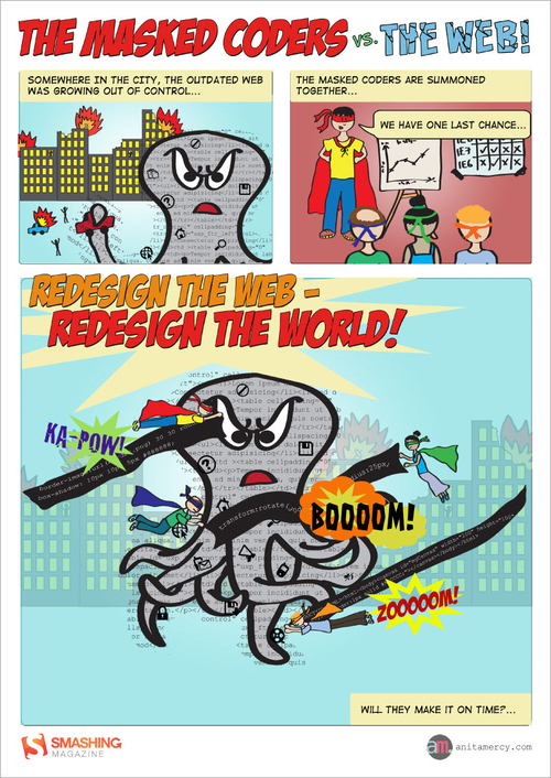
Anita Mercy—The Masked Coders
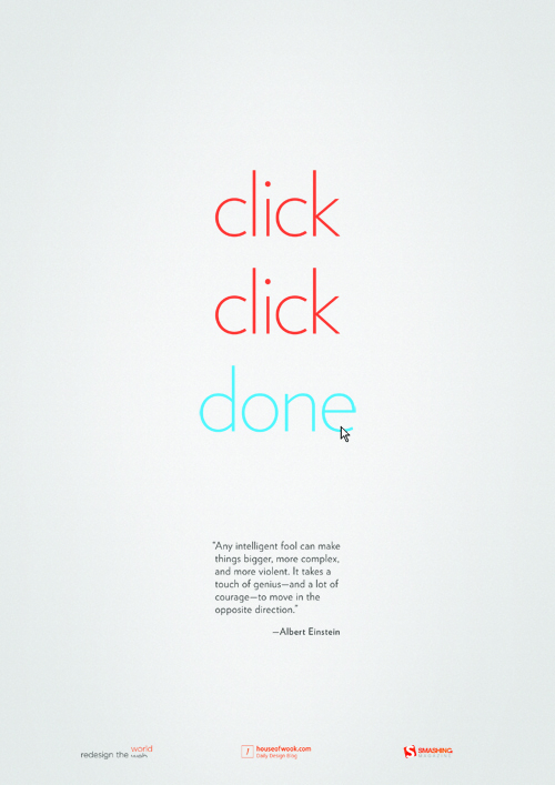
Jin Wook — Click Click Done
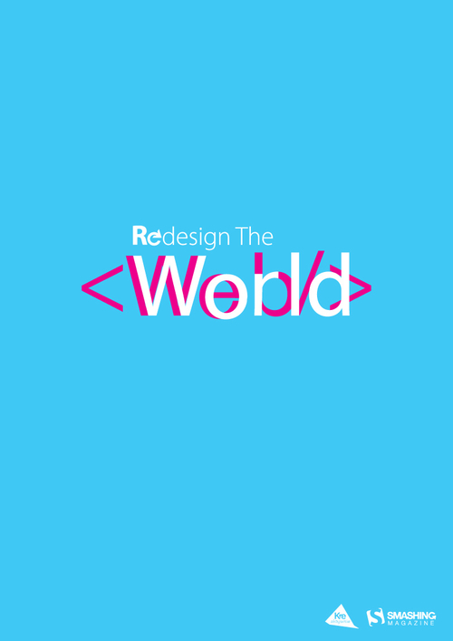
Grzegorz Norberciak—Webld
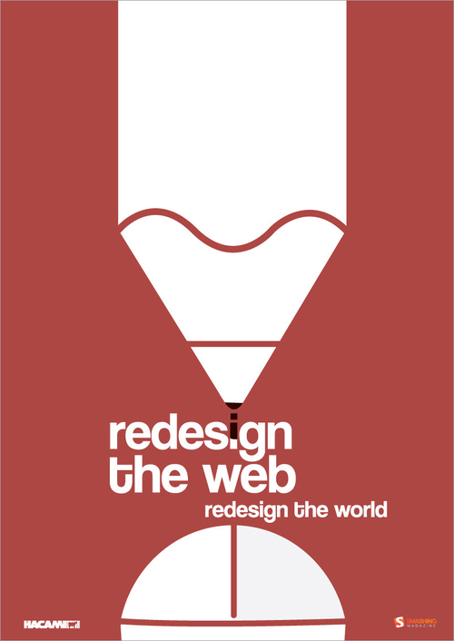
Ian Caie — Mouse
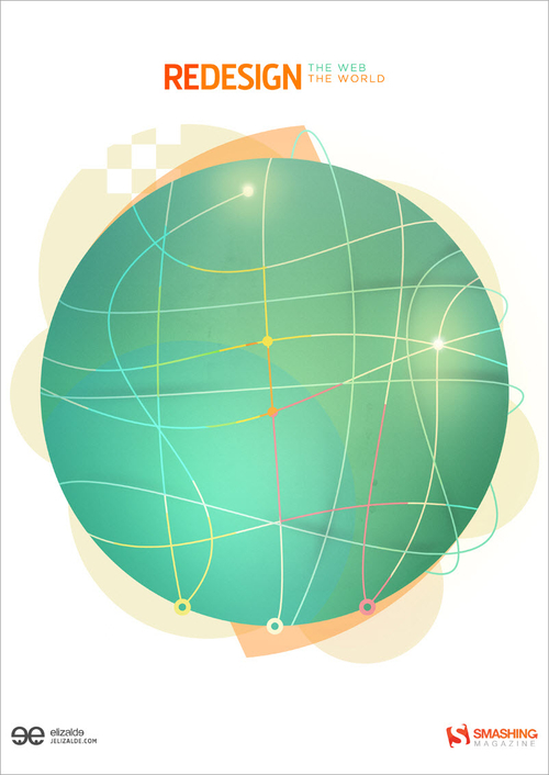
Jose Luis Elizalde — Redesign The Web
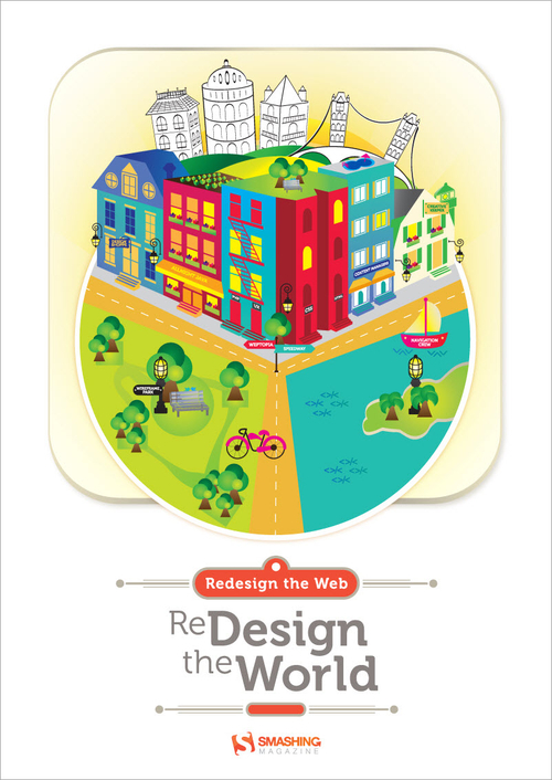
Lourdes Irizarry — Redesign The World
“To help redesign the world I created a “Webtopia” App, where form and function unite. Using vibrant shapes as basic building blocks, I organized the town into an infographic-style pie chart, with equal parts technical and creative. The result is a clean, engaging, productive and functioning town. Influenced by travel and my favorite surroundings, I used both modern and traditional elements to create a well-balanced, multi-dimensional world.”
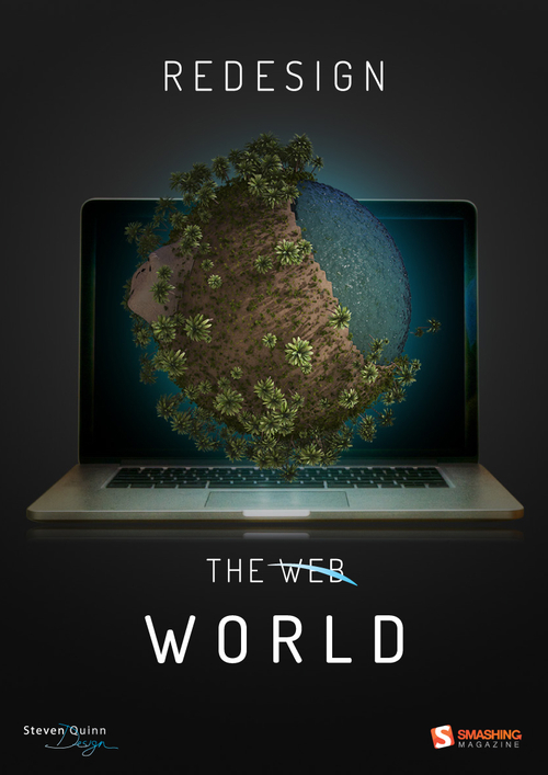
Steven Quinn — Redesign The World
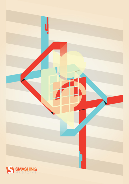
Marcus Marritt — Designing For A Narrative
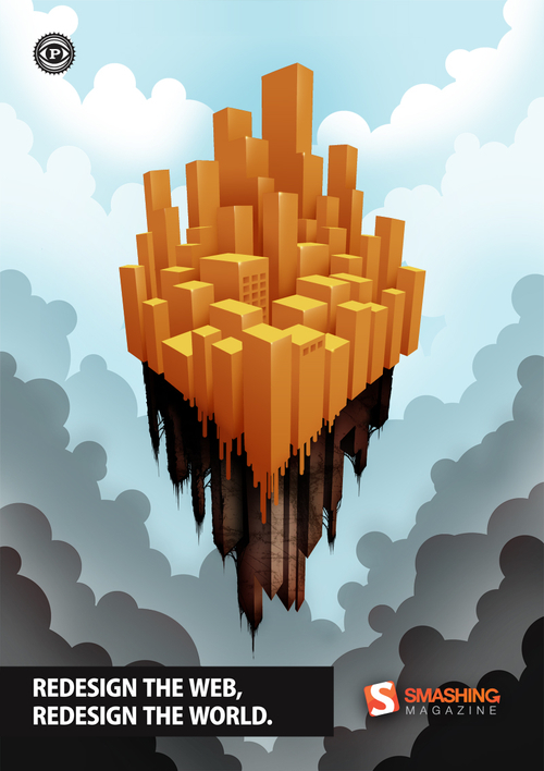
Paul Johns — A Fresh Coat Of Paint
“My concept for this design is a floating city that represents both the world and the Web. This golden city has been created atop the ashes of a crumbling old city. The gold city is a representation of good design, best practices, cross-browser and platform compatibility, and the implementation of Web standards. Gold is used to represent the highest caliber quality and value, and the orange hue is a nod to Smashing Magazine.
The crumbling city beneath represents sub-par design (outdated coding practices and incompatibility across browsers and platforms). The clouds in the background reflect the status of this Web/world, fading up from dark and polluted to airy and clean. The ‘good’ city is slowly melting downward, so eventually there will be nothing left of the original city. This represents the hopeful concept that thoughtful, well-planned design will overtake careless, poorly executed design. Once standards and good designs take over everything, the floating city (the world) will have been redesigned as well.
I think it’s important that the city represents both the world and the Web simultaneously, to show that they are intrinsically connected. The Web is the world’s way of communicating and interacting, so the more efficient the Web, the more efficient the world. The more beautiful the Web is, the more beautiful the world will be.”
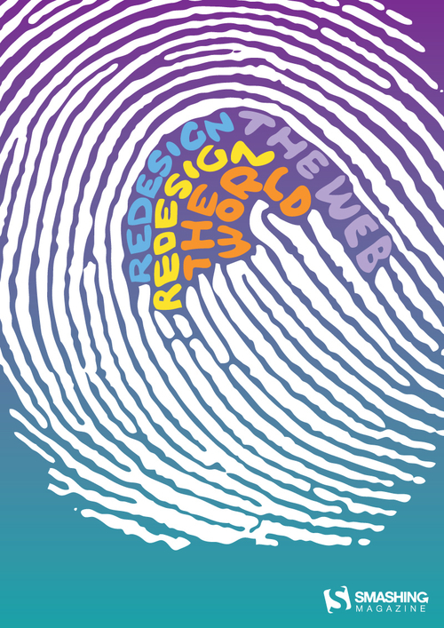
Sergio Nakamura — Huella
Vinícius de Thomaz Domingues — Redesign The Web
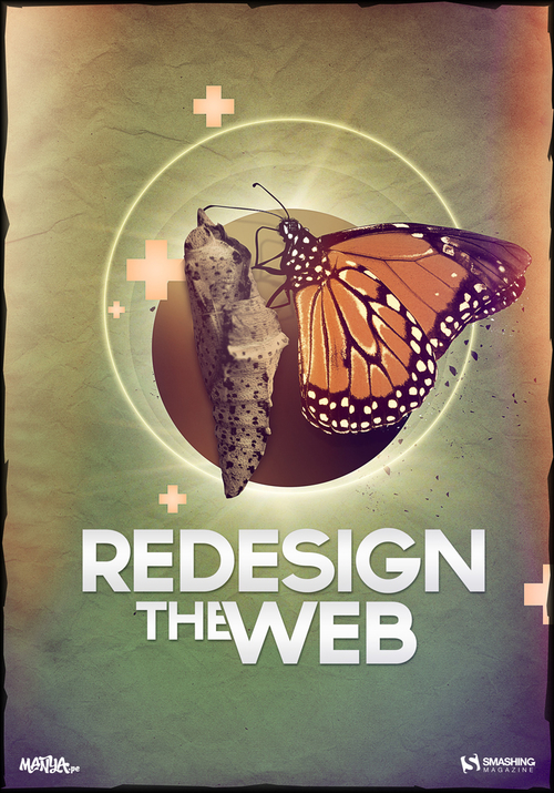
Yankale Hochman — The Web As A Butterfly
“The Web has been developing very fast. In a short time, we believe that development can be compared to a caterpillar (or silkworm) that has been transforming itself into a cocoon. But there is still one step more in the evolution: the step, where a complete Web becomes light, fast, functional and as attractive as a butterfly. This last step is in our hands. Let´s make it together.”
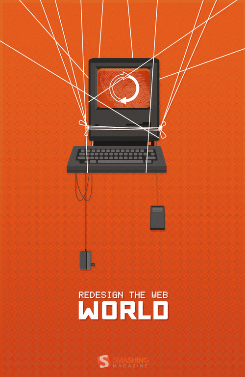
Zachary VanDeHey — Leave Your Mark
“My idea is pretty simple, redesign the web redesign the world is all about leaving your mark. I’m a firm believer that great web design can create feelings and emotions. In the same way that music and literature can move people to change and take action so too can web designs. Take hold, reload, and leave your mark.”
Inspirational Interpretations By Five Well-Respected Designers
By the start of the contest, we presented you striking and inspiring interpretations from five well-respected designers. For your convenience, these are now also available for download.
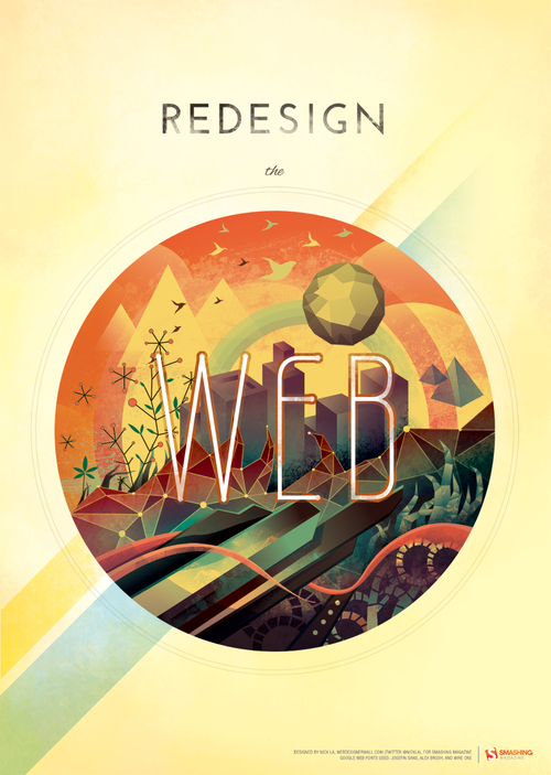
Nick La
Nick La interprets the Web as an earth-like eco-system. The Web is situated in an abstract, futuristic environment, with colors and elements that convey an almost mystical atmosphere. The interpretation has a visionary quality to it and shows a touch of Jules Verne. Have you noticed how Nick managed to have both dinosaurs and tweets in one artwork?
Larissa Meek
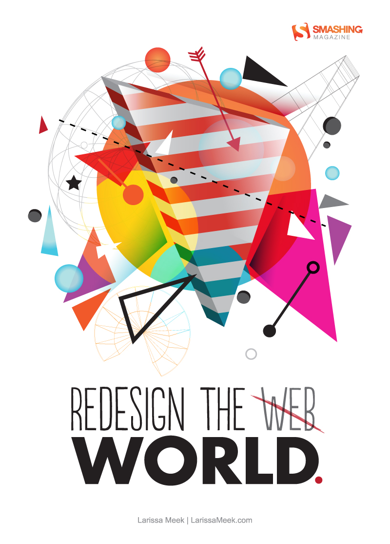
Larissa Meek’s first poster concept is strongly geometric and bursts with color. “I wanted to capture the essence of what a more beautiful world would feel like based on the statement ‘Redesign the Web, Redesign the World,’” says Larissa. The result sure catches the eye.
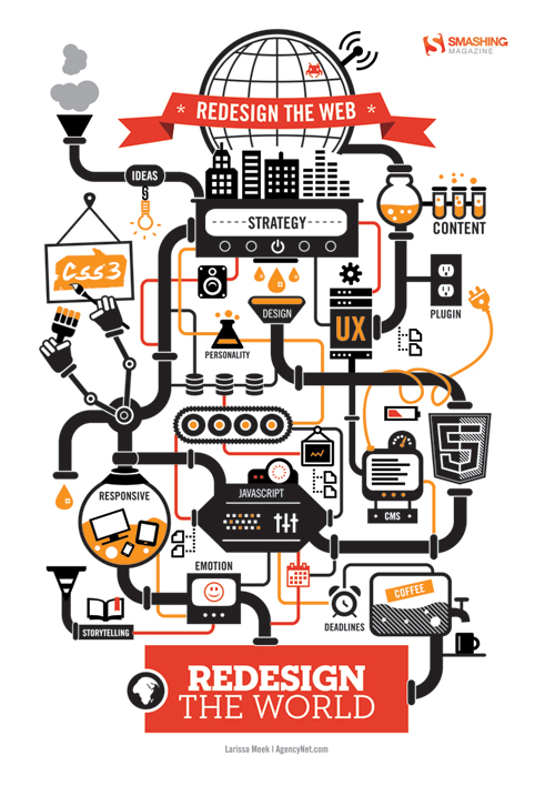
Larissa Meek’s second concept shows another interesting approach: visualizing the various elements that the Web currently consists of. The poster captures techniques such as CSS and HTML, workflow elements such as storytelling and also the daily realities of the professional designer (such as deadlines, coffee breaks and ideation). All elements are interconnected in a clever composition using just two main colors: red and orange.
Simon C. Page
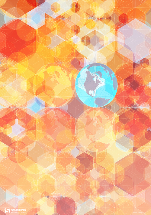
Simon C. Page is known for his abstract geometric styles. His poster design is made up of a variety of shapes and structures that are fundamental to the Web—the world being one of them.
Ricardo Gimenes
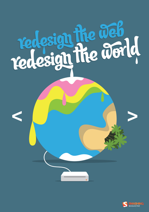
Brazilian designer Ricardo Gimenes’ concept relies on Smashing Magazine’s familiar cartoon style and introduces what might be considered a <redesign> tag.
Veerle Pieters
Veerle Pieters’ cover design for our Smashing Book 3 (Sold Out) reflects the various elements that a redesign has to balance with the various building blocks of the Web. Read more about Veerle’s ideas behind the design and the process and read more about the printed Smashing Books.
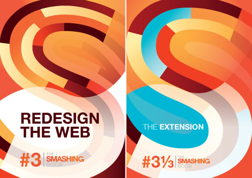
- Redesign the Web: Preview
- Redesign the Web: A3 size (PDF)
- Redesign the Web: A4 size (PDF)
- The Extension: Preview
- The Extension: A3 size (PDF)
- The Extension: A4 size (PDF)
Be Sure To Join In Next Time!
Thanks to all who have participated in this contest. There will be more contests and goodies coming up soon, so be sure to stay tuned! And you might want to check out our previous contests as well.
Sincerely Yours,
— The Smashing Team
Further Reading
- Breathtaking Typographic Posters
- 60 Concert Posters From Ten Amazing Artists
- Design Something Every Day!


 Register Free Now
 Celebrating 10 million developers
 SurveyJS: White-Label Survey Solution for Your JS App

