Retiring The Portfolio Screenshot
The humble screengrab, staple component of a million personal and agency portfolios, can now retire with thanks for years of sterling service showing snippets of work done for a particular client or project. The screengrab always reflected a mythical state in time where the website looked just as the designer intended it, not how it typically ends up after a week or two when the client has been adding their own ad banners, stock photos of business people shaking hands or several poorly worded press releases.

As designers and developers, we spend a great deal of time and effort getting a project just right for a client, yet often we don’t do it justice when we display the extent of our involvement and the various component parts that go into the whole thing. So many personal and agency portfolios simply display a couple of screen grabs of a project along with a few hazy bullet points saying things like “HTML & CSS”; or “WordPress CMS development.”
These tell us very little about the effort that’s gone into a project and aren’t really very helpful to visitors who might be looking to your portfolio with a view to working with you on a project.
It’s great to see this trend is slowly changing and we’re seeing some more detail and resources being made available for us, so we can read about and learn from that were probably unthinkable even a few years ago.
“We learn more from studying the thought behind the design vs just the visual design.”
New Opportunities For Design
Opting for a more detailed approach to displaying your work opens the door to a more creative approach to your portfolio.
In our ongoing update to our own website, we’ve made the decision to focus on fewer projects and instead create custom designed case studies for each, because not only do we enjoy sharing the details of a project itself, typically over time we’ve found we also write several blog posts with varying bits of information, from design process to development methods and code, along with assorted business methods or techniques we’ve found productive and useful, and creating a richer case study shows our skills and experiences better.
All of this combines to create a much richer story of a project, in addition to the opportunity to customize a design to tell that story in a way that’s interesting and engaging. It’s an extra outlet to show your design work.
A Willingness To Be More Open
It’s noticeable that more and more agencies (and therefore clients) seem to be open to sharing more background process and actual results of their projects, and the decisions and reasons for some choices. It’s hugely helpful seeing the reasons for a choice, not just the polished end result out of any sort of context.
Many clients these days are showing an active desire to actually share more resources, processes and code. You only need look as far as GitHub for countless frameworks and development guidelines that are entirely open to the public to learn from.
A great example is the new Gov.uk website here in the UK, that has been developed in public and backed by regular blog updates and feedback, released to anyone who wishes to find out more about how the website has been designed and developed.
The Role Of The Front-End Developer
Over the last few years, there’s been a significant increase in the prominence of the “front end developer,” and while I’m not discussing the specifics of what that role does and does not entail, in my experience it does often (to me at least) involve significant JavaScript development, and it’s something that words and a screenshot don’t really convey well.
Replacing these screenshot-based projects with live, interactive demos is a great way to expand a portfolio and show how something works in a real life context.
Hosting work on CodePen or jsFiddle is a good start, but perhaps consider going the extra couple of steps to design some great interactive demos and show them off like an actual mini product instead of just an isolated snippet.
Case Study Detail
There are some truly great bits of work out there at the moment and they’re now being backed by ever more detailed case studies instead of screenshots and bullet points. Here are some great ones to read.
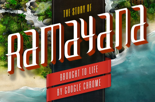
The Story of Ramayana by Fantasy Interactive

An incredibly designed and detailed overview of *Fantasy Interactive*’s work with Google. It’s great to see detail on how multiple teams and partners work together to pool their skills, resulting in something groundbreaking.
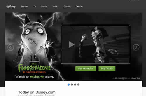
The Thinking Behind the New Disney.com

As you’d imagine, a high-profile website like Disney.com has multiple stakeholders and various objectives for its visitors. The blog The Fox Is Black does a great job of explaining not only the outcomes, but just as importantly, the objectives and challenges for the website, which show why many design choices have been made and what the results were.
More Designed Case Studies
- Fantasy Interactive’s full range of case studies
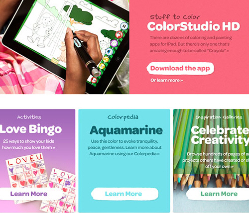
- Daniel Mall’s Crayola.com case study
- Puma redesign by Viget
- Behind the scenes with Circle App
- FreeAgent redesign
- The all new Squarespace
Technical Case Studies
- The story of the new Microsoft homepage
- Matt Berridge’s extensive write-up of a recent NHS project
- David Bushell’s write-up of the Passenger Focus website rebuild
- Andy Clarke’s redesign of the International Organization for Standardization website
- Trello’s tech stack
Next time you’re adding a project to your portfolio, perhaps consider writing it up in a bit more detail and turning it into a case study or a code release that fellow designers and developers can learn from, and understand why the result of the project is what it is.
Seen any good case studies recently? let me know at @welcomebrand or leave a comment.
Further Reading
- My Workflow To Design And Develop A Portfolio Website
- 10 Steps To The Perfect Portfolio Website
- An Analysis Of Navigation In Portfolio Websites
- How To Create Effective App Screenshots


 Celebrating 10 million developers

 SurveyJS: White-Label Survey Solution for Your JS App
 Register Free Now


