How To Succeed With Your Mobile App
Most apps fail. This cruel reality has led many disillusioned developers to conclude, often subconsciously, that succeeding on the App Store is like striking it rich in the gold rush: you just need to get lucky.
The idea of luck is a dangerous sedative to ease the pain of failure. Pain is a good thing. It shows something is wrong. If my app fails, I want to know why. Instead of blaming forces beyond our control, why not look at what folks like tap tap tap and Tapbots are doing to succeed again and again and again.
While applying this formula flawlessly is nearly impossible, working towards it will dramatically increase your chances of success. These concepts are based on the iOS platform, but many of the principles apply to other platforms as well.
Idea
Any successful app rests on the foundation of a solid idea, because the idea determines the ultimate potential of the execution. Avoid the temptation of jumping straight into execution after having an epiphany in the shower. A little bit of research up front can save you a lot of pain down the road.
Find A Vacuum
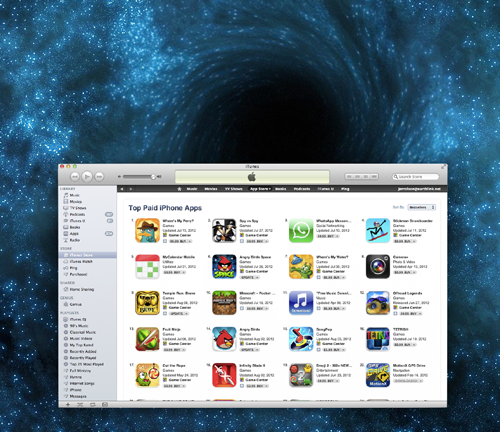
Phill Ryu (@phillryu) has an impressively consistent track record of top apps: Clear, The Heist and Classics, to name a few. His secret for validating ideas is pretty simple: find a vacuum. The App Store houses a plethora of quality, user experience and innovation vacuums. Vacuums are cool because they inherently want to be filled. A few examples:

Clear: among thousands of to-do apps, Clear (by Realmac Software) filled a user interface (UI) innovation vacuum. Entering a crowded category seems counter-intuitive, but the biggest categories provide the biggest opportunities if you can innovate within them.
Tweetbot: Twitter bought Tweetie and dumbed it down to appeal to the masses. Tweetbot filled the Twitter power user vacuum.
iTranslate Voice: The release of Siri intrigued the world, instantly generating a vacuum for apps like iTranslate Voice that behaved like Siri but offered different functionality. Every new technology introduces a new vacuum along with it.
For sure, the low-hanging fruit is gone, but there are still tons of vacuums out there, particularly in the design department. Find a vacuum that you are passionate about and fill it.
Show Me The Money
Most apps don’t make money. If revenue is important to you, it is worth exploring what kind of apps make money and what kind of apps don’t. Building on Marco Arment’s theory of two app stores, I postulate that three categories of apps make money, and one category doesn’t.
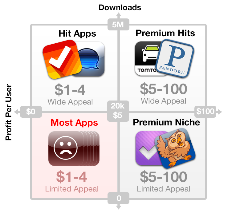
Hit Apps:
- High volume, low price;
- Appeal to almost everybody, targeting impulse purchasers who browse the top charts and featured lists;
- Huge launches based on intense marketing campaigns;
- Require tens of thousands, if not hundreds of thousands of downloads to generate significant profit.
Examples: Clear ($3) and iTranslate ($1).
Premium Niche Apps:
- Low volume, high price;
- Target a serious niche;
- Users find the app through thorough research and are willing to pay big bucks to improve their lives;
- A large profit per user makes traditional customer acquisition methods (i.e. pay-per-click ads) viable and scalable.
Examples: OmniFocus ($10) and Proloquo2Go ($190).
Premium Hit Apps:
- High volume and high profit per user;
- The only viable space for funded startups that need to turn a big profit;
- Rare but rewarding.
Examples: TomTom GPS ($50), Pandora (monthly $3.99 subscription) and freemium games that make a huge average profit per user through addictive add-ons and credits.
Most Apps Fail:
- Low volume and low profit per user;
- Even if such an app garners some attention, the limited appeal and low price limit significant success.
Developers read inspiring stories of app millionaires, look at the astounding number of devices being sold every day and develop grossly optimistic back-of-the-napkin download projections for their relatively niche apps. They conclude that if they could only capture a fraction of a percent of the market, they could sell their app at $0.99 and make a fortune.
It just doesn’t work that way. The brutal reality kicks in when the first day of sales generates six downloads, mostly from friends and family. The app idea might have scratched their itch, but it was just too niche to be a hit.
Your app idea probably falls into this category. Don’t ignore this.
Building an app that makes money is hard. David Barnard, the brilliant mind behind App Cubby, suggests that the future of sustainable revenues may lie in true freemium, scaling the cost with the value derived. Generate lots of downloads and creatively find ways to let users who find more value pay more for it. These kinds of creative monetization ideas are relatively untested for non-game apps, but that’s what makes this industry so exciting.
Make A Statement
No, I mean, literally, write something down. Whittle your idea down to its core and create one sentence that defines your app and its target market. Apple does this for their internal apps and you should do it too.
For example:
“Grades shows college students what score they need to aim for on their next exam.”
If you cannot explain the basic value of your idea in one sentence, it’s too complex. Mobile apps need to focus on doing one task extremely well, because your target market must instantly desire your app after seeing one screenshot.
After defining the app’s core, check every feature idea against this core and remove the cruft.
Design
Apple’s culture revolves around design excellence. It’s no coincidence the apps Apple showcases are always well designed. Design is the most critical component in building a successful app.
Don’t Make Me Think
Like websites, apps are incredibly disposable. If an app doesn’t make sense immediately, users feel little pain in deleting it. The title of Steve Krug’s popular book encapsulates our task as usability designers: don’t make me think. Like a well-designed doorknob, the interface itself implicitly explains its own use and value.
A few points to that end:
Kill the Baby Every cool feature idea inevitably adds complexity to the app. Strip the app, the screens and even the elements within each screen to their essence. Good design is more about saying no to good ideas than it is about generating them.
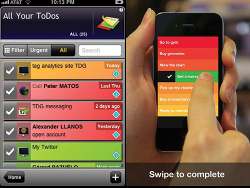
Consider UI Conventions Users have certain expectations about how the UI on their devices should behave based on the conventions they see in the operating system and the primary apps they use every day. Pay attention to the UI guidelines (iOS Human Interface Guidelines, Android User Interface Guidelines) and be sure to understand a convention before ignoring it.
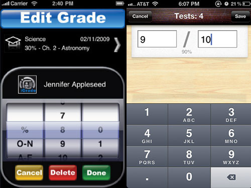
Think Like a Human Users have models in their head about the way the world works. Don’t design according to your database or programming limitations, but according to how the user thinks about things.
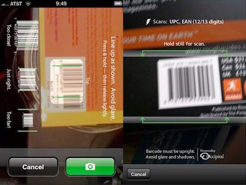
Don’t Make Me Work Users are lazy. They don’t want to read instructions and they hate typing. The best apps figure out the absolute minimum the user needs to do for the app to function.
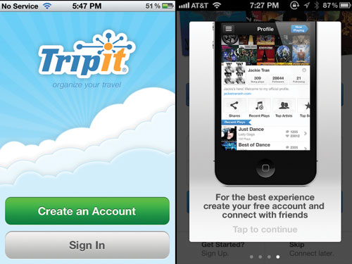
Do Usability Testing Don’t let eye scanning and focus groups intimidate you. Do whatever you can! Most basic usability problems surface by simply getting the interface in front of some potential users. Ask a few questions (“what do you think this app does? How might you do X task?”), and watch them. Do it early and often throughout the entire design and development process.
Get Emotional
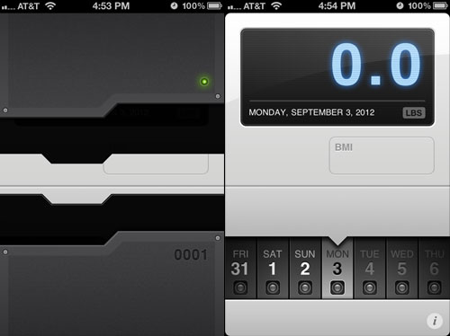
The sliding pane opening animation in Weightbot, the humorous copy in Everyday, the satisfying ascending charms when you check off items in Clear; though offering little utility, these tiny details elicit a powerful emotional response. These apps exhibit a personality. You either love them or you hate them, but you definitely don’t forget them and you are much more likely to share them.
Usable isn’t good enough any more. The best apps go the extra thousand miles to pay attention to the details that make an app enjoyable. Simon Schmid wrote a thorough treatment on emotional design, but here are some basic points relating to apps.
Visuals Matter Beautiful apps sell better, are more enjoyable to use and feel more valuable than bland apps. Though beauty can be found in rich gradients, textures and shadows, strive for the subtler attributes of elegance, readability and tasteful layout. Use skeuomorphism (UI that mimics physical objects) only where it enriches the experience and doesn’t distract from it. If you’re unfamiliar with basic graphic design principles, The Non-Designer’s Design Book by Robin Williams is a great place to start.
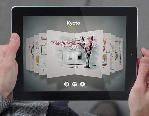
Experiment With Sound Sound in a UI is a delicate, powerful and largely unexplored tool. Experiment to see if sounds can improve your app.
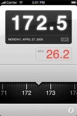
Touch Is Magic Apple’s engineers don’t stop working until their products feel right. It’s why the first iPhone’s bouncy scrolling “scrolls like butter.” If an object doesn’t respond immediately to the touch, it reminds you that you are using a computer and not actually directly manipulating the object.

Gestures can provide a powerful connection between the interface and the user but can also be frustratingly undiscoverable if not implemented correctly. Experiment with new interactions and don’t stop working until every interaction, transition and metaphor makes sense and feels right.
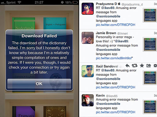
Spice Up Your Words Users generally dislike instructional copy, error messages and notifications. Why not make their day by writing quirky, witty or maybe even humorous copy! Users will appreciate the unexpected pleasure.
Animate With Class Whether it’s elements moving on the screen or transitions between screens, animation can express personality and give users a sense of continuity and polish as they navigate the app.
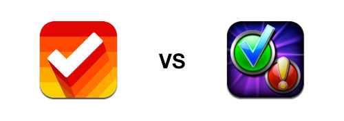
Don’t Neglect Your Icon The icon is most people’s first impression of your app. It also occupies a space on users’ precious home screen. The best icons are simple but memorable; they stand out without being garish. The icon should look beautiful at large sizes, yet iconic enough to be recognized within an app folder on the home screen.
Programming
Your technical choices influence the experience of the app, and thus, its success on the App Store.
Go Native
The “build once, deploy everywhere” method is a terrific recipe for mediocre apps.
To start, the method itself is a myth. Different operating systems have different UI conventions and patterns. With the exception of games where a custom interface is desired, one interface that deploys to all platforms results in a foreign experience on each platform.
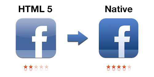
At very best, we can build once and optimize everywhere. Apps like Zipcar have successfully used this approach. Unfortunately, Zipcar is an exception to the rule of suboptimal apps built using this approach. There are a few reasons for this.
- Build once, optimize everywhere encourages a bottom-up design approach where the programming heavily constrains the design of the app. It stifles design innovation by tempting you to cut corners in order to satisfy the lowest common denominator.
- Technologies like PhoneGap essentially turn your app into a browser window that runs JavaScript code. Avoid these. JavaScript apps tend to feel slow, choppy, unnatural and error-ridden because JavaScript just isn’t ready to match native experiences.
- Tools like Appcelerator compile native code. These perform much better but still lack the flexibility and robustness of pure native code. Since you do not have direct access to the code that is running on the phone, errors can be more difficult to locate and squash. They can also make it difficult to implement new technologies right away, giving you a disadvantage against competitors who can tie into new technologies from the day they are announced.
- The bottom line: choose your technology based on the design, not your design based on your technology. Design your apps for the various platforms first. Then see if something like Appcelerator is capable of executing those designs without compromise.
For an in-depth view of cross-platform trade-offs, read Aral Balkan’s comprehensive treatment on the subject.
Code Quality Matters
While perfectly-formed, well-documented code does not directly affect the user, it certainly affects your ability to push out timely, robust updates, something that can be critical to continued success.
In addition, laggy, bug-ridden code definitely affects the user. The user doesn’t care if there is a good reason why the app crashed or deleted their data — it’s still the brand’s fault. I have seen cases where this alone has stolen the thunder out of the launch of otherwise promising apps.
Hourly rates can be deceiving. In the time it takes a poor coder to build one component sloppily, a quality coder can build three components robustly. If you decide you don’t like the poor coder, a new coder will most likely have to start from scratch because the legacy code only makes sense to its author. On the other hand, quality code can be reused and built upon easily.
Marketing
If you have a marketing department, good for you, but grassroots marketing by a developer or a designer can often be even more effective. Believe me, when I started, my name didn’t mean anything to anybody that mattered. Now my work has been featured by Apple, Mashable, TechCrunch, The Huffington Post, Fox News and dozens more. All this without spending a dime on marketing, aside from a few website costs.
Start Early
Many developers think of marketing as something to do after an app launches. Nothing could be further from the truth.
A huge launch is critical, especially for inexpensive apps. If your launch does not propel your app into the top charts, the app will most likely fade into oblivion almost instantly amidst the thousands of apps launching every week. An app that is not on a top chart is nearly invisible to most consumers.
After the launch, a review here and there doesn’t help much to propel your app up the charts. It’s just the way the App Store rankings work. Ranking algorithms constantly change but they are roughly based on sales in a window of time, say four days, weighted towards the latest day. This means that marketing you do today will not affect your ranking a week from now, making fragmented press all but worthless. Only concentrated marketing blasts work. The launch constitutes your number one chance to show your app to the world in a concentrated way.
With this in view, App Savvy author Ken Yarmosh characterizes the marketing of apps as a crescendo. Marketing an app should start at the very beginning and continually develop as it consummates in a huge launch blast.
Make Friends
Connections are everything. They power your marketing machine. No connections means no warm doors, and, with thousands of apps vying for press attention every week, a warm door is gold.
Connect With Apple Employees, Tech Writers and Influential Designers and Developers in the Community Realize that actual human beings run companies like Apple, TechCrunch and tap tap tap. A lot of these people are really cool and love to meet and promote people with great products and ideas. Make a list of people to connect with and actively seek opportunities to do so.
Go Where They Are
- Twitter is a good place to start — nearly every influencer in the tech industry tweets.
- Commenting on influential blogs or emailing the author can be a great way to initiate contact.
- Face-to-face connections are the most powerful, so be sure to hit up the Apple Worldwide Developers Conference (WWDC) and other conferences that the Apple community tends to congregate at. Local meetups are also a great place to meet people.
Be Cool, Don’t Spam Just because you get the opportunity to talk to someone doesn’t mean they are instantly interested in your pitch. Build a meaningful connection first. Then they’ll be asking you what cool things you’re up to. When you do show off some work, do it in the way of seeking advice and feedback rather than pitching. It comes off better and often elicits great feedback.
Give and You Shall Receive Build meaningful connections with people by getting into their mind and thinking about their needs and wants. Maybe an influential person asks a technical question on Twitter that you know the answer to, or writes a post you have thoughts on. Be sure to respond! Do this a few times and they might just notice. Finally, remember that people have egos — be sure to let them know when you appreciate their work.
Post Interesting Stuff Link to insightful articles and maybe even write your own blog with the things you learn about. People love to read honest journaling and analysis of apps. Websites like iDevBlogADay promote your articles to the community.
Build Buzz
You don’t want your launch to fall flat, so a few weeks before launch, start revving up the hype machine. The idea is to build up a fan base who will be the first to download your app on launch day.
- Set up Twitter and Facebook accounts for your app. This gives potential fans an easy way to follow and mention your app. Use the account to post sneak peeks, updates on progress and contests. You can even use the account to follow people you think might be interested in the app. They’ll see you’re following them and might even check the app out.
- Build a teaser website with a form to sign up to your mailing list. Include something to entice people — an attractive Web design, a beautiful screenshot and maybe even a video.
- Create a video. Nothing builds buzz like a well-done video. The buzz behind the Clear video exemplifies that. It’s also an easy way to show the press what your app is all about.
- Run a private beta. Your beta testers will be your biggest fans going into launch because they feel invested in the development of the app.
Get Featured
After winning an Apple Design Award, my app was featured in nearly every tech publication I had ever hoped for, but all that press combined generated fewer downloads than when Apple featured it.
So how does one get featured by Apple? Thousands of apps come out every week, and only a select few find a place on the App Store homepage.
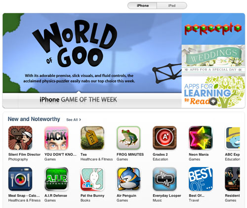
First, the app has to be “featureable.” It must interest Apple in some way. Does it have a polished design? Does it show off the Apple platform? Is it something you cannot find on other platforms? Any of these characteristics boost your chances. The good news is that out of the thousands of apps coming out, very few feature the kind of design discussed here, making it relatively easy to stand out.
Second, you need to get Apple’s attention. Making connections within Apple can be invaluable. As a general rule, though, you need to make your own splash before Apple will make you a bigger one. Apple has an editorial team. They find apps to feature. You need to get to the places they are looking. Based on my experiences, they probably look at new apps that are “charting” — moving up the charts. For that, you need to generate a good number of launch-day sales. It takes at least a few hundred sales to chart in most categories. Besides that, think of the places you might go to find new quality apps; they probably visit the same websites.
Pitch The Press
Press reviews help establish credibility, an initial stream of downloads and visibility to influential people or Apple employees. Seek press attention at least a week or two before launch — these people are busy and you want to try to have reviews lined up to publish on launch day.
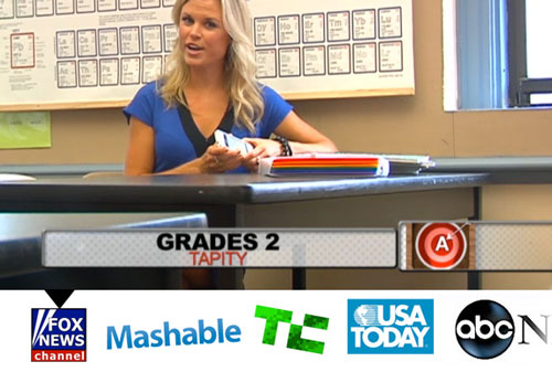
This is the part where you contact all those really great friends you’ve made within the press and tech community, giving them a sneak peek of your app and asking if they want to hear more.
After exhausting your warm doors, start cold calling. Have a story, keep it short, make it personal and don’t forget to follow up.
Build A Fan Base
The most powerful app company is one with a fan base. Sonico Mobile, a partner on our latest app, Languages, recently released an app called iTranslate Voice. The app became an instant #1 hit with very little promotion from the press or Apple. How? Sonico advertised iTranslate Voice to their 30 million strong iTranslate user base and sent out an email to their massive mailing list.
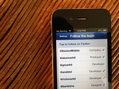
A fan base takes time to develop. Be sure to make it easy for fans to join your mailing list, like your Facebook page and follow your Twitter account. In addition, consider a mass-market free app as part of a strategy to gain millions of fans. Ad bartering services like Swappit allow you to build up ad impression credits and use them all at once on a big launch.
Conclusion
Success is measured in different ways. The first version of Grades made less than $10,000, but it was a stepping-stone to an Apple Design Award, and dozens of invaluable connections. Now our company is positioned to launch top-selling apps like Languages, which is more than making up for Grades pecuniary issues.
Monetary success is hard, but it gets easier as you go. As you consistently produce quality apps, your brand becomes recognized by the press and Apple, your team gains critical hands-on experience and you develop a fan base. This is definitely a long-term game, but the payoff can be incredible. It’s a great feeling to know that millions of people are enjoying the fruit of your hard work. Learn the lessons, don’t compromise and make a dent in the universe.
Further Reading
- Key Ingredients To Make Your App Go Viral
- Smart, Effective Strategies To Design Marketing Campaigns
- A Roadmap To Building A Delightful Onboarding Experience


 Agent Ready is the new Headless

 SurveyJS: White-Label Survey Solution for Your JS App

