Introducing New iOS6 Features In Mobile Safari
If you’ve had half an eye on the tech press over the last few weeks, you’ll be aware of the update to iOS, or at least of its replacement of Google maps with the new iOS Maps app.
Stories of parks appearing where once there were roads, seas disappearing and more, abound. I’m not going to wade into the debate about whether or not Apple should have done this or whether the new app is an improvement or not, but instead I’m going to focus on the update to mobile Safari — and specifically, what it means for Web developers.
So, What’s To Like?
Admittedly, the latest version of Safari doesn’t make such great strides as the previous update did, but there are some tools in there which will be of use or interest to developers. These include:
- File upload,
- Full screen mode in landscape,
- Web audio,
- CSS images,
- Web inspector.
So, lets take a look at each of these in turn and give some ideas of how you could be using them in your projects.
File Upload
I developed a website this summer which was a fun, quick project designed to help a group of friends I was on holiday with (there was quite a crowd of us and it included geeks, so bear with me). The website included a gallery page, where we could upload photos we’d taken during the holiday. Unsurprisingly, this consisted mainly of shots taken late at night of people doing daft things after a few drinks, but that’s by the by. The frustrating thing about this page was that no one could upload photos to it from their phone. People had to email them to me and I uploaded them via my WordPress app, but even that was a messy process.
The reason for this was that it was impossible to upload images, or any files, via Safari running on iOS5. It just wasn’t supported by the browser.
The good news is that with iOS6, this has changed. If you add a form to your website which includes a field to upload files, your users can do it. At present they can only upload images or video — after all, iOS doesn’t include the kind of file management you’d need to upload other kinds of documents, although this could change in the future as iCloud support becomes more integrated with Safari.
Adding an input field for file upload is simple. Just insert the following into your HTML:
<input type=file>Note that the following is also acceptable syntax:
<input type="file">This will create a field which accepts video or audio from Safari, using the interface you’ll be familiar with if you’ve developed or used apps which allow image upload or capture:
But what if you want to specify the kind of media to be uploaded? The good news is that for photos and videos, this can be done, but unfortunately not for audio, PDF or streaming media at present.
To specify the media type, insert one of the following:
<input type=file accept="video/*">
<input type=file accept="image/*">
Safari also accepts multiple images in one field, which is coded using . So, to make this clear for users, you might add:
<label>Multiple files:</label>
<input type="file" multiple>
The user adds as many images as they want by tapping on each of them before uploading — saving on going through the process more than once:

The interface for uploading multiple images in one field.
After uploading, the user sees the multiple images displayed one on top of the other, with the number of images shown. The user can’t capture those images live though — just select ones from their photo stream or camera roll.

A Web form showing uploading images.
This would be useful for any website or Web app which involves sharing images or videos or providing copies of them, for example as part of a job application. Or you could just start a community photoblog!
Full Screen Mode In Landscape
Apple is keen on full screen mode. It’s been working its way into their own and third-party apps on Mac for a while, it’s a feature of photo and video apps such as YouTube, and now it’s come to mobile Safari. Only in landscape orientation though — I’m not entirely sure why this is, but it could be related to the Reading List function, which Apple might want users to use instead of going full screen when in portrait orientation.
So, what does full screen mean? It simply adds a button to the bottom right of the screen which the user taps to get rid of the browser chrome, so this screen:

Safari when not in full screen mode.
becomes this:
This isn’t a huge change, but it does offer some possibilities to designers and developers, for example, if you’re developing a photo website and want to incorporate a non-standard navigation such as swiping or zooming, or if you’re developing a game or Web app and want to make full use of the available space. By removing the chrome, you focus the user on the content and your own navigation, which makes the experience more app-like and immersive. It also makes a lot more content visible — if you’re still thinking about “above the fold,” stop it right now!
But a word of warning — if you do decide to use this feature, make sure your navigation is intuitive and in line with Apple’s mobile UX guidelines, or your users will just be confused.
Web Audio
Web audio can be infuriating. Luckily the days are gone when every website we opened seemed to play some random music in the background, just because the website owner liked it, and probably in breach of copyright. If you were like me, you quickly clicked the back button so your boss wouldn’t know you were messing around on the Internet.
The Web audio API allows you to include multiple sounds, schedule playback and more — all things which I, as someone who isn’t a sound engineer, struggle with. It allows you to include rich, interactive audio content — much more than simply using the tag. Being able to incorporate this alongside rich visual content delivered using HTML5 could be really interesting — a further step towards delivering some of the interactive content previously only seen in native apps.
CSS Images
Mobile Safari has introduced a few CSS features for displaying and rendering images. These include:
Image Filters
These apply effects to an image in the browser, saving the need to store and download a second image. Effects include brightness, contrast and saturation. The filters are applied before rendering, and you can use more than one together.
This hasn’t been adopted as a standard yet, so use the webkit prefix, for example to increase contrast:
img.filter {
    -webkit-filter: contrast(200%);
}
The above example doubles the contrast in an image, by increasing it to 200% from 100%, which is the starting point.
The available image filters are:
hue-rotate- allows you to change an image’s color with reference to degrees of rotation around the color wheel,grayscale- transitions an image from color to black & white,sepia- a bit like grayscale, but applies a sepia effect (and could save time on Instagram!),blur- makes an image blurred,brightness- dims the image,contrast- increases or decreases an image’s contrast,invert- inverts an image horizontally.
If your website is targeted at iOS devices, this could save you a lot of time retouching images in Photoshop, as well as reducing HTTP requests if you want to show multiple copies of an image with different effects. For more information on the syntax and some demos, have a look at this Nettuts+ tutorial.
CSS Cross Fade
Cross fade is a kind of CSS transition which fades one image into another using whichever effect you specify. It can be used as alternative to a JavaScript-powered slideshow, for example by stacking multiple images on top of each other and adding a timer effect between transitions or providing a button for the user to click.
Brad Shaw has written a great tutorial with the code for this which is well worth a look.
CSS Image Set
This feature is brand new and isn’t standard yet, but could be useful in some contexts. It allows you to set different image sizes depending on the screen resolution — useful for sending larger images to retina devices without additional media queries or device detection. It only allows 1x and 2x scaling, which corresponds to standard resolution screens and retina displays:
img.resize {
    -webkit-image-set(url(low.png) 1x, url(hi.jpg) 2x);
}
It isn’t a perfect solution to the issue of responsive images, as it needs to be set for each and every image which it applies to, but it could be useful for large images such as banners or gallery photos where size is an issue and the number of images isn’t high. It does also avoid using background images to deliver responsive images, which is bad for accessibility.
I wouldn’t recommend using it for every image on your website though, as it would take forever!
And Finally… The Web Inspector
All Web developers use some kind of debugging or inspection tool. Whether that’s Firebug, Chrome Developer Tools or Safari’s Web Inspector, we all have our favorite.
Every now and then I’m working on a responsive website with device-dependent code and I want to inspect that code on a mobile device. Until now, it’s been tricky. There is a JavaScript solution by Shaun Inman which opens a new window with the code from the page you were just on, but it’s limited compared to what we’re used to on the desktop.
The Web Inspector changes all that — up to a point. It only works via USB (yes, I know — let’s hope they improve that one) and only with Safari 6 and above on a Mac, but it does allow you to inspect the code from a mobile website or — even better — an app, as it is on the device.
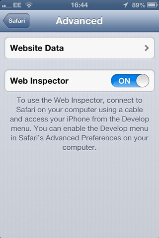
To enable it, first you’ll have to switch it on. In the “Settings” menu, go to Safari → Advanced, and turn Web Inspector on:

Turn Web Inspector on in the “Settings” menu.
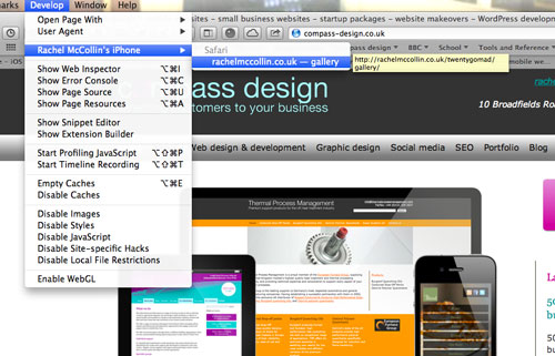
Once you’ve switched it on, plug your iOS device into a Mac using a USB cable (if you can find one) and open up desktop Safari. In the “Developer” menu, you’ll have the option to view the code on your device:

You will see your iOS device as an option in the “Developer” menu of desktop Safari.
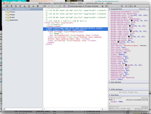
This opens the standard Web Inspector window (which may be a little confusing if you have another website open in the background — remember it’s the code from the page on your device you’re looking at, not the page on your desktop Safari).

Web Inspector shows the code for the page you have open on your iOS device.
This feature isn’t ideal — I’d rather it connected via Wi-Fi or, even better, allowed you to inspect code on the device itself — especially useful when using an iPad as a replacement for a laptop, as I often do. But it will be incredibly helpful to app developers and to anyone developing websites that take responsiveness past CSS media queries.
Summary
These are the most interesting features of the latest release of mobile Safari for Web designers and developers. I’d like to have seen more (such as uploading files via iCloud or Web Inspector on the device), but as always with Apple, new features which aren’t quite there yet often evolve into something more polished.
In my view, the file upload and Web inspector will be the most useful. I’m already imagining the uses of file upload for photo sharing and community websites, and Web inspector is something I wish I’d had access to when I was recently researching mobile testing tools. Web audio is fairly niche but represents a further step away from native apps and towards Web apps, while the CSS image properties take adoption of new CSS properties on mobile a step further and add to the ongoing debate about responsive images.
I look forward to trying some of these things out on new or existing websites!
Credit of image on front page: Shardayyy
Further Reading
- Prioritizing Devices: Testing And Responsive Web Design
- Where Are The World’s Best Open Device Labs?
- Establishing An Open Device Lab


 Agent Ready is the new Headless
 SurveyJS: White-Label Survey Solution for Your JS App


