When You Shouldn’t Use Fitts Law To Measure User Experience
The key statement of Fitts’s Law is that the time required to move a pointing device to a target is a function of the distance to the target and its size. In layman’s terms: the closer and larger a target, the faster it is to click on that target. This is easy to understand, not too difficult to implement and it doesn’t seem to make much sense to contradict such a simple and obvious statement.
However, before you start applying Fitts Law on every single pixel you can find, consider a few problems that might arise for you as an interaction designer.
Fitts’s Rule Number 1: Create Larger Targets
The likely most prominent statement derived from Fitts’s Law is that the larger a target, the faster it is to acquire.
The Benefits
Creating larger targets will facilitate interaction as well as allow you to get the most pixels out of your interface.
For example, some websites do not extend the clickable area of a button or link to the entire target. As a result, more precision is required to move the cursor to the respective link, which leads to slower navigation times. Fitts’s Law would suggest utilizing every available pixel to enlarge the clickable area and thus making it a larger target to click.

The target to the left lets a few pixels of screen real estate go to waste. The target to the right makes itself larger and quicker to click by exploiting every pixel at its disposal. (Left example: Firefox, Right example: Apple)
Increasing the absolute or relative size of a button to make it easier to click is also a popular technique among designers for communicating priorities within the interface and prompting or calling users to perform a particular action.

Relative and absolute size communicate priority within an interface. (Example: LibreOffice)
Although there are many more considerations to be factored in when designing a call-to-action button, Fitts’s Law provides one of its foremost theoretical foundations.
The Perils
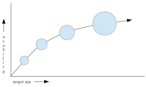
The downside of large targets is, of course, that they can break the balance in your interface as well as quickly take up screen real estate. However, even if you have plenty of space to spare, you do not have to constantly enlarge your target areas to make them more usable since the predicted usability of the size of a button progresses in a non-linear fashion.

Good for your pixels: The usability of the size of a button is a non-linear relationship.
Thus, if you make a small button 10% larger, it will become much more clickable, but if you make an already very large button 10% larger, you will not gain much more in terms of its usability.
Fitts’s Rule Number 2: Minimize Cursor Movement
A second statement one can deduce from Fitts’s Law is that the closer a target, the faster it is to acquire.
The Benefits
If you place the links and buttons users are most likely to access on a regular basis next to each other, rather than distribute them across the interface, you will speed up interaction by reducing the amount of pixels the cursor will have to travel.
Consider, for example, the Ubuntu Unity interface. It allows you to browse various sources and use two different filters on the results: a text filter and a file type filter. However, notice in the picture below how far apart the two filters are. While the text filter is placed at the very top of the screen, the file type filter is placed at the very bottom.
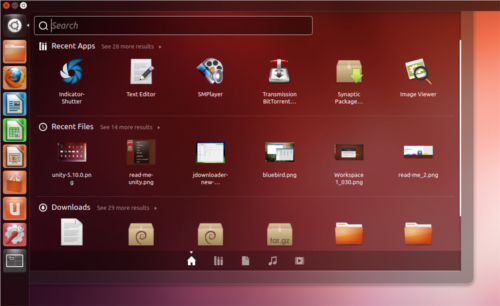
Fitts would disagree: Search filters are often accessed successively and should therefore be placed close to each other. (Example: Ubuntu Unity, Screenshot: Webupd8.org)
For a fluent workflow, this arrangement is not optimal. When performing search queries, users often access the input field and file type filters in quick succession to adjust their search results. In order to do that here, the cursor would have to travel quite a distance. Instead, placing the file type icons next to the input field would have minimized cursor movement and sped up interaction (as well as freed up some vertical space).
The Perils
Arranging elements strictly according to this formula can cause conflict with other important design principles, such as the principle of grouping and separating different classes of functionality or content. Its purpose is to give your interface a clear and consistent structure as well as increase its discoverability.
Notice in the picture below how the various tools are sorted into small, meaningful groups: in this case table tools to the left and insert tools to the right.

Sorting interface elements into meaningful groups will give your interface a clear, consistent structure. (Example: Numbers)
This allows users to create a familiar mental map of where to access a certain kind of information or tool. By contrast, if you analyzed the buttons purely by the frequency in which they are accessed, you would probably choose a different arrangement to minimize cursor movement. This, however, would break the functionally-consistent structure of your interface.
Another principle Fitts’s Law can interfere with is the principle of providing a clean and tidy interface. In order to clean up their interfaces, many websites group their content into drop-down menus. Although many designers raise objections against their usability (a discussion of which would go beyond the scope of this article), drop-downs are nonetheless acknowledged as a visually elegant and space-efficient way to unclutter the interface and organize its content.
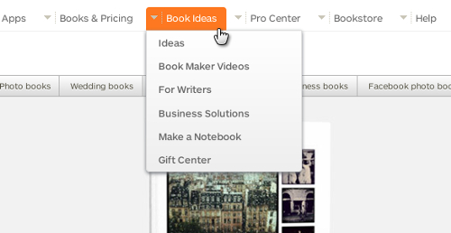
Drop-downs can help you structure your content and unclutter the interface. (Example: Blurb.com)
The reason Fitts’s Law does not recommend the use of drop-downs is that they involve a longer cursor movement since users cannot access the target in a straight line. Instead, users will have to first click or hover over the drop-down menu, and then move the cursor down the list (and possibly across sub-menus as well) until they eventually reach the desired entry. But considering the benefits of drop-down menus, a longer cursor movement can be an acceptable trade-off.
A third, very important principle that may force you to defy Fitts’s Law is the principle of building forgiving interfaces, which aim to prevent and minimize the costs of mistakes.
Fitts’s Law suggests placing elements directly next to each other to minimize cursor movement, which would also save some space. However, saving those few pixels can result in users accidentally clicking the wrong item, especially when item boundaries are not easily discernible or when focused items are not highlighted distinctly enough.

Accidents waiting to happen: the placement of interface elements can either cause or prevent mistakes. (Example: Codebeamer.com)
Be aware, though, that the consequences of mistakes are less severe when the elements represent navigational functionality as opposed to sharing or editing functionality.
If I open the wrong link, I can simply click the “Back” button to revert my mistake. Thus, when it comes to the links in your header or sidebar, there is no real harm in leaving no space between them.
When it comes to navigating during consumption, things can become more annoying. When playing video or audio files or displaying text files, accidentally clicking the “Stop,” “Eject,” “Next Item” or “Clear Playlist” buttons will require more effort on the users part to revert to the original state.
However, when it comes to editing and (especially) sharing functionality, mistakes can become downright destructive. If I click on a button such as “Send,” “Print,” “Delete,” “Download,” “Upload,” “Burn,” “Rip,” “Close,” “Shut Down,” “Connect,” “Disconnect,” “Accept” or “Decline,” my actions can be of much more severe consequences and may not be undone as easily.
Therefore, especially for elements with editing or sharing functionality, you should take precautions to minimize mistakes and the consequences of mistakes:
- Offer easy ways to undo the performed action (one option: temporary undo buttons).
- Try to leave a few pixels of space between the buttons.
- Make item boundaries clearly visible.
- Highlight focused items.
- Group buttons to minimize the damage if a mistake occurs.
To give an example for the last point in the list: if I accidentally click on the “Get Mail” instead of the “Write Mail” button, the results are not dramatic, but do not place the “Reply” and “Delete” buttons next to each other.
A special type of input method aiming to prevent mistakes is the two-step input method. Two-step input methods are slightly less usable since the two steps entail a longer hand or cursor movement yet, as a consequence, they are more secure. The basic idea is that while you can accidentally perform both actions separately, it is unlikely that you will accidentally perform them successively. Take, for example, swipe-to-delete.
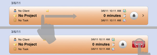
First swipe, then delete. While each on its own can easily be triggered by accident, they become a fail-safe mechanism when combined. (Example: Timelogger App)
I can imagine myself accidentally swiping from left to right or accidentally pushing a button, but not accidentally performing both actions in succession.
Two-step input methods lend themselves for mobile devices, which are more prone to accidental inputs. However, they can also be more space efficient in that the second step doesn’t need to be visible until after the first step has occurred.
So, whether swipe/tap, swipe/swipe or tap/tap combinations, two-step input methods make things a bit more difficult than just pressing a large button, but the inconvenience adds a little bit of security that is sometimes necessary to safely get your work done.
Fitts’s Rule Number 3: Avoid Muscular Tension
The goal of Fitts’s index of performance (PDF) is to quantify the information capacity of the human motor system. In other words: it aims to rank input methods according to the amount of physical effort they require to execute a certain command.
The Benefits
The benefits of effortless input methods are most obvious when working with cumbersome devices. The most prominent example is vertical touchscreens, which are typically deployed in professional environments to create, visualize and manage large sets of data.

Fitts’s Law can facilitate and prolong interaction with vertical touchscreens. (Example: Perceptive Pixel)
When working with vertical screens, keeping your arms in an upright position can quickly tire the deltoid muscles and cause input mistakes or force the user to abandon the interaction. Therefore, avoiding complex and strenuous input techniques can facilitate and prolong the interaction with those devices.
The Perils
Input methods that are more difficult to perform can sometimes actually prevent mistakes. For example, mobile devices are often carried around in pockets, which can trigger commands by accident. In those situations, high-precision input methods are deployed, which use a higher input difficulty to make sure that a command is not executed accidentally. However, these input methods are also a way of making users aware of the severity of the command. Take, for example, the way an iPhone is turned off:
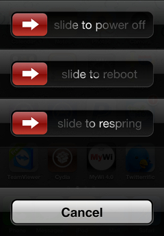
Choosing UI elements by the severity of their consequences: Slide controls for dangerous commands, buttons for harmless ones. (Example: iPhone, Screenshot: Outsideinnovation.com)
Powering off or rebooting the device are quite weighty commands; once triggered, they cannot be undone. Therefore, they are made into sliders, which require a higher precision. By contrast, the cancel command is of no comparable consequence here; hence it is made a button.
Slide controls and other gestures that require a higher precision are the most secure but also the most tedious input methods. Therefore, in order to balance security and usability, they are usually reserved for dangerous commands that are executed infrequently, such as unlocking the screen, turning off the device, setting system-wide preferences, performing administrative tasks or silencing wake up alarms. When dangerous commands are supposed to be executed quickly or frequently, for example when editing, deleting or transferring items, a well-spaced icon arrangement or two-step input method are more appropriate. Although they do not offer the exact same degree of security, they are still fairly secure yet much easier to perform.
A second reason to implement more awkward input methods is to take advantage of the space-efficient nature of gestures. According to Fitts’s index of performance, gestures, which involve some degree of dragging, require a higher muscular tension, which is why Fitts’s Law favors pointing-and-clicking. However, the advantage of gestures is that they trigger functionality without requiring UI controls.
Take, for example, the way you manage your art collection at deviantART. In order to add an item to your Favorites, you do not have to press a button. Instead, as soon as you start dragging a picture, a pane is displayed which you can drop it onto.

Dragging-and-dropping provides functionality without needing visible elements to trigger it. (Example: deviantART)
Since dragging-and-dropping doesn’t require buttons or other UI elements to trigger that functionality, it is very space efficient. The downside, of course, is that gestures do not offer any obvious visual clues as to their existence (except perhaps through tooltips). Nonetheless, if screen real estate is crucial, these input methods, although more difficult to perform, become almost a necessity.
Fitts’s Rule Number 4: Exploit The Prime Pixels
The concept of prime pixels states that some pixels are faster to acquire than others. Corners and edges of the screen are especially fast to access. However, the fastest-to-acquire pixel in any situation is simply the pixel at the current cursor position, which has lead to the introduction of the right-click context menu into human–computer interaction.
The Benefits
Context menus appear at the very pixel you right-click and provide you with context-sensitive options for the selected item. As a result, you do not have to move the cursor to a possibly distant fixed location in the interface. There are two kinds of context menus: linear menus and radial or pie menus.
Consulting Fitts’s Law will reveal that it favors radial menus over linear menus. The reasons: First, the wedge-shaped menu entries offer larger target areas. And second, because the menu has a circular shape, the pixels the cursor has to travel to reach either menu entry are always identical. This consistency allows users to create a more efficient muscle memory. By contrast, in linear menus only the menu entries closest to the initial cursor position are quickly accessible, which is why the most frequently performed actions should have those spots reserved for them.
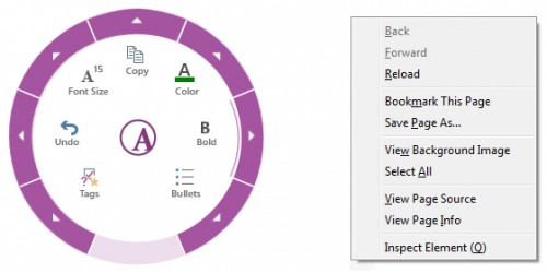
Fitts’s Law favors radial over linear menus. (Left example: OneNote 2013, Right example: Firefox)
The benefits of placing items at the corners and edges of the screen are that the screen frame guides and positions the cursor once it reaches that location.
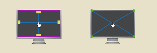
Corners and edges are prime screen real estate. (Diagrams: Particletree)
The user could basically throw the cursor to a corner or edge to select the respective item without having to readjust the cursor position. The result: the targets will be much easier and faster to click.
The Perils
Empirical studies confirm the theoretical assumptions about radial and linear context menus, stating that seek time and error rates give the former a slight edge over the latter. Yet when the participants were asked purely about their subjective preferences, the pie menu was not favored anymore.
In fact, the pie menu, although favored by Fitts’s Law, does have a few disadvantages that can outweigh its benefits in certain situations.
One issue is that the circular menu shape quickly leads to small target areas when more menu entries are added. One way to deal with this problem is to remove redundant options, in line with Hick’s Law. For example, if menu entries are not only applicable to the selected item, or if they are already accessible somewhere else in the interface, they do not have to be incorporated into the context menu as well (“Cut,” “Copy” and “Paste” always apply solely to the selected area as opposed to “Undo,” “Redo,” “New File,” “Save File,” “Print File,” or “Zoom In/Out” and thus lend themselves as fixed toolbar items).
A second way to manage a large number of options are sub-menus. While this is possible within radial menus, doing so will quickly clutter the screen and make them appear less organized than traditional linear menus. This is related to a very specific advantage of linear over radial menus: linear menus make it easier to express hierarchies via sub-menus as well as to group entries.

Grouping entries is more easily done in linear menus. (Example: Word 2013, Screenshot: PCPro.co.uk)
Finally, circular menus take up more space. This can lead to two problems: they can obscure selected items, and they are more likely to pop up at places other than the current cursor position when triggered close to screen edges.
Therefore, in summary, you should consider a linear context menu over a radial menu if:
- You have to integrate many options,
- You have to work with sub-menus,
- You want to group and rank menu entries,
- Screen real estate is critical.
And finally, as to the corners and edges of the screen, two potential problems should be mentioned when working with mouse-operated devices. On large screens, the amount of pixels the cursor will have to travel can somewhat offset the aforementioned benefits. Also, Web designers will not be able to benefit from this rule because their content (except when in full-screen mode) is run in a browser window. As a result, they cannot take advantage of the edges of the screen and will almost necessarily have to opt for a more compact, centered layout.
However, when working with devices that are not mouse-operated such as touchscreens and styli, placing interface elements at the corners and edges of the screen will not only yield no positive results as to speeding up interaction. It can even have a detrimental effect. On large screens it would require users to constantly stretch their arms, which can tire them very quickly. Consequently, frequently accessed tools should be made into freely movable objects on large devices. Thus, users would be able to work more comfortably by placing these tools close to their preferred or prime hand position, which, incidentally, would be very much in line with Fitts’s Law.
Final Thoughts
The difficulty faced by interaction designers and user experience designers is that they have to consider, balance and combine measurable and non-measurable dimensions of user experience to create the best possible product. Fitts’s Law tries to help user interface designers by giving them easily quantifiable, mathematically accurate values to base their design decisions on.
Of course, it is often possible to measure the quality of an interface using mathematical values: The fewer clicks required to access a certain set of data, the faster the navigation. The more vertical pixels a horizontally aligned interface preserves, the better it is suited for the respective device orientation. The closer the most frequently accessed buttons are placed, the more economic the cursor movement.
However, since interfaces are designed for humans, they also have to be consistent, considerate, inclusive, playful and discoverable: qualities that can hardly be measured as easily as clicks or pixels. The stunning accuracy and simplicity of mathematical formulas may sometimes lead designers to favor the measurable over not-so-easily-measurable dimensions. And while mathematical formulas can, indeed, help you enrich user experience, you should treat those formulas as tools, not as principles.
Instead, you should debate and choose anthropological principles first, and, if they permit it, use formulas such as Fitts’s Law as much as possible to actually improve user experience.
Further Resources
Resources you might be interested in:
- Fitts’ Law: Modeling Movement Time in HCI A brief overview of Fitts’s Law.
- The Information Capacity of the Human Motor System in Controlling the Amplitude of Movement (PDF) Paul Fitts’s original article published in the Journal of Experimental Psychology in 1954.
- Visualizing Fitts’ Law A list of diagrams visualizing the basic rules of Fitts’s Law.
- Fitts’s Law as a Research and Design Tool in Human-Computer Interaction (PDF) A case study comparing the efficiency of various input methods.
- An Empirical Comparison of Pie vs. Linear Menus A controlled experiment testing the seek time and error rates for pie versus linear menus.
- A Quiz Designed to Give You Fitts A small quiz to test your knowledge of Fitts’s Law.
Further Reading
- What Is User Experience Design? Overview, Tools And Resources
- The Elements Of The Mobile User Experience
- The Lean UX Manifesto: Principle-Driven Design
- Redefining Hick’s Law


 SurveyJS: White-Label Survey Solution for Your JS App


 Celebrating 10 million developers
 Try ProtoPie AI free →

