The New Mobile Book Is Finally Here!

Email Newsletter
Weekly tips on front-end & UX.
Trusted by 182,000+ folks.
 Register for Free

 Custom Web Forms for Angular, React, & Vue. Your backend.

 Celebrating 10 million developers
Until then, the complimentary digital version is waiting for you in your Smashing Shop dashboard. And if you haven’t ordered just yet, make sure to get the book now!
At this very moment, all pre-orders are being shipped from Berlin, Germany, by airmail. Due to an unexpected huge amount of pre-orders in the past days, delivery of the new book orders will take a bit longer since we only have a limited amount of printed books in pre-sale stock.
Of course, we are printing extra copies in this very moment as you read this post. But unfortunately, the shipping of the new printed copies can only start in early January 2013. Still, you get the eBook automatically once you’ve ordered the printed book, so you can start reading right away!
eBook Is Now Available
The eBook of the Mobile Book is available for download immediately: PDF, ePUB and Kindle formats for your convenience. If you have pre-ordered the book, your eBook is waiting for you in your Download Area. Also, keep in mind that the eBook is included in the Smashing eBook Library—our annual subscription with 70% discount on all Smashing eBooks.
And if you still haven’t ordered yet, you can get the Mobile book right now, and start reading within a couple of minutes! You won’t be disappointed. Why? Let’s see why.
What’s In The Book?

When it comes to mobile, there are more open questions than definitive answers. Due to its fragmentation, it’s not so easy to understand how the mobile market looks and works in general. How can you pick the right mobile strategy and select the right approach for your website? What design patterns and what UX techniques can assist you to design faster and more effectively for mobile devices? What design patterns do you need to be aware of when building responsive websites and what patterns will help you optimize the performance for mobile? When you design with mobile in mind, how exactly should your design process differ from a traditional design workflow?
Our new book attempts to answer these questions. Well-known experts such as Peter-Paul Koch, Stephanie Rieger, Trent Walton, Brad Frost, Dave Olsen, Josh Clark and Remy Sharp have contributed to the book to present the most relevant and valuable insights. To ensure the quality of the material, the chapters have been reviewed by Scott Jenson, Bryan Rieger, Tim Kadlec, Bruce Lawson and other active members of the mobile design community. The foreword was written by Jeremy Keith. It wasn’t easy to bring together such a stellar line-up of experts, but a compromise wasn’t an option.
Technical Details
- 320 pages, 16.5 × 24.0 cm (6.5 × 9.5 inches).
- For both newcomers and experienced Web designers and developers.
- Quality hardcover with stitched binding and a ribbon page marker.
- Shipped from Berlin, Germany, only via air mail.
- $5 worldwide shipping (check worldwide delivery times).
- Also available as an eBook (PDF, EPUB, Kindle).
Why You Should Pre-Order “The Mobile Book”
The mobile environment is a new major challenge, but also a great opportunity. In our upcoming Mobile Book, 12 brand new chapters from experts on mobile summarize the knowledge and best practices in mobile design and development to prepare you, dear reader, for the challenges of the mobile future.
The traffic coming from mobile devices is steadily increasing and has become significant in marketing. It’s time that we learn how to address these pressing issues — how to develop the best solutions for our clients so they don’t lose traffic, gain better brand awareness, find new customers and be prepared for the unpredictability of the mobile environment in the future. If there is a book that every Web designer and developer needs today, then it is surely this one.

Table Of Contents
When setting up the concept of the book, we worked hard to ensure a delicate balance between basic knowledge and the current state of the art. Please note that changes to chapter titles are still possible.
| AUTHOR | CHAPTER | DETAILS |
|---|---|---|
| Jeremy Keith | Foreword | |
| Jeremy Keith has been around on the Web for a while and saw the emerging mobile medium from its earliest days. With his preface for the Mobile Book, Jeremy introduces us to this new facet of the Web and the new possibilities and challenges that the Mobile industry produces as a relatively young medium. | ||
| Peter-Paul Koch | What's Going on in Mobile? | |
| This chapter provides a general overview of what's going in the mobile industry today, who are its main players and how they influence each other. From a technical perspective, the chapter reviews the peculiarities of mobile networks and platforms, existing mobile browsers and guidelines for testing websites on mobile. You'll understand the mobile market, how it works, what it involves and how it affects our daily work. Chapter keywords: mobile value chain, operators, device vendors, fragmentation, Android, iPhone, Windows Phone, OS vendors, proxy browsers, open device lab, mobile network. | ||
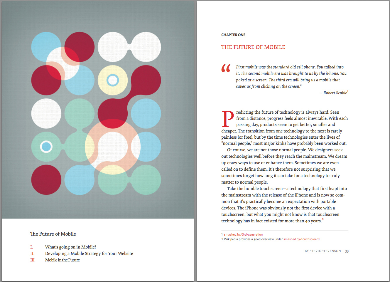
| Stephanie Rieger | The Future of Mobile | |
| This chapter provides a glimpse of where the future of mobile might lead, and what technologies will lead us there. These include new low-power computer chips, new display technologies, new APIs and the growing penetration of near field communication (NFC). But more important than the technologies themselves is how they will need to work together, enabling new and exciting ways to do business, to connect with friends and family and to interact with the world around us.Chapter keywords: connected devices, TVs, consumer customization, display technologies, RFID, NFC, Device APIs. | ||
| Trent Walton | Responsive Design Strategies | |
| The main components of Responsive Web Design(RWD) — flexible grids, flexible images, and media queries — are just the tip of the iceberg. And with the ever-increasing number of devices flooding the market, RWD is the most effective way to address them all at once. This chapter by Trent Walton features strategies, techniques and design workflow tips on building effective and bulletproof responsive designs.Chapter keywords: image aspect ratios, resolution independence, breakpoints organization, vertical and em-based media queries, content choreography, image hierarchy, fluid type. | ||
| Brad Frost | Responsive Design Patterns | |
| As Responsive Design continues to evolve, we’re confronted with difficult problems about how to create adaptive interfaces that look and function beautifully across many screen sizes and environments. E.g. how do we handle navigation that’s four levels deep? This chapter features emerging responsive design patterns and explains how to use them meaningfully in your projects. Brad Frost provides useful tips and expert advice on various design elements covering everything from complex navigation to advanced data tables.Chapter keywords: style guides, layout, navigation, conditional loading, progressive disclosure, background images, icons, maps, type, carousels, accordions, forms, tables. | ||
| Dave Olsen | Optimization For Mobile | |
| Although Responsive design per se has provided a great fundamental concept for designing mobile-optimized websites, the core ideas that make up these concepts pre-date the mobile revolution. In this chapter, Dave Olsen reviews what it takes to optimize mobile experiences in terms of performance. How do we keep responsive websites lightweight? What do we need to know about caching, lazy loading, latency? How can we start using RESS? Device detection or feature detection? Also, how do we develop and test our websites for performance? This chapter answers all these questions and more.Chapter keywords: mobile performance, latency, localStorage, lazy loading, Data URI scheme, JS frameworks, RESS, browser detection, feature detection. | ||
| Dennis Kardys | Hands On Design for Mobile (UX Perspective) | |
| Mobile requires us to rethink the way we create, develop and build experiences for our users. In this chapter, you'll look at some of the more glaring pitfalls to conventional processes, specifically as they pertain to how we design—and how we communicate design—for an increasingly mobile-accessed Web. You'll learn about implementing and selling processes that support a realistic understanding of what it means to design with mobile in mind.Chapter keywords: psychology, contextual interviews, collaborative design workshops, design studio methods, sketching, wireframing, convergent prototyping. | ||
| Josh Clark | Designing With Gestures and Touch | |
| Among the many new opportunities of the mobile medium are the capabilities of mobile devices. One of the major interaction changes, however, involves gestures and touch. In this chapter, Josh Clark explains how we can use them to improve the mobile user experience and provides concrete examples of implementations in real-life applications. | ||


| AUTHOR | CHAPTER | DETAILS |
|---|---|---|
| Greg Nudelman Rian van der Merwe | Mobile UX Design Patterns | |
| The key to using design patterns is not to get caught up in copying the exact implementations, but instead to witness the underlying reasons for why something works, and then adopt a unique design situation with authenticity, grace and vision. This chapter attempts to collect strategic patterns that reflect the underlying customer experience trends unique to the mobile environment, and use examples of particular implementations that call out important existing or emerging trends.Chapter keywords: faceted refinement, parallel search, zero results recovery, tap-ahead, engagement, rollaway dashboard menu, tabbed views, reading and pagination. | ||
| Nathan Barry | Developing and Designing for iOS | |
| As an experienced designer of iPhone and iPad applications, Nathan Barry takes us on a detailed journey through the iOS platform. Starting with general culture and language of iOS, he moves to iOS design patterns, technical implementations in Xcode, the design and development process for new iOS apps as well as pricing, marketing and submission guidelines. Each section is accompanied with examples, suggestions and best practices.Chapter keywords: mobile, user experience, native applications, native as culture, interaction design principles, responsive Web design. | ||
| Remy Sharp | Developing and Debugging HTML5 Apps | |
| If you've had some experience with debugging in mobile browsers, you'll know that debugging in IE6 back in the day was easy. In this chapter, Remy Sharp explains the technical workflow for developing, testing and debugging your Web applications on mobile devices. The chapter focuses on how to reduce the edit-refresh-test cycle and how to get inside these devices to debug.Chapter keywords: mobile testing, debugging tools, open device lab, Android, Opera Mobile, Firefox for Android, simulators. | ||
| Sebastiaan de With | Understanding The Android Platform | |
| As an experienced designer of Android apps, Sebastiaan de With provides a detailed insight into the Android platform, its peculiarities, the difficulties caused by fragmentation of the Android OS as well the developing and submission process for Android apps. | ||
| Arturo Toledo | Designing For The Windows Phone | |
| With its new Windows design language, Microsoft created an entirely new design methodology focused on the content of applications, relying more on type and less on graphics. In this chapter, Arturo Toledo, former UX designer at Microsoft, explains the new design concepts such Hub & Spoke model, Panoramas, Pivots and Pages, reviews Windows Phone design grid and design guidelines, provides UX advice on when what model is most appropriate and presents a workflow from the ideation phase to the design and development phase of a Windows phone app.Chapter keywords: sketching, flow, hub & spoke model, panoramas, pages, list views, design grid, app bar, animations, branding. | ||


"[We've had] a total of 880 million Android & iOS devices entering the market in just over five years. Consider the shift that occurs when iOS & Android put a combined billion [mobile] devices in people's hands. That's almost half the Internet population of the world and equivalent to the total number of (Windows) PCs in use around the world. Mobile first yet?" — Luke Wroblewski


“When Vitaly asked me if I was interested in producing a series of illustrations for 'The Mobile Book', I jumped at the chance. I always love to get my teeth into a creative project. It was an open brief, so I wanted to do something interesting. I didn't want to go down the route of illustrating mobile phones and computer screens etc. It felt too obvious. Instead I opted for an abstract approach. Based on the section titles of the book, I created a visual representation of the titles. For example, for the title 'Responsive Web Design' I created an illustration that shows circles based on a grid that are overlapping and morphing into each other. This is represent the fluid and reactive nature of 'Responsive Web Design'. For the 'Mobile Platforms' section my idea came from the overlapping highways on a spaghetti junction. This is to represent the the complexity of developing for multiple platforms and mobile browsers. For the cover of the book I created four icons, which are essentially simplified versions of my illustrations. This was one of the most difficult projects I've worked on in recent months but it was also one of the most rewarding. I'm supper happy with the outcome and thankful I was asked to be involved.” — Mike Kus


“I got my hands on an early copy of The Mobile Book, by Smashing Magazine. I'll cut to the chase and just say this: It's fantastic. You should own it. Really.” — Christopher Butler

“The standard, the reference book for Mobile. I worked for a mobile web publishing company for 18 months and the depth of knowledge provided by the experts in this book is extraordinary. It blew me away. This book provides a diplomatic, comprehensive guide to understanding “Mobile”, delivered by people who have a real passion for the Mobile endeavours in our community.” — Ben Howdle

“I’ll cut to the chase for those deliberating a purchase: it’s well worth the cover price. The eBook edition is a steal! This book establishes a mindset of understanding and exploring the medium. It embraces the breadth of its domain and will set you on an exciting path.” — David Bushell

“As somebody who spends a lot of time tinkering and tweaking websites to make them work better, I thought this book was bloody brilliant. There is so much depth and information packed into its 336 pages that I think it will become the book for the mobile Web.” — Ian Nuttall

“Every chapter is full of golden nuggets of information and the standard of writing is, as you would expect from a Smashing Magazine book, impeccable.” — Craig Lockwood

"It’s essential reading for those involved with the design and development of web/app based output. The essays within will encourage you to consider how people interact with mobile technology and help you to produce mobile friendly solutions to your projects." — Dave Hughes
"This book has something for all levels of expertise. [..] It doesn’t patronise, it doesn’t talk over your head either, it teaches. It is an important book of its time, don’t hesitate in picking it up." — Jordan Moore

"Earlier I mentioned that you should add this book to your shelf, in reality, you’ll probably want to keep it on your desk." — Joshua Johnson

"In general I think this book is a great addition for a company or agency library. As a specialist, it can leave you with a few chapters that are very much beyond your reach and can leave you with dangerous “knowledge” but a team reading the applicable chapters and then pooling their knowledge and learnings can use this book to go into the mobile future kicking and screaming. And kicking arse." — Christian Heilmann

"The Mobile Book provides a detailed and well curated overview and reference for designers getting to grips designing for, and working with, the ever changing world of devices and responsive design." — James Young

"The Smashing Mobile Book is a good read about the current and future mobile landscape and how we can better design and develop for it. If you're interested in mobile you should get this book." — Steven Bradley

"The Mobile Book serves as a complete guide to all things mobile, but also as a testament to the adaptability and power of this developing market and those who work to shape and make it what it is today. The wave of our connected futures." — Robert Bowen


| What are the costs for shipping to my country? | |
| The shipping cost for one book or a bundle is $5 — wherever you are in the world. We ship everywhere worldwide. We are paying a share of the shipping costs ourselves to make it possible for anyone to purchase the book. Our prices are transparent: we don’t have any hidden costs, and we won’t confuse you with tricky calculations. What you see is what you pay! | |
| What about delivery times? | |
| All books will be shipped via air mail to keep delivery times as short as possible. You can find the anticipated delivery time for your country in the delivery times overview. Please note that we will start to ship the books early-mid December 2012. | |
| Will the book be available in other languages? | |
| Maybe in future, but we have not made arrangements for that yet, so don’t hold your breath. | |
| Is the Mobile Book available as an eBook? | |
| Yes, the book will be available in PDF, EPUB and Kindle (Mobipocket) formats, and you can pre-order the eBook bundle now. | |
| Is "Mobile Book" the "Smashing Book #4"? | |
| No, "The Mobile Book" is a new series that we are starting here at Smashing Magazine. It is not Smashing Book #4 — it has a different design, layout and concept than other Smashing books. However, the Smashing Book #4 will be published in May 2013 — please stay tuned! | |
| What payment methods are accepted? | |
| We accept PayPal, VISA, MasterCard and American Express. We use a secure connection, with 256-bit AES encryption and a green GeoTrust Extended Validation SSL CA certificate. | |
| Is there a money-back guarantee? | |
| Yes, absolutely! No risk is involved. Our 100-day full money-back guarantee keeps you safe. Don’t hesitate to return your purchase. You’ll get your money back—no ifs, ands or buts about it. | |
| I have a question that is not covered here. | |
| Please leave a comment below, or get in touch with us via the contact form or via @SmashingSupport on Twitter. We would love to help you in any way we can! | |
Thank you for your support, everybody—we truly appreciate it. And we hope that you’ll love the Mobile Book just as much as we do!
Further Reading
- 50 Examples Of Stellar Use Of Light, Shadow And Texture
- Colorful Inspiration For Gray Days: Illustration And Photography
- Responsive Web Design: Meet The Brand New Smashing Book 5
- It’s Here! “Understanding Privacy,” A New Smashing Book Is Shipping Now
 (vf, il, mrn)

