Think Again: Assumptions About Mobile To Reconsider
The popularity of mobile has skyrocketed over the past few years. We’ve seen six generations of iPhones, five iPad models, hundreds of Android phones and thousands of different devices being manufactured. Design and development have gone all the way from static and desktop-centric to responsive and device-aware. And it has been a very exciting journey.
The field is relatively young — we are all learning (usually by mistakes). Because of that, we are also struggling with generalizations and even stereotypes. Let’s have a look at common myths associated with the mobile universe.
Myth: Mobile Is Well-Defined
It has become widely accepted that “mobility” refers to handheld devices, which you can easily use on the go, for Web browsing or anything else. Following that thought, we could easily make an assumption that even a remote control or MP3 player could potentially be a mobile device. But are they?
Barbara Ballard, author of Designing the Mobile User Experience, does a great job explaining the idea behind mobile:
“Fundamentally, 'mobile' refers to the user, and not the device or the application.”
Mobility is strictly connected to the user and situation they’re currently in, not to the piece of hardware they’re using. This easily leads us to the conclusion that what really matters is the context, not the device. Some mobile industry luminaries have stated that the idea of context has been overblown. Indeed, it can easily lead to many unfortunate decisions and false assumptions which can drastically affect the end product.
As Jeremy Keith, author of HTML5 for Web Designers and mobile specialist, has said:
“We have once again created a consensual hallucination. Just as we generated a mythical desktop user with the perfect viewport size, a fast connection and an infinite supply of attention, we have now generated a mythical mobile user who has a single goal and no attention span.”
By defining mobile as a set of circumstances, a setting, we are in danger of making some sweeping generalizations. We analyze, we study reports and use cases, but mobile interactions are far less trivial than we think.
As studies show (PDF), over 70% of Americans use their phones while in the bathroom. In some countries, the percentage of people with Internet access that is solely provided by mobile exceeds 50%. According to ComScore’s Mobile Metrix, Facebook’s mobile app accounts for 80% of their traffic. These facts prove that assuming short attention spans and oversimplifying interfaces are not solutions to addressing the problem space.
People tend to use their phones or tablets at home while sitting on the sofa or in a cafe. What’s even more important is that they’re willing to perform complicated tasks and actually spend money. Rather than guessing what the user is trying to achieve on a mobile device, we should assume they want to do everything and try to better understand the constraints of each device. We should be concerned about the content that we’re trying to serve while bearing in mind the context is continuously changing.
As developers, we need to ditch our desktop-centric thinking which taught us to prototype for a certain set of conditions, and aim towards more flexible content. Instead of focusing on a single platform, we should create reusable copy and assets, which will serve as a base for multiple scenarios.
Myth: Mobile Is iOS
We have already established that we cannot take network speed, screen dimensions, operating system or browser for granted. The mobile market is hugely diversified. Yet it’s still sometimes identified with iOS devices only.
Apple products are high profile. Their brand is hyper-consistent and instantly recognizable. But iOS represents less than half of the mobile market. And favoring iOS (or any one platform in general) might lead to poor user impressions.
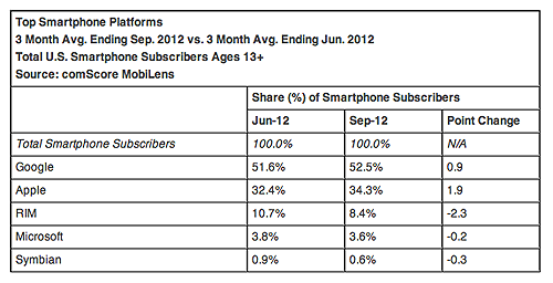
Within the US, Google owns roughly 53% of the smartphone market. That basically amounts to a huge number of wildly different Android devices.
Let’s have a look at market share:

Both Android and iOS are growing while other platforms are slowly loosing more and more users.
These numbers mean that we have thousands of resolutions ranging from the first phone with Internet access, Nokia Communicator (640 × 200 pixels), up to Samsung Galaxy S3 (1280 × 720 pixels). While some of the models are discontinued, it still gives us a greater picture of the market’s diversity.
When talking about screen size, it would be a crime not to mention pixel density. The real boom with higher-density screens started when Apple introduced retina display along with iPhone 4. But what does it mean for us? It’s one more factor we need to take into account. Because we are dealing with more pixels per inch than usual, we need to supply higher resolution graphics or else rely on SVG, which isn’t always a solution we can use.
We not only need to consider the diversity of original equipment manufacturers (OEMs), operating systems and screens but also the multitude of browsers. Some of the most well known and widely used are:
- Opera Mobile,
- Opera Mini,
- Safari,
- Chrome,
- Dolphin,
- Internet Explorer Mobile,
- Blackberry,
- WebOS browser.
Some of these are default browsers, provided by vendors, and some are user-installable. This is only a small fraction of available browsers, though. Taking this even further, all of the aforementioned browsers have a rendering engine, and while they are usually built upon WebKit, the distributions vary which introduces us, developers, to a whole new range of cross-browser issues.
That leaves us with a few factors to consider: type of device, such as smartphone, tablet, personal digital assistant (PDA), etc.; resolution; orientation; pixel density; and the browser with its rendering engine. All these limitations define how the implementation process will look. It would be a crime to assume device uniformity.
Myth: Mobile Means Less
Imagine you’re reading the delivery menu for your favorite American restaurant, and you want to order a steak. To your utter shock and dismay, you find that it’s not on the menu. You’ve had steak before when visiting the restaurant in person, so you wonder why you’re not seeing it on the delivery menu.
Someone in charge decided that Americans have poor eating habits, and if they are not willing to come to the restaurant in person for the full experience, then they are likely to be sitting at home on a couch in front of the television, and are not fit to have the meal. You enter into absolute food rage and never return to the restaurant again.
When you think about this situation, you should quickly notice that it’s not that different from daily decisions developers and designers make.

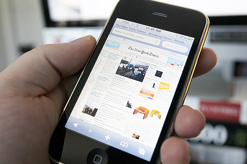
Having too many features may be just as harmful as cutting them down, as you can see when viewing The New York Times website on mobile.
You decide what set of features and interactions are necessary for a perfect user experience. It’s especially important on mobile, when you try to cut features to make the interaction as easy and seamless as possible, basically making assumptions and decisions for your users. Nothing is more frustrating than being deprived of the ability to make your own choices.
It’s critical to put the users’ needs first. If mobile gets less features by default, customers can potentially be left without the means to engage with your actual product. People perform all kinds of actions while using a wide range of devices. 25% of mobile users engage in online shopping through their phones and tablets. Would you ever think that every three minutes (within the UK) a vehicle is purchased using the eBay mobile app? Tiffany & Co. also noted a significant rise in sales and traffic after launching their mobile app — would you think that people buy diamonds on mobile?
The main focus should go to delivering great experiences within the feature set you’re offering on desktop, not limiting them. While some features appear as unnecessary, you cannot assume that they aren’t without proper testing and real interaction. As Aral Balkan points out:
“If you’re not involved in building what you’re designing, you’re not designing, you’re assuming; you’re drawing pretty pictures.”
Myth: Mobile-Specific Content Is Mandatory
“There is no Mobile Web. There is only The Web, which we view in different ways. There is also no Desktop Web. Or Tablet Web. Thank you.”
Mobile isn’t an independent creature — it’s an experience we’re creating. We could not possibly accommodate all devices that are currently available. The ideal situation would be to have one, uniform experience of the brand, served according to device.
It all comes down to the most crucial part of Web design — content. Being perfectly aware of goals that you’re trying to achieve and leveraging content strategy is essential for creating cross-universe compatible experiences. While we try to tailor, cut and paste content that we think is essential on mobile, again we are trapping ourselves in false assumptions of users’ context (by choosing what’s the most appropriate piece of information they are potentially looking for) and finally ending up making mobile less compelling and bereft of features.
That’s why we should consider designing content out rather than canvas in. Being focused on content from the very beginning will help keep you from being trapped within visual limitations that come with the wide variety of available devices, and make the copy usable regardless of the platform it is being served on.
Myth: Mobile Means Apps
There are few approaches for serving optimized content for mobile. Having an app is one of them — not necessarily the best, though. An app is just a container for the content we are trying to serve. While some apps bring us delightful experiences (such as Solar or Instagram), we can’t rush ourselves and create an app for every website or product we are working on. Especially if we are planning to give the app a subset of desktop features.
“See, your product isn’t really a product at all. Your product is something called content. It’s a service.”
An app is considered a product by many. As Josh Clark outlines above, the essence of the product is and always will be the content and service or set of functionalities you are giving to your customers. Currently, both App Store and Google Play are each offering over 700,000 apps for download. Are all of them being used? Probably not. Are they all providing the content or features the user would like to see? For sure, no.

Responsive design has been adopted by well known brands such as Tiffany & Co.
Since having an app isn’t always the way to go — what is? A good alternative is responsive design. It has been a really hyped topic over the past few months, and not without reason. It certainly can be easier to use media queries than to write a native iOS app or play around with PhoneGap. It also gives the impression of cohesion and creates a seamless experience. Development-wise, it prevents you from creating a couple different apps (for different platforms) and code bases.
Instead of creating an app to make the “New & Noteworthy” section within the App Store, and therefore limiting yourself to the container you’ve chosen, try to think about a strategy which will reduce the amount of redundancy in your work and that will serve all users. Before jumping on the bandwagon of apps, be sure that you have good content strategy thought out.
Conclusion
These are exciting yet overwhelming times for Web development. We are forced to rethink the purpose of websites or apps we are creating. We have no ability to predict what will happen next, what constraints and abilities the next devices will bring. What is important these days are back-end systems which provide all the data we are trying to display — it’s not only presentation layer we need to care about, which still somehow remains the most important factor. We are observing robust growth and increasing interest in APIs, which along with content are drivers of layout change.
It all comes down to both knowing the needs of your audience and revolving around content. We tend to acknowledge the constraints of platforms and design strictly for given requirements. Let’s make sure that the data is accessible anywhere, anytime, on any device.
Further Reading
- Designing the Mobile User Experience by Barbara Ballard The basics of mobile design.
- Content Strategy for Mobile by Karen McGrane A guide on how to prepare cross-platform content.
- Mobile First by Luke Wroblewski A comprehensive guide for mobile development strategies.
- On Mobile Context by Jason Grigsby Thoughts on mobile context and useful resources on this topic.
- Building Mobile-Optimized Websites, Google Developers Tips on developing for mobile.
- This Is Responsive by Brad Frost An open source collection of responsive patterns and modules.
Further Reading
- Building A Better Responsive Website
- Responsible Considerations For Responsive Web Design
- Losing Users If Responsive Web Design Is Your Only Strategy
- How To Provide The Greatest Mobile User Experience Possible


 SurveyJS: White-Label Survey Solution for Your JS App


 Agent Ready is the new Headless

