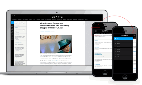
Why Responsive Web Design Has To Win Out
When considering a mobile Web strategy and weighing responsive Web design against a separate mobile website, the most important metric is how functional the website is for the user. This goes beyond better content organization for smaller screens. Mobile (and desktop) websites should be easily found, easily shared, fast loading, easy to maintain and easy to build on.
If we keep that in mind, considering where the Web is today and where it looks to be going, there are many compelling arguments for responsive Web design.
Setting The Stage
Consider something as simple as Google Doodles. These small updates create major buzz for Google, and they offer a bit of surprise on an almost daily basis. Then consider how websites like Facebook update their code base twice a day. Both cases hint at a future where users will expect content and features to evolve faster than ever.
On top of new content demands, people are also sharing information more than ever, creating the need for centralized, up-to-date content and a reliable way to access that content.
Unfortunately, those aren’t the only challenges created by this evolving Internet. Those problems can, however, be solved using responsive Web design.
Before I get into the specifics of why I believe responsive is better now and in the future, I’d like to clear one thing up.
The Content Myth
To frame this whole debate, it’s important to forget an old myth. It’s the belief that content should be restricted, dumbed-down or eliminated for mobile users based on their goals and intent.
Up until now, limiting content made some sense. Especially in the early days of the modern mobile Web browser. Today, however, it is widely accepted that we don’t know anything about our users’ goals based on which device they are using. Users need and expect full functionality on their mobile device, because they could be using it anywhere, for any reason. 28% of American adult smartphone owners now access the Internet mostly on their mobile device. That means that many of your users literally require all of the same functionality on mobile that they would otherwise get on a desktop.
We can’t eliminate content or functionality, but we also can’t show everything at once on a small screen. This means we need to redesign and reorganize content into smaller “views” and hide or hint at secondary content in smart ways. This isn’t necessarily easy, but it’s necessary.

Now that we know the facts — that we have to restructure content, but not eliminate it — there are two ways to achieve this. One is with responsive Web design, and the other is a separate, mobile-focused website.
Consistent URL Structure
URL structure is very important on the Web today. Your website and its content get shared in many different ways, from different places, on different devices. People find your URLs in search results, they click on your ads, they get to your blog from Facebook and they get information about your company emailed to them from a friend.
The device that your users share a link from will dictate the specific URL they share, and if that doesn’t match the device the link is viewed on, there’s a chance that the user receiving the shared link will see a confusing or misleading layout. We can fix this with redirects, but as we add more complexity and functionality into mobile websites, this becomes a serious task to manage. It’s often not done correctly.
We’ve all clicked on links from a search engine, an email or a tweet that take us to the wrong version of a website. For example, your friend wants to email you a Wikipedia article. They’re on a phone, so they email you the link en.m.wikipedia.org/wiki/Responsive_web_design, and you open that link on your laptop. You’ll see a single column of copy that spans the entire length of your 13 inch screen. This is annoying, but more importantly, it confuses and discourages visitors.
SEO
Furthermore, www.mysite.com and m.mysite.com are different URLs. If redirects aren’t structured properly, search engines and analytics may not realize that two URLs serve the same content on different devices. Search relevance and analytics reporting can easily get splintered.
Even more detrimental is a URL structure that’s completely different for mobile. Instead of just adding the m. prefix to the URL, some mobile websites have a completely different page structure for mobile. This should absolutely be avoided, separate website or not!
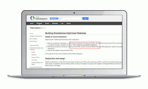
Google, just one search engine, is taking measures to index and serve up the correct versions of websites, but we can’t rely on a computer to realize that two different URLs with the same content should be indexed, ranked and weighted as the same page. So to make sure Google indexes your different URLs properly (and fairly), you need to follow their guidelines and add extra code. Google shows you how in a tutorial, but at the top of the page, they make it clear that for SEO, responsive design is “Google’s recommended configuration.”

Load Time
We need to keep the same page structure and the same URLs, but we should organize the display of the content based on the device. That presents a specific challenge for responsive design, though. Load time.
When using one code base to reorganize content, we inevitably create extra divs and other elements that get hidden. On mobile devices, over data networks and with limited processing power, this is an issue because whether they’re hidden or not, your phone loads all of the elements in your code.
Smart and efficient coding can minimize this load time. Sometimes people mistake responsive Web design for “time-saving” development, but in reality, coding responsive websites correctly is hard. Minimizing load time requires expertise in coding and a solid knowledge of how code and browsers work. But for the most part, a good developer can achieve speedy loading when it comes to text and other “light” content.
Images, however, are a much more serious challenge. Today, there isn’t a great answer.
Images
Images on responsive websites need to be large enough for a huge screen, even though they get sized down visually for small screens. So we create them large, but then our mobile websites suffer because we still have to load that full-size image. With bandwidth, cache size and processor limitations, this is not ideal.
There are plenty of responsive image solutions in the works for the future, like the picture element, and there are groups who are looking for long-term, standards-based solutions. Still, there are no great solutions today to make sure that your images get served at an efficient file size or that they crop well when screen real estate is limited.
There are some workarounds, though. There’s Adaptive Images to swap images out at breakpoints. There’s jQuery Picture and Picturefill that simulate the functionality of the proposed picture element. For the proprietary platform my company builds on, we’ve created a jQuery plugin (released open source at Responsive Img) to efficiently handle switching images at different screen sizes. Although it solves load time issues, it still relies on JavaScript and isn’t a permanent, long-term solution.
At some point, there will be a solution. Today, 90% of the time, this issue is more of an annoyance than a complete roadblock. As data connections get faster and mobile phones get more powerful, it becomes even less of an issue. That, combined with the promise of future code standards for responsive images, means someday we won’t worry as much about load time issues with images, and we’ll have even less reason to do anything but responsive Web design.
I don’t want to downplay the load time issue, though. There are cases — certain websites that are too image-heavy or where complexity exaggerates the load time issue — where a separate website may still be smarter. Just like adding load time through responsive design, using a separate website is a compromise. It needs to be a calculated decision. Most responsive websites, especially with the help of JavaScript, can still squeak by with acceptable load times and reap all the additional benefits of responsive Web design.
Content Updates And New Features
What won’t change in the future is the increasing need for agile websites that improve and adapt based on user and Internet trends. We’re updating both content and functionality more and more frequently. With responsive design, we only need to add functionality to a single code base, saving time and creating focus. The amount of time it takes to maintain separate versions of the same website is often underestimated.
Furthermore, iteration is a growing key to successful modern websites. It’s becoming a necessity for websites today to get regular feature updates and add-ons, especially for e-commerce and Web apps. There’s so much data available on how people use your website that it’s an oversight not to adjust your user experience based on that data. At some point, maintaining and improving multiple versions of the same website means that time and money either go toward adding fewer features to both versions, or more features to only one (probably the desktop version). My company has a client that serves as a perfect example.
We’re retained to maintain and update a website we didn’t build, which has a completely separate mobile version. This large, corporate client has good analytics data, so they have lots of improvements and new initiatives for the website in the pipeline. Since we only have so many hours in our monthly retainer, and because the wish list of fixes and features exceeds those hours, we typically end up adding all the great new functionality to the desktop version only.
Right now, the mobile experience is far behind the desktop experience, and it doesn’t look like that will change anytime soon. There just aren’t enough hours. Yet, they’ve run campaigns based around QR codes and have promoted mobile use of their website at events.
In some ways, this is a huge oversight. In another way, it’s just an unavoidable problem caused by having a separate mobile website. For our client, it’s hard to argue that it’s smarter to release fewer new features for more website versions. They’d rather see initiatives go live then spend time and money maintaining the mobile version. With good reason, but with bad results.
This All Adds Up To One
To summarize, we know a few things. We know that all content and functionality needs to be available for mobile users. We know that today, URL structure is important. We know that load time is important, but it will one day be less of an issue. We know that websites need to always evolve, and that it takes time to implement changes and new features.
If you look at those factors in total, responsive Web design has to win out.
That said, coding technique and mobile strategy should still be considered individually for each project. There are times when images are too important, when functionality is required to be very different or when target user demographics prohibit responsive design. In my opinion this rarely happens, but it’s good to remember that responsive isn’t a blanket solution that fixes all of the Web’s issues.
One last thing. Don’t forget that for every separate mobile version you’re building and maintaining, a separate tablet version and TV version are right around the corner.
No matter how many versions you support, if you’re using separate websites, you’re supporting too many. Ideally, you should only have to support one. Responsive design makes sense today. It makes more sense tomorrow.
Further Reading
- Responsive Web Design: What It Is And How To Use It
- The State Of Responsive Web Design
- Design Process In The Responsive Age
- Using Sketch For Responsive Web Design


 SurveyJS: White-Label Survey Solution for Your JS App
 Agent Ready is the new Headless


