Creating Wireframes And Prototypes With InDesign
Hundreds of tools may be available for interaction designers, but there is still no industry standard for interaction design the way Photoshop and Illustrator are to graphic design. Popular programs are out there, but many of them have considerable drawbacks, which has led me to explore alternative apps.
I eventually chose Adobe InDesign for much of my preliminary interaction design work. Yes, you read that correctly: InDesign, a desktop publishing app originally created for designing books and magazines, is currently my tool of choice for designing low- to medium-fidelity wireframes and interactive prototypes.
Slowly but surely, InDesign has evolved from a print-only tool into an application that can produce interactive media for the iPad and eReaders, too. Surprisingly, it has built-in tools for creating interactivity and animation within your spreads. Though it may sound crazy at first, hundreds of thousands of designers have adopted InDesign as their go-to application for eBooks.
We’ll take InDesign one step further than these authors to produce fully interactive wireframes and prototypes. As you will soon see, InDesign has a unique set of tools and features that are perfectly suited to designing wireframes and interactive prototypes in a more intuitive way than you ever thought possible!
What Makes It A Great Wireframing And Prototyping Tool?
I look for only four categories of features in a wireframing and prototyping app. InDesign has them all in droves.
Wireframing
- Creation
Create original artwork in a flexible and robust environment, where any shape or style of object imaginable can be created easily. - Modularity
Design once, and have the changes cascade throughout the whole document.
Prototyping
- Interactivity
Create different states of a design in which the user can actively engage with the design and change the states of the prototype. - Animation
Set up transitions between various states of an application.
Set-Up
Set Up InDesign For Interactivity
Before creating a wireframe or interactive prototype, setting up both InDesign and the new document correctly is imperative. After opening InDesign but before creating or opening a document, go to the “Preferences” panel (on a Mac, InDesign Menu → Preferences, and on a PC, Edit → Preferences → General) and change the following preferences.
Global preferences (i.e. when no documents are open):
- “Units & increments”: Set units to pixels
- “Display performance”:
- “Default view”: High quality
- “Raster images, vector graphics, transparency”: Higher quality (resolution)
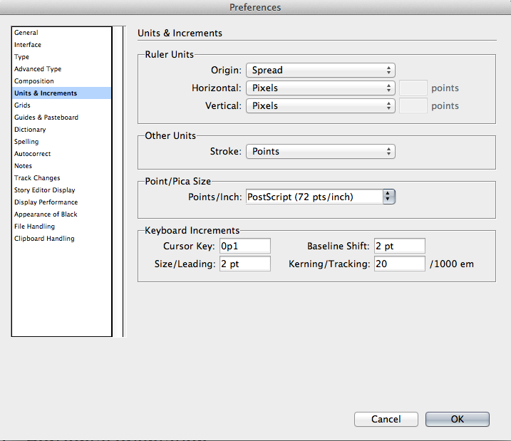
Change InDesign’s application-level settings (“Units and increments”) before creating a wireframe or prototype. Larger view.
After changing the global preferences of InDesign, create a new document (on a Mac or PC, File → New → New Document), and set up the following properties.
- Intent: Web
- Properties
- Pixels as dimension
- Common screen sizes
- Horizontal orientation (for desktop and traditional Web)
- No facing pages (spreads)
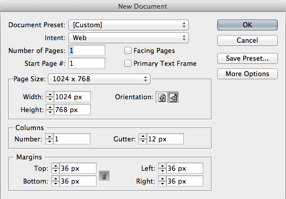
Setting the “New Document” properties to “Intent: Web” enables you to create a new document with pixel dimensions. InDesign provides many presets for common screen sizes.
Note: Documents created with “Intent: Web” will have an RGB color space.
Set Up The Workspace
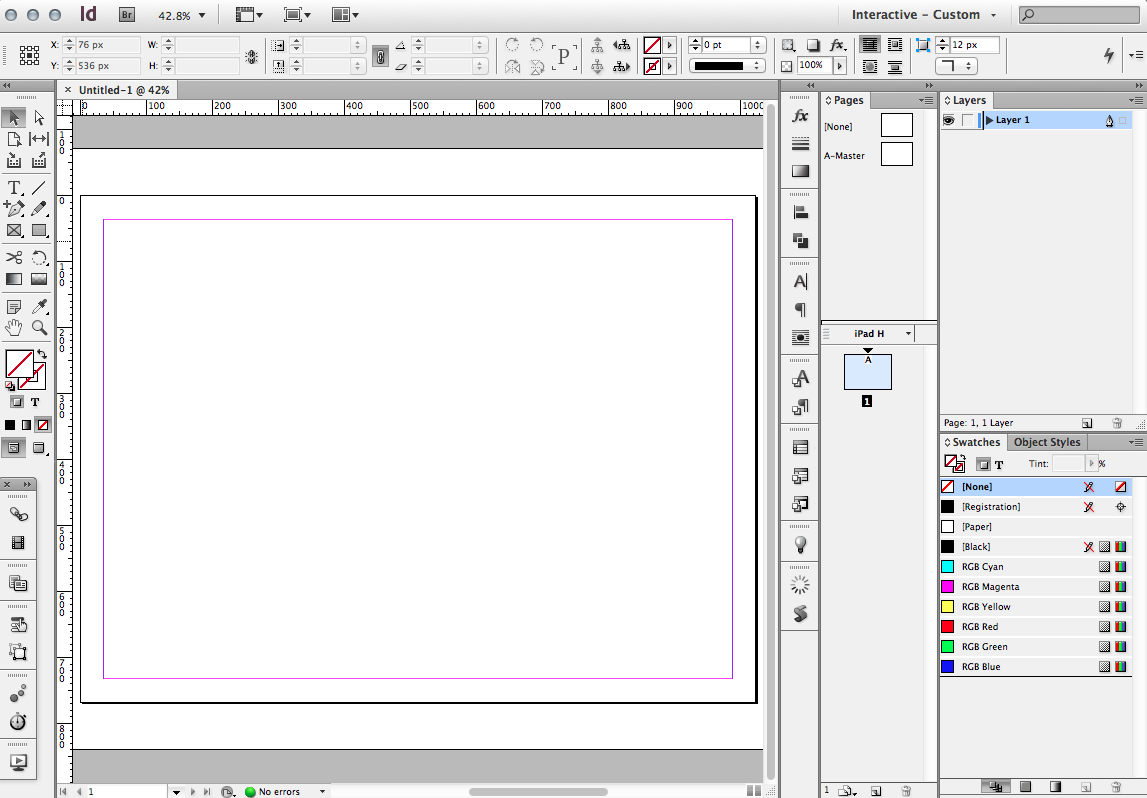
Make all of the interactive functionality new to InDesign CS5 and CS6 quickly accessible. I like to place them on the left side of the screen, under the tools palette. Larger view.
As stated, InDesign can be used to produce static print-based media as well as fluid, animated interactive media. The type of project you are creating will dictate what features you will need quick access to and, thus, how the user interface should be arranged.
How one sets up their workspace is a matter of personal preference, but after much trial and error, I’ve found a set-up that works for me. What works for you may be different, but I recommend using the information provided in this section as a starting point for your customization of the InDesign interface.
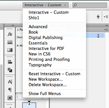
Once you have placed the panels the way you like them, save them as a named workspace. You can switch between workspaces in the upper-right of the InDesign application window.
Two workspace presets are provided with InDesign (found in the upper-right drop-down menu), “Digital Publishing” and “Interactive for PDF.” I have created my own workspace (named “Interactive - Custom” in the screenshot above), based on the other two.
Basically, all of my typographic, layout, color and other design-oriented panels are on the right, and all of the new interactive panels are on the left, under the tools panel. The panels listed just below are docked together on the left of my screen.
Here is a quick introduction to a subset of the interactive panels:
- Links
Displays all external assets that have been placed in your documents. Link images, relink and update your assets. - Media
Manage movies and audio files placed in your document. You can customize how these media files play and are viewed in your document. - Liquid Layout
Set up rules for how objects may be repositioned when the document is viewed on various devices and, thus, at various page sizes and orientations. - Buttons and Forms
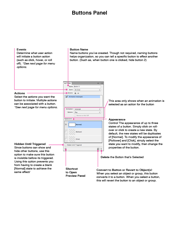
Convert objects to buttons, and control button properties. - Animation
Create animations, and determine how objects move. - Timing
When multiple animations occur on one page, control their timing so that they are played in the correct order. - Object States
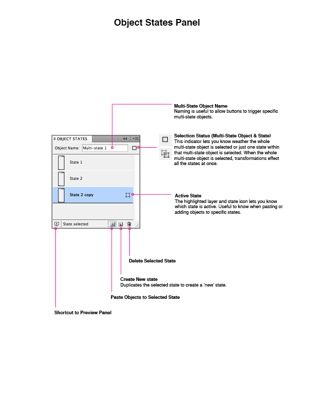
Create objects that have multiple states (such as slideshows and drop-down menus). Each state can be shown and hidden using buttons. This is powerful for creating complex interactions. - Preview
Preview how an animated and interactive document will look and behave without having to export first.
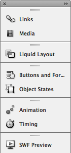
These panels are where most of InDesign’s interactive functionality can be accessed.
I don’t use the panels for hyperlinks, bookmarks or page transitions much, so I don’t dock them with the others.
Wireframe Creation Features
Drawing Tools
Drawing tools may seem like a commodity in the realm of design software. However, many commonly used interaction design applications rely on the placement of predefined UI controls such as buttons and sliders. Ideally, a wireframing application should have vector-drawing tools. Vector graphics are advantageous because they allow for non-destructive editing; and for the most part, the nature of vectors forces you to maintain low to medium fidelity. Jumping into visual design too early in the design process is easy if you are using a program such as Photoshop.
Although InDesign’s drawing tools are not as sophisticated as Illustrator’s, they are more than enough to get your ideas across. The logic here is that, the more robust the drawing tools in a wireframing or prototyping app are, the less you’ll have to jump in and out of other tools, which would create bottlenecks, extra work and technical hurdles.

The drawing functionality in InDesign is similar to Illustrator’s. Many of the bells and whistles found in Illustrator may be missing, but you get a core set of streamlined and powerful drawing tools to render anything you can imagine.
Layout
InDesign is one of the only design tools that has robust grid support built in, and I find myself designing with grids all the time. (You can find all of the layout functionality by going to Layout → Margins and Columns.) Grids from widely used systems, such as the 960 Grid System, can be easily and quickly created and used throughout a design by using master pages, which we’ll cover later. Horizontal and vertical guides can be used in conjunction with columns to create subgrids for greater complexity and precision in a layout.
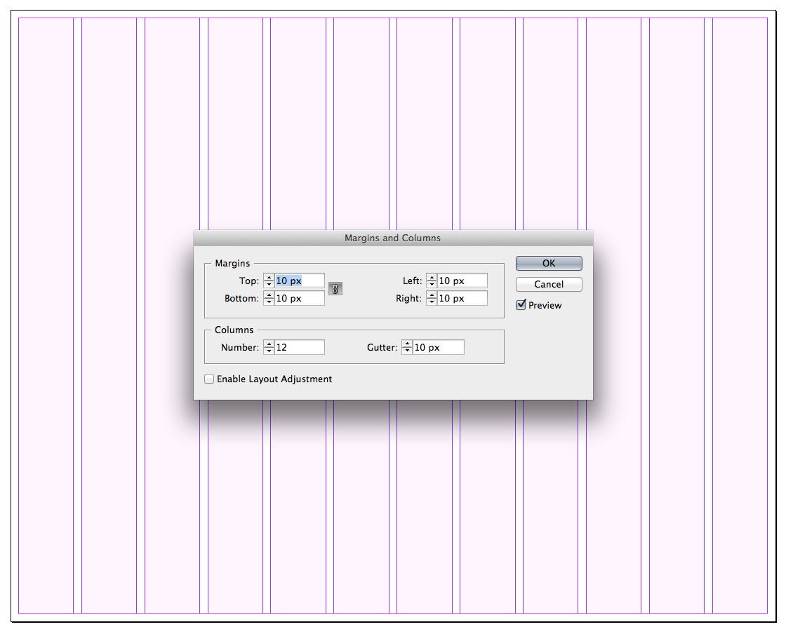
Quickly and easily create grids for your document, such as the 12-column grid based on the 960 Grid System, shown here. Larger view.
Tables
Not to be confused with the very old technique of laying out Web content, tables in InDesign are often used to display tabular data, as well as list and grid views, in a user interface. In fact, creating tables is one of the reasons why I started creating wireframes in InDesign in the first place!
I often turn cell borders off (either by setting the stroke to none or to 0 pixels), so that the table can inform my design but not be so literal or distracting in the final wireframe or prototype. Other common reasons why I use tables are to create tabs that evenly distribute the text label in each tab, and to create subgrids for alignment in a design when the main grid just won’t do.
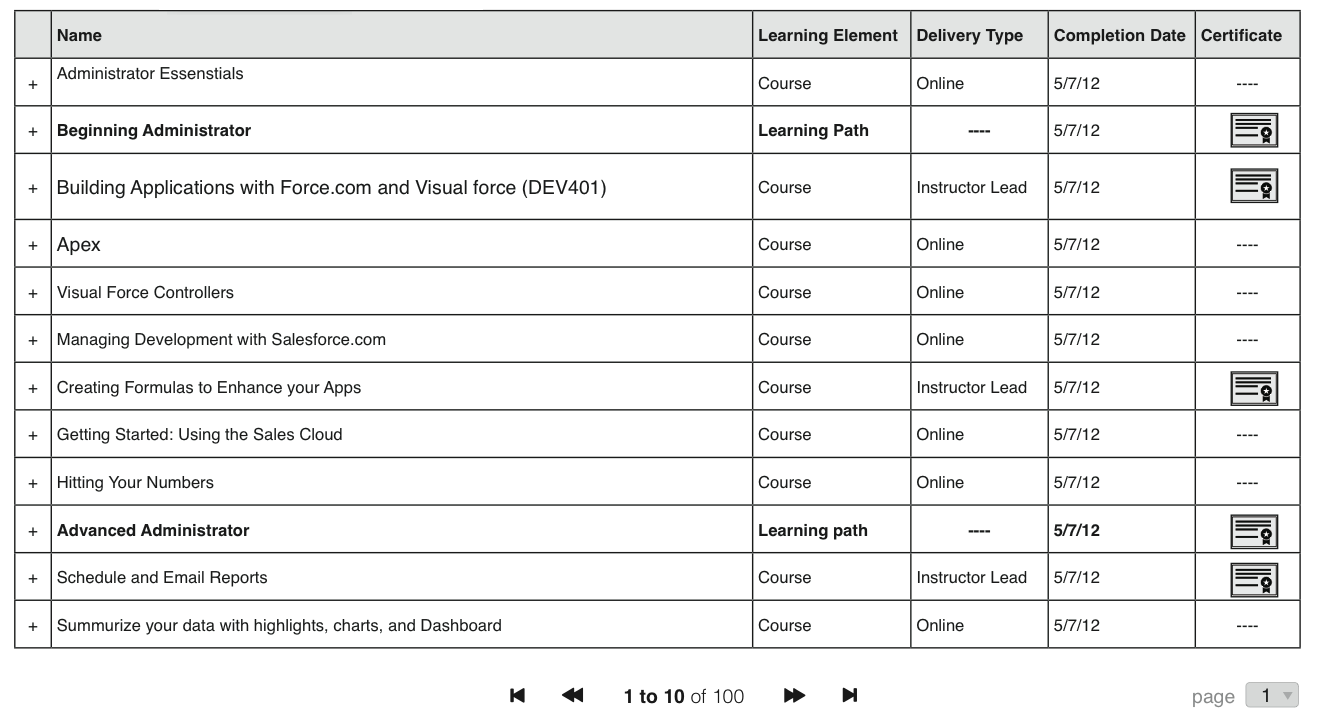
Tabular data can be created in seconds in InDesign. When tables are needed, no better design program than InDesign is out there. Larger view.
Layers
While layers may seem like a no-brainer feature that doesn’t warrant mentioning, plenty of apps simply don’t have them. (InDesign didn’t have the ability to show objects in the Layers panel until CS5.) Layers provide the ability to group, reorganize, selectively show and hide, and selectively lock and unlock objects in a design. The larger and more complex a design is, the more important layers become.
Multi-page documents in InDesign share the same organization of layers: every page has the same number of layers, which are also in the same order. When a layer is created, moved in the stacking order or deleted, or when its visibility has changed on one page, those modifications are reflected on all other pages. While the organization of layers is consistent throughout an InDesign document, the designs on each page may be unique.
In the last several months, I have experimented with various ways to order my layers and have come to the conclusion that only a few layers are needed to adequately organize my files. Typically, I use only four layers: I place a notes layer at the top to add explanatory text about the design; next, I use an input layer, where I show user actions and input; below that, I show modals (dialog boxes, lightboxes and popovers), which appear over the background layer.
This is a common layer structure for my documents:
- Notes
- User input
- Modals
- Background
The wireframes I create usually have four layers. The background layer contains most of the design. Overlays are above the background. User input, such as from a mouse or hand, sits on top. Finally, notes are placed above everything so that I can annotate detailed interactions.
Multiple Pages
By their very nature, interactive documents require multiple pages. Pages in website design (and screens in app design) are a fundamental unit of interaction, because they contain the content that users navigate to throughout the application.

Large and small projects would benefit from the organization that pages provide.
Alternate Layouts
This new feature in CS6 is a game-changer for responsive and mobile design. Alternate layouts allow you to create designs for multiple devices and orientations in the same file. With InDesign CS6, we now have a tool in our arsenal to make designing for dozens of screen variations almost as easy as designing for one. The textual content of each size and orientation is all linked, so updates will automatically propagate to all variations of a design.
Alternate layouts were designed to work with the liquid layout toolset (discussed next), so that if layout rules were set up properly in the original layout, then newly created layouts would automatically update to conform to the different dimensions. Of course, alternate layouts may be used without liquid layout rules, too, so that you can manually control how objects are displayed in each layout.
When working on more than one layout, you might need to refer to other layouts or toggle repeatedly between multiple ones. To see two layouts simultaneously and work back and forth between them, simply click on the split-view icon to the right of the scroll bar at the bottom of the InDesign window.
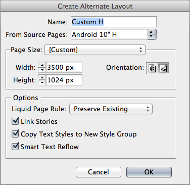
Alternate layouts are used to manage one design that will be viewed on multiple devices.
Liquid Layout
Liquid layout changes the way content adjusts to the size of the page. (According to Adobe, this feature is HTML5-based.) Liquid layout lets you be more flexible: you can design once and set up some simple rules, and then the design will automatically adapt when the display’s size or orientation changes.
Set up liquid layout rules in one of six ways: off, scale, recenter, object-based, guide-based, and controlled by master. The details of the liquid layout rules are enough to take up an entire article by themselves and are, thus, beyond the scope of this article. I highly recommend reading Pariah Burke’s article “InDesign How To: Using Liquid Layout” to get up to speed on the rules.
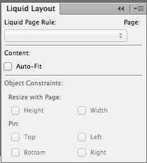
Define liquid layout rules before creating an alternate layout, to fully leverage the time-saving benefits of this feature.
As you set up the liquid layout rules for a page, preview and test those rules to see whether they have the desired effect. To test your new liquid layout, select the page tool, and you will see handles at the edges and corners of the page. By dragging these handles, you can temporarily adjust the size of the page. This behavior lets you test how the content adapts when the page changes in size. Holding Option on a Mac or Alt on a PC lets you permanently change the page’s size by hand.
Wireframe Modularity Features
Master Pages
Master pages extend the functionality of pages by allowing a parent page to have objects and to have layers that are shared with its children pages. When content on the master page changes, it also changes on the children. Masters are typically used to contain headers, footers, logos and empty frames that act as placeholders. Surprisingly, very few other applications have master pages. The versatility and saved time that master pages bring cannot be overestimated. They help with consistency, and they help designers use repeatable design patterns throughout a project.
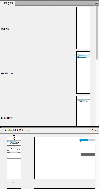
When master pages are applied to other pages, you are able to share the master’s objects to the regular pages.
Note: Objects on a master page layer appear behind objects assigned to the same layer in the document page. If you want a master item to appear in front of objects on the document page, then assign a higher layer to the object on the master. A master item on a higher layer will appear in front of all objects on lower layers. Sometimes I create special layers for masters that are above the “normal” layers.
Masters Based On Other Masters
Masters can be created based on previously created masters. As far as I know, this feature is unique to InDesign. By creating a parent-child relationship between masters with a document, a nesting effect occurs (similar to the cascade in a cascading style sheet), which makes for a powerful way to create constancy and to update documents with ease.
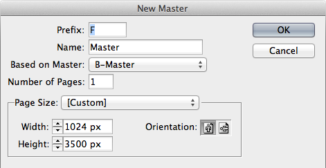
Basing a master on another enables you to create similar variants of a design. Masters may be based on only one other master at a time.
Placing Files
When pixel-perfect styling matters, you can switch to whatever application you want to design in, and place that file in an InDesign document for seamless integration. Placement is especially powerful when using multilayer Photoshop or Illustrator files, because InDesign displays them in full fidelity.
Note: By default, InDesign previews placed images with a low-resolution preview. This does not reflect the quality of the placement or that of the original file — InDesign uses a pixelated proxy image to keep up performance on your computer. With CS5 or CS6 and a decent computer, I have found that a high-quality image preview doesn’t affect performance and is a more accurate way to view your work. I recommend setting the display performance to “high” as the default in InDesign. (This can be done by opening InDesign and going to View → Display Performance → High.) Setting this when no document is open will set the default for all newly created files. Older files will retain the view settings that were selected the last time they were saved.
Each time a document is placed, it references the original file. For instance, if a PSD is altered, one click can update all of the instances of that Photoshop file that appear in an InDesign document. When only a portion of an image is necessary, InDesign offers some of the most intuitive and rapid masking tools available.
Note: Placed items are linked to the containing InDesign document based on their file location. To gather all files into one central folder, use the File → Package command.
You can place most media types in an InDesign document.
The placement feature is easy to take for granted, because it is a fundamental tool in InDesign’s arsenal that has been around since the software’s debut. But placement enables you to create a kind of collage whereby you can design the pieces in whatever tool you deem appropriate, and then assemble those pieces in InDesign.
Placing InDesign Documents In Other InDesign Documents
InDesign allows documents to contain other InDesign documents. Think of a placed InDesign file in a master object (rather than a master spread) because it makes it easy to reuse content in a design in a consistent, fast and easy way. If the original InDesign document is edited, all instances of the document will instantly reflect the changes. A placed InDesign file may show up in its container file an infinite number of times.
This feature allows for functionality similar to that of symbols in Flash and Illustrator, but expands on their use by facilitating constancy across multiple documents. This is an extremely useful feature that is not widely known but can save countless hours. For those working on collaborative teams, you can save InDesign documents to be used as reusable components in a shared folder, and any updates made by one person will be available instantly to the rest of the team.
InDesign documents may contain other InDesign documents. This seemingly simple feature allows you to create symbol-like functionality that allows object changes to propagate to an entire document.
Snippets And Libraries
Placed InDesign files make it possible to reuse content and to edit the originals. There are other ways to reuse content, such as snippets and libraries; however, these two methods do not allow the originals to be opened or edited after creation. Because of this, they should be used prudently, and only when the content in a library or snippet is finalized and won’t change. Snippets are more flexible and powerful than libraries, but using placed InDesign documents is recommended in most cases.
Styles (Object, Character, Paragraph, Table And Table Cell)
As anyone who has used character and paragraph styles in InDesign would attest, styling is an amazing time-saver and provides a level of precision and consistency that would otherwise be impossible. Object styles enable you to style one object to your heart’s content, and when you are happy with the way it looks, you can save all of the effects and the transparency, stroke and fill of an object to be applied to other objects later on. If the style itself is updated, then all objects that have been assigned that style will be updated as well.
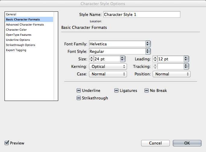
Styles enable you to maintain a consistent look and feel in a document and to update the styles of any and all objects when requirements change or the mood strikes. Larger view.
Interactive Prototyping Features
Buttons
When an object is converted into a button, it becomes clickable and interactive, able to initiate a myriad of actions such as navigating to a particular page, initiating animation or playing a sound. Almost any object can be turned into a button. A button is a special kind of “container frame” that hold the objects that make up the visual appearance of the button.
Multi-State Objects
When a person uses an application or website, the objects on the screen that they interact with will often change states. For instance, a carousel slideshow might show a featured set of 10 images that rotate through the collection, showing one photo at a time. In this example, the carousel slideshow is one object with 10 states. In other programs, you would have to create a new page or art board for each of the 10 images in the carousel.
Without multi-state objects, the carousel object would have to be duplicated nine times, each state on a different page. This method is inefficient and doesn’t accurately reflect what is actually happening — that the carousel is changing states. State changes are not the same as page changes, and InDesign allows you to differentiate between the two! Multi-state objects are special objects that can change appearance depending on how or when a user interacts with them.
Hyperlinks
Those blue underlined text links we have come to know and love on the Internet are alive and well in InDesign. Hyperlinks turn text into interactive objects that, when clicked, transport the user to a new page or to a different position on the same page. You can also easily turn URLs in text into hyperlinks (be sure to define the character style of hyperlinks first).
A note on named versus unnamed hyperlinks. When making a hyperlink, you need to decide whether it can be used multiple times (which InDesign calls a “shared hyperlink destination”) or will be a one-off link. If you are going to use a hyperlink several times in a document, making it named is great. That way, if you need to edit the link, you can change it once and it will get updated everywhere in the file.
Media
Similar to the Links panel, the Media panel holds all of the movies and audio files that are linked within a document.
Bookmarks (PDF)
Used primarily for print PDFs, bookmarks make it easy for the viewer to find a particular section of the document. Bookmarks may be nested. A table of contents can generate bookmarks without your having to add bookmarks manually, which saves a lot of time. As with HTML, a link can direct you to a whole other page or (if it’s an anchor link) to another spot on the same page. Because there is no way to name pages in InDesign, you can also use bookmarks while designing a document for reference purposes.
Page Transitions
Whole page-transition effects, similar to those in Keynote and PowerPoint, are available in InDesign.
Animated Prototyping Features
Animation
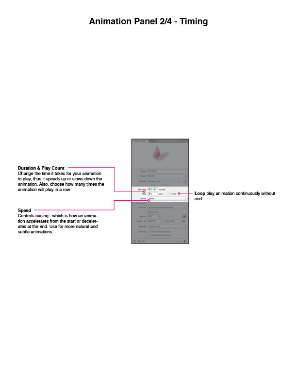
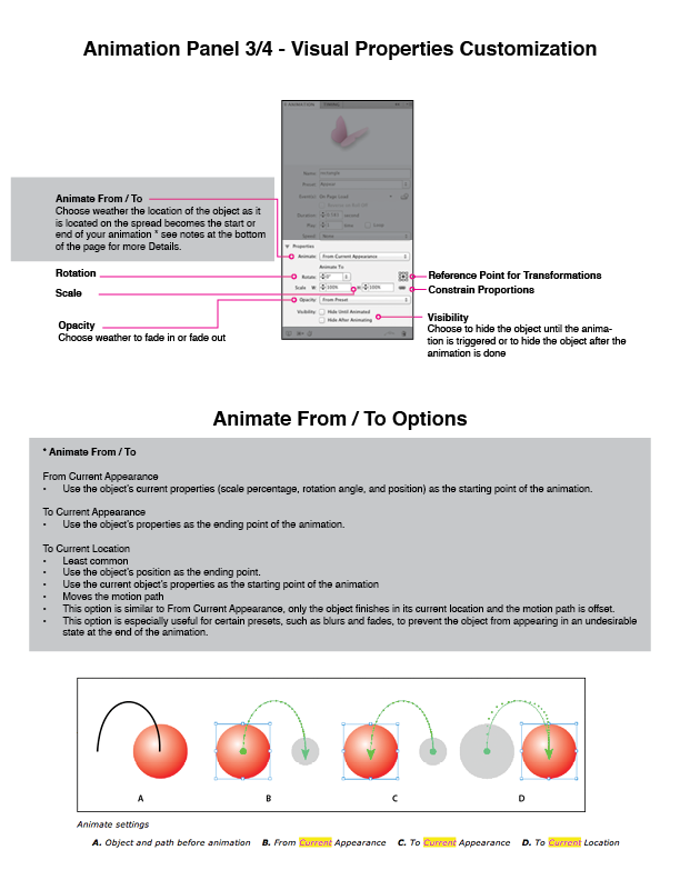
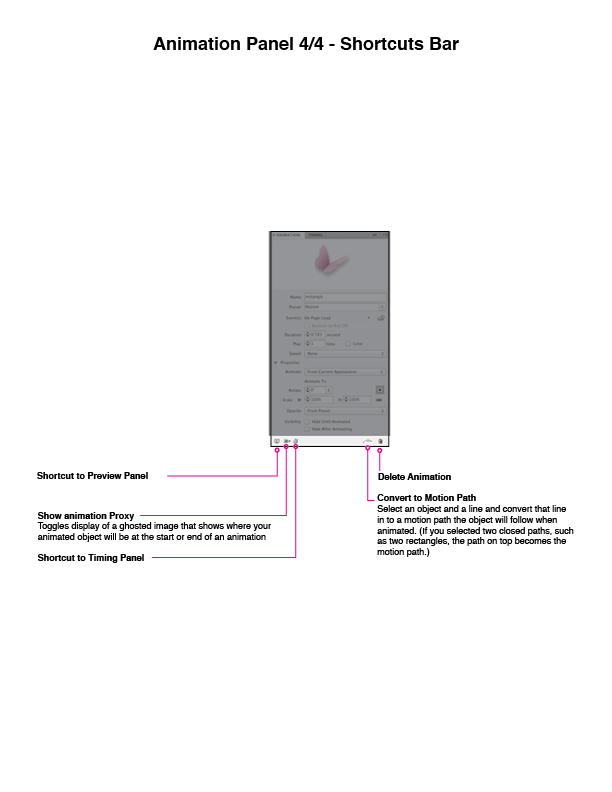
Though they can be thought of as eye candy, transitions provide additional information, context and feedback, and they help people visualize the results of their actions. Objects animate as a result of a user action, such as navigating to a page or clicking a button. The animations in InDesign have the same presets found in Adobe Flash CS5 Professional and above. Common presets, such as bounce, slide in and fade in, come bundled with InDesign, but you can create your own presets, save them and share them with others using InDesign or Flash.
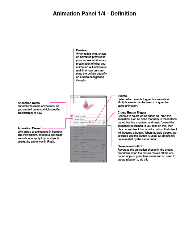
Animation panel: detail 1 of 4. Larger view.
Animation panel: detail 2 of 4. Larger view.
Animation panel: detail 3 of 4. Larger view.
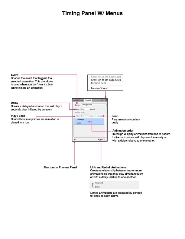
Animation panel: detail 4 of 4. Larger view.
Timing
The timing pane is used for advanced animation sequences in which a user action initiates the animation of two or more objects. The timing pane takes the place of a dedicated timeline found in apps such as Flash, and it resembles panels found in Keynote and PowerPoint (with some powerful additions). Timing is used to control the order in which objects animate, determining whether those objects animate one after another, at the same time or somewhere in between.
Timing panel: details. Larger view.
Previewing And Exporting
Previewing An Interactive Document
With so many options to tweak in an interactive document, periodically testing your interactions will help you to iterate on the design and to experience what you are creating from a user’s perspective. Thankfully, InDesign helps you do this without having to export the whole document, which saves time and lets you stay in InDesign to test the design as you are creating it.
The difference between previewing a document and exporting a document may seem minute, but because previewing is so fast, easy and but one click away, you are more likely to use it to test, evaluate and tinker with a design — and increasing the number of iterations in the design process is a surefire way to increase the quality of your deliverable.
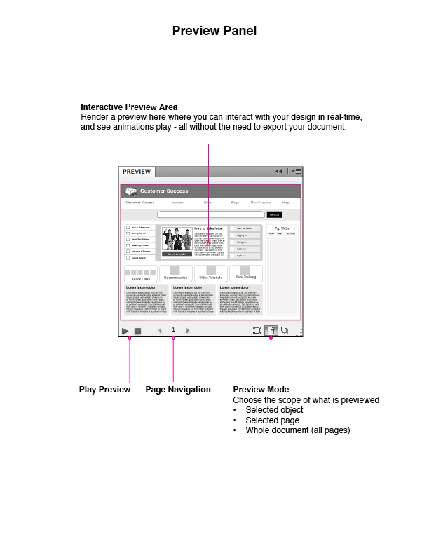
Preview panel: details. Larger view.
Exporting
InDesign’s interactive features work only when you export the file to a format that supports them, such as PDF, SWF, FLA or XHTML. And different formats support different features.
HTML Export
Though InDesign has an “export to HTML” feature, it is so anemic that it is not worth using. Perhaps Adobe wants people to use its digital publishing platform — the resulting HTML files that InDesign produces natively are not useful because they don’t maintain the styling or interactivity of the working document. Adobe has said it wants to move in the direction of supporting Web standards, but as of CS6, I would not recommend exporting to the Web from InDesign.
Luckily, a company named AJAR Productions has a new Kickstarter project that aims to rectify the shortcomings of HTML exporting. Currently, the InDesign to HTML5 project is a work in progress, but it will have a 1.0 release very soon. Please take a look at this new plugin and see what it can do for you. The developers are very responsive to constructive feedback. Hopefully, Adobe will see how useful this functionality is and follow the awesome lead of this Kickstarter project. With the InDesign to HTML5 plugin, you can produce designs with the following features and benefits:
- With the WYSIWYG, no-programming-needed design environment, produce layouts that are faithful to the original InDesign file.
- Embed fonts on your website.
- Produce built-in page navigation.
- Use master page content.
Extending InDesign
The company Eight Shapes has created a toolset called Unify to fully maximize the interactive features of InDesign. Unify is a documentation system to produce wireframes, maps, flows, storyboards, plans, style guides, specifications, usability testing reports and prototypes. I only recently discovered Unify and have found it to be extremely helpful in my work.
Drawbacks And Limitations
Before you start rushing to mock things up in InDesign, I’d like to mention a few caveats. First and foremost, few professionals are using InDesign to create wireframes and prototypes. This means that there are few tutorials and support documents to help you if you get stuck or confused. Learning how to create animated eBooks or iPad magazines might help you approximate what you are trying to do, however. Also, there are almost no native InDesign files that can be used as stencils or pre-made components similar to those found in programs such as OmniGraffle.
There is a way to quickly create your own set of stencils from those already available online, though. You can copy and paste stencils from other programs into Illustrator, clean up the images, and then paste them into InDesign. As mentioned, you can embed InDesign documents in other InDesign documents in such a way that approximates the use of symbols in Fireworks, Illustrator and Flash. Embedded InDesign documents can be treated like stencils. The advantage is that these documents can be accessed by a team from a shared location, and when the source files are updated, every document that contains the embedded InDesign files will also get updated. While getting your InDesign stencil collection up and running might require some leg work, it is well worth the effort.
The interactive features of InDesign were not intended to be used for rapid prototyping or for creating rich complex interactions. While the interactive tools are perfectly suited to eBooks, they are not yet robust. The types of documents InDesign produces are intended to be used with the Adobe Publishing Suite and EPUB — two formats with different but related limitations. Interactive PDFs, SWFs and even HTML can be exported, too, but they don’t produce files with as high a fidelity as Adobe Publishing Suite or EPUB.
In some ways, the interactive toolset makes InDesign feel like a facsimile of PowerPoint or Keynote in terms of how page transitions are handled and animations triggered. The similarity to presentation apps makes it easy to jump in and start producing work quickly. But there are some drawbacks. As anyone who has created an animation-rich prototype in a presentation program can attest, although it looks slick in the end, designing a non-linear flow in the confines of a linear document is a bit of a hack.
Despite these minor limitations, I hope you have discovered the amazing benefits of InDesign. Although not perfect, InDesign offers many perks and features that will transform the way you create wireframes and interactive prototypes.
Conclusion
Many people are familiar with InDesign, but they often overlook it when choosing a wireframing or prototyping tool. This popular application in Adobe’s Creative Suite, once a print-only tool, has become a hybrid program that can produce multimedia content for the Web and eReaders. Though not perfect, the unique combination of its creative workflow, modularity, and toolsets for interaction and animation make InDesign a robust and powerful program that is perfect for creating both wireframes and prototypes.
Other Resources
You might be interested in further articles and resources related to this article.
Further Reading
- Translating Design Wireframes Into Accessible HTML/CSS
- How To Succeed In Wireframe Design
- Fixed Elements And Overlays In XD: Incredibly Easy And Fun Methods For Your Prototypes
- How To Speed Up The Wireframing Process With Photoshop And Adobe XD
- Techniques For Gracefully Degrading Media Queries


 Agent Ready is the new Headless


 SurveyJS: White-Label Survey Solution for Your JS App
