How To Design A Better Mobile Checkout Process
It’s not just apps. By a landslide, users prefer mobile websites to apps for shopping. For every shopping activity, including researching products and prices, reviewing products, participating in promotions, and purchasing, most respondents (61 to 81%) preferred using a browser to a native app.
In the days and months to come, it will become increasingly important for retailers to fuel this growth by creating seamless, user-friendly checkout processes that inspire trust and that make full use of all of the advantages the medium has to offer.
Let’s dive into some examples of mobile checkout processes and see what we can learn.
1. Include Only Vital Fields
We’ve all answered those dreaded questions, such as “How did you hear about us?” While they may serve the vendor, they do nothing for the buyer, who is offering up their hard-earned cash and deserves to call the shots here.
While these questions are annoying on a desktop, they can be fatal in mobile. Take these two examples:
On the left, the responsive mobile checkout process by Moby succeeds by reducing the fields to the bare essentials, condensing the entire process into one cohesive page.
On the right, Kay Jewelers shows how a simple experience can quickly become extraordinarily cumbersome. Three pages in total display unnecessary fields such as “Evening phone” and “Mobile phone,” while breaking fields apart — the “Address” field is given three imposing lines (instead of just one for a ZIP code), and the user is required to retype their email address.
2. Allow Checkout As A Guest
Providing an option to check out as a guest should be standard practice across media (although 24% of e-commerce websites don’t), and especially on mobile. A user is much less likely to complete an order if they have to go through the process of creating an account and confirming it. The statistics back this up, sometimes shockingly so. One major retailer reportedly saw a $300 million leap in sales by removing the “Register” button!
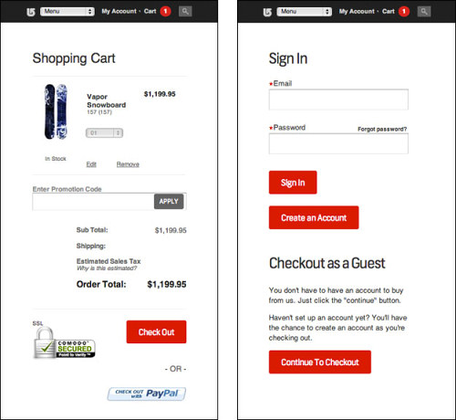
Burton starts its checkout process by hedging its bet, giving the user all three options: “Sign in,” “Create an account” or “Checkout as a guest.” Larger view.
3. Leverage Mobile UI Elements
Fandango has a fluid mobile checkout experience. One big reason why is that it leverages the advantages of the medium, often relying on touch controls, which a user is much more likely to use than typing.
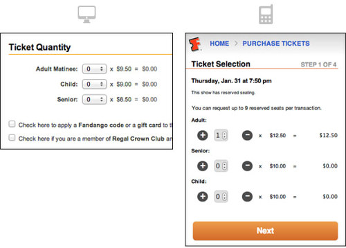
Fandango’s desktop UI versus mobile UI. Larger view.
In Fandango’s desktop UI (left), a user is prompted to select quantities using a typical drop-down menu. In the mobile UI (right), they are prompted to update quantities using increment selectors (with an option to type as well), which is speedier in that medium.
4. Remove Distractions, Not Content
Once a user is in the checkout process, they have obviously expressed a willingness to buy. Put another way, the website has switched from being a salesperson to being an order fulfillment center. With that in mind, remove anything that draws their attention anywhere other than the task at hand.
Conversions can rise in enclosed checkouts, a tactic you may have noticed when purchasing from Amazon. With this technique, the vendor removes the standard header, including the menu links and search bar, which could drive the user elsewhere. A checkout page can be made especially simple on mobile.
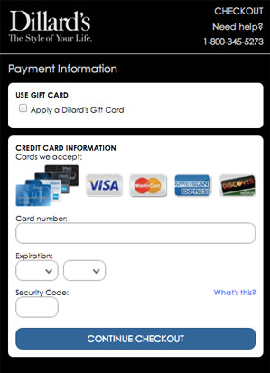
Once a user is in Dillard’s checkout process, their only escape is to tap the logo in the top-left corner.
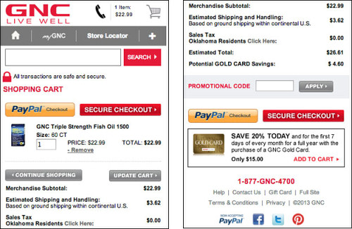
Social media links, like these in GNC’s shopping cart, should have no place in the process and could drive users away. Larger view.
A content-rich checkout page might seem like a good idea, but it will distract the user from their purchasing decision.
This doesn’t mean we should remove all content. Mobile engagements typically last 80% as long as desktop ones, and that number is rising. Users might still have questions about shipping guidelines, delivery, terms and conditions and more. A good experience should give them the option to find answers.
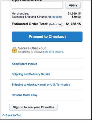
On Crate & Barrel’s mobile website, standard questions are showcased at the bottom of the shopping cart page, enabling the customer to get answers without leaving the checkout funnel.
5. Show Progress
A user wants to know where they are, where they are going and how much longer until they’re done. Progress bars alleviate anxiety here.
Recent studies show that the majority of major e-tailers show a progress bar, although many implementations leave much to be desired.
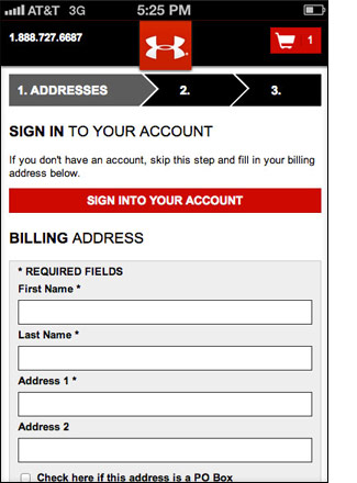
While Under Armour’s mobile website leads users through the process with a simple, sensible progress bar, it would improve by describing the steps to come.
6. Build Lightweight
Above all, time is precious. 74% of mobile visitors will leave a website if it takes longer than five seconds to load. Users have come to complete an action, and they are already convinced that it’s the right thing to do, so it’s best to get out of their way.
Adhere to the “Seven Guidelines for Designing High-Performance Mobile User Experiences.” And use a testing tool to optimize loading times; Mobitest by Akamai is my choice.
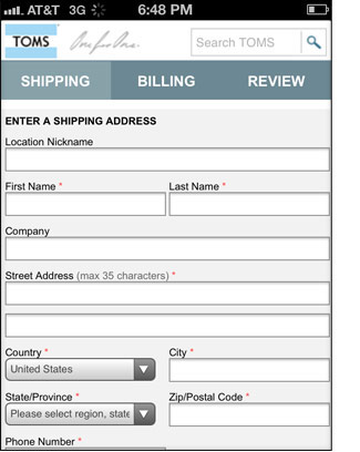
It’s not going to win any design awards, but Tom’s Shoes has a quick-loading, bare-bones checkout page that does the trick.
7. Provide Security Reassurances
One of the biggest reservations users have left about mobile e-commerce is security. To get over this hurdle, designers needn’t be subtle: provide as many reassurances as possible that the experience is secure, and drive the point home. This means using iconography, SSL certificates and dedicated callouts in copy.
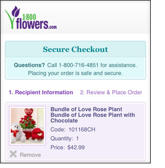
1-800-Flowers.com actively reminds users of the security of their order using a variety of tactics.
8. Google Wallet, PayPal And Amazon Are Your Friends
Instead of forcing users to fumble through checkout forms and type their address, use a trusted service such as Google Wallet, PayPal and Amazon to get users two taps away from completing their payment. Their information will be automatically populated, and the process will be nearly complete.
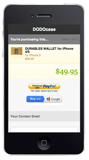
No-frills mobile e-commerce experiences on Shopify.
Mobile e-commerce experiences on Shopify, like this one for DODOcase, aren’t visually exciting, but that’s not the point. They hush any noise, while allowing users to quickly check out using trusted third-party applications.
9. Take Advantage Of Geolocation And One-Touch Calling
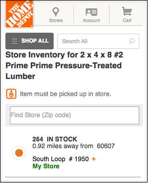
The Home Depot’s mobile website lets users pick up items in store and uses GPS to find the closest location and check inventory.
Use GPS information to easily point a user to a physical location, as an alternative to a Web conversion. By using a URL string like https://maps.google.com/maps?daddr=BEST+BUY&saddr=Current+Location on mobile, Google will automatically retrieve the nearest location and provide directions. Best Buy observed that 28% of users visiting its mobile platforms were using it to make an in-store purchase, making it a successful value proposition.
Also, use one-tap calling with the tel: protocol to enable users to call for support with one tap — a much easier experience than jotting down a phone number.
10. As Always, Test Across Systems And Setups
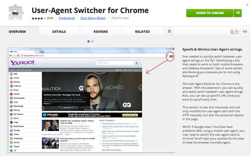
Mobile testing with the User Agent Switcher for Chrome. Larger view.
Mobile testing can be difficult and time-intensive, but with the market split between an array of operating systems, prioritizing by market share and testing at multiple resolutions is important. Getting your hands on a phone for each OS is always best, but if that’s not possible, you can use a browser plugin named User Agent Switcher for Firefox and Chrome. It can be an invaluable time-saver for testing, allowing you to bounce between different OS experiences on your desktop.
The other factor in the OS conversation is design. Many designers of mobile Web experiences make the mistake of borrowing interface elements from their OS of choice. For instance, a designer who uses an iOS device might adopt Apple’s button styles. While this would make sense in a native app, a mobile website is a cross-browser experience, and a native aesthetic will likely turn off users of other OS’ — or, even worse, might just plain look bad.
Conclusion
At long last, the promise of m-commerce is starting to be fulfilled. Never before has the gap between a good and bad mobile checkout experience affected revenue so much.
If retailers give the user a clear, focused, streamlined and lightweight path to making their purchase — while recognizing the advantages and limitations of a mobile experience outlined above — all parties will benefit.
Further Reading
- Fundamental Guidelines Of E-Commerce Checkout Design
- The Thumb Zone: Designing For Mobile Users
- Exploring Ten Fundamental Aspects Of M-Commerce Usability
- Boost Your Mobile E-Commerce Sales With Mobile Design Patterns


 Agent Ready is the new Headless
 SurveyJS: White-Label Survey Solution for Your JS App

