Exploring 10 Fundamental Aspects Of M-Commerce Usability
Everyone is talking about mobile. Some e-commerce websites are venturing into it. Mobile commerce (also known as “m-commerce”) has immense potential, exhibiting a 86% growth rate and hitting $25 billion in 2012 (set to reach $86 billion by 2016, according to eMarketer).
It’s also a whole new platform, with new interaction methods and usage contexts that introduce a host of limitations and pitfalls to watch out for when designing and running an m-commerce website. With few best practices yet established, m-commerce is, to a large degree, unchartered territory when it comes to actual implementation.
This is why we decided to invest the better part of a year at Baymard Institute to conduct a large-scale usability study focusing specifically on m-commerce (following the “think aloud” protocol). We set out to explore the entire mobile shopping experience, including users’ conceptual understanding of m-commerce websites and how users interact with form fields, category navigation, search, product pages, the checkout process, etc.
The 18 m-commerce websites that we tested were: 1-800-Flowers, Amazon, Avis, Best Buy, Buy.com, Coastal.com, Enterprise.com, Fandango, Foot Locker, FTD, GAP, H&M, Macy’s, REI, Southwest Airlines, Toys “R” Us, United Airlines, Walmart.
Despite testing the mobile websites of some of the largest e-commerce players in the world, our subjects encountered 1,000+ usability-related issues during the testing sessions. These usability issues have been analyzed and distilled into 147 design recommendations in a report titled “M-Commerce Usability.” In this article, we’ll share 10 recommendations from that report with you.
While following some of the guidelines would improve the usability of desktop websites, too, there is a major difference in the severity of breaking them. Whereas these guidelines are largely “nice improvements” on desktop, they are among the “vital basics” to get right on an m-commerce website. Thus, most of these usability guidelines are not exclusive to mobile, but they are much more critical to get right in the m-commerce context.
1. Make The Home Page Easily Scannable
Issue: When users are not able to get an overview of the entire website by quickly scanning the home page, they will feel less confident with the website and often end up choosing the wrong path for their task.
70% of the test subjects scrolled up and down the entire page when first landing on a home page or a category list, in what most described as “getting an overview of my options.” These subjects wanted to see their options before deciding which to choose. Even when they knew how they wanted to find a given product, some subjects still chose to get an overview of the home page, presumably to get a better feel for the website on which they were going to shop. In some instances, when a subject found the category they were looking for, they continued to look through one or two other categories to get a better sense of the other options on the website.
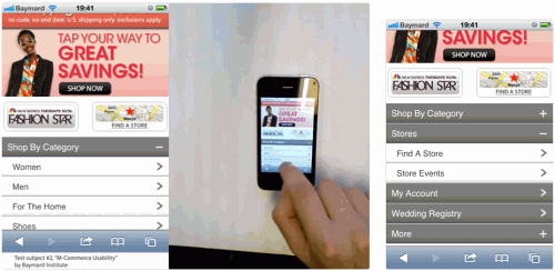
Most subjects scanned the whole home page to get an overview of their options and to better understand what they could do on a particular website. Here, one subject continued to explore the home page options, even after having found his desired navigation path of “category” → “men.”
Therefore, making the home page easily scannable is important because this will be the first point of contact for a very large portion of your mobile visitors. This initial impression will have a significant impact on the types of products they expect your website to carry and, just as importantly, not carry. While “easily scannable” might sound a bit vague, three instances of “what not to do” became clear during testing.
Having Too Many Visual Elements
Avoid the confusing eye path that results from placing multiple highly graphical elements that demand attention high up on the home page. This was the case on Macy’s, where approximately 60% of the first viewable part of the home page is plastered with highly graphical content, with at least eight different elements calling for attention:
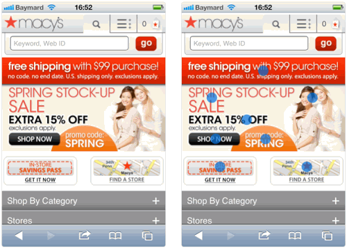
Multiple subjects were overwhelmed by Macy’s home page because it was very difficult to scan. As one subject expressed it, “I’m desperately trying to get an overview here. There’s so much crap being shoved at my face.” The right-hand image shows typical eye fixations.
This is not to say you cannot have graphics — but limit their size if they are above the fold on the home page, and design them to have a clear eye path.
Not Showing The First Layer Of Categories
Another mistake is unnecessarily hiding the category navigation. Some websites have a single “browse categories” option, which takes the user to a new page with the first layer of category choices. If you have a website where the user cannot browse with any method other than category and search (i.e. not by “brand” or “store” directly from the home page) and the number of main category options is of a somewhat manageable size, then this is an oversimplification. Instead, show the first level of category options directly on the home page so that users can start scanning the list immediately upon landing on the home page.
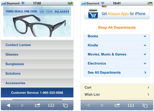
On the left: On Coastal.com, all the category options are displayed directly on the home page, which not only allows direct access, but gives users an accurate idea of the types of products they can expect to find on the website. For stores with multiple ways of browsing the catalog (e.g. by both “category” and “brand”), displaying the category options directly on the home page might not be feasible. On the right: For stores with a very high number of first-layer categories (typically mass merchants), a curated list with the most popular options might prove to be a better option, because displaying all categories would impede scannability.
Moreover, do not present the categories in a drop-down dialog. Multiple subjects explicitly stated that they had to scroll through the entire list to choose the category in which they expected to find a particular product. The problem with a drop-down quickly became clear, then: because it takes up only 50% of the available screen, getting an overview of the available categories became needlessly difficult (see Best Buy below).
Because the gesture area is also only half the size, the subjects also had a much harder time accurately controlling the scrolling speed. Lastly, the drop-down interface element was confused with a filter selection by some subjects and not recognized as the main website category navigation.
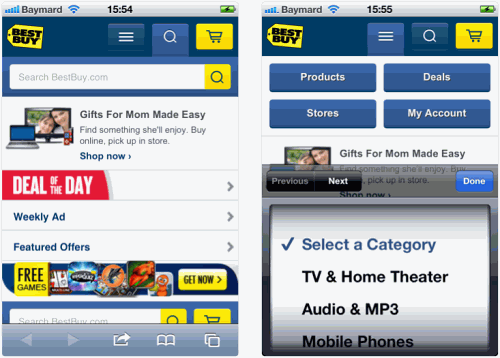
Do not follow the example of Best Buy, which does not have a category option in the main body of its home page content. Instead, a “three bars” icon takes the place of a category option in the page’s header. This not only requires all users to understand the meaning of the three bars icon, but also makes it impossible to get an overview of the store by scanning the home page. And, of course, using a drop-down to actually select a category is not ideal either.
Perfect Fold Alignment
Finally, do not design your website to have perfect alignment or white space exactly at the fold. This happens on GAP’s website, where it is easy to doubt whether the home page contains more than a search field and a few graphics (i.e. no category navigation), because these home page elements align precisely with the viewport fold (on an iPhone at least).
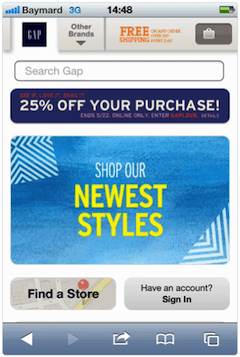
One subject, a bit surprised, asked, “This is it? This is the entire page?” believing this was GAP’s entire home page. When elements are spaced with pixel-perfection alignment around the viewport fold, users are more likely to misinterpret the top part as being the entire home page (in this case, missing out on the category navigation below).
To indicate more content, simply align the elements so that some are only partly viewable within the viewport on the most popular mobile devices.
Therefore, when designing a scannable home page:
- Put very few (if any) very visually stimulating graphics above the fold on the home page, and make sure the ones that are there have a clear eye path so that the user can quickly get an overview.
- Try to ensure that the fold (on the most popular mobile devices) partially cuts off some content, to indicate more options below.
- Display navigation options on the home page as a list (not in a drop-down).
- If you have only one category navigation type (such as “product type” or “department,” and not also “brand” or “store”), then show the first level of the category hierarchy directly on the home page either in full or, if there are too many options, as a curated and collapsed list of the most popular choices.
- Only display highlighted or featured products below the search field and the category navigation options.
2. Be Sensitive To People’s Fear Of Losing Their Data
Issue: Typing on mobile devices is clumsy, so users are constantly worried about losing their inputted data.
“Argh, no! Do I have to start over? Now I’m getting angry. Doesn’t it have my shit already?,” a subject moaned, referring to his previously typed address and credit-card information, which suddenly disappeared. “Now I’m leaving. This isn’t a serious store.”
Data persistence is not something to take lightly. Your users certainly don’t. Of course, the recommendation is simple: always persist the user’s data, which requires investing in solid technology, testing thoroughly, and storing inputted data temporarily on the user’s device (most mobile browsers support localStorage). In practice, of course, this is easier said than done, and numerous websites have failed miserably, to the great frustration of users.
Because users have already suffered through many horrible experiences of lost data, they often exhibit extreme caution around certain types of elements and avoid certain interactions when possible. The following screenshot shows the types of actions and elements that particularly worry users. Either avoid these elements altogether or soothe users’ fear with the smart use of microcopy, icons and animations.
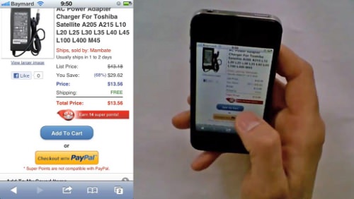
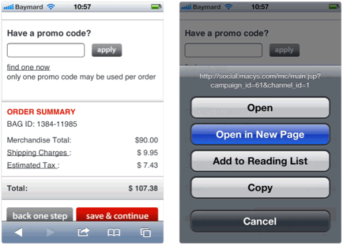
During checkout, the subjects consistently opened links in a new window because they were afraid their data would be lost if they opened links in the current window.
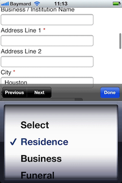
Subjects were almost always disturbed by unexpected page reloading (i.e. any page reloading that is not a direct consequence of clicking a link or button). In the image above, a subject selected a “Residence type,” which reloaded the page, causing the subject to immediately scroll up and down to ensure that none of their data was lost. We observed this type of unease with page reloading among subjects time and again throughout testing.
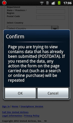
Many subjects were scared by system dialogs and often assumed that they would lose data by clicking “OK,” even though few of them actually read the message. The subject in the test shown above wanted to go backwards in the process to pick another ticket but was met with this dialog, which he cancelled — assuming that he would have to re-enter everything if he wanted to select another ticket.
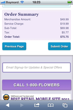
A good number of the subjects believed that leaving the checkout process would destroy their data and so refused to go back and check for other products. The subject in the test above contemplated going back to find another bouquet of flowers, but decided against it because he did not want to re-enter all of his data. This happened despite many of the test websites actually remembering the users’ details, even if the users left the checkout process midway — the keyword, of course, being “many” websites, rather than “all.” Given this inconsistency, users have no way to know beforehand, so their only safe choice is to just assume the worst on all websites.
During checkout, the “back” button was generally perceived by the subjects to be dangerous, and subjects used it during checkout only when they felt they were out of all other options. In many cases, this perception was justified: numerous websites did indeed fail to persist the user’s data when they used the “back” button. However, equally important is that process step links and other “back” links and buttons that were part of the website’s UI were generally considered by the subjects to be “safe.”
Therefore, including either process steps or “back” links in the checkout is crucial so that users do not feel they have to gamble by using the browser’s “back” button and can instead use your website’s dedicated UI element(s) for the purpose. In the test shown above, the subject hunted up and down to find a link or button that would take him back to the previous step, but was unable to find one. Finally, he tried the browser’s “back” button.
These were the most significant insights relating to users’ fear of lost input. In general, the subjects were vastly more pessimistic about websites on which they had once lost data. For example, clicking the keyboard’s “next” button cleared one subject’s input on a website, which made her consistently avoid that button throughout the rest of the checkout. As she said, “Here, I don’t dare click ‘Next’ anymore because I don’t want to start over again.” Not only that, the subject also became overly cautious when interacting with any fields on the website, fearing that even the slightest hiccup would destroy her data.
A single bad experience set low expectations for the rest of the website. So, how do we avoid bad experiences in cases where we are unable to persist the user’s data due to technical limitations? In these instances, clearly warn the user that they are about to do something destructive.
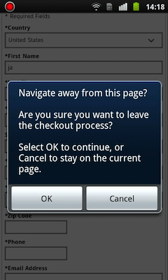
As the subject left the incomplete checkout, the website warned her that her data would be lost. “This is very good,” the subject remarked, “because if I did something wrong by accident, I would be extremely annoyed if they deleted everything. So, it’s good that they warn me like this if the data would otherwise be lost.”
Persisting data is always the ideal, of course, but warning the user and giving them the option to back out before destroying their data is a good secondary solution, and it sure beats simply destroying the user’s data without warning; moreover, it gives the user a chance to cancel the destructive action. This type of fallback solution could be especially useful for less common navigation paths, where persistent data is too time-consuming to implement, considering how few users it affects.
This could also entail something like persisting the user’s cart or checkout data when switching between the full website and mobile website. In these instances, it is acceptable to simply warn the user that they will lose their data if they proceed, and then give them the option to proceed (and lose their data) or stay (and keep their data).
Data persistence is clearly a complex matter, especially when one considers the user’s expectations towards data persistence. We observed subjects creating accounts merely to ensure persistence, and witnessed data lost due to accidental clicks, and we watched with as much surprise as the subject when an entire form was remembered perfectly by autofill, turning potentially horrible data loss into a small moment of joy. Data persistence is tricky, but getting it right is crucial.
3. Add A Primary Button At The Bottom Of Product Pages
Issue: Users are likely to misinterpret cart buttons in the page’s footer if there is no “Add to Cart” button at the bottom of every product page.
A wide range of the tested websites had multiple identical primary call-to-action (CTA) buttons on product pages (i.e. two “Add to Cart” buttons), one at either the top or middle of the product page and a second one at the bottom.

On Best Buy, one subject read this product’s entire specification sheet and was in the mindset of “Yes, this is the product I want to purchase.” He saw the website’s shopping-cart icon at the bottom of the page (second image above) and clicked it, believing it was an “Add to Cart” button. Logically, he assumed the product would be added to his cart and so continued browsing for more products, only to notice much later in the shopping session that the website had “deleted” his cart’s contents (the TV was never added in the first place).
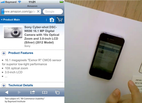
The subject here on Amazon thought the shopping-cart icon was the button for adding the displayed product to her cart.
It turned out that on the websites with only one CTA button on a product page, subjects often ran into severe problems even with adding a product to their cart — which, in some cases, ultimately led to abandonments. Cart icons in the page’s header or footer were often mistaken for an “Add to Cart” button.
Both Best Buy and Amazon failed to make the primary buttons immediately obvious and generally available, which led subjects to start interpreting various icons on the page, including the cart icon, as shown in the two examples above. Subjects often scrolled to the bottom of a product’s page when looking for the “Add to Cart” button (a behavior confirmed in another study).
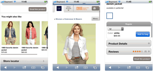
This subject started looking for the “Add to cart” button by scrolling to the bottom of the page, then scrolling back to the top of the page, thinking she might have missed it, and finally scrolling down again patiently, until finding the “Add to bag” button in the middle of the page.
To accommodate this behavior and reduce misinterpretation of any cart icons, add a second “Add to Cart” button to the bottom of all of your product pages. A second button there will also support a more natural interaction flow, as the user first reads the product description, then the specification sheet, then the reviews and so on, and then, at the end of the page, decides whether to buy or not. Only if the product page is extremely short (one to two mobile viewports tall) would a single button suffice.
4. Be Very Careful With Animated Carousels
Issue: Users fail to discover vital features that appear only in a carousel, and they have a hard time interacting with carousels themselves.
Animated carousels caused interaction problems for half of the test’s subjects. The carousels simply changed too quickly for some subjects to both read and select an option.
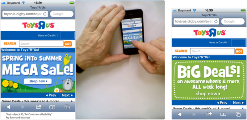
A subject was about to click the “Mega Sale” slide (left image), but the carousel animated to the next slide at the very same moment, forcing the subject to wait for that slide to reappear.
In multiple instances, a subject found a carousel slide interesting and attempted to tap it. However, the carousel changed to the next slide at the very same moment, causing the wrong slide to load. Sometimes the subjects noted this, but sometimes they did not and left the landing page immediately because they did not find it relevant to what they were looking for.
Interestingly, the “Prev” and “Next” buttons in the Toys “R” Us carousel were not used by a single subject during testing, despite these issues:
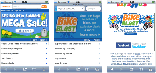
The carousel changed the very second this subject tapped it, registering a click for “Bike Blast” instead of the “Mega Sale” she wanted. The subject never noticed and assumed that “Bike Blast” was the sale.
Both of these interaction issues were also encountered (and still exist) in the early versions of carousels on full websites, but as carousels have become increasingly popular on e-commerce home pages over the last several of years, they have evolved, so most now stop animating when the user hovers over an option with the mouse.
And most also have an indicator that enables the user to see how many slides a carousel has and, just as importantly, to jump to a particular slide (such as back to the one that piqued their interest but changed too quickly). These interaction issues cannot be easily solved on mobile because there is no hover state and much less screen real estate.
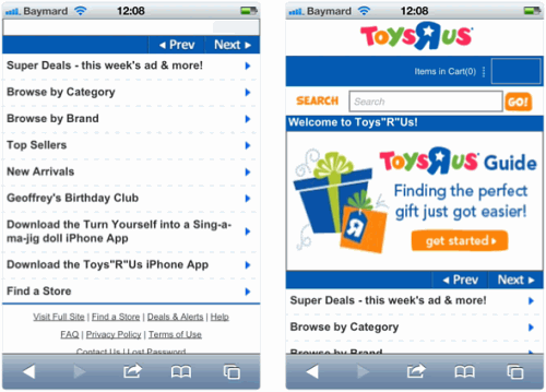
On Toys “R” Us’ home page, the subjects pored over the menus to find a “Gift Guide” wizard but could not find one (image on left). It turns out there is a wizard but is accessible only via a particular slide in the rotating carousel at the top of the page.
Perhaps an even more critical usability issue is that most test subjects simply ignored the carousel after quickly glancing at the first slide. Some waited and looked at two to three slides before focusing elsewhere. This proved critical on some websites, such as Toys “R” Us’, because the majority of subjects were desperately looking in the traditional navigation for certain features (such as the “Gift Finder”) that were accessible only via the carousel. Some subjects spoke at length about how the website really should have some sort of “gift guide,” ultimately abandoning the website because they could not find one.
Users ignore animated carousels for multiple reasons. First, a carousel’s content might look like advertising, depending on how it is styled, greatly increasing the chance of banner blindness (a subgroup of subjects tended to focus much more closely on text-based navigation than on graphics-based navigation). Secondly, when using a large laptop or desktop monitor to browse a full website, the user is able to check out other options on the home page while still glancing at the carousel slides as they change.
On mobile devices, however, the screen is so small that a carousel would take up a significant portion of the viewport, making it practically impossible to scan any navigation or category options while monitoring the carousel slides (one of them will always be partly or completely out of sight). Therefore, if users are to see all options in a carousel on a mobile device, they will have to watch the carousel for its full duration (like a video clip).
Regardless of the cause(s), what is really important is that the vast majority of subjects ignored the animated carousels completely and, on the home page, focused instead on the category navigation and search features. For this reason, be very cautious about relying on carousels for important content, and never have it as the only path to a particular feature.
5. Be Careful Of Showing Product Information Or Images On Separate Subpages
Issue: Users have incredible difficulty understanding the scope of product subpages.
On a mobile device, understanding the scope of the current page is vastly more difficult for users, due to the very small display. Mobile pages often lack the subtle yet vital page-scope cues that are present on full-size pages, such as a full set of breadcrumbs, an overview of the current page, and full URL paths viewable throughout the browsing session.
This lack of scope on mobile makes having any kind of substeps or subpages that refer to a main page very risky, because the user would have to fully understand the scope of the current page in order to appreciate the difference between the subpage and main page.
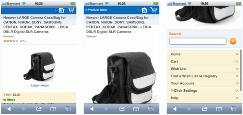
When users want to see larger versions of images of an Amazon product (left), they are taken to a subpage (middle). Our test subjects clearly noticed that they were still within a product’s particular scope (because of the large product image), but they did not understand where the rest of the product page went (right).
This became immediately apparent when testing websites that offer a “larger view” option of their images, taking users to a separate product subpage, as seen on Amazon above. Because of the apparent lack of access to vital content, such as “Product Description,” “Product Specs” and “User Reviews” (which are available only on the main product page), the subjects who did not notice this change in scope assumed that such content simply did not exist for the given product and continued looking for other products with such information, discarding perfectly matching ones.
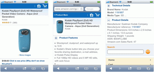
Amazon also uses subpages to show full specification lists, causing the exact same issue, except that this time subjects were unable to locate something as vital as the “Add to Cart” button.
On a mobile device, and especially on subpages, understanding the current scope is simply much more difficult. Instead, display your “larger views,” image galleries, detailed specification sheets and the like (i.e. all relevant content) directly on the product’s main page. You could also use progressive disclosure by collapsing each content section by default, to avoid overly long pages; but then be sure to have clear trigger indicators. A strategy such as this minimizes the need to display additional information and images on subpages and the resulting scope issues.
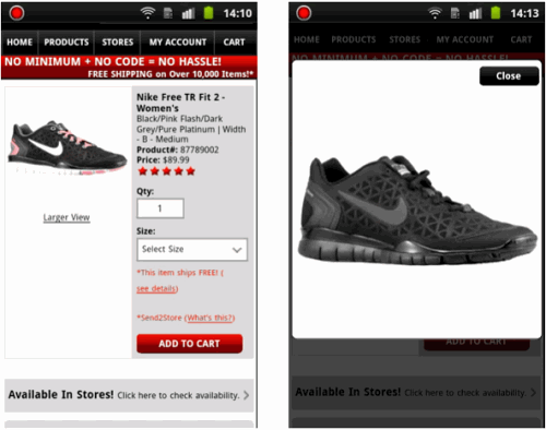
Especially with image galleries, you also have the option of an overlay, as shown above on Foot Locker. With an overlay, the user can still see the product page beneath and have a simple way to get back to it.
6. Be Thoughtful In The Design And Sequence Of Your Three Account-Selection Options
Issue: Users had difficulty figuring out how to initiate “Guest Checkout” and understanding field relationships, selection options and buttons in the account-selection steps.
On mobile, the user’s selection of a checkout type — “create an account,” “sign into account” or “guest checkout” — will be a separate step (unlike on full websites, where it could be integrated into the first step). More than half of the test subjects (60%) had serious trouble identifying, seeing and selecting the guest-checkout option at the account selection step during checkout.
Multiple times, the misunderstandings led subjects to believe that registration was required, despite it being optional, and carried all of the downsides of forced account registration (including abandonments). Therefore, the design of your account-selection screen for mobile is just as important as having a guest-checkout option at all.
Several different design schemes led to these serious misunderstandings, as the following screenshots illustrate.
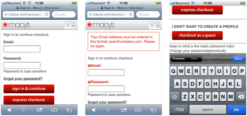
On Macy’s, subjects saw the account-selection step (above left) after selecting the cart. Some clicked “Express Checkout,” believing they would have a fast checkout (as a guest), only to get form-field validation errors for the two fields because “Express Checkout” requires a Macy’s account (above center). Some only discovered the “Checkout as a Guest” option further down the page (right), after getting this validation error, while others never noticed the guest-checkout option and registered for an account, believing it was required.
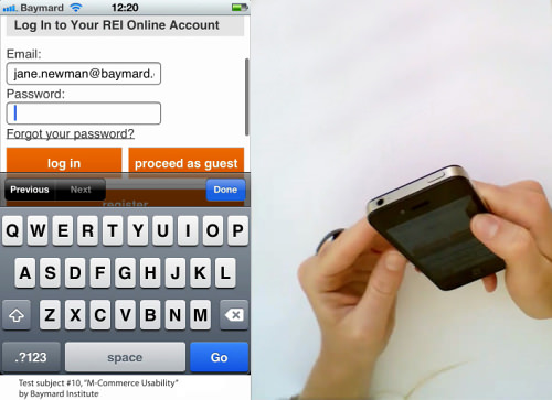
On multiple websites (Amazon, Toys “R” Us, REI, GAP, Best Buy), subjects started to interact with the fields, such as by providing their email address (above). On REI, every single subject interacted with the email field before looking for, or figuring out that there was, a guest-checkout option.
In most cases, the subjects spotted the error before submitting the form (typically upon reaching the password field and deducing that they were on an account sign-in or creation form). In such cases, not even detailed analysis of your Web statistics and error logs would reveal these issues because no validation error ever occurs.
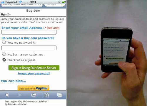
On Buy.com, things are even worse. The vast majority of subjects simply could not figure out the relationship between the four checkout methods (sign-in, create account, guest checkout and PayPal checkout), the two form fields, the three radio buttons and the two primary buttons. All tapped the “Checkout as a Guest” option after spending some time trying to understand the page.
Then, the naming of the “Sign in Using Our Secure Server” button utterly confused subjects because they were trying to check out as a guest (and, therefore, actively opted not to sign into anything). This particular naming has been used by Amazon for years and has even been highlighted as a best practice to indicate a secure checkout, so how could it lead to such major misinterpretation?
The reason is that it indicates the user will sign in, which makes sense only if they have an account or will create one, but not if they are checking out as a guest. (Amazon does not offer a guest-checkout option, so the wording makes sense in that context.) Given the button’s name, one subject assumed that the only other prominent button on the page, “Checkout with PayPal,” must be the one to pick to initiate the “Checkout as a guest” selection.
Others finally clicked the oddly named button — but nothing seemed to happen. It turns out that inline text reading “Required” appeared next to the “Enter your eMail Address” label (seen above), but no one noticed it initially. The subjects typically waited for a little while just in case the website did not load, and then clicked again, at which point most realized that they needed to fill in more data. By this point, some, especially those who did not notice the validation error, concluded that they were not allowed to check out as a guest and proceeded to create an account instead.
One explained his experience thusly, “Normally I would think ‘guest checkout’ would let me through without having to create an account. But here I have to fill in my mail, so I have no idea what that option is for, then. To be on the safe side, I’ll then pick the ‘No, I’m a new customer,’ because if I’m forced to create an account, I might as well just do it properly anyways.”
Making the account-selection process clear is as important as offering a guest checkout option. Following two main design principles will help to prevent these serious problems:
- Always place the guest-checkout option at the top, with its own button to proceed, so that the user does not need to fill in an email field in this step. (If needed, you can look up whether the user has an account in the next step, when you ask for their email address, to ensure that they have not selected the guest checkout just because it is the first option in the list.)
- Collapse all of the fields and descriptions for all three options — “guest checkout,” “sign in” and “create an account” — bringing each option down to a single line, making it possible to get an overview in the viewport without having to scroll or expand. Dynamically expand them when tapped, revealing the fields and descriptions. This will also make clear which fields are related (and required) for each option.
Below, we have created a simple mockup to illustrate how account selection can be clarified by combining these two principles:
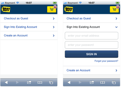
All three account-selection options are displayed in collapsed state (with guest checkout at the top), so that the user can instantly see all available options. The options can either expand inline (image on right) or redirect to the next step in the checkout process. Progressive disclosure also makes the relationship between an option and its fields much clearer.
7. Disable Autocorrection When The Dictionary Is Weak
Issue: Poor autocorrection is frustrating when users notice it, and can be detrimental when they do not.
Autocorrection usually works poorly for abbreviations, street names, email addresses and similar words that are not in the dictionary. This caused significant problems throughout testing and resulted in a great deal of erroneous data being submitted as subjects completed their purchases.
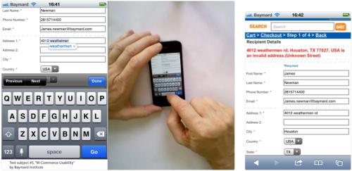
When this subject typed in his street name, “westheimer,” the phone incorrectly autocorrected this to “weathermen” (left). However, the subject did not notice this, submitted the form and received a validation error (right).
One of the major issues of autocorrection was that the subjects often failed to notice the correction (because they were often focused on what they were typing, instead of what they had typed). This is fine if the “correction” is correct, but it can be detrimental if it is wrong. For example, in multiple instances, a valid address was autocorrected to an invalid one and submitted because the subject failed to notice it.
On websites without address validators, this resulted in wrong addresses being submitted, unless the subject was particularly attentive on the order review page. After all, the user’s address will often be replaced with something that looks very similar, although incorrect. In addition to the “weathermen” example, official address abbreviations, such as “Rd,” were autocorrected, to “Ed.”
That being said, autocorrection did prove very helpful when it worked. So, don’t disable it in all fields. Use it discreetly, and disable it on fields for which autocorrection dictionaries are weak. This typically includes names of various sorts (street, city, user) and other identifiers (such as email address).
You can disable autocorrection by adding an autocorrect attribute to the input tag and setting it to off, like so:
<input type="text" autocorrect="off" />
8. Make Fields Long Enough To Fully Display Common Data (And Put Labels Above Fields)
Issue: Users cannot easily spot errors, let alone correct them, when the field is too short to display the entire inputted data.
Due to the small size of mobile screens, form fields often get so short that users cannot self-validate before submitting their data, and users have a very difficult time correcting any validation errors because they cannot see the inputted data in its entirety.
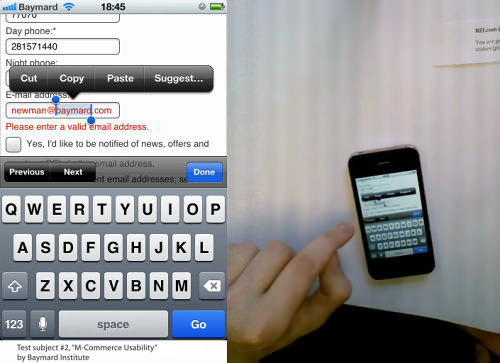
“I can’t see what I’ve typed. Argh. Then I’ll delete everything and retype it.” On REI, a validation error for an email field that was too short to be displayed in its entirety made it impossible for the subject to see what the actual error was. In trying to pan the inputted text, the subject accidentally enabled both the iOS text-selection tool and the text-replacement tool.
Form fields that are too short presented problems for many subjects who tried to confirm the validity of their data before submitting it. They often made complaints such as, “I can’t see if the emails are the same when the email field isn’t long enough.” Some examples are seen below.
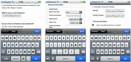
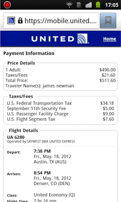
On the left: Amazon’s email field is too short, despite the abundance of white space. In the middle: United’s credit-card field shows only 15 characters, even though most card numbers are 16 digits. On the right: Macy’s email fields are too short for users to verify whether the two addresses they’ve inputted match.
Given how easy it is to make a typing mistake on a mobile device, fields that are not long enough to allow users to validate their data before submission are very harmful to the typing experience. Even worse, they make correcting any validation errors unnecessarily difficult.
Note that in the case of Amazon and the earlier example from REI, the white space is sufficient to make the field much longer, while the other two examples have no additional space to make the fields longer because the labels are all left-aligned. For this very reason, labels should be placed above form fields to allow full use of the space and to display all of the user’s data (at a decent font size). Displaying labels to the left of the fields would be acceptable only when the device is in landscape mode (as explained in detail in “Mobile Form Usability: Place Labels Above the Field”).
An adequate width for email and address lines is the full screen. Then, adjust the font size of the fields to allow for the full display of reasonably long data, such as first.lastname@my-company.com. (The character-length distribution of our own newsletter list shows that 96% of email addresses are 30 characters or fewer.)
9. Enable Users To Verify The Inputted Day And Date
Issue: Using text fields for dates requires unnecessary mental processing of the user and can cause serious selection errors.
During testing, websites that had only a simple text field or drop-down dialog for date selection presented problems for 80% of the subjects.
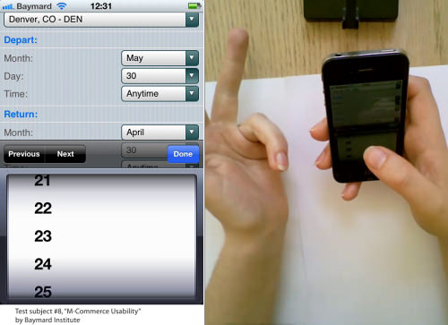
This subject was among the 80% who were unsure which date “this Friday” was. So, she decided to count the days on her hand, wanting to make sure she picked the right one.
This happened with both Southwest (which uses drop-downs for the month and day) and United (which shows a text field for writing MM/DD/YYYY). On both of these websites, the following scenarios occurred:
- A handful of subjects had to count the days on their hand (as explained above).
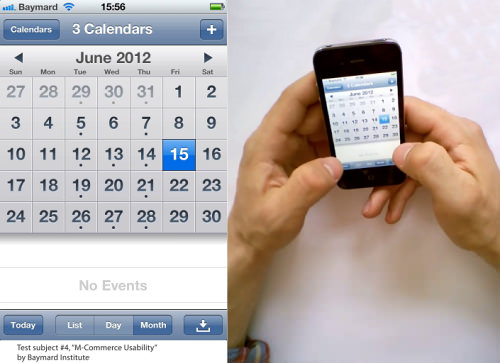
- Half of the subjects went off-site and opened the phone’s native calendar app to double-check the date for their weekend trip (to confirm “this Friday”). In the instance seen above, this calendar verification goes completely awry because the subject checked the day of June 15th, instead of July 15th, and ended up purchasing a flight ticket for his “weekend” trip that left on a Sunday and returned on a Tuesday.
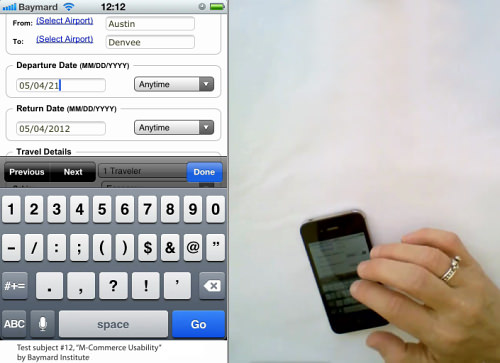
- Lastly, a few struggled with typing and using the text-selection tool to enter the correct date on a website that uses a text field for date selection.
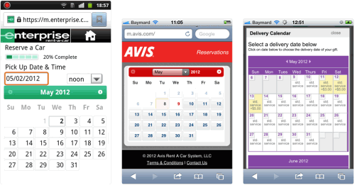
By contrast, on the three test websites that provided a graphical interface for inputting dates in the form of a calendar view (namely, Enterprise, Avis and 1-800-Flowers, seen above), not a single one of these issues arose, and the subjects generally liked being able to verify the day and date they were selecting. This could potentially save customers from incorrectly counting or “verifying” the wrong weekday (as mentioned earlier) and thus booking the wrong date.
While this is an annoyance on desktop as well (since the user would be no better equipped to spot the errors there), the severity and impact on the user’s experience is much greater in mobile when it comes to correcting the erroneous data, because panning and editing truncated data on a three- or four-inch touchscreen is much more cumbersome than using a mouse or keyboard arrows on a desktop. Furthermore, ordering tickets on the wrong day is much less likely on the desktop because the booking form and a separate calendar application can be displayed next to each other — whereas on mobile, only one can be viewed at a time.
Therefore, always provide an interface that enables users to verify the day of their selected date. One option is to display a calendar interface in which the user explicitly selects the date they want. That would simplify the actual selection interface and, more importantly, gives users a chance to verify the day. If you already use a drop-down for date inputs and do not want to replace it, you could instead append the day after each date option (for example, “March 15 – Monday”); although that would require the month to be included in each drop-down day value or, in case a separate drop-down is used to select the month, you would need to dynamically update the day names depending on the currently selected month.
10. Make The Hit Area For Each List Item Distinct
Issue: With some lists, users simply have no idea where to tap in order to select an item.
Can the entire “element” be tapped? Or only the product title? And what about the thumbnail? During testing, multiple issues arose as subjects were unsure of where to tap in order to select an item in a list. This was by far the worst on websites where list items were above the recommended half-screen height. In fact, one subject got completely stuck and was unable to complete her purchase.
The problem was by no means limited to websites with list items that were too tall; it was just worse on those websites. The issue also extended to websites whose list items were normal in size but whose hit areas were unclear, which severely limited the subjects and even resulted in abandonments.
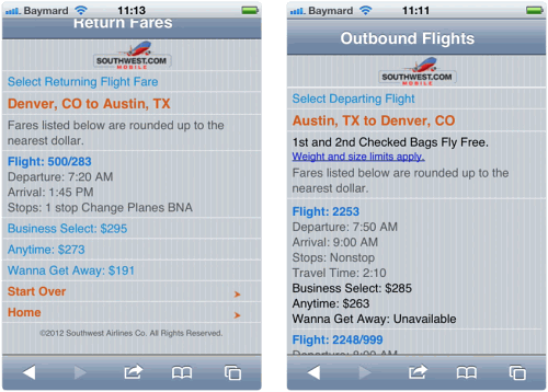
It simply was not clear to subjects what can and cannot be clicked on this page. Note the very inconsistent link styles. Orange is sometimes used for the header, other times for a list item. Separators are sometimes used to set off list items, other times to set off elements of text. Some text is one shade of blue, which sometimes indicates a link, while other links are styled in a darker blue and underlined. Confused yet? The subjects were, too.
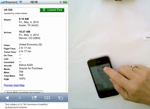
Note how the subject was trying to click the “Lowest Fare” label, believing this was the button to choose the displayed flight. Besides the primary button being unclear, the list item is also very long. Combined, these two design choices are a surefire way to leave some users in doubt on how to even proceed.
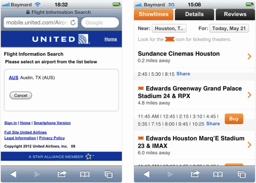
On the left: This subject did not know what to click in order to proceed on United’s website. Presumably, this was caused by the single result. With no options to compare and choose between, it was not clear to the subject what to select. On the right: Many subjects did not pick up on the ticket icon and its meaning on Fandango’s website. Instead, they assumed that the movie was playing only in theaters where a “Buy” button was shown (which was not the case).
The images above show only some of the many instances where it was unclear to subjects what elements are clickable, what the differences are between the different hit areas and, most importantly, where to click in order to select an item in a list. The websites with the far fewest problems with hit areas embraced multiple of the following recommendations:
- Make the entire element area clickable. In particular, the thumbnail, product header and price should be clickable and should lead to the product page.
- Style the title as a link (using your primary style for text links).
- Indicate the virtual space with an arrow or similar visual cue, showing that the entire list item will move the user to the next step in the process.
- Consider separate “Buy Now” or select buttons for very long list items — i.e. when a list item could be easily mistaken as pieces of information, rather than a collective entity to be clicked.
- Avoid multiple hit areas within the same visual element — in particular, links or buttons within a list item that lead to different pages.
Designing M-Commerce Websites
Aside from their practical use, these 10 recommendations have hopefully given you a glimpse of just how complex designing an m-commerce website really can be. It’s not simply a matter scaling and adding media queries; it’s an entirely new platform, and the balancing act is particularly difficult to get right due to the complex tasks involved, such as product finding and product comparison and multi-step processes such as checking out. In many ways, designing and optimizing an m-commerce website is much more difficult and often requires more “intelligent” website features than a traditional desktop e-commerce website. It comes as no surprise that IBM reports average m-commerce conversion rates that are roughly half of its desktop e-commerce conversion rates.
In general, the more complex a mobile website’s features, the more likely the experience should be significantly different from the desktop experience. The greater the difference between the two, the stronger the argument for having a standalone mobile website. Of course, maintaining two versions of the same website comes with many issues, especially with maintenance (of content, code and design). A responsive design is a better solution in some cases, but it depends very much on the size and complexity of the website, as well as on your organization’s strengths and weaknesses. It’s a nuanced issue, with many gray areas and with good arguments both for and against having a standalone mobile website.
If you can achieve this by designing for mobile first, then a responsive design could be truly great — not just in its maintainability, but also its user experience. Be clear, however, that if your existing website is complex, merely scaling it down to different devices won’t be enough to offer a great mobile experience. And if messing with the full website’s existing structure and content isn’t an option, then you might be forced to create a standalone mobile website in order to provide a decent experience — although maintaining content and code on the two separate platforms in parallel could turn out to be both expensive and messy.
Thus, getting an m-commerce website right tends to be very resource-demanding, as you account for all of the nuances. But the opportunities are great. This is a new world, and it will take time before best practices stabilize. Spending time and money on a mediocre m-commerce website is wasteful. Yes, making the website great will require significant investment, but the potential payoff is high, too. M-commerce is a window of opportunity; it enables you to distinguish yourself from competitors and to position yourself well to grab a share of this market, which is expected to reach $86 billion by 2016.
Note: You can find out more about m-commerce usability guidelines in the (non-free) report “M-Commerce Usability” by the author of this article.
Further Reading
- Boost Your Mobile E-Commerce Sales With Mobile Design Patterns
- How To Plan Your Next Mobile E-Commerce Website
- How To Design A Better Mobile Checkout Process
- The Thumb Zone: Designing For Mobile Users
(al) (il)


 Celebrating 10 million developers
 Register Free Now

 SurveyJS: White-Label Survey Solution for Your JS App

