The State Of Responsive Web Design
Responsive Web design has been around for some years now, and it was a hot topic in 2012. Many well-known people such as Brad Frost and Luke Wroblewski have a lot of experience with it and have helped us make huge improvements in the field. But there’s still a whole lot to do.
In this article, we will look at what is currently possible, what will be possible in the future using what are not yet standardized properties (such as CSS Level 4 and HTML5 APIS), and what still needs to be improved. This article is not exhaustive, and we won’t go deep into each technique, but you’ll have enough links and knowledge to explore further by yourself.
The State Of Images In Responsive Web Design
What better aspect of responsive Web design to start off with than images? This has been a major topic for a little while now. It got more and more important with the arrival of all of the high-density screens. By high density, I mean screens with a pixel ratio higher than 2; Apple calls these Retina devices, and Google calls them XHDPI. In responsive Web design, images come with two big related challenges: size and performance.
Most designers like pixel perfection, but “normal”-sized images on high-density devices look pixelated and blurry. Simply serving double-sized images to high-density devices might be tempting, right? But that would create a performance problem. Double-sized images would take more time to load. Users of high-density devices might not have the bandwidth necessary to download those images. Also, depending on which country the user lives in, bandwidth can be pretty costly.
The second problem affects smaller devices: why should a mobile device have to download a 750-pixel image when it only needs a 300-pixel one? And do we have a way to crop images so that small-device users can focus on what is important in them?
Two Markup Solutions: The Element And The srcset Attribute
A first step in solving the challenge of responsive images is to change the markup of embedded images on an HTML page.
The Responsive Images Community Group supports a proposal for a new, more flexible element, the < picture > element. The concept is to use the now well-known media queries to serve different images to different devices. Thus, smaller devices would get smaller images. It works a bit like the markup for video, but with different images being referred to in the source element.
The code in the proposed specification looks like this :
<picture width="500"  height="500">
  <source  media="(min-width: 45em)" src="large.jpg">
  <source  media="(min-width: 18em)" src="med.jpg">
  <source  src="small.jpg">
  <img  src="small.jpg" alt="">
  <p>Accessible  text</p>
</picture>
If providing different sources is possible, then we could also imagine providing different crops of an image to focus on what’s important for smaller devices. The W3C’s “Art Direction” use case shows a nice example of what could be done.
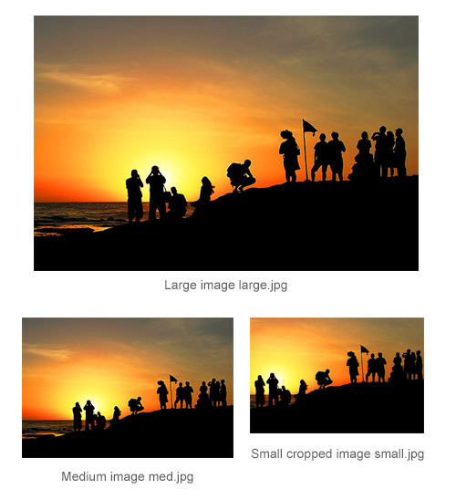
(Image: Egor Pasko)
The solution is currently being discussed by the W3C Responsive Images Community Group but is not usable in any browser at the moment as far as we know. A polyfill named Picturefill is available, which does pretty much the same thing. It uses a div and data-attribute syntax for safety’s sake.
A second proposal for responsive images markup was made to the W3C by Apple and is called “The srcset Attribute”; its CSS Level 4 equivalent is image-set(). The purpose of this attribute is to force user agents to select an appropriate resource from a set, rather than fetch the entire set. The HTML syntax for this proposal is based on the <img> tag itself, and the example in the specification looks like this:
<img  alt="The Breakfast Combo"
  src="banner.jpeg"
  srcset="banner-HD.jpeg  2x, banner-phone.jpeg 100w, banner-phone-HD.jpeg 100w 2x">
As you can see, the syntax is not intuitive at all. The values of the tag consist of comma-separated strings. The values of the attribute are the names or URLs of the various images, the pixel density of the device and the maximum viewport size each is intended for.
In plain English, this is what the snippet above says:
- The default image is
banner.jpeg. - Devices that have a pixel ratio higher than 2 should use
banner-HD.jpeg. - Devices with a maximum viewport size of
100wshould usebanner-phone.jpeg. - Devices with a maximum viewport size of
100wand a pixel ratio higher than 2 should usebanner-phone-HD.jpeg.
The first source is the default image if the srcset attribute is not supported. The 2x suffix for banner-HD.jpeg means that this particular image should be used for devices with a pixel ratio higher than 2. The 100w for banner-phone.jpeg represents the minimum viewport size that this image should be used for. Due to its technical complexity, this syntax has not yet been implemented in any browser.
The syntax of the image-set() CSS property works pretty much the same way and enables you to load a particular background image based on the screen’s resolution:
background-image: image-set(  "foo.png" 1x,
  "foo-2x.png"  2x,
  "foo-print.png"  600dpi );
This proposal is still a W3C Editor’s Draft. For now, it works in Safari 6+ and Chrome 21+.
Image Format, Compression, SVG: Changing How We Work With Images On The Web
As you can see, these attempts to find a new markup format for images are still highly experimental. This raises the issue of image formats themselves. Can we devise a responsive solution by changing the way we handle the images themselves?
The first step would be to look at alternative image formats that have a better compression rate. Google, for example, has developed a new image format named WebP, which is 26% smaller than PNG and 25 to 34% smaller than JPEG. The format is supported in Google Chrome, Opera, Yandex, Android and Safari and can be activated in Internet Explorer using the Google Chrome Frame plugin. The main problem with this format is that Firefox does not plan to implement it. Knowing this, widespread use is unlikely for now.
Another idea that is gaining popularity is progressive JPEG images. Progressive JPEG images are, as the name suggests, progressively rendered. The first rendering is blurry, and then the image gets progressively sharper as it renders. Non-progressive JPEG images are rendered from top to bottom. In her article “Progressive JPEGs: A New Best Practice,” Ann Robson argues that progressive JPEGs give the impression of greater speed than baseline JPEGs. A progressive JPEG gives the user a quick general impression of the image before it has fully loaded. This does not solve the technical problems of performance and image size, though, but it does improve the user experience.
Another solution to the problems of performance and image size is to change the compression rate of images. For a long time, we thought that enlarging the compression rate of an image would damage the overall quality of the image. But Daan Jobsis has done extensive research on the subject and has written an article about it, “Retina Revolution.” In his experiments, he tried different image sizes and compression rates and came up with a pretty interesting solution. If you keep the image dimensions twice the displayed ones but also use a higher compression rate, then the image will have a smaller file size than the original, but will still be sharp on both normal and high-density screens. With this technique, Jobsis cut the weight of the image by 75%.
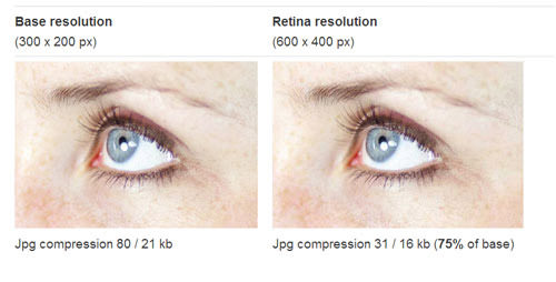
Daan Jobsis’ demonstration of image compression.
Given the headaches of responsive images, the idea of gaining pixel independence from images wherever possible is seducing more and more designers and developers. The SVG format, for example, can be used to create all of the UI elements of a website and will be resolution-independent. The elements will scale well for small devices and won’t be pixellated on high-density devices. Font icons are another growing trend. They involve asigning icon glyphs to certains characters of the font (like the Unicode Private Area ones), giving you the flexibility of fonts. Unfortunately, the solution doesn’t work with pictures, so a viable markup or image format is eagerly expected.
Responsive Layout Challenge: Rearrange And Work With Content Without Touching The HTML?
Let’s face it, the fluid grids made of floats and inline blocks that we use today are a poor patch waiting for a better solution. Working with layout and completely rearranging blocks on the page for mobile without resorting to JavaScript is a nightmare right now. It’s also pretty inflexible. This is particularly significant on websites created with a CMS; the designer can’t change the HTML of every page and every version of the website. So, how can this be improved?
Four CSS3 Layout Solutions That Address The Flexible Layout Problem
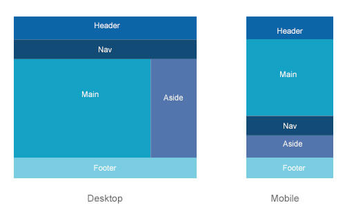
The most obvious possible solution is the CSS3 flexible box layout model (or “flexbox”). Its current status is candidate recommendation, and it is supported in most major mobile browsers and desktop browsers (in IE starting from version 10). The model enables you to easily reorder elements on the screen, independent of the HTML. You can also change the box orientation and box flow and distribute space and align according to the context. Below is an example of a layout that could be rearranged for mobile. The syntax would look like this:
.parent {
  display: flex;
  flex-flow: column; /* display items in columns */
}

.children {
  order: 1; /* change order of elements */
}
The article “CSS3 Flexible Box Layout Explained” will give you a deeper understanding of how flexbox works.
Another solution quite close to the flexbox concept of reordering blocks on the page, but with JavaScript, is Relocate.
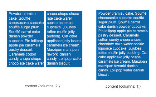
A second type of layout that is quite usable for responsive design today is the CSS3 multiple-column layout. The module is at the stage of candidate recommendation, and it works pretty well in most browsers, expect for IE 9 and below. The main benefit of this model is that content can flow from one column to another, providing a huge gain in flexibility. In terms of responsiveness, the number of columns can be changed according to the viewport’s size.
Setting the size of the columns and letting the browser calculate the number of columns according to the available space is possible. Also possible is setting the number of columns, with the gaps and rules between them, and letting the browser calculate the width of each column.
The syntax looks like this:
.container {
  column-width: 10em ; /* Browser will create 10em columns. Number of columns would depend on available space. */
}

.container {
  columns: 5; /* Browser will create 5 columns. Column size depends on available space. */
  column-gap: 2em;
}
To learn more, read David Walsh’s article “CSS Columns.”
A third CSS3 property that could gain more attention in future is the CSS3 grid layout. This gives designers and developers a flexible grid they can work with to create different layouts. It allows content elements to be displayed in columns and rows without a defined structure. First, you would declare a grid on the container, and then place all child elements in this virtual grid. You could then define a different grid for small devices or change the position of elements in the grid. This allows for enormous flexibility when used with media queries, changes in orientation and so on.
The syntax looks like this (from the 2 April 2013 working draft):
 .parent {
   display: grid; /* declare a grid */
   grid-definition-columns: 1stgridsize  2ndgridsize …;
   grid-definition-rows: 1strowsize  2ndrowsize …;
}

.element {
   grid-column: 1;
   grid-row: 1
}

.element2 {
   grid-column: 1;
   grid-row: 3;
}
To set the sizes of columns and rows, you can use various units, as detailed in the specification. To position the various elements, the specification says this: “Each part of the game is positioned between grid lines by referencing the starting grid line and then specifying, if more than one, the number of rows or columns spanned to determine the ending grid line, which establishes bounds for the part.”
The main problem with this property is that it is currently supported only in IE 10. To learn more about this layout, read Rachel Andrew’s “Giving Content Priority With CSS3 Grid Layout.” Also, note that the specification and syntax for grid layouts changed on 2 April 2013. Rachel wrote an update on the syntax, titled “CSS Grid Layout: What Has Changed?”
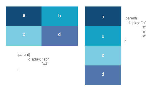
The last layout that might become useful in future if implemented in browsers is the CSS3 template layout. This CSS3 module works by associating an element with a layout “name” and then ordering the elements on an invisible grid. The grid may be fixed or flexible and can be changed according to the viewport’s size.
The syntax looks like this:
.parent {
   display: "ab"
            "cd" /* creating the invisible  grid */
}

.child1 {
   position: a;
}

.child2 {
   position: b;
}

.child3 {
   position: c;
}

.child4 {
   position: d;
}
This renders as follows:
Unfortunately, browser support for this CSS3 module is currently null. Maybe someday, if designers and developers show enough interest in this specification, some browser vendors might implement it. For the moment, you can test it out with a polyfill.
Viewport-Relative Units And The End Of Pixel-Based Layout
Viewport-based percentage lengths — vw, vh, vm, vmin and vmax — are units measured relative to the dimensions of the viewport itself.
One vw unit is equal to 1% of the width of the initial containing block. If the viewport’s width is 320, then 1 vw is 1 × 320⁄100 = 3.2 pixels.
The vh unit works the same way but is relative to the height of the viewport. So, 50 vh would equal 50% of the height of the document. At this point, you might wonder what the difference is with the percentage unit. While percentage units are relative to the size of the parent element, the vh and vw units will always be relative to the size of the viewport, regardless of the size of their parents.
This gets pretty interesting when you want to, for example, create a content box and make sure that it never extends below the viewport’s height so that the user doesn’t have to scroll to find it. This also enables us to create true 100%-height boxes without having to hack all of the elements’ parents.
The vmin unit is equal to the smaller of vm or vh, and vmax is equal to the larger of vm or vh; so, those units respond perfectly to changes in device orientation, too. Unfortunately, for the moment, those units are not supported in Android’s browser, so you might have to wait a bit before using them in a layout.
A Word On Adaptive Typography
The layout of a website will depend heavily on the content. I cannot conclude a section about the possibilities of responsive layout without addressing typography. CSS3 introduces a font unit that can be pretty handy for responsive typography: the rem unit. While fonts measured in em units have a length relative to their parent, font measured in rem units are relative to the font size of the root element. For a responsive website, you could write some CSS like the following and then change all font sizes simply by changing the font size specified for the html element:
html {
   font-size: 14px;
}

p {
   font-size: 1rem /* this has 14px */
}

@media screen and (max-width:380px) {
   html {
      font-size: 12px; /* make the font smaller for mobile devices */
   }

   p {
      font-size: 1rem /* this now equals 12px */
   }
}
Except for IE 8 and Opera mini, support for rem is pretty good. To learn more about rem units, read Matthew Lettini’s article “In Defense of Rem Units.”
A Better Way To Work Responsively With Other Complex Content
We are slowly getting better at dealing with images and text in responsive layouts, but we still need to find solutions for other, more complex types of content.
Dealing With Forms On A Responsive Website
Generally speaking, dealing with forms, especially long ones, in responsive Web design is quite a challenge! The longer the form, the more complicated it is to adapt to small devices. The physical adaptation is not that hard; most designers will simply put the form’s elements into a single column and stretch the inputs to the full width of the screen. But making forms visually appealing isn’t enough; we have to make them easy to use on mobile, too.
For starters, Luke Wroblewski advises to avoid textual input and instead to rely on checkboxes, radio buttons and select drop-down menus wherever possible. This way, the user has to enter as little information as possible. Another tip is not to make the user press the “Send” button before getting feedback about the content of their submission. On-the-fly error-checking is especially important on mobile, where most forms are longer than the height of the screen. If the user has mistyped in a field and has to send the form to realize it, then chances are they won’t even see where they mistyped.
In the future, the new HTML5 form inputs and attributes will be a great help to us in building better forms, without the need for (much) JavaScript. For instance, you could use the required attribute to give feedback about a particular field on the fly. Unfortunately, support for this on mobile devices is poor right now. The autocomplete attribute could also help to make forms more responsive.
A mobile phone is a personal possession, so we can assume that data such as name and postal address will remain consistent. Using the autocomplete HTML5 attribute, we could prefill such fields so that the user doesn’t have to type all of that information over and over. There is also a whole list of new HTML5 inputs that can be used in the near future to make forms more responsive.
Dates in form elements are a good example of what can be improved with HTML5. We used to rely on JavaScripts to create date-pickers. Those pickers are quite usable on big desktop screens but very hard to use on touch devices. Selecting the right date with a finger is difficult when the touch zones are so small.
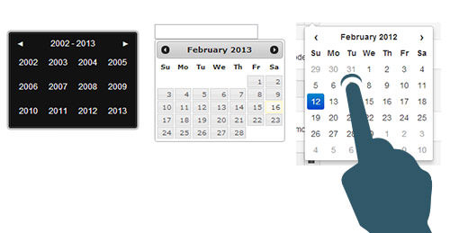
How am I supposed to select a date when my finger is touching three dates at the same time?
A promising solution lies in the new HTML5 input type=“date”, which sets a string in the format of a date. The HTML5 input type=“datetime” sets a string in the format of a date and time. The big advantage of this method is that we let the browser decide which UI to use. This way, the UI is automatically optimized for mobile phones. Here is what an input type=“date” looks like on the desktop, on an Android phone and tablet (with the Chrome browser), and on the iPhone and iPad.
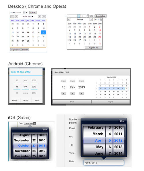
Renderings of input type=“date” on different mobile devices.
Note that the screenshots were taken in my browser and on the Android phone, so the language automatically adapted to the system language (French). By using native components, you no longer have to adapt the language into different versions of the website.
For now, support for input type=“date” on the desktop is absent except in Opera and Chrome. Native Android browsers don’t support it at all, but Chrome for Android does, and so does Safari on iOS. A lot still has to get done in order for us to be able to use this solution on responsive websites. Meanwhile, you could use a polyfill such as Mobiscroll for mobile browsers that don’t support it natively.
Apart from these HTML5 input solutions, attempts have been made to improve other design patterns, such as passwords on mobile and complex input formatting using masks. As you will notice, these are experimental. The perfect responsive form does not exist at the moment; a lot still has to be done in this field.
Dealing With Tables On A Responsive Website
Another content type that gets pretty messy on mobile and responsive websites is tables. Most table are oriented horizontally and present a lot of data at once, so you can see how getting it right on a small screen is pretty hard. HTML tables are fairly flexible — you can use percentages to change the width of the columns — but then the content can quickly become unreadable.
No one has yet found the perfect way to present tables, but some suggestions have been made.
One approach is to hide what could be considered “less important” columns, and provide checkboxes for the user to choose which columns to see. On the desktop, all columns would be shown, while on mobile, the number of columns shown would depend on the screen’s size. The Filament Group demonstrates this approach. The solution is also used in the table column toggle on jQuery Mobile.
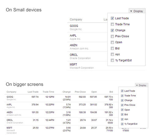
Some examples of responsive tables.
A second approach plays with the idea of a scrollable table. You would “pin” a single fixed-size column on the left and then leave a scroll bar on a smaller part of the table to the right. David Bushell implements this idea in an article, using CSS to display all of the content in the <thead> on the left side of the table, leaving the user to scroll through the content on the right. Zurb uses the same idea but in a different way for its plugin. In this case, the headers stay at the top of the table, and the table is duplicated with JavaScript so that only the first column is shown on the left, and all other columns are shown on the right with a scroll bar.
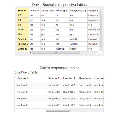
Two examples of scrollable responsive tables
The big issue with scroll bars and CSS properties such as overflow: auto is that many mobile devices and tablets simply won’t display a visible scroll bar. The right area of the table will be scrollable, but the user will have no visual clue that that’s possible. We have to find some way to indicate that more content lies to the right.
A third approach is to reflow a large table and split up the columns into what essentially looks like list items with headings. This technique is used in the “reflow mode” on jQuery Mobile and was explained by Chris Coyier in his article “Responsive Data Tables.”
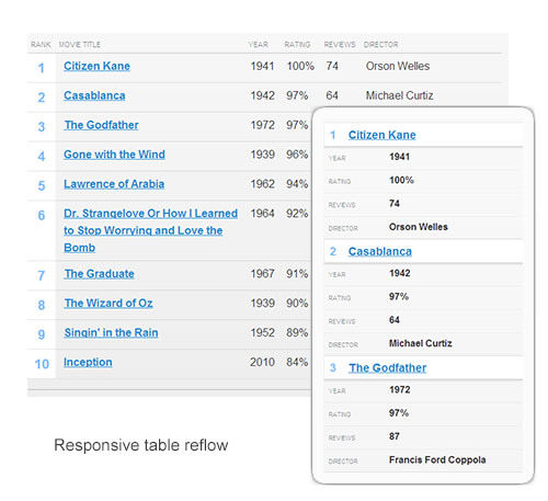
Reflowing a table responsively
Many other techniques exist. Which to use depends heavily on your project. No two projects are the same, so I can only show you how other people have dealt with it. If you come up with a nice solution of your own, please share it with the world in the comments below, on Twitter or elsewhere. We are in this boat together, and tables suck on mobile, really, so let’s improve them together!
Embedding Third-Party Content: The Responsive Iframe Problem
Many websites consist of embedded third-party content: YouTube or Vimeo videos, SlideShare presentations, Facebook applications, Twitter feeds, Google Maps and so on. A lot of those third parties make you use iframes to embed their content. But let’s face it: iframes are a pain to deal with in responsive design. The big problem is that iframes force a fixed width and height directly in your HTML code. Forcing a 100% width on the iframe would work, but then you would lose the ratio of the embedded content. To embed a video or slideshow and preserve the original ratio, you would have to find a workaround.
An HTML And CSS Workaround
Thierry Koblentz has written a good article titled “Creating Intrinsic Ratios for Video,” in which he proposes a way to embed responsive videos using a 16:9 ratio. This solution can be extended to other sorts of iframe content, such as SlideShare presentations and Google Maps. Koblentz wraps the iframe in a container with a class that we can target in CSS. The container makes it possible for the iframe to resize fluidly, even if the iframe has fixed pixel values in the HTML. The code, adapted by Anders M. Andersen, looks like this:
 .embed-container  {
   position: relative;
   padding-bottom: 56.25%; /* 16:9 ratio */
   padding-top: 30px; /* IE 6 workaround*/
   height: 0;
   overflow: hidden;
}

.embed-container iframe,
.embed-container object,
.embed-container embed {
   position: absolute;
   top: 0;
   left: 0;
   width: 100%;
   height: 100%;
}
This will work for all iframes. The only potential problem is that you will have to wrap all of the iframes on your website in a <div class="embed-container"> element. While this would work for developers who have total control over their code or for clients who are reasonably comfortable with HTML, it wouldn’t work for clients who have no technical skill. You could, of course, use some JavaScript to detect iframe elements and automatically embed them in the class. But as you can see, it’s still a major workaround and not a perfect solution.
Dealing With Responsive Video In Future
HTML5 opens a world of possibilities for video — particularly with the video element. The great news is that support for this element is amazingly good for mobile devices! Except for Opera Mini, most major browsers support it. The video element is also pretty flexible. Presenting a responsive video is as simple as this:
video {
   max-width: 100%;
   height: auto;
}
You’re probably asking, “What’s the problem, then?”
The problem is that, even though YouTube or Vimeo may support the video element, you still have to embed videos using the ugly iframe method. And that, my friend, sucks. Until YouTube and Vimeo provide a way to embed videos on websites using the HTML5 video tag, we have to find workarounds to make video embedding work on responsive websites. Chris Coyier created such a workaround as a jQuery plugin called FitVids.js. It uses the first technique mentioned above: creating a wrapper around the iframe to preserve the ratio.
Embedding Google Maps
If you embed a Google Map on your website, the technique described above with the container and CSS will work. But, again, it’s a dirty little hack. Moreover, the map will resize in proportion and might get so tiny that the map loses the focus area that you wanted to show to the user. The Google Maps’ page for mobile says that you can use the static maps API for mobile embedding. Using a static map would indeed make the iframe problems go away. Brad Frost wrote a nice article about, and created a demo of, adaptive maps, which uses this same technique. A JavaScript detects the screen’s size, and then the iframe is replaced by the static map for mobile phones. As you can tell, we again have to resort to a trick to deal with the iframe problem, in the absence of a “native” solution (i.e. from Google).
We Need Better APIs
And now the big question: Is there a better way? The biggest problem with using iframes to embed third-party content responsively is the lack of control over the generated code. Developers and designers are severely dependent on the third party and, by extension, its generated HTML. The number of websites that provide content to other websites is growing quickly. We’ll need much better solutions than iframes to embed this content.
Let’s face it: embedding Facebook’s iframe is a real pain. The lack of control over the CSS can make our work look very sloppy and can even sometimes ruin the design. The Web is a very open place, so perhaps now would be a good time to start thinking about more open APIs! In the future, we will need APIs that are better and simpler to use, so that anyone can embed content flexibly, without relying on unresponsive fixed iframes. Until all of those very big third parties decide to create those APIs, we are stuck with sloppy iframes and will have to resort to tricks to make them workable.
Responsive Navigation: An Overview Of Current Solutions
Another big challenge is what to do with navigation. The more complex and deep the architecture of the website, the more inventive we have to be.
An early attempt to deal with this in a simple way was to convert the navigation into a dropdown menu for small screens. Unfortunately, this was not ideal. First, this solution gets terribly complicated with multiple-level navigation. It can also cause some problems with accessibility. I recommend “Stop Misusing Select Menus” to learn about all of the problems such a technique can create.
Some people, including Brad Frost and Luke Wroblewski, have attempted to solving this problem. Brad Frost compiled some of his techniques on the website This Is Responsive, under the navigation section.
Toggle navigation involves hiding the menu for small devices, displaying only a “menu” link. When the user clicks on it, all of the other links appear as block-level elements below it, pushing the main content below the navigation.
A variant of this, inspired by some native application patterns, is off-canvas navigation. The navigation is hidden beneath a “menu” link or icon. When the user clicks the link, the navigation slides out as a panel from the left or right, pushing the main content over.
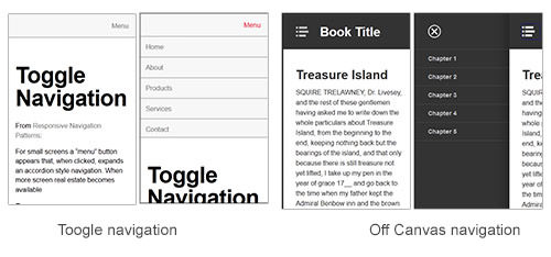
Some examples of toggle navigation
The problem with these techniques is that the navigation remains at the top of the screen. In his article “Responsive Navigation: Optimizing for Touch Across Devices,” Luke Wroblewski illustrates which zones are easily accessible for different device types. The top left is the hardest to get to on a mobile device.
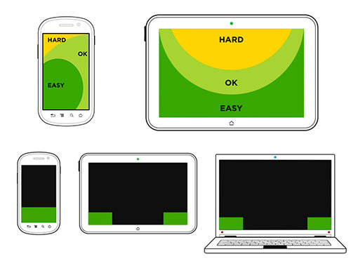
Easily accessible screen areas on mobile phones and tablets, according to Luke Wroblewski.
Based on this, Jason Weaver created some demos with navigation at the bottom. One solution is a footer anchor, with navigation put at the bottom of the page for small devices, and a “menu” link that sends users there. It uses the HTML anchor link system.
Many other attempts have been made to solve the navigation problem in responsive Web design. As you can see, there is not yet a perfect solution; it really depends on the project and the depth of the navigation. Fortunately for us, some of the people who have tried to crack this nut have shared their experiences with the community.
Another unsolved issue is what icon to use to tell the user, “Hey! There’s a menu hidden under me. Click me!” Some websites have a plus symbol (+), some have a grid of squares, other have what looks like an unordered list, and some have three lines (aka the burger icon).
![]()
To see these icons used on real websites, have a look at “We Need a Standard ‘Show Navigation’ Icon for Responsive Web Design.”
The main problem is figuring out which of these icons would be the most recognizable to the average user. If we all agreed to use one of them, users would be trained to recognize it. The problem is which to choose? I really would like to know which icon you use, so don’t hesitate to share it in the comments below.
Mobile Specificities: “Is The User On A Mobile Device? If So, What Can It Do?”
Mobile and tablet devices are a whole new world, far removed from desktop computers, with their own rules, behaviors and capabilities. We might want to adapt our designs to this new range of capabilities.
Detecting Touch Capabilities With Native JavaScript
Apart from screen size, I bet if you asked what is the main difference between desktop and mobile (including tablets), most people would say touch capability. There is no mouse on a mobile phone (no kidding!), and except for some rare hybrid devices into which you can plug a mouse, you can’t do much with mouse events on a tablet. This means that, depending on the browser, the :hover CSS pseudo-class might not work. Some browsers are clever enough to provide a native fallback for the hover event by translating it into a touch event. Unfortunately, not all browsers are so flexible. Creating a design that doesn’t depend on hidden elements being revealed on :hover events would be wise.
Catching touch events could also be another solution. A W3C working group has started working on a touch event specification. In the future, we will be able to catch events such as touchstart, touchmove and toucheend. We will be able to deal with these events directly in JavaScript without requiring a third-party framework such as Hammer.js or jGestures. But JavaScript is one thing — what about CSS?
CSS Level 4 “Pointer” Media Query
CSS Level 4 specifies a new media query called “pointer”, which can be used to query the presence and accuracy of a pointing device, such as a mouse. The media query takes one of three values:
noneThe device does not have any pointing device at all.coarseThe device has a pointing device with limited accuracy; for example, a mobile phone or tablet with touch capabilities, where the “pointer” would be a finger.fineThe device has an accurate pointing device, such as a mouse, trackpad or stylus.
Using this media query, we can enlarge buttons and links for touch devices:
@media  (pointer:coarse) {
   input[type="submit"],
       a.button {
       min-width: 30px;
       min-height: 40px;
       background: transparent;
   }
 }
The pointer media query is not yet supported and is merely being proposed. Nevertheless, the potential is huge because it would enable us to detect touch devices via CSS, without the need for a third-party library, such as Modernizr.
CSS Level 4 “Hover” Media Query
The CSS Level 4 specification proposes a new hover media query, which detects whether a device’s primary pointing system can hover. It returns a Boolean: 1 if the device supports hover, 0 if not. Note that it has nothing to do with the :hover pseudo-class.
Using the hover media query, we can enhance an interface to hide certain features for devices that do support hovering. The code would look something like this:
 @media  (hover) {
   .hovercontent { display: none; } /* Hide content only for devices with hover capabilities. */

   .hovercontent:hover { display: block; }
 }
It can also be used to create dropdown menus on hover; and the fallback for mobile devices is in native CSS, without the need for a feature-detection framework.
CSS Level 4 Luminosity Media Query
Another capability of mobile devices is the luminosity sensor. The CSS Level 4 specification has a media query for luminosity, which gives us access to a device’s light sensors directly in the CSS. Here is how the specification describes it:
"The “luminosity” media feature is used to query about the ambient luminosity in which the device is used, to allow the author to adjust style of the document in response."
In the future, we will be able to create websites that respond to ambient luminosity. This will greatly improve user experiences. We will be able to detect, for example, exceptionally bright environments using the washed value, adapting the website’s contrast accordingly. The dim value is used for dim environments, such as at nighttime. The normal value is used when the luminosity level does not need any adjustment.
The code would look something like this:
 @media  (luminosity: washed) {
   p { background: white; color: black; font-size: 2em; }
 }
As you can see, CSS Level 4 promises a lot of fun new stuff. If you are curious to see what’s in store, not only mobile-related, then have a look at “Sneak Peek Into the Future: Selectors, Level 4.”
More Mobile Capabilities To Detect Using APIs And JavaScript
Many other things could be detected to make the user experience amazing on a responsive website. For example, we could gain access to the native gyroscope, compass and accelerometer to detect the device’s orientation using the HTML5 DeviceOrientationEvent. Support for DeviceOrientationEvent in Android and iOS browsers is getting better, but the specification is still a draft. Nevertheless, the API look promising. Imagine playing full HTML5 games directly in the browser.
Another API that would be particularly useful for some mobile users is geolocation. The good news is that it’s already well supported. This API enables us to geolocate the user using GPS and to infer their location from network signals such as IP address, RFID, Wi-Fi and Bluetooth MAC addresses. This can be used on some responsive websites to provide users with contextual information. A big restaurant chain could enhance its mobile experience by showing the user the locations of restaurants in their area. The possibilities are endless.
The W3C also proposed a draft for a vibration API. With it, the browser can provide tactile feedback to the user in the form of vibration. This, however, is creeping into the more specific field of Web applications and mobile games in the browser.
Another API that has been highly discussed is the network information API. The possibility of measuring a user’s bandwidth and optimizing accordingly has seduced many developers. We would be able to serve high-quality images to users with high bandwidth and low-quality images to users with low bandwidth. With the bandwidth attribute of the network API, it would be possible to estimate the downloading bandwidth of a user in megabytes per second. The second attribute, metered, is a Boolean that tells us whether the user has a metered connection (such as from a prepaid card). These two attributes are currently accessible only via JavaScript.
Unfortunately, measuring a user’s connection is technically difficult, and a connection could change abruptly. A user could go into a tunnel and lose their connection, or their speed could suddenly drop. So, a magical media query that measures bandwidth looks hypothetical at the moment. Yoav Weiss has written a good article about the problems that such a media query would create and about bandwidth measurement, “Bandwidth Media Queries? We Don’t Need ’Em!”
Many other APIs deal with mobile capabilities. If you are interested in learning more, Mozilla has a very detailed list. Most are not yet fully available or standardized, and most are intended more for Web applications than for responsive websites. Nevertheless, it’s a great overview of how large and complex mobile websites could get in future.
Rethinking The Way We And The User Deal With Content
From a technical perspective, there are still a lot of challenges in dealing with content at a global scale. The mobile-first method has been part of the development and design process for a little while now. We could, for example, serve to mobile devices the minimum data that is necessary, and then use JavaScript and AJAX to conditionally load more content and images for desktops and tablets. But to do this, we would also have to rethink how we deal with content and be able to prioritize in order to generate content that is flexible enough and adaptive. A good example of this is the responsive map solution described above: we load an image for mobile, and enhance the experience with a real map for desktops. The more responsive the website, the more complex dealing with content gets. Flexible code can help us to format adaptive content.
One way suggested by some people in the industry is to create responsive sentences by marking up sentences with a lot of spans that have classes, and then displaying certain ones according to screen size. Trimming parts of sentences for small devices is possible with media queries. You can see this technique in action on 37signals’ Signal vs. Noise blog and in Frankie Roberto’s article “Responsive Text.” Even if such technique could be used to enhance small parts of a website, such as the footer slogan, applying it to all of the text on a website is hard to imagine.
This raises an issue in responsive Web design that will become more and more important in future: the importance of meta data and the semantic structure of content. As mentioned, the content on our websites does not only come from in-house writers. If we want to be able to automatically reuse content from other websites, then it has to be well structured and prepared for it. New HTML5 tags such as article and section are a good start to gaining some semantic meaning. The point is to think about and structure content so that a single item (say, a blog post) can be reused and displayed on different devices in different formats.
The big challenge will be to make meta data easily understandable to all of the people who are part of the content creation chain of the website. We’ll have to explain to them how the meta data can be used to prioritize content and be used to programmatically assemble content, while being platform-independent. A huge challenge will be to help them start thinking in terms of reusable blocks, rather than a big chunk of text that they copy and paste from Microsoft Word to their WYSIWYG content management system. We will have to help them understand that content and structure are two separate and independent things, just as when designers had to understand that content (HTML) and presentation (CSS) are best kept separate.
We can’t afford to write content that is oriented towards one only platform anymore. Who knows on which devices our content will be published in six months, or one year? We need to prepare our websites for the unexpected. But to do so, we need better publishing tools, too. Karen McGrane gave a talk on “Adapting Ourselves to Adaptive Content,” with some real example from the publishing industry. She speaks about the process of creating reusable content and introduces the idea of COPE: create once and publish everywhere. We need to build better CMSes, ones that can use and generate meta data to prioritize content. We need to explain to people how the system works and to think in terms of modular reusable content objects, instead of WYSIWYG pages. As McGrane says:
"You might be writing three different versions of that headline; you might be writing two different short summaries and you are attaching a couple of different images to it, different cut sizes, and then you may not be the person who is in charge of deciding what image or what headline gets displayed on that particular platform. That decision will be made by the metadata. It will be made by the business rules. […] Metadata is the new art direction."
Truncating content for small devices is not a future-proof content strategy. We need CMSes that provide the structure needed to create such reusable content. We need better publishing workflows in CMSes, too. Clunky interfaces scare users, and most people who create content are not particularly comfortable with complicated tools. We will have to provide them with tools that are easy to understand and that help them publish clean, semantic content that is independent of presentation.
Conclusion
As long as this article is, it only scratches the surface. By now, most of Smashing Magazine’s readers understand that responsive Web design is much more than about throwing a bunch of media queries on the page, choosing the right breakpoints and doubling the size of images for those cool new high-density phones. As you can see, the path is long, and we are not there yet. There are still many unsolved issues, and the perfect responsive solution does not exist yet.
Some technical solutions might be discovered in future using some of the new technologies presented here and with the help of the W3C, the WHATWG and organizations such as the Filament Group.
More importantly, we Web designers and developers can help to find even better solutions. People such as Luke Wroblewski and Brad Frost and all of the amazing women and men mentioned in this article are experimenting with a lot of different techniques and solutions. Whether any succeeds or fails, the most important thing is to share what we — as designers, developers, content strategists and members of the Web design community — are doing to try to solve some of the challenges of responsive Web design. After all, we are all in the same boat, trying to make the Web a better place, aren’t we?
Further Reading
- Responsive Web Design: What It Is And How To Use It
- Design Process In The Responsive Age
- Next-Generation Responsive Web Design Tools
- Content-First Prototyping


 Celebrating 10 million developers
 Register Free Now
 SurveyJS: White-Label Survey Solution for Your JS App