How Your Product Can Benefit From User Feedback
Like many great ideas, ours was born of a problem. When I was a graduate student at MIT, I sat next to a classmate who is visually impaired. He would whisper to me to ask the time, even though he wore a watch — which prompted me to wonder how the blind tell time.
I later learned from my classmate that he had a talking watch that announced the time out loud when he pressed a button, but he rarely used it in public because he found it disruptive and embarrassing. After that conversation with my classmate, I went home and Googled “watch for the blind”. I couldn’t believe what I saw.
The only options for the visually impaired were the disruptive talking watch that my classmate had told me about and a tactile watch that required users to lift the face and touch the hands to read time. The latter option, I learned, was fairly fragile, and users could easily displace the hands.
I was shocked. Here we are in the 21st century, and we don’t have a product that makes it easy for everyone to tell time! Clocks and timepieces are all around us — from the microwave in your kitchen to the smartphone in your back pocket — but the digital display still fails to address one basic issue: We have to look at it.
Telling time, then, requires sight.
Our Methodology
I became determined to solve this problem. I began experimenting with prototypes, then brought those prototypes to users for feedback on how to improve the design.
This section explains the process we took, from concept to Kickstarter. We’ll go through our initial prototyping process, then explain how user testing transformed the way we approached the design, and conclude by detailing how we developed the final product.
Our First Prototype
When I set out on this mission, I knew I needed to get feedback from users as early as possible. As soon as I had the design on paper, I looked for user groups. But I quickly learned that the traditional approach to research and development — using a drawing or video demo to solicit user feedback — was impossible for this project. Because our target users are blind, we had to make the product and take it to them.
We also knew that we needed to take a different approach than designers who had come before us, because the fragile hands that have been used on timepieces for the blind can easily be moved out of place. We began experimenting with ball bearings as indicators, held in place with magnets.
Our first prototype was about as simple as you can get and was made of the last material you’d expect: Legos. We used fewer than 20 Lego pieces, plus small magnets and two ball bearings. We brought that to user groups — more on that process below — and once we confirmed positive feedback on our concept design, we refined the prototypes by printing parts with laser-cutters and 3-D printers.
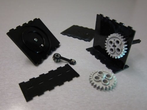
Our first prototype was made of fewer than 20 Lego pieces, plus small magnets and two ball bearings. (Large preview)
We also added actual watch movements to make working prototypes. Making the prototype work at the actual size of a watch, with standard watch movements and a standard watch battery, was important to getting accurate feedback.
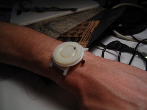
Another of our early prototypes was designed to fit your wrist. (Large preview)
User Testing
To find quality user groups, I reached out to organizations that serve the blind and visually impaired and attended meetings with their members. Each time, I brought one or two prototypes of my tactile timepiece and let them try it on.
With only a few prototypes to go around in the initial phases, these presentations to groups of 20 or 30 members proved to be frustrating. A limited number of people were using the timepiece at any given time, with others waiting impatiently to try the product. So, I began meeting with users one on one at their homes and businesses instead. Those meetings tended to be far more fruitful because users could take their time with the product and offer comprehensive feedback.
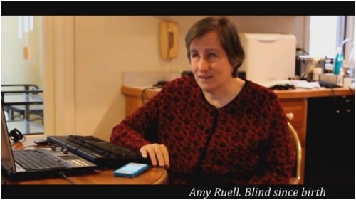
This video shows our early research with the visually impaired, as well as some of our early prototypes and how users interacted with them.
Sound time-consuming? It was. But this user research, the process of meeting in person and creating prototypes, was also incredibly valuable — so valuable, in fact, that it completely transformed our approach to the design.
Sure, we made some small discoveries, like where to place the indicators. But the biggest thing we learned was something we didn’t expect. Through this process, we identified unique needs of our users that we hadn’t realized exist: We learned that they are as concerned with fashion and style as they are with function.
In almost every meeting with a person who is visually impaired, one of the first questions was always about the look, the material, the size and even the color of the watch — components that I hadn’t strongly considered in my original vision.
That user feedback changed everything.
The User Interview That Changed Our Vision
One woman who helped us works in the fashion industry and has a son who is visually impaired. As her son approached his 18th birthday, she wanted to buy him one of the only high-fashion accessories available to men, a nice watch. But she was dismayed to find that no fashionable watch for the blind exists. Everything she found was ugly or cheap or, worse, had a bulky design that called attention to the wearer’s disability.
This woman was thrilled to discover we were developing just the product she was looking for. She was so thrilled, in fact, that she borrowed a prototype to take home to her son.
The next day she returned to tell us that her son hadn’t even bothered to try on the watch. He didn’t want to wear a watch that was specifically for the blind, she said, no matter how convenient the technology.
In conversations with people who are visually impaired, we were surprised to hear this feedback again and again. They want to wear a watch that everyone else is wearing, not one specifically designed for someone with a disability. A product designed “for the blind” would accentuate the barriers and differences between the blind and the sighted. Wearers would be no better off with it than with the talking watch in the MIT classroom.
Similarly, we found that when presenting the timepiece to sighted users, portraying it as a “watch for the blind” that the sighted could wear as well garnered a rather lukewarm reaction. They were disenchanted with a product designed for the visually impaired.
When we instead introduced the watch to sighted users as an innovative, tactile timepiece that would help them tell time without having to look down at their wrist at inopportune moments — during long business meetings, less-than-magical dates or dinners with family — the response was much more enthusiastic.
So, we made a huge shift, transitioning from a timepiece for the blind to a high-fashion product designed to be inclusive, a product that would help everyone tell time easily. When users, whether visually impaired or sighted, fell in love with the fashionable design and innovative function of the timepiece first, then learning the motivation behind it later only boosted their interest.
Research, Insight And More Prototyping
As we gained insight from users, we continued to build prototypes, improving the design. Each time, we created a prototype that reflected what we’d learned.
After more than a year, we contracted a watch manufacturer to create a prototype that was more in line with what the actual timepiece would look and feel like. This prototype was made of the same materials that would go into the final product; so, more than ever before, our test groups were able to get a feel for how it would work and how it would feel on their wrist. We also modified many of our hand-made parts to be suitable for mass production.
All told, we went through 15 iterations in less than two years.
Below are three major improvements we made with each passing prototype.
1. Placement Of Indicators
Early designs had both ball bearings — one for the minute and the other for the hour — on the face, like a traditional watch. But we learned from users that this made it difficult to distinguish the hour from the minute indicator. So, we moved one ball bearing to the side of the timepiece.
But which indicator would we move? We watched how test groups used the timepiece and realized that when someone checks the time, they typically already have a sense of the hour and are checking for the minute. That decided it for us: We left the minute indicator on the face of the timepiece and moved the hour to the side.
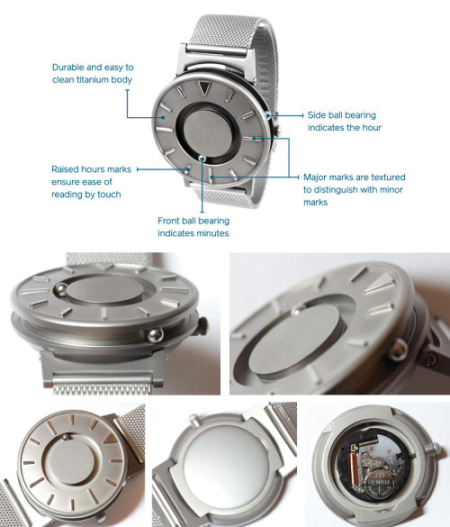
Our completed prototype had a ball bearing on the face and another on the side.
2. Using Magnets Strategically
We also used the prototyping process to address what until now has been a major issue with tactile timepieces, that users can unwittingly move the indicators out of place.
Because we weren’t using hands, as other products do, this was less likely, but still possible. We engineered the timepiece so that the magnets hold the ball bearings in place. If they’re bumped or moved, they might fall out of position, but a quick shake of the wrist would set them back to the correct positions.
Over time, we also developed raised marks on the face to indicate the hours, with major marks at 12:00, 3:00, 6:00 and 9:00 textured to make them easier to distinguish.
3. The Look Of The Timepiece
Because users were highly concerned with how the watch looks, we put a lot of effort into making it fashionable. We chose durable titanium for the body, with a choice of two wristbands, one a stainless steel mesh, the other a leather and fabric combo. We even ran a poll on our Facebook page to see which of our wristband colors was most coveted by our community.
While we had first focused solely on function, we’d now integrated another component that was essential to success: aesthetics.
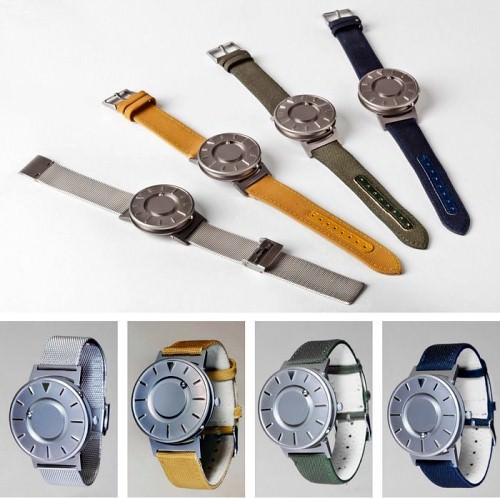
The body of ‘The Bradley’ is titanium, making it sleek, easy to clean and durable. Watch bands are available in a classic stainless steel mesh or in fabric and leather in three different colors.
Obtaining A Patent
When we realized we were truly onto something, we set out to obtain a patent — which led to a slew of other discoveries and ideas. We found designs for prototypes of tactile watches that already exist! None had truly succeeded in the marketplace, and most never even made it to market, but they served as inspiration nonetheless.
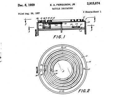
The first design patent on record to use magnets and ball bearings was issued in 1959. (View more detailed drawings of patent no. 2915874.)
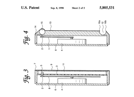
Another utility patent issued in 1998, patent no. 5805531, is similar to the one above. When we dove into the legalities, we discovered that the earlier patent covers what the latter patent claims, so the earlier patent invalidates the latter.
We hope that our designs serve as inspiration for designers in the future, too. Once our patent is approved — it’s now pending — we plan to make it available for free to anyone who wants to improve on our design.
Compared to other watches, our design is different in two main ways.
Structurally, the watch works differently. It has one ball bearing on the face and one on the side, while all other designs have two indicators on the face. This is a subtle difference but an important one because it enables the timepiece to accurately tell time without the two magnets interfering with each other. As explained above, it also makes it easier for the user to distinguish between the hour and minute indicators.
Aesthetically, our timepiece looks fashionable. Other designs are focused mainly on function, but our timepiece is also a fashion accessory.
Our Pivot: We Stopped Designing A Watch For The Blind
To solve the problem I’d set out to tackle, I had to forget about it. I had to focus on designing an innovative and fashionable accessory that everyone would love — and that everyone could use, too. That’s how our company got its name, Eone, and it’s how The Bradley became the timepiece it is today.
The minimalist tactile design of our timepiece addresses one simple issue we all face: Sometimes we aren’t able to look at our watch to tell time. Even if you’re lucky enough to have eyesight, you’ll no doubt find yourself in situations where looking at your watch would be rude or impossible. In these situations, touching your watch is a far superior solution.
While embracing this pivot last year, my team and I discovered Brad Snyder via YouTube. Brad trained for the Paralympics after losing his eyesight from an IED in Afghanistan less than a year before, and he went on to win gold and silver medals in swimming in the 2012 London Paralympics. Brad’s determination, work ethic and positive attitude inspired us. And we had something big in common: We both aimed to show the world that blindness doesn’t make it impossible to achieve amazing things. Brad has since become both our official spokesperson and the namesake of our first timepiece, The Bradley.
Our Pre-order Campaign On Kickstarter
Now that we’re ready to manufacture our first round of timepieces, we’ve turned to our users for support in funding the product that they helped us to develop. The response has been overwhelming! Months after investors balked at our request for funding, saying that the market for watches is too crowded, our supporters pre-ordered in droves.
We surpassed our funding goal of $40,000 on the first day of our Kickstarter campaign, and in the end we raised more than $594,000 — ten times our initial goal — from more than 3,850 backers. We are so grateful to our supporters for helping us show that you can create a product with beautiful form, while still offering exceptional, inclusive design and function.
Further Reading
- Essential Visual Feedback Tools For Web Designers
- Meet “User Experience Revolution”, A New Smashing Book
- How To Design Outstanding Feedback Loops
- Improving Reviews Using Science-Based Design


 Try ProtoPie AI free →
 Celebrating 10 million developers
 Register Free Now


