The Line Of Least Resistance
In chess, the psychological dimension that springs from a dialogue between two brains, two ideas, two strategic conceptions that depend on the personality of each chess player has long been somewhat of a romantic mystery. How do Grandmasters think? What strategies do they use?
More often than not, the most successful strategies are rooted in our very own nature. And common to most Grandmasters is that they almost never take the easy way out. A different, better alternative is always available, and they go looking for it. That creativity, that compulsion, that drive to look beyond what comes instinctively is what fuels successful strategies and explains why so few Grandmasters are out there.
For most of us, however, things are simpler. We tend to favor the shortest path, the easy way out, the shortcut. We cut through the middle of the park if we have to.
We’re naturally lazy. When we think, we search for the nearest pattern, and when we find the pattern, we don’t need to think anymore — we just follow the pattern. Our brains have evolved to be — borrowing Edward de Bono’s expression — “brilliantly uncreative.” This preference for shortcuts is what Grandmasters naturally exploit.

Playing on well-known weaknesses, automatisms or unconscious actions has long been a common strategy in chess. (Image credits: Mukumbura)
When it comes to using and interacting with technology, that underlying behavior seems to hold. Users unconsciously look for the line of least resistance — la loi du moindre effort, as psycholinguist François Richaudeau called it. Richaudeau’s work revolved around words, but considering how vital communication, language and words are to the design of interactions, the core principles still apply: The shortest words will be those emitted, understood and read with the minimum of effort, and also those most frequently employed due to their more profound presence — or incrustation — in our memory.
We remember shorter words better. That’s because, according to Kenneth S. Goodman, we process graphic, syntactic and semantic information simultaneously. In doing so, users carry out cycles of sampling, predicting, testing and confirming as strategies to bring in “the most reliable prediction with the minimum use of the information available.”
The process isn’t specific to words and reading, though. It underlies our behavior and interaction with the world around us.
Framing it in this way seems to suggest the generalized idea that behavioral patterns are linked to common causes — a concept expanded by behaviorism to the extent that it proposes a predictable and reliable link between a stimulus and the response it produces. That generalization is largely refuted by the cognitive revolution on the grounds that prior knowledge and mental processes intervene between a stimulus and response to reduce the predictability of human behavior — or the response — given a stimulus. Essentially, we can’t predict behavior.
While that may hold true at a micro level, there are still plenty of common paths of action in the way we work — stimulus, sensory organs, interneuron, brain, processing, motor neuron, response. It’s still safe to assume that if we design an environment in which even the subtlest of details is sympathetic to how we, as humans, work and think, and with the singular purpose of easing the experience, then users will always favor that line of least resistance.

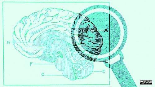
Is the environment we design sympathetic to the way we work? (Image credits: opensourceway)
Designing an experience from a perspective that is more closely related to how we naturally strategize, designing guidance through pattern prediction, as opposed to limit enforcement, might prove to be a more viable approach.
Let’s put that in perspective. Take decision fatigue.
We all make decisions every day. Some of them big, some of them small, some conscious and some so insignificant that they slip by us without our even realizing. And in a world in which we are constantly bombarded with information and media options, such as blogs, social networks, magazines and TV, the effects of so many decisions that we have to take day by day become increasingly obvious.
Our decisions, even those that are mere preferences between option A and B, gradually take their toll on our cognitive load. The mental processes of decision-making are strenuous; we have only a finite store of mental energy available to exert self-control.
Basically, we get tired if we make too many decisions. As a result, according to Barry Schwartz, one of three things is likely to happen: we end up making poor decisions, we become more dissatisfied with our choices, or we get paralyzed and don’t choose at all.
Interaction processes — regardless of the medium — are a prime example of decision fatigue in action. At a micro level, hundreds of small, subtle and, most of the time, unconscious decisions that we take every time we use an application, browse a website or even follow an ad can affect the way we experience the artefact that we’re interacting with.
At a macro level, thanks to what we know about decision fatigue, we can predict that users can be overwhelmed to the point of making a default choice or no choice at all, depending on the option they face. One example of this is Dan Ariely’s opt-in versus opt-out example for forms of the US Department of Motor Vehicles. It shows that we can basically predict how people will react in a very specific situation by controlling the design of the application form, paying close attention to the defaults.
This is a very specific prediction of behavior. We’re not normally used to thinking of behavior as being that predictable. But in a lot of situations, it is. Ariely calls it being predictably irrational.
Contextual cues — through signs or linguistic cues, because they have the potential to refer to a specific value system — can sometimes direct cognition in particular ways, either encouraging or discouraging certain patterns of behavior. Thus, it’s vital that user experience practitioners maintain complete control over and responsibly use all elements in an interface that could be used as contextual cues and predictors.
And one of the biggest cues at the disposal of designers is language.
We, as a species, have refined language through countless iterations over the span of millennia to such an extent that words are tied to complex experiences, rather than to singular instances, by way of symbolic representation.
The Power Of Words
In 1967, Paul Watzlawick described what later became a cornerstone of communication theory: meta communication. He postulated that every communication includes, apart from the plain meaning of words, more information: information on how the talker wants to be understood and how they see themselves in relation to the receiver of the information.
Language, as a clear manifestation of the cognitive capacity of the human mind, is only a medium to carry out acts of communication. That’s one of the reasons why H.F. Bradley once said that experience is basically incommunicable.
Still, there is always something to communicate — moods, annoyances, happiness, feelings, ideas. There is always something that we need to understand — a noise, a color, a sign, a danger, an emotion. There is always some medium that is familiar to us — a grammar, an artistic language, a chess board, an interface.
While context provides a window into how people behave, words have the power to steer people towards a particular pattern of behavior through frame manipulation.
Frame manipulation invariably affects users — admittedly, to different degrees. One prime example of how the context of options and the wording of a question affects behavior is Tversky and Kahneman’s famous experiment in 1981, which demonstrated systematic reversals of preference when the same problem was presented in different ways.
The experiment required participants to make a hypothetical decision, and the researchers tried to determine whether they could steer the participants towards an answer simply by wording the questions carefully.
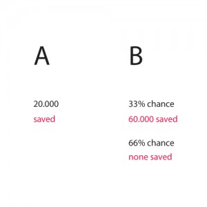
The experiment proposed a hypothetical outbreak of disease with 60,000 predicted deaths, and participants had to choose between two programs:
- Program A 20,000 people would be saved.
- Program B There is a 33% chance that all 60,000 would be saved, and a 66% chance that none of them would be saved.
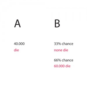
With these options, program A was a favorite among participants. But what happened when the same question was asked again, but this time, instead of counting the number of lives saved, counting the number of deaths? Here’s how the second option would have sounded:
- Program A 40,000 people would die.
- Program B There is a 33% chance that none of them would die, and a 66% chance that all of them would die.
This time around, the clear favorite was program B.
The interesting part is that the math is exactly the same for both: 40,000 out of 60,000 would die anyway. But with the first option, participants were given the choice of a gain: they were given the choice to save 20,000 people. So, the gamble was perceived as negative against the word “save.”
In the second option, participants were given the choice of a loss: 40,000 people would die, or they could gamble that none of them would die with a 30% chance.
Users were influenced simply by the wording. This later became known as the framing effect. The effect helps to explain why people are much more likely to buy meat when it’s labeled as 85% lean, instead of 15% fat. And it’s why twice as many patients opt for surgery when told they have an 80% chance of surviving, instead of a 20% chance of dying.
As the experiment demonstrates, words have the power to selectively influence a user’s perception of meaning. And, for most applications, words can also be used to elicit interactions.
Summing Up
Context is the barrier that makes or breaks a user’s experience. Those unconscious moments, every bit of information we discard on our way up an emotional peak, all of those fine details — they all could potentially lead to a sensible, sympathetic experience. A enjoyable experience is shaped only by context.
Some people use context and design great experiences, some don’t. Oliver Reichenstein calls it a continuum. That’s perfectly natural. We need to constantly make an effort to glance at the future once in a while — to permit ourselves educated dreams.
We need to permit ourselves to keep the vision going — from the ones whom we got it from, to the ones coming to get it. We all have the tools to do it. We just need to be responsible with them.
Further Reading
- Web Design Checkmate: Using Chess For Success in Web Design
- Using Brainwriting For Rapid Idea Generation
- How To Enhance Your Creativity – Taming The Wild Mind
- How To Maximize Your Creative Energy


 SurveyJS: White-Label Survey Solution for Your JS App

 Agent Ready is the new Headless


