Up On The Wall: How Working Walls Unlock Creative Insight
Research wall, design wall, research board, ideation wall, inspiration board, moodboard, pinboard — Working walls are known by countless names. Underlying them all is a single idea: that physically pinning our sources of inspiration and work in progress, and surrounding ourselves with them, can help us to rearrange concepts and unlock breakthrough insights.
In their 2009 paper on creativity in design, human media interaction researcher Dhaval Vyas and his colleagues coined the term “artful surfaces” to refer to “surfaces that designers create by externalizing their work-related activities, to be able to effectively support their everyday way of working.” According to Vyas and his colleagues at the University of Twente (in the Netherlands), designers integrate these surfaces “artfully” and organize information in such a way that it empowers them to visualize and extend their work in progress.
Working Walls And Design Thinking
In this article, you will learn how displaying data and ideas on a large vertical surface can enhance your design thinking process. One of the first things to know is that the practice of using “working walls,” as we will call these surfaces from now on, is scarcely documented in scientific literature — hence, the need for a working definition of a working wall (redundancy intended). For the purpose of this article, we’ll define it as a large vertical surface on which ideas, data and work in progress can be displayed, rearranged and extended.
This design thinking tool being as powerful as it is, it comes as no surprise that a myriad of other fields have adapted and used it for years. But just how do working walls come into play in design thinking? Tim Brown, president and CEO of IDEO, defines design thinking like so:
"A human-centered approach to innovation that draws from the designer’s toolkit to integrate the needs of people, the possibilities of technology, and the requirements for business success."
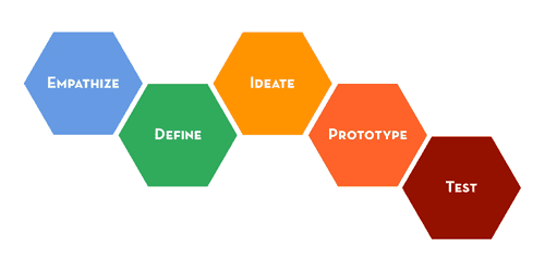
To further define this approach, The Institute of Design at Stanford (or d.school) has outlined five steps in the design thinking process:
It all starts with empathizing with the people you are designing for. Then, you define a clear perspective of the process by making sense of a large amount of information. You proceed with ideation, exploring a wide array of concepts and generating possible solutions. Prototyping involves building an object (or artifact) that a user can experience and give you feedback on. Testing is about triggering an actual response from your intended user.
Working walls can facilitate every step of the design thinking process, and they offer unique advantages to bolster creative thought. The tool can help us empathize with and gather input from users, define a focused approach based on a large amount of data, capture the ideation process, display a low-fidelity prototype that users can interact with, and keep track of the way we’ve tested our creative assumptions.
Hopefully, the following benefits and working wall templates will inspire you to create your own today.
1. Empathize: Enable Peripheral Participation By Users
Large vertical surfaces can be used to spark interaction with your intended users. Wall-sized displays allow for easy visualization and intervention, which makes them particularly useful for consumer research.
Vyas and his group spent over 250 hours studying design departments at universities and companies in the Netherlands and concluded that artful surfaces are “an important vehicle for peripheral participation in a project, allowing visitors to enter its context.”
They labeled this participatory environment a “creative ecology,” where users are free to interact via their inputs on working walls.
5 Guys Burgers and Fries, for instance, has been using working walls to invite customers to describe their dining experience.

(Image: Carly Baldwin, NJ.com)
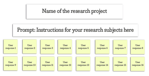
Here’s a working wall template that you can use to gather input from your audience and to empathize with their wants and needs:
Try out some of these prompts:
- Name one thing you love or enjoy about X?
- Name one thing you hate or dislike about X?
- What would you change about X?
- How does X make you feel?
2. Define: Synthesize Key Findings By Detecting Affinities
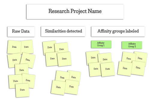
Once you’ve collected information about your audience, pinning the raw data onto a working wall will help you to rearrange and make sense of it. This type of working wall displays what we call an affinity diagram. Although people have been grouping similar ideas under labels for thousands of years, it was Japanese anthropologist Kawakita Jiro who originally developed the affinity diagram in the 1960s.
The premise of an affinity diagram is that, at first glance, several points of our data might seem unrelated, convoluted or unclear. However, by grouping related concepts, we are able to detect patterns that will help define our design approach.
Consider private detectives. You’ve seen them in the movies and on television. The sleuth will often map out a suspect’s life on a sketching wall and proceed to make breathtaking connections. In this case, a working wall is used to find affinities along the subject’s journey (“What are some patterns we can expect this person to follow?”), to find affinities in the lifestyles of the subject and their peers (“What do we know about A’s relationship with B?”) and to solve fuzzy criminal cases in general.
Take the “gladiator wall” from Shonda Rhimes’ award-winning television show Scandal:

(Image: Esther James)
Here’s a working wall template that you can use to identify affinities in a fuzzy dataset:
These questions will help you get started with the template:
- “How is data point A similar to data point B?”
- “How are both A and B different from C?”
- “Is there a category (i.e. label) that describes these data points well?”
- “Why does a certain data point look isolated? Does this ‘outlier’ yield an interesting insight?”
3. Ideate: Stimulate Divergent And Holistic Thinking
Psychologist J.P. Guilford coined the term “divergent thinking,” which the Gale Encyclopedia of Psychology defines as “the ability to develop original and unique ideas and to envision multiple solutions to a problem.” This essential design skill is the key to ideation.
We could design several types of working walls to brainstorm, gather inspiration, and fully map out concepts and their relationships.
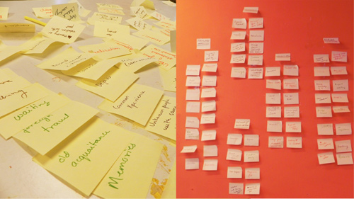
When brainstorming individually or in a group, stick notes at the top of the working wall to show all ideas. Then, using the affinity diagram method described above, identify which ideas are related, and categorize them accordingly.
(Image: Oranaozchi)
To maximize inspiration for ideation, set up a “moodboard” layout on the working wall to collect ideas from different sources. Fashion designers, for instance, observe a phenomenon called “planned obsolescence,” which basically means that they design garments knowing that those garments will eventually become unfashionable.
This instability demands a disciplined creative process in which (almost) everything can become a source of inspiration. Fashion designers everywhere use inspiration boards to capture seasonal trends, textures, accessories, sketches and muses when ideating for their next collection.

Fashion designer Christian Siriano poses with the inspiration board for his spring/summer 2014 collection. (Image: The Derek Daily)
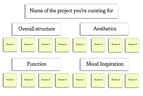
Here’s a working wall template you can use to get inspired with ideating:
Ask yourself these questions to get started with the template:
- “Does this finding relate to the overall structure (such as the layout or grid) that I am trying to implement in this project?” (If so, include it as a source.)
- “Is this particular aesthetic treatment (such as the use of color or typography) similar to the one I am trying to convey in this project?” (If so, include it as a source.)
- “Is a particular functional feature associated with the utility I am embedding in this project?” (If so, include it as a source.)
- “Does a certain mood (such as an atmosphere or emotion) in this source inspire what I am trying to convey with this project?” (If so, include it as a source.)
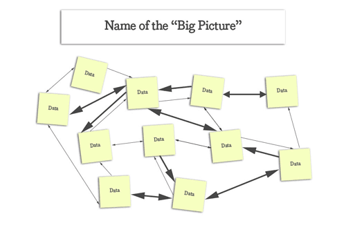
The working wall style we’ll explore next can help you map out a given concept and find important relationships between its subconcepts. Think about it: Doesn’t working on a large surface help you to visualize the big picture? What if you had enough space to add more concepts related to your subject? Working walls get it done.
This kind of big-picture reasoning has been called “holistic thinking.” According to psychologist Richard Nisbett at the University of Michigan, holistic cognition involves “an orientation to the context or field as a whole, including attention to relationships between a focal object and the field.”
This is the opposite of analytic thinking, whereby we pay attention primarily to the object and its categories, using rules (i.e. formal logic) to understand the object’s behavior.
East Asians tend to be more “holistic,” while Westerners are more “analytic,” according to Nisbett and his colleagues at the University of California (Berkeley), Seoul National University (Korea) and the Ecole Polytechnique (France) in a 2001 paper titled “Culture and Systems of Thought: Holistic Versus Analytic Cognition.” This groundbreaking research earned the team a grant from the National Science Foundation.
Evidence suggests that if you were raised in a society influenced by classical Greek thought, holistic thinking might not come all that naturally to you. However, product and service design is holistic by nature and, thus, requires stepping out of our comfort zone and transforming our mindset. Working walls are invaluable tools in this process.
Wartime generals, for example, have been using working walls to map out large-scale military intelligence strategies for decades. Winston Churchill kept some nifty underground chambers covered wall to wall with maps, thousands of color-coded pins and tiny annotations. These maps helped Churchill and his administration plan military advances, ideate different scenarios and think collectively about the best tactics to pursue.
Failing to see the big picture could mean the difference between victory and defeat in war and design.

“The Map Room” in the Churchill War Rooms. (Image: Kaihsu Tai)
Use the template below to map out a concept and its relationships. The width and marker of each arrow represent the strength and direction of a relationship, respectively.
Ask yourself these questions to get started with the template:
- “Does concept A influence concept B, or is it the other way around?”
- “How strong is the relationship between concepts A and B? Is there one?”
- “If concept A influences B, is the effect reciprocal? Does A exert a stronger influence over B, or is the strength of their force upon each other equal?”
4. Prototype: Create And Change Prototypes Easily
You could combine elements on a working wall to create a prototype of a design solution. This low-fidelity version of the solution could make use of mixed media such as the following:
- magazines;
- books;
- sketches;
- screenshot printouts;
- 3-D material, such as textures;
- photos;
- wireframes, blueprints and diagrams;
- evidence from primary research;
- evidence from secondary research;
- text quotes that capture a mood;
- other artifacts.
Interior designers combine elements on a working wall to create a scheme for a room. In the absence of a finished space, these boards serve as a low-fidelity prototype that gives the client sufficient clarity.
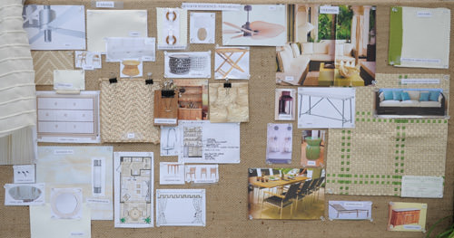
Working wall for a cabana design in Vero Beach, Florida. (Designer: Erin Paige Pitts)
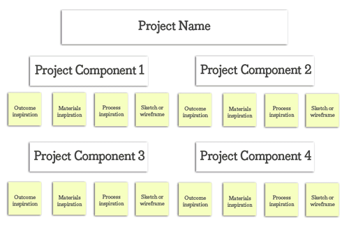
Here’s a working wall template you can use to create a low-fidelity prototype that users can give you feedback on:
And here are the questions to get you started:
- “Into what major components can this product or service be broken down?”
- “How can I show the user what the materials for a particular component will look like?”
- “How can I show the user the flow of their interaction with the product or service once it is finished?”
- “How can I give the user a glimpse of the final outcome? Would mockups, wireframes, sketches or blueprints help them to visualize it?”
Prototypes evolve, and unless we have a quick way to access previous versions of our own work, that sense of progress will fade and we’ll lose sight of the design decisions that took us from A to B in the first place. Second thoughts, insecurities and analysis paralysis take over. Understanding and being able to visualize our process give us the confidence that we are building on a strong foundation and give us the strength to justify our design choices.
Interaction designers, for example, must somehow navigate a dense jungle of user experience design, visual style, branding, layout, grids, typography and function changes. Working walls are an essential asset for succeeding in that.
The BBC UK published an amazing article explaining how it redesigned its website. It printed out every single screen of the old website and pinned it up on what the team now calls the wall of shame. The team gathered around this large vertical surface to prototype and pin new versions of its website. The result is a triumphant wallpaper-sized timeline of where the BBC used to be and where it stands now.
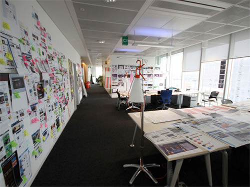
“A New Global Visual Language for the BBC’s Digital Services,” BBC Internet Blog
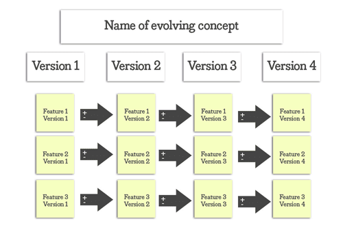
Here’s a template to visualize prototype changes over time:
And here are the questions to get started:
- “Into what major features can this product or service concept be broken down?”
- “How does each feature currently look?” (Include this in the column for the version you are currently working on.)
- “What elements will we add to this feature going forward?” (Include them after the plus sign in each of the arrows pointing to the next version.)
- “What elements will we remove from this feature going forward?” (Include them after the minus sign in each of the arrows pointing to the next version.)
5. Test: Visualize And Validate Design Assumptions
Researchers in every field experiment and iterate on their results. In the previous step, we saw how to use a working wall to create and refine a prototype before introducing it to our target users. Stage five of the design thinking process, testing, can also be facilitated using a different type of working wall.
Startup founders use a “validation board” to visualize their prototype tests. The free canvas created by Lean Startup Machine helps you to display the different iterations (or pivots) that your design solution hypotheses have undergone. You can also classify your assumptions depending on whether they’ve been validated. As on other working walls, elements may be moved around as the process unfolds.
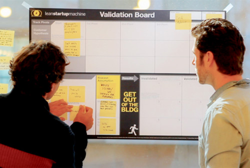
(Image: The Validation Board: A Free Tool for Testing New Startup Ideas From Lean Startup Machine,” Harrison Weber, The Next Web)
Use this working wall template to visualize and validate your design assumptions:
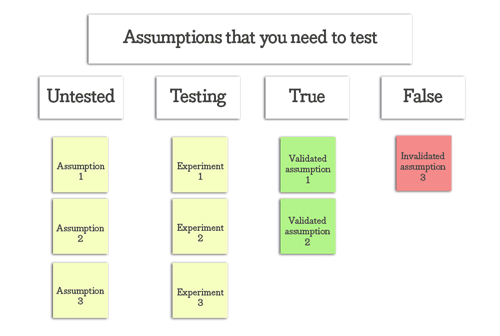
Here are the questions to get started with the template:
- “Which assumptions haven’t we tested yet?” (Include them in the first column, labeled “Untested.”)
- “How do we go about testing this assumption? How will we know whether it is true or false?” (Include this “experiment design” in the second column, labeled “Testing”.)
- “Has this assumption proven to be true or false?” (Move the original sticky note in the “Untested” column to either the third or fourth column, depending on the result of the experiment.)
Takeaways
Working walls are invaluable tools for design thinking. They empower research, sense-making, ideation, prototyping and testing. Using wall-sized displays in our design process empowers convergent, divergent and holistic thinking — all essential creative skills.
I hope you’ve found inspiration in these different and innovative uses of working walls. The next time you start a design project, keep these templates and ideas close to heart.
Do you know of other effective uses and layouts for working walls? Comment away!
Further Reading
- Using Brainwriting For Rapid Idea Generation
- Hold A Kickoff Meeting Before Diving Into The Design
- How To Enhance Your Creativity – Taming The Wild Mind
- Becoming A Better Facilitator


 SurveyJS: White-Label Survey Solution for Your JS App
 Register Free Now
 Celebrating 10 million developers