Off The Beaten Canvas: Exploring The Potential Of The Off-Canvas Pattern
The off-canvas flyout menu has taken over as the primary navigation pattern for mobile layouts — even some desktop layouts have jumped on board. And for good reason: An off-canvas menu is a great way to maintain context while giving the user a lot of additional information.
In this article, we’ll talk about why off-canvas has become so successful as a navigation pattern and show its potential to be so much more. From filters on product list pages to shopping carts to lists of recently viewed articles, the potential of this pattern is bound only by our drive to pioneer. It’s time that we explore just how far off canvas we can go.
Here Be Dragons
You’ve seen off-canvas flyouts before — you know, those sidebars that slide in from the edge of the screen? By now, they could even be considered commonplace. There’s a reason their popularity has exploded recently: In mobile, the notion of a window has all but disappeared. The majority of devices on the market today give us little control over the window.
Instead, we have only two major layers to work with: the viewport and the canvas. While these offer plenty of potential, designers have started to chafe against the limitations of the constrained viewport. The off-canvas flyout — used sparingly on the desktop — becomes extremely important in this landscape.
With the limited real estate on mobile devices, designers saw the need to open up space and present relevant information without forcing the user to lose context or leave their position on the screen. Going off-canvas enables us to do that. On the desktop, we rarely go off canvas — there just isn’t the need. In mobile, off-canvas is a groundbreaking concept. It creates a new frontier of design possibilities. And, as with mapping any unexplored territory, it offers treasure to those willing to take the risks. For designers, it’s a rare opportunity to create something new.
The Early Explorers
Certainly, the first people to go beyond the canvas and brave the unknown are lost to us. Like the Americas, we remember only those who made landfall most famously. Thus, Facebook is our Columbus.
Facebook set out to solve a very specific problem that it found on mobile screens. Its navigation menu is long, with a lot of content that is relevant to the user. The user needs to be able to explore that navigation without losing their place in the timeline. If they decide not to navigate away, they should be able to jump right back to where they were.
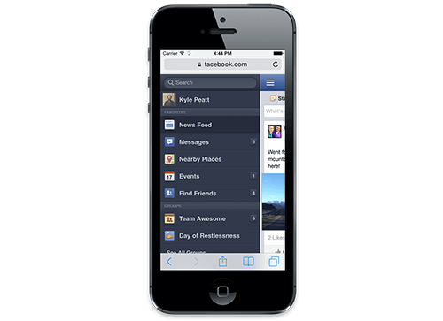
Facebook’s original off-canvas flyout was a lot like what Facebook currently has as its mobile Web navigation. Today, it still uses off-canvas for its messaging system, as well as its Android apps. (Large preview)
Common navigation patterns wouldn’t work. The menu is too long to pop over the entire screen, and if it appeared elsewhere on the canvas, it would pull the users out of context. The solution to the problem was to lock the canvas and pull it to the right — revealing the navigation underneath. Using off-canvas like this was an entirely novel concept.
Charting New Territory
The reason it works — and why it feels so natural — is because the action is very natural. Moving something to the side temporarily and redirecting focus, while keeping a glimpse of what the user was doing before, is an extremely common action in the physical realm. We’ll hold our place in a newspaper as we flip to a referenced section. We’ll keep our thumb on a page and flip to an endnote in a book. We’ll jut out a sheet as we try to find the receipt for a line item in our tax return.
These are all physical examples of what the off-canvas flyout emulates: saving your spot so that you can get right back to what you were doing. The off-canvas flyout is a perfect way to interact with content in mobile because it solves a very distinct problem: focus.
In mobile, all we have is focus. This makes maintaining context extremely hard. We force users to scroll up and down, and we hide and reveal content to do all of the things we want users to do. Scroll bars, which would indicate where the user is on the page, are usually absent, and getting back to one’s exact place is often hard. Context is important to the user’s mental map of the content. Without it, they’d get lost and fall off of the website.
With off-canvas flyouts, we maintain context on the page while presenting a huge array of new information. Flyouts can hold entire pages worth of new interactions and content, without the user getting lost at all. It’s an extremely powerful pattern, with potential that we haven’t even begun to uncover.
Flat-Earth Syndrome
Despite all of this potential, we aren’t really willing to push the boundaries of off-canvas. We designers have developed an unfortunate tendency to avoid experimentation. We’re more than willing to implement proven patterns, but we’re less likely to think critically about why a pattern is successful. Sure, we know that the off-canvas flyout is great for navigation, but that’s not all it’s good for.
Facebook wasn’t solving a navigation problem when it created the pattern. It was solving an interaction problem. It needed a way to present a large quantity of interactions and information without distracting the user from their original intention — the timeline. Instead of thinking of the off-canvas flyout as a navigation pattern, we need to think of it as a content strategy. How do we present more information to the user without distracting them from what’s at hand?
Facebook didn’t limit the flyout to navigation either. It used it for the list of messaging contacts as well. This is probably an even better use of the flyout because users are highly inclined to quickly pop open the sidebar, see who’s online, and send them a quick message before returning to browse the timeline. Patterns like this are not immutable. In fact, the only way they’ll get better is if we continually experiment with them. Facebook revolutionized the way we lay out content for mobile, and very few people are carrying that torch forward.
Beware The Siren Song
There’s a risk here. We shouldn’t use the off-canvas pattern merely because it’s novel or popular. As with most things in Web development, every method has its pros and cons. The off-canvas flyout isn’t perfect for every situation. It’s best when you need to provide a lot of information or complicated interactions without pulling the user away from the main content.
If you have only a few navigation items or if the supplementary information that you’re providing is short, then the pattern would probably be more disruptive than convenient. Remember that it provides a new view while maintaining the context of the original view — people will lose some flow whenever they open that flyout. If the supplementary information is minimal, then use a popover or a pushdown interaction instead and leave the user on the screen.
Another thing to keep in mind is that the off-canvas flyout requires a bit more processing power and browser capabilities than other methods. While this is mostly mitigated by a good framework (see my recommendation at the end of this article), these issues still stand. Old devices and devices without JavaScript support might get left behind if you don’t provide a good fallback for this pattern. I recommend progressively enhancing — i.e. provide a simple solution for old browsers, while detecting support for new features and providing a more optimal solution for browsers that can handle it.
Filling In The Details
So, what is the flyout really good for? Below are a few examples that highlight the pattern’s value.
Shopping Carts
When I was working on the design for Garmin’s e-commerce website earlier this year, I had a chat with my standard “test user” (i.e. my girlfriend). We talked a bit about what she liked and didn’t like about e-commerce on mobile websites. The biggest problem she brought up was that she often wants to check what she’s placed in her cart, but to do that, she has to visit the cart page, which takes her away from the content she’s currently browsing.
This triggered a little “A-ha!” moment for me. Why not use off-canvas flyouts to hold all of the cart’s information? The user can quickly pop open their cart whenever they want and glance at what’s inside. They can also immediately begin to check out — effectively removing a whole step from the checkout process. If you work in e-commerce, then you’ll know that the fewer steps in the checkout process, the less likely the user will abandon their cart.
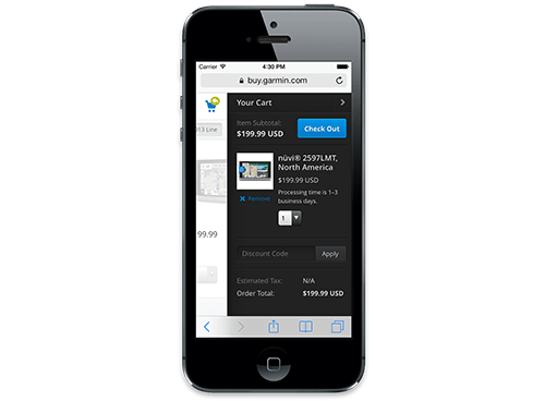
Garmin uses a flyout in mobile instead of a separate cart page. Users can go directly to the checkout area from this flyout wherever they are on the website. (Large preview)
To teach users about this functionality, I designed the cart flyout to pop open whenever users added something to their cart. This kind of just-in-time instruction is very helpful, and the timing is perfect because users wouldn’t need to know about the cart until they add something to it. If you’re building an e-commerce website, then you probably already have everything you need to make this happen.
Many websites show a preview of the cart when the user hovers over the cart icon or adds a product to it. You can easily repurpose this information into a flyout on small screens. For an example of a responsive website that has a flyout cart, check out Zazzle.
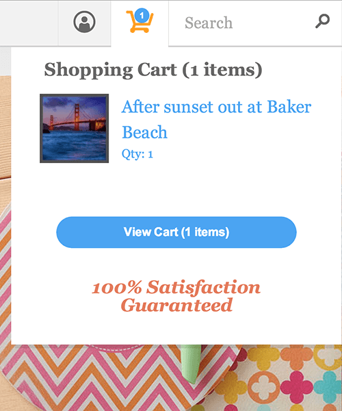
Zazzle has a popover cart for large screens and an off-canvas flyout for small screens.
We didn’t have access to existing cart information on the page from Garmin’s desktop website, so we used progressive enhancement to “AJAX” the cart information across pages. Our engineering team stored the cart information in local storage so that we wouldn’t need to check it every time the page loads. We update it whenever the user performs an action that would cause it to change.
This results in a fast and extremely functional cart flyout. The user can do everything they can do with a regular cart — update quantities, add coupon codes — from any page they are on. The flyout adds functionality in an intuitive way, without taking anything away from the user.
Product Filters
Another excellent use for a flyout on an e-commerce website is to house filters for category pages and product list pages. Many desktop layouts have a huge number of filters for the user to parse and select for lists of products. Traditionally, dealing with these on mobile has been very difficult: You would either present the user with the long list of filters or show the products — never both.
With off-canvas flyout, the user can pop out the filters, toggle the ones they want and then easily return to the updated list of products. They won’t lose their place, and they’ll get all of the functionality of the desktop layout. Best of all, if a sliver of the content is showing, the user will get immediate feedback on their actions. The list of products will update in real time as the user toggles the filters.
Page History
Off-canvas flyout isn’t limited to e-commerce, of course. One of our goals when designing Style.com’s new mobile website was to enable users to easily switch between fashion collections and to dive deep into showcase galleries. Switching context is so common on this website that the user needs a way to easily keep track of everything they’ve been looking at.
The developer implemented an off-canvas flyout that could slide out and show every single thing that the user has done on the website, in chronological order with thumbnails. Finding a previously viewed collection is as easy as scrolling through the list.
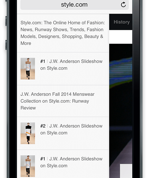
Style.com uses a flyout to make the user’s viewing history persistent and easy to access. Every article and image viewed is recorded so that the user can quickly return to it.
Commenting
Another highly effective use of the pattern on publishing websites is to display comments. More and more websites are following Medium’s example of allowing users to comment directly on individual lines and paragraphs in an article. This functionality is usually missing from the mobile version, and Medium is guilty of this. An off-canvas flyout is a perfect solution to this problem. Clicking a comment flag would pop open a pane that contains the comments for the lines that are visible, and the user could scroll through each comment for that line. When the user collapses the sidebar, they’d be exactly where they left off.
While I was writing this article, the New York Times announced a new version of its website, which pretty much does this with comments. A contextual off-canvas comment bar flies out in position with the article — but only in desktop layouts. Users can focus on reading the article itself and, when they’re interested in the comments, quickly check what other people are saying about the paragraph they’re reading.

The New York Times’ new website has off-canvas flyout for comments. Interestingly, this pattern is not used at all in the mobile view, where it might be even more effective.
This idea could be applied beyond blogs and news websites. Imagine reading a scientific article or any text with footnotes. Each link could open a flyout that contains the relevant footnote. The user would be able to quickly get the information they need without ever losing the context of the page. This would actually improve the reading experience — the sort of thing digital designers dream of.
The Final Frontier
All of the examples listed above have a commonality. The user is aided by the flyouts, but their success doesn’t depend on using them. They could access their shopping cart or their viewing history or the comments without a flyout. Off-canvas is by no means necessary, but it makes life a lot easier. The user is more likely to stick around and buy stuff, read more articles and view more ads.
We need to stop being complacent. Just because a flyout works really well for Facebook’s navigation doesn’t make it a “navigation pattern.” Let’s think critically about what each pattern does and why it’s effective. If we do that, then we’ll be in the perfect position to build on the foundation laid under us. This is especially important in mobile, whose patterns are less mature than the desktop’s — and for good reason: Mobile designers simply haven’t been around as long.
You’ll notice that I’ve been talking solely about off-canvas flyouts. This is a little lazy, too. When considering off-canvas, we automatically think of flyouts. But even more is possible with off-canvas layouts. Countless methods and patterns are waiting to be discovered by intrepid designers. Our canvases aren’t all the same — sure, they share many parts, but each does something slightly different. Our off-canvas solutions should be different, too.
As Web designers, we’re constantly treading the same path — perhaps discovering a shortcut if we’re lucky. But the map usually stays the same. We get complacent, retracing the steps of those who have gone before us, wearing down the path deeper and deeper. We need to be pathfinders. Just as Facebook led us off canvas with its flyouts, we need to explore new territory. Maybe for now, we just need to find novel uses for flyouts. Perhaps later, we’ll find entirely new off-canvas concepts. And perhaps the truly adventurous will discover an entirely new interaction layer.
Here’s to frontier designers and the maps they make.
Some Homework
If you’re still curious about off-canvas or would like to learn ways to implement the pattern as covered here, check out some of the resources below.
- “Off Canvas Multi-Device Layouts,” Luke Wroblewski Wroblewski offers insight into how we can use different off-canvas layouts to match desktop layout patterns. This is good for thinking about layouts but should also give you some ideas on how to do things differently.
- “‘View Mode’ Approach to Responsive Design,” Daniel Wiklund Wiklund’s fantastic article covers a lot of the same concepts that I’ve covered here but from a slightly different perspective.
- “Off Canvas Layouts,” Zurb Zurb outlines the different types of off-canvas layouts possible with Foundation. Even if you don’t use Foundation, this great resource will kickstart ideas on various possible layouts.
- Pikabu Implementing an off-canvas flyout that works well on a variety of mobile devices isn’t easy. I know this because we’ve had to deal with it at Mobify. We weren’t happy with a lot of the implementations out there, so we wrote one that works on a majority of devices — including Android 2.3 — and we open-sourced it for anyone to use.
- “Implementing Off-Canvas Navigation for a Responsive Website,” David Bushell, Smashing Magazine Bushell deals with a problem people often ignore. Performance is a huge consideration because a flyout has to feel perfect in order for the user to want to use it. Bushell shows some great ways to make sure your animations are performant and smooth.
(Big thanks to Jacky Gilbertson for her amazing illustrations!)
Further Reading
- Exploring The Potential Of The Off-Canvas Pattern
- How To Implement Off-Canvas Navigation For A Responsive Website
- When Off-Canvas Isn’t Good Enough
- How To Keep Framework Development Simple And Bug-Free


 Agent Ready is the new Headless

 SurveyJS: White-Label Survey Solution for Your JS App


