Mojo Motors’ Responsive Redesign With Fireworks: Visual Design Stage
We covered details on how to use Adobe Fireworks to set up a responsive design wireframe, reusable components, prototypes and ways to share designs.
In this article, we’ll share how we used Adobe Fireworks in our iterative visual design process, along with other useful tips.
Recommended reading: Switching From Adobe Fireworks To Sketch: Ten Tips And Tricks
In Search Of The Key Design Tool
As discussed in the “Creating Wireframes And Prototypes” section of part 1, our choice of a design tool came down to the following:
- Speed. Fireworks proved to be quicker for directly creating and manipulating visual elements on the screen than other tools, like Photoshop and Illustrator. The combination of integrated vector tools and bitmap-editing capabilities in one package, plus pages, states, symbols, styles and extensions, was something unique and worked best for us.
- File size. We found that PSD visual design files created in Photoshop for the same screen designs are much larger than those created in Fireworks — sometimes two to five times larger.
- Team learning curve. When Gabriel Gross (our visual UI designer) joined the team, we had already created a lot of wireframes in Fireworks. He initially considered just translating those wireframes to Photoshop. Because of the amount of work that would have been required, he decided to try Fireworks on a few screens. About a week later, he suggested working directly from the Fireworks PNG wireframe files, instead of recreating the designs from scratch. From this point forward, we’ve been using the wireframe files as the starting point for visual design screens.
- Workflow and efficiency. Reusing wireframes as a staring point really helped us get from wireframes to high-fidelity visuals in record time. We were able to take advantage of the efficiencies built into sharing files and iterating on them together. For a detailed look at a similar workflow, check out “Designing Interactive Products With Fireworks” by Nick Myers of Cooper and “iOS Prototyping With Adobe Fireworks and TAP” by Shlomo Goltz.
Note: Gabriel was also familiar with Adobe Flash and its various features and quirks. The transition to Fireworks was fairly straightforward — the Properties panel that spans the bottom of the screen, navigation of nested symbols, the symbols library and so on are quite similar in Fireworks and Flash.
Exploring Branding And Style
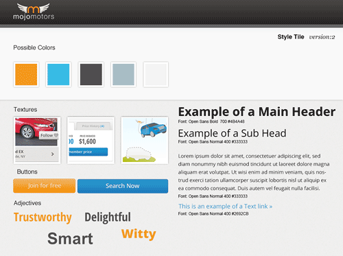
As discussed in the previous article, the design team decided on a pragmatic approach to creating visual elements. We decided early on in the project that we would only do as much visual layout and style exploration as necessary in graphics applications — the rest would be done through an iterative process in the browser. With this in mind, we ditched any elaborate branding exercise needed just for stakeholder buy-in and opted to create style tiles and a revised logo.
So, What Are Style Tiles?
Style tiles are a design document consisting of fonts, colors and interface elements that communicate the essence of the visual brand of a website or application. They help to communicate a proposed common visual language and can be used to discuss style preferences that meet the goals of the stakeholders or client. Samantha Warren explains the workflow pretty well in her article on A List Apart, “Style Tiles and How They Work,” so I won’t go into deeper detail than this:
"Websites are so much more than just usable interfaces: they tell a story... Style tiles are a flexible starting point that define a style to communicate the web in a way that clients understand. A style tile is more refined than a traditional identity mood board and less detailed than a website mockup or comp. When an interior designer redesigns a room they don’t build multiple options of the designs they’re proposing, they bring color swatches, paint chips, and architectural drawings. Style tiles act as paint chips and color swatches for the interface that we can execute on any device or at any dimension. It’s a truly responsive solution to visual design."
To learn more about style tiles, I recommend also visiting Samantha’s website Style Tiles.
Typography And Typecast
Most designers would agree that their favorite graphics application does not provide an accurate preview of how text will appear in the browser. With this in mind, we did as much text layout as was needed in graphics applications and then explored the finer typographical details in the browser. There, we could also accurately evaluate the effect of responsive layouts on the type as we moved through breakpoints.
In working with fonts, we faced the same dilemma explained by the Typecast team:
"We discovered that working with system fonts in Fireworks was faster for our designers, but build was slow because our developers had to interpret fonts and classes, resolve inconsistencies and negotiate font compromises with the designers. Plus there was that pesky problem of comp fonts not always resembling site fonts due to the rendering. And when we moved to designing with web fonts, it was the opposite problem. It was faster for developers because there were fewer negotiations and less guesswork. But designers were wasting valuable project time stepping through a really repetitious process to get the web fonts into their layouts. You know the deal: Go to URL → Paste copy → Preview → Capture → Import to comp → Resize → Arrange – Repeat40 → Find typos → Pull hair out → Repeat → Show client comp → Get requests to make bigger, smaller, different → Die a little inside → Repeat20 Both approaches had serious drawbacks."
So, to help us compare and narrow down Web fonts for Mojo Motors’ website, we turned to Typecast’s own solution.
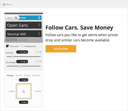
Typecast is a powerful browser-based design tool that makes it easy to experiment and design with the actual Web fonts that you plan to use on your website. The application lets you design visually and builds standards-compliant HTML and CSS in the background. Each Typecast subscription also comes with access to Web fonts from Typekit, Font Deck and Google, as well as a free Fonts.com account. Other features include the ability to create style guides and to share projects. Typecast is really a game-changer, and I highly recommend considering it as part of your responsive design toolkit.
Redesigning Mojo Motors’ Logo
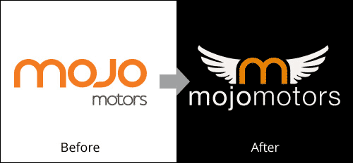
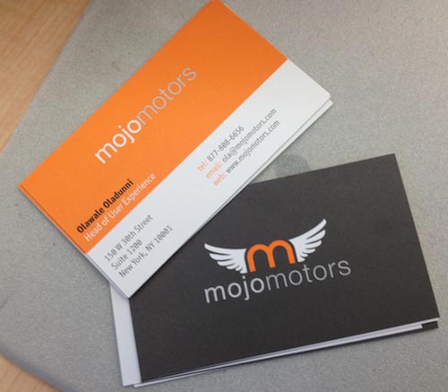
As part of the website redesign, our team was also tasked with rethinking the company’s logo. All of the logo explorations were done in Illustrator, which is better suited to this type of work. Using Illustrator made more sense because it enabled us to create and output both CMYK files for print and RGB files for the screen.
Setting Up The Workspace For Visual Design
The key to using an existing Fireworks wireframe file for visual design work is to set up the application and the files properly. As discussed in the previous article, we did this up front so that we could take advantage of the application’s pixel-precise layout capabilities and increase our overall efficiency throughout the project.
Let’s quickly cover the basics.
Keyboard Shortcuts
One thing that can speed up the completion of tasks in Fireworks is mastering the keyboard shortcuts. For someone transitioning from another Adobe application, Fireworks provides the option to customize the keyboard shortcuts to closely match those of Photoshop, Illustrator or InDesign — or any variation you may need, for that matter. Our team settled on Photoshop’s shortcuts because they were the most familiar.
Changing these settings in Fireworks is easy. In Windows go to Edit → Keyboard Shortcuts, or on a Mac go to Edit → Fireworks → Keyboard Shortcuts. Then, select “Photoshop” or another shortcut set from the “Current Set” dropdown menu, and click “OK.”
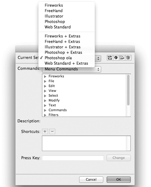
To customize further, open the “Keyboard Shortcuts” dialog again:
- In the “Commands” field, select a specific Fireworks menu command or tool.
- Type a new shortcut combo in the “Press Key” field, and click the “Change” button;
- When you are done editing the shortcuts, save the shortcut set as a variant of the set you selected previously (e.g. “My_Custom_Set”).
Now you can work faster using the keyboard shortcuts that you are familiar with!
Grids, Guides, Rulers And Tooltips
The great thing about carefully setting our responsive design grids during the process of creating a wireframe is that all of the grids and guides that we needed were already in place for the visual design process. Below are some of the options that we enabled when setting up our initial files.
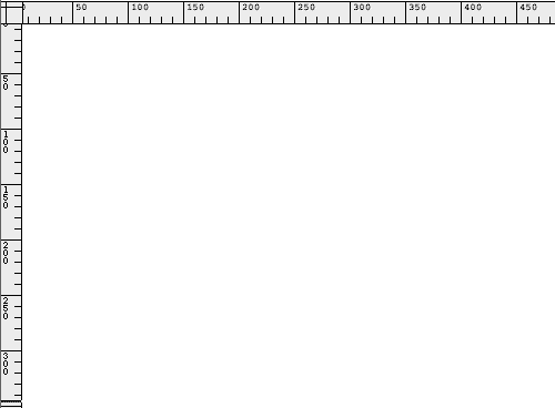
Rulers are really handy for orienting yourself visually and are required for working with guides on the screen (in the menu, View → Rulers).
We set our visible horizontal and vertical background grids to 10 pixels. Grids and of some their options can be accessed by going to View → Grid → Show Grid/Snap to Grid/Edit Grid… or by going to Edit → Preferences → Guides and Grids.
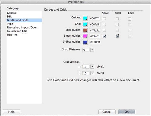
This setting works well also because it matches the pixel increment (10 pixels) when objects are moved on the screen (for example, when we nudge an element using the Shift + arrow key shortcut). We often toggle this setting on and off as needed when drawing.

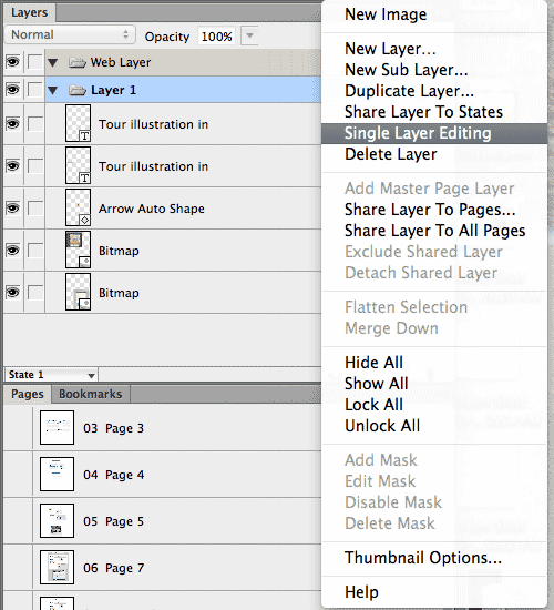
We typically add guides to match the responsive grid layers and other objects as needed; guides are then toggled on and off while drawing. Guides in Fireworks are page-specific and don’t automatically appear on all pages unless placed on a master layer.
Here are a few useful tips:
- Position unlocked guides precisely in Fireworks by clicking on a guide and entering the position directly.
- Check guide’s spacing by placing your cursor between two guides and holding down the
Shiftkey. - If you move a guide while holding down the
Shiftkey, you can also precisely dial in the spacing.
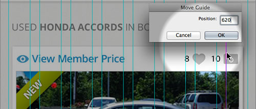

Shift between guides.
Shift while moving a guide.Guides and their options can be accessed via View → Guides → Show Guides/Lock Guides/Snap to Guides/Clear Guides…. You can also use keyboard shortcuts to speed up these operations.
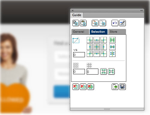
Note: To do more with guides, I highly recommend the Guides panel extension by Eugene Jude, which enables you to create guides from selections, copy and paste guides, etc.
For an in-depth look at grid and guide workflows, check the “Grids Panel” and the “Guides Panel” sections in Ashish Bogawat’s article “Optimizing the Design Workflow With Fireworks Extensions.” (By the way, a similar panel named GuideGuide has recently become available for Photoshop users as well.)
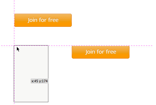
Smart guides are really helpful and enable you to visually align objects on the screen without having to use the Align panel. Turning these on (by going to View → Smart Guides) will allow you to see the precise adjustments to the location or size of an object when performing a free transform operation.
Useful tip: If you find yourself creating a lot of responsive design grids, then you might also want to consider the Insert Grids extension by John Dunning.
Color Management, Color Picker And Swatches
Unlike the rest of Adobe’s Creative Suite, Fireworks does not require any particular color management settings for you to get started. The application was designed from the ground up for screen design, and it is set to the RGB color space out of the box.
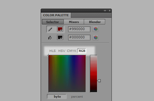
Note: The Color Palette panel, in addition to the RGB, HSV and HLS color spaces, also shows a CMYK option, but it is not recommended for print work.
The popup color picker is quite easy to use and is one of the best ways to specify colors for a user interface. It supports RGB and HEX color selection by default, as well as the more flexible RGBa specification that is supported by all modern browsers. Another useful feature is the one-click color copy feature. (As of the time of writing, Sketch is the only other app that has similar RGBa capabilities. Also worth mentioning is that Adobe has just added color-picker options for fills and strokes in Photoshop CS6 and CC.)
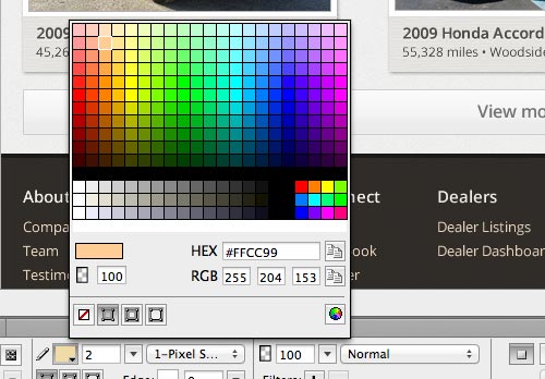
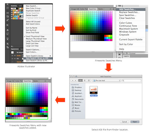
To bring in the color palette from our exploration, we saved an RGB .ASE file in Illustrator and imported it into Fireworks with the help of the Swatches panel. Once imported, the color scheme became immediately available in the color picker.
The Color Palette panel is a great alternative to using the Swatches panel or color picker to specify colors. The panel is broken down into “Selector,” “Mixer” and “Blender” tabs.
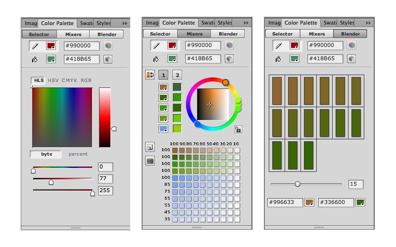
- “Selector” tab This allows you to choose between different color models and select colors using an Adobe-like color picker, instead of the default color cubes swatches. The available options include HSV, HSL, CMYK and RGB; for most of our redesign work, we used the RGB model.
- “Mixer” tab This is great for recoloring artwork and creating color tints. We relied on this greatly for stretching the range of our color palette. To try two different palettes in your document, follow these steps:
- Click “Palette1” on the left of the panel to set the base colors for the first palette.
- Click “Palette2” on the right side of the panel, and then select the base colors for the second palette.
- To switch back and forth between the two palettes, select the palette to recolor with and then click the “Replace Color” icon.
- “Blender” tab Here, you can create a color gradation series, which is really handy for exploring gradients. All you have to do is this:
- Fill the color boxes at the bottom of the panel to select the beginning and ending colors.
- Use the “Steps” slider to select the number of steps in the series.
- Exporting. Exporting any palette out of this panel requires saving it as an .ACT swatch file, which can be shared with other Fireworks or Photoshop users. Unfortunately, Illustrator cannot open this swatch file format. To share with Illustrator, consider exporting an .ASE file via the Swatches panel, which will work across all Adobe products.
Note: The most recent versions of Fireworks (CS5, CS5.1, CS6) all natively support both .ACT and .ASE swatch formats. Earlier versions of Fireworks (CS4 and older) support only .ACT.
Setting Up The Document For High-Resolution Displays
Another decision we had to make before starting the visual design process was how to set up our files for high pixel-density (or “Retina”) displays. We could approach this in a few ways:
- Start with standard-resolution files and scale up for Retina graphics. We opted for this because we were starting from standard-resolution wireframes.
- Start with high-resolution files and scale down for non-Retina graphics.
Both conversion methods should be quite seamless and yield the same results. Objects in Fireworks are created as vector shapes by default, and any effects applied will also scale (assuming, of course, that you have not created any shapes using filled selections, which were popular in Photoshop prior to the more robust shape layer option available today). All text objects in Fireworks will scale without problems, too.
Working With Raster Images (Bitmaps)
Any bitmap images can be replaced with a higher-resolution versions. The key is to always start with high-resolution images where needed and scale down. Below are a few other options to consider:
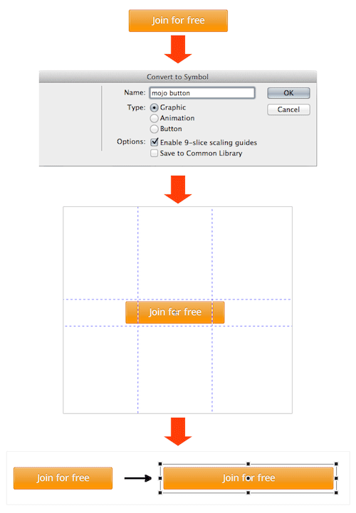
- Image symbols. An alternative to replacing your images (and one I highly recommend) is to turn your high-resolution images into symbols (
Modify → Symbol → Convert to Symbol, orF8) and scale down their placed instances in the layout. Once you turn a raster image into a symbol, you can scale it down to any size and then back up to the original size as many times as you’d like without any loss in quality. If you choose this method, you won’t have to replace your images! - Linked images. An option I discovered recently is to link images. This requires installing the free Linked Images extension by John Dunning. With this option, your layouts will be refreshed with the high-resolution images upon being scaled up (the images are stored in a folder outside of the Fireworks file). For a detailed overview of this method, please check the “Linked Images” section of “Fireworks Extensions for a Better Design Workflow, Part 2.”
Note: For layout purposes, we used the first option to set image symbols of cars as placeholders. The final car images are generated dynamically on the server and rendered on the live website. We won’t cover this production process in this article.
Hint: A good read on Retina graphics is “Retinafy Your Websites and Apps” by Thomas Fuchs.
Live (Pre)View: Bringing Wireframes To Life
Live View, Skala Preview And Xscope
Just as when we were creating the wireframes, we frequently had to check how the mockups looked and scaled on real devices, such as the iPhone and iPad.
For quick previews while designing, we turned again to the LiveView app (check out my previous article for details on our process). Alternatives to LiveView are Skala Preview and Xscope, which provide similar functionality but integrate better with Photoshop. Skala Preview is also compatible with Android devices.
Bringing Wireframes To Life
Once the file was set up, the next step was to add pixel precision to the interface and content. This is also when we applied brand elements such as color, typography, iconography and the logo from our style tiles. Putting the pages for each breakpoint in one working file made it easier to transpose screen elements between mobile, tablet and desktop layouts (see part 1 of this series for details on pages, states and symbols in Fireworks).
Favorite Fireworks Features During The Visual Design Stage
In this next part, we’ll cover some Fireworks features, tools and workflows that really came in handy during the visual design stage.
Properties Panel (Property Inspector Panel)
A lot of great features in Fireworks make creating screen graphics fast and efficient, but the single most powerful UI feature for us was the contextual direct editing of objects, available via the Properties panel (also called the Property Inspector (or PI) panel). This powerful panel changes contextually based on the type of object selected on the canvas.
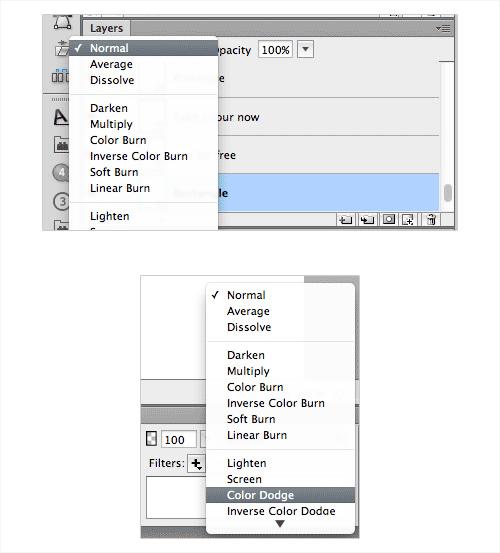
The Properties panel is normally found at the bottom of the screen when a document is first opened in Fireworks. It allows you to manage all attributes, such as fills, strokes, gradients, patterns, textures, size, position, scale, opacity, blend modes, live filters, text properties, masks (and masks properties), symbols and much more, for any selected object or group of objects.
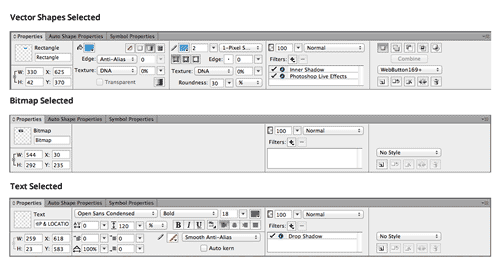
Once you understand how the Properties panel works, quickly inspecting and changing the properties of all types of objects with pixel-level precision become really easy. You might also find that making changes is a lot faster than in any other graphics application (including Sketch!).
Gradients
Creating gradients is quite simple and intuitive. Adjusting and changing the fill type can be easily done at any time. Fireworks also offers 12 gradient types out of the box. And the dither option reduces banding when images are exported.
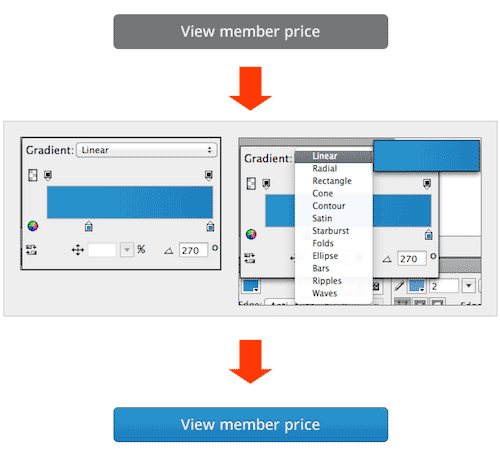 Side note: Starting with CS6, Adobe added some similar features to Photoshop, including the ability to add fills and strokes to shape layers as an alternative to live filters such as gradient overlay effects. Unfortunately, you can’t change the fill type as easily once you have committed to a gradient or any other type. Changing the fill type requires selecting the shape layer with the Path Selection tool, which will reveal your options in the options bar (in CS6) or in the Properties panel (in CC), at which point you can make your changes.
### Textures
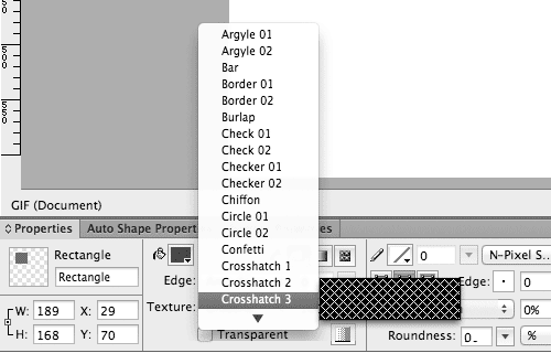
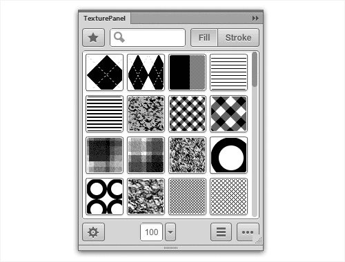
In addition to applying fills to vector objects in Fireworks, you can add textures to any fill type or stroke. Being able to apply textures to strokes is really useful for simulating CSS border-image effects, which is now supported by most modern browsers. Other features include being able to use your own texture files and specifying the opacity level.
Fireworks Live Filters And Photoshop Live Effects
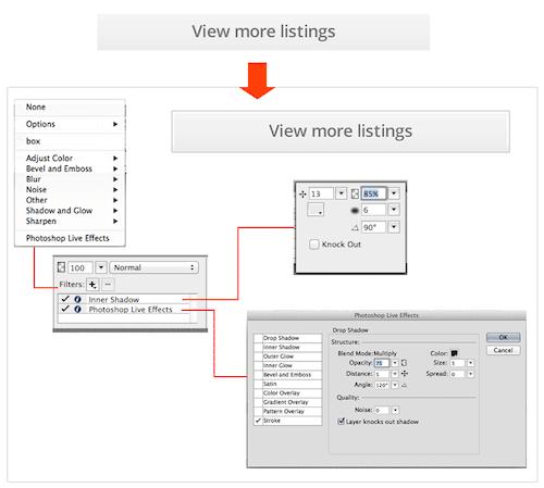
Fireworks comes with most of the important non-destructive effects that you will need to bring screen designs to life, and it includes some familiar Photoshop live effects as options. I typically opt for Fireworks’ native filters before considering the Photoshop ones.
Fireworks’s live filters can be applied to any type of object (vector, bitmap, symbol, etc.) non-destructively, and the stacking order of applied live filters may be changed simply by dragging and dropping. Another key feature is the ability to apply multiple filters of the same type to a single object.
Pasting Attributes
Copying and pasting attributes (using the simple Control/Command + C and Control/Command + Alt + Shift + V shortcuts) between objects is an awesome feature and a huge timesaver, one we often leveraged during the process of going from wireframes to visual comps. Unlike copying and pasting layer styles in Photoshop, Fireworks transfers all attributes — including font type, font size, fill type, stroke type, applied live filters and so on — from one selected object to another.
Pasting attributes can even be done selectively (see the “Paste Selective Attributes” section of “Fireworks Extensions for a Better Design Workflow, Part 2”), which makes the feature even more powerful.
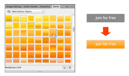
Styles And the Styles Panel
While being able to copy and paste attributes is very useful, using Fireworks’ styles is a lot more efficient and an essential part of creating visual mockups.
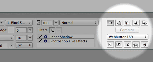
Styles in Fireworks are analogous to CSS in Web design. They can be quickly applied to objects on the screen to mock up variations or can be used to apply a final style guide for brand consistency. Whenever a style definition changes, all objects that have the same style are updated automatically.
Path Panel
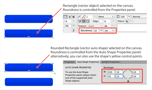
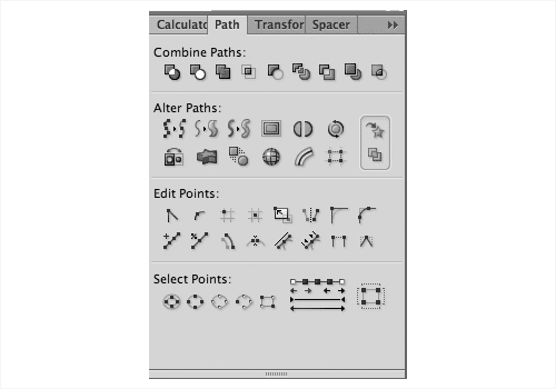
Fireworks has an easy to use and robust set of vector-editing tools, with many of the same features found in Illustrator. Most of the tools can be accessed from the Path panel (and a few are in the “Modify” menu). In CS6, some of the basic path tools were added to the Properties panel, for easy access.
Note: There is a more recent version of the Path panel (with many additions and improvements) than the one that ships with Fireworks CS6. (In case you’re wondering, Aaron Beall is the talented developer responsible for the latest versions of the Path panel in Fireworks, including the one in CS6.)
Importing From And Exporting to Illustrator
Fireworks handles .AI files very well, and we used it whenever we had to work with vector art created in Illustrator or in Illustrator-compatible applications. As part of the importing process, you are even presented with a “Vector File Options” window, giving you the option to select a specific Illustrator artboard to import.
We especially took advantage of this workflow with our company’s logo and illustrations throughout the website. Our freelance illustrator worked in Illustrator and imported directly into our Fireworks layouts. For smaller artwork, you could also copy a single object or group of objects in Illustrator and then paste them directly in Fireworks.
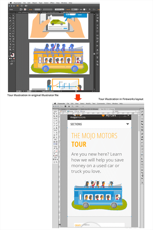
Edit → Copy as Vectors, and then pasting the vector objects in Illustrator. (Simply copying and pasting objects would put bitmap objects in Illustrator, instead of vectors, so always go to Edit → Copy as Vectors, instead of Edit → Copy.)
To export large artwork in Fireworks, save the entire file as an .AI file and then open that .AI file in Illustrator.Note: In Illustrator CC, Adobe removed the importing and exporting options described above. If you are using Illustrator CC, you might need to save your files as “Illustrator v. CS6” to take advantage of all of these capabilities, or work in Illustrator CS6 or lower, which supports all of these options out of the box.
### Importing From And Exporting To Photoshop
Importing and exporting with Photoshop is a breeze with Fireworks — Fireworks can save to .PSD and also open .PSD files. In both cases, layers and naming conventions will be preserved.
The results will vary according to the options you’ve set during the importing or exporting process and how much editability you would like to retain. My suggestion is to experiment a little to see which settings work best for your purpose.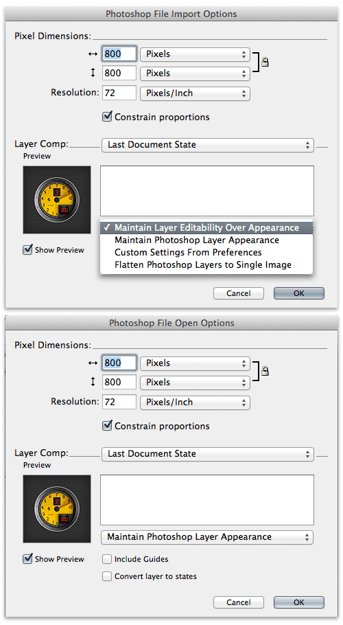
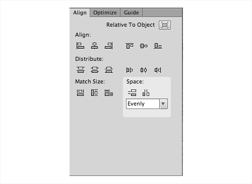
- Match size This option lets you match the size of the selected object to the height or width (or both — but usually the longer dimension) of another object.
- Space evenly This is different than distribution, enabling you to align objects a fixed distance apart.


- “It’s Time to Dump Photoshop and Embrace Sketch,” Baz Deas
- “Discovering Sketch,” Jean-Marc Denis
- “Refining Your Design in Adobe Fireworks,” Benjamin De Cock
- “Developing a Design Workflow in Adobe Fireworks,” Joshua Bullock
- “Useful Fireworks Techniques and Features for Large Design Teams,” Kris Niles
- “The Power of Adobe Fireworks: What Can You Achieve With It?,” Michel Bozgounov
- “iOS Prototyping With TAP and Adobe Fireworks,” Shlomo Goltz: Part 1, Part 2, Part 3
- “Optimizing the Design Workflow With Fireworks Extensions,” Ashish Bogawat: Part 1, Part 2, Part 3
What’s Next?
We’ve planned this case study of Mojo Motors to span three articles. Part 1 covered the UX and interaction design stage. Part 2 has covered the visual design stage. Part 3 (currently on the drafting board) will discuss how our team translated the visual design to the front-end iterative development cycle. Stay tuned!
Further Reading
- Sketch, Illustrator or Fireworks? Exploring A New Free UI Design App: Gravit
- How To Boost Your Design Workflow With Setapp
- Mid-Century Modern Illustration: Creating A Cover Book With Illustrator And InDesign
- Building Complex Forms In Vue
 (mb, al, il, mrn)



 SurveyJS: White-Label Survey Solution for Your JS App
 Agent Ready is the new Headless

