Understanding The CSS3 transition-timing-function Property
People of the world, strap yourself in and hold on tight, for you are about to experience truly hair-raising excitement as you get to grips with the intricacies of the hugely interesting CSS timing function!
OK, so the subject matter of this article probably hasn’t sent your blood racing, but all jokes aside, the timing function is a bit of a hidden gem when it comes to CSS animation, and you could well be surprised by just how much you can do with it.
First of all, let’s set the scene and ensure we’re all familiar with the scenarios in which the timing function is relevant. As alluded to, the functionality becomes available when you’re working in the realm of CSS animation, which includes CSS transitions as well as keyframe-based animation. So, what exactly is it and what does it do?
The CSS3 transition-timing-function Explained
It’s one of the less obvious animation-based CSS properties, whereas most of its counterparts are rather self-explanatory. Nevertheless, the gist of it is that it enables you to control and vary the acceleration of an animation — that is, it defines where the animation speeds up and slows down over the specified duration.
While it does not affect the actual duration of an animation, it could have profound effects on how fast or slow the user perceives the animation to be. If you’re not sold having learned of its actual purpose, then stick with me here because the timing-function property gets a lot more interesting than the definition suggests.
Note: There is no actual property named “timing-function.” When I refer to this “property,” I am actually referring to both the transition-timing-function and the animation-timing-function properties.
Before moving on, let’s just familiarize ourselves with the syntax and where it fits into the whole process of defining an animation in CSS. To keep things simple, let’s use a CSS transition for this example. We’ll begin with the full array of transition properties:
div {
   transition-property: background;
   transition-duration: 1s;
   transition-delay: .5s;
   transition-timing-function: linear;
}

/* This could, of course, be shortened to: */
div {
   transition: background 1s .5s linear;
}
The shorthand for defining a transition is fairly lenient, the only requirement for the order being that the delay parameter must be stated after the duration value (but not necessarily immediately after). Furthermore, the transition-duration value is the only one that is actually required for the code to function; and because the default values of the other parameters are adequate most of the time, your transitions seldom need to be anything more than the following snippet:
div {
   transition: 1s;
}

/* This is the same as saying: */
div {
   transition: all 1s 0s ease;
}
But that’s a bit boring. While the defaults are often sufficient for standard hover events and such, if you’re working on something a little more substantial, then the timing function is a serious trick for fine-tuning an animation!
Anyway, you now have an idea of what the timing function does. Let’s look at how it does it.
Looking Under The Hood
Many of you probably don’t look past the available keywords for the timing-function property, of which there are five: ease (the default), ease-in, ease-out, ease-in-out and linear. However, these keywords are simply shorthands for defining the Bézier curve.
The what?!
You might not be familiar with the term, but I’d wager that you’ve actually seen a Bézier curve — heck, if you’ve used graphical editing software, then you’ve probably even created one! That’s right, when you use the Pen or Path tool to create a nice smooth curve, then you’re drawing a Bézier curve! Anyway, to get to the point of this section, the Bézier curve is the magic behind the timing function; it basically describes the acceleration pattern on a graph.
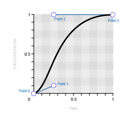
This Bézier curve translates to the ease keyword.
If you’re anything like me the first time I saw a Bézier curve like this, then you might be wondering how on earth that curve could be formed from four points plotted on a graph! I couldn’t possibly tell you in words, but, fortunately, I have a particularly fantastic GIF to do the job for me, courtesy of Wikipedia.

A cubic Bézier curve being drawn (Image: Wikipedia)
Because this curve is formed from four points, we refer to it as a “cubic” Bézier curve, as opposed to a “quadratic” curve (three points) or a “quartic” curve (five points).
Introducing The cubic-bezier() Function
Now then, this is where things get really exciting, as I reveal that you can actually get access to this curve through the cubic-bezier() function, which can simply be used in place of the keywords of the timing-function property value. I appreciate that you may need a moment to contain your excitement…
With the cubic-bezier() function, you can manipulate the Bézier curve whichever way you desire, creating completely custom acceleration patterns for your animation! So, let’s look at how this function works and how it enables you to create your very own Bézier curve.
First, we know that the curve is formed by four points, which are referred to as point 0, point 1, point 2 and point 3. The other important thing to note is that the first and last points (0 and 3) are already defined on the graph, with point 0 always sitting at 0,0 (bottom left) and point 3 always sitting at 1,1 (top right).
That leaves just point 1 and point 2 available for you to plot on the graph, which you can do using the cubic-bezier() function! The function takes four parameters, the first two being the x and y coordinates of point 1 and the latter two being the x and y coordinates of point 2.
transition-timing-function: cubic-bezier(x, y, x, y);
To get comfortable with the syntax, as well as with how it creates the curve and with its physical effect on the animation, I’ll take you through the five timing-function keywords, their equivalent cubic-bezier() values and the resulting effect on the animation.
ease-in-out
Let’s start with the ease-in-out keyword because the logic behind this curve and how it translates to the animation are probably the easiest to understand.
/* The cubic-bezier() equivalent of the ease-in-out keyword */
transition-timing-function: cubic-bezier(.42, 0, .58, 1);
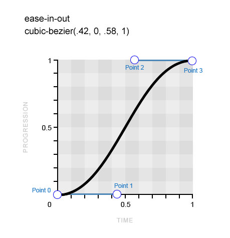
A perfectly symmetrical Bézier curve, which means that the animation will ease in to full speed and then ease out at exactly the same rate.
You can see that point 1 is positioned at 0.42 along the x-axis and at 0 on the y-axis, whereas point 2 is positioned at 0.58 on the x-axis and 1 on the y-axis. The result is a perfectly symmetrical Bézier curve, which means that the animation will ease in to full speed and then ease out at exactly the same rate; hence, the name of this keyword.
If you look at the demo below, you will see the physical effect of the ease-in-out value, as well as how it compares to the other keyword values.
See the Pen bHzqm by Stephen Greig (@stephengreig) on CodePen.
Ease
The ease keyword is the default value of the CSS timing-function property, and it is actually quite similar to the previous one, although it eases in at a faster rate before easing out much more gradually.
/* The ease keyword and its cubic-bezier() equivalent */
transition-timing-function: cubic-bezier(.25, .1, .25, 1);
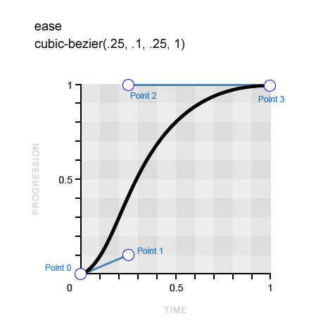
The curve for the keyword ease eases in at a faster pace before easing out much more gradually.
You can see a sharper incline in the curve initially, while the finish is more drawn out, which directly translates to the physical effect of this timing function on the animation. Don’t forget to refer to the earlier demo after reviewing each of these examples to compare the effects.
ease-in And ease-out
The ease-in and ease-out keywords are, unsurprisingly, exact opposites. The former eases in before maintaining full speed right through to the finish, while the latter hits full speed right off the bat before easing to a finish. The ease-in-out keyword that we looked at previously is, as logic would suggest, a perfect combination of these two Bézier curves.
/* The ease-in keyword and its cubic-bezier() equivalent */
transition-timing-function: cubic-bezier(.42, 0, 1, 1);

/* The ease-out keyword and its cubic-bezier() equivalent */
transition-timing-function: cubic-bezier(0, 0, .58, 1);
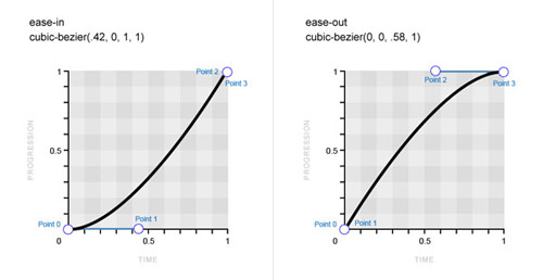
Bézier curve for the ease-in keyword (left) and the ease-out keyword (right) (Large version)
Linear
The final keyword to address does not correspond to a curve at all. As the name implies, the linear timing-function value maintains the same speed throughout the animation, which means that the resulting Bézier curve (or lack of) would be just a straight line. There is simply no varying acceleration pattern to depict on the graph.
/* The linear keyword and its cubic-bezier() equivalent */
transition-timing-function: cubic-bezier(0, 0, 1, 1);
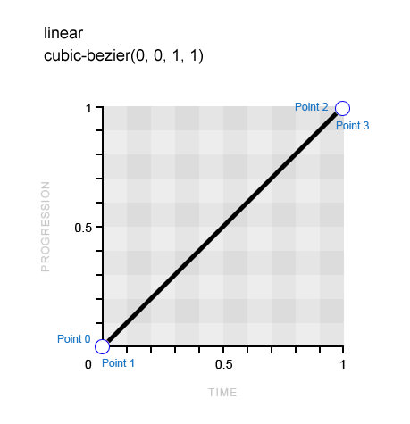
The linear timing-function value maintains the same speed throughout the animation.
If you refer back to the demo, you will probably notice that, despite all of the examples having the exact same duration values, some of the animations appear to be slower than the others. Why is that? Well, to take the ease-in-out keyword as an example, we know that it starts and finishes at a slower pace, which means that it has to cover the middle ground of the animation at a much faster pace. This effectively ensures that we perceive the actual animation to be both shorter and faster, while, say, the linear animation appears longer and more drawn out.
You might feel that this article is very slowly easing into its full pace (see what I did there?), so now it’s finally time to step things up a bit and look at how to use the cubic-bezier() function to create our own custom timing functions.
Creating Custom Acceleration Patterns With The cubic-bezier() Function
Now that we’ve seen how the keywords equate to the corresponding Bézier curves and seen their effect on the animation, let’s look at how to manipulate the curve to create custom acceleration patterns.
You should now be able to plot points 1 and 2 on the graph using the cubic-bezier() function and have a pretty solid idea of how this will affect the animation. However, considering that you’re plotting points on a graph that you typically can’t see, obviously this could get very tedious very quickly.
Fortunately, people like Lea Verou exist, who seemingly won’t rest until CSS development couldn’t be made any easier! Lea has developed the aptly named Cubic Bézier, which is basically a playground for creating completely custom Bézier curves and comparing them in action to the predefined keywords. What this means for you is that, instead of tediously editing the decimals in your cubic-bezier() functions, you can just visit Cubic Bezier and play around with the curve until you’ve achieved the desired effect. Much more convenient.
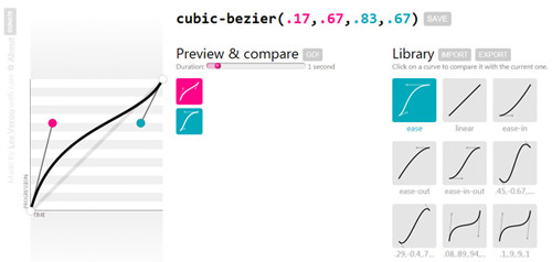
Lea Verou’s superbly useful Cubic Bézier (Large version)
The shorthand keywords give you great options for timing functions to start with, but the differences between them often appear minor. Only when you start to create custom Bézier curves will you realize the radical effect the timing function can have on an animation.
Just look at the following working examples to see the extreme differences between the animations, despite all of them having the exact same duration values.
See the Pen baFhH by Stephen Greig (@stephengreig) on CodePen.
Let’s take a closer look at the first of these examples and try to understand why it produces such a radically different effect.
/* cubic-bezier() values for first example from preceding demo page */
transition-timing-function: cubic-bezier(.1, .9, .9, .1);
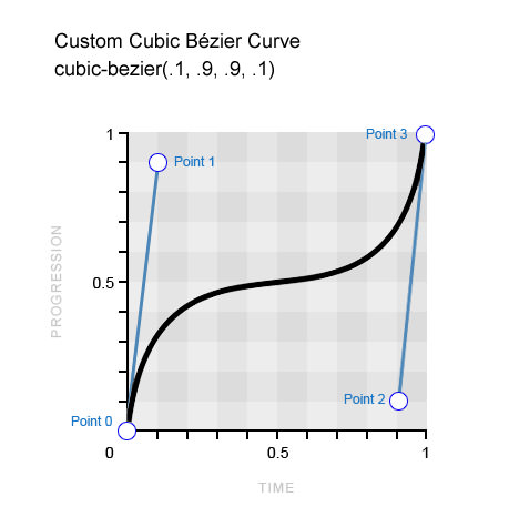
Example of a custom Bézier curve
The main difference between this timing function and the default keywords is the sharp inclines of the Bézier curve against the “progression” scale (the y-axis). This means that the animation progresses in short bursts, with a long gradual pause in the middle (where the curve levels out). This pattern contrasts starkly with what we’ve become used to with the timing-function keywords, which take the opposite approach, with the easing periods coming at the beginning or the end of the animation, rather than in the middle.
With custom Bézier curves now in the bag, surely we have all but exhausted the capabilities of the cubic-bezier() function, right?! You’d think so, but this crafty beggar has got even more up its sleeve!
Getting Creative With Bézier Curves
Yep, it’s true: Bézier curves get even more exciting! Who’d have thought? The scope widens with the revelation that only the time scale (x-axis) is limited to the 0–1 range on the graph, whereas the progression scale (y-axis) can extend below and beyond the typical 0–1 range.
The progression scale is exactly what you’d think it is, with the bottom end (0) marking the beginning of the animation and the top end (1) marking the end of the animation. Typically, the cubic Bézier curve always travels north along this progression scale at varying intensities until it reaches the end point of the animation. However, the ability to plot points 1 and 2 outside of this 0–1 range allows the curve to meander back down the progression scale, which actually causes reverse motion in the animation! As ever, the best way to understand this is through visuals:
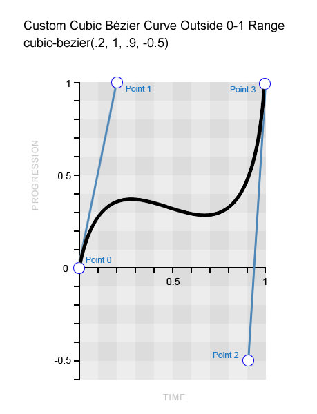
A custom Bézier curve using a value outside of the typical 0–1 range
You can see that point 2 is plotted outside of the typical 0–1 range at -0.5, which in turn pulls the curve downward. If you look at the following demo, you’ll see that this creates a bouncing effect in the middle of the animation.
See the Pen kILDb by Stephen Greig (@stephengreig) on CodePen.
Conversely, you could place this backward motion at the beginning of the animation and also make it temporarily run past its intended finishing point. Think of it like taking a couple of steps back to get a running start; then, at the end, your momentum carries you past your destination, causing you to take a couple of steps back to ensure that you arrive at the intended destination. Look at the working example to really understand what we’re talking about here. In addition, the Bézier curve that produces this effect can be seen below.
See the Pen xcCqj by Stephen Greig (@stephengreig) on CodePen.
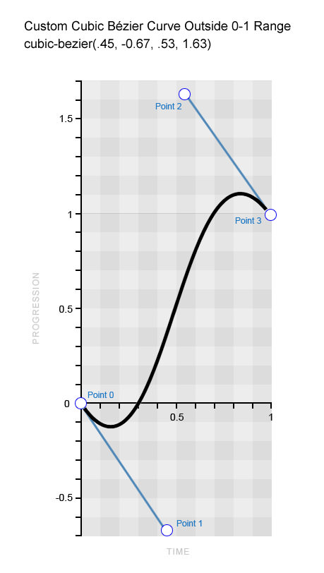
A custom Bézier curve using a value outside of the typical 0–1 range
You should now have a pretty good idea of how cubic-bezier() values outside of the typical 0–1 range can physically affect how an animation plays out. We can look at moving boxes all day long, but let’s finish this section with an example that clearly demonstrates this type of creative timing function.
See the Pen vbqBh by Stephen Greig (@stephengreig) on CodePen.
That’s right: We’re animating a floating balloon! …What? Haven’t you always wanted to do that with CSS?
The brief for this animation is to “add helium” to the balloon on click so that it floats to the “ceiling,” where it will bounce slightly before sticking to the top, as it naturally would. Using a cubic-bezier() value outside of the 0–1 range allows us to create the bounce and ultimately helps to produce a realistic effect. The following snippet shows the coordinates used in the cubic-bezier() function, and the resulting Bézier curve appears below that.
/* The cubic-bezier() values for the bouncing balloon */
transition-timing-function: cubic-bezier(.65, 1.95, .03, .32);
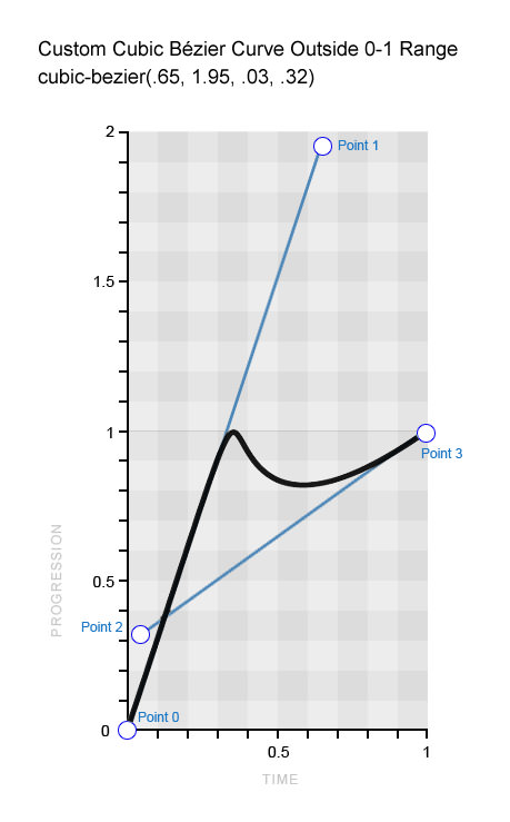
A custom Bézier curve to emulate a bouncing balloon
This example explains particularly well how the curve translates to the resulting animation because it reflects it almost perfectly. First, you can see that the curve travels from the beginning of the progression scale to the end in a straight line, indicating that the balloon travels from the start of the animation to the finish at a constant speed. Then, very similarly to the balloon, the curve bounces off the tip of the scale and goes into reverse before returning steadily and gradually to the top. All quite straightforward really!
Once you’ve mastered the curve and the art of manipulating it to do what you want, you’ve nailed it.
Timing Functions And Keyframe-Based CSS Animation
One final thing to note before moving on (yes, there is more to cover!) is how timing functions behave when applied to CSS keyframe animation. The concepts are all exactly the same as those in the transition examples we’ve been working with so far, but with one exception that is important to be aware of: When you apply a timing function to a set of keyframes, it is executed per keyframe, rather than for the animation as a whole.
To clarify, if you have four keyframes that move a box around four corners of a square, and you apply the “bouncing” timing function that we used in the earlier balloon example, then each of the four movements would experience the bounce, rather than the entire animation. Let’s see this in action and view the code.
See the Pen rscGb by Stephen Greig (@stephengreig) on CodePen.
@keyframes square {
   25% {
      top:200px;
      left:0;
   }

   50% {
      top:200px;
      left:400px;
   }

   75% {
      top:0;
      left:400px;
   }
}

div {
   animation: square 8s infinite cubic-bezier(.65, 1.95, .03, .32);
   top: 0;
   left: 0;
   /* Other styles */
}
Note that if the 100% keyframe isn’t defined, then the element will simply return to its original style, which is the desired result in this case, so defining it is not necessary. It is clearly evident from the demo that the timing function is applied to each of the four keyframes because they each appear to bounce off the walls of the container.
If you need certain keyframes to take on a timing function that is different from the others, then go ahead and apply a separate timing-function value directly to the keyframe, as indicated in the following snippet.
@keyframes square {
   50% {
      top: 200px;
      left: 400px;
      animation-timing-function: ease-in-out;
   }
}
Introducing The steps() Timing Function
Did you think we were done with timing functions? Ha, think again, pal! I told you that there’s a lot more to CSS timing functions than a few predefined easing functions!
For this section, we can swap our curves for straight lines as we explore the concept of “stepping functions,” which are achieved through the steps() timing function.
The steps() function is more of a niche tool, but it’s useful to have in the toolkit nonetheless. It enables you to break up an animation into steps, rather than the usual tweened motion that we’re used to. For example, if we wanted to animate a square moving 400 pixels to the right in four steps over 4 seconds, then the square would jump 100 pixels to the right every second, rather than animating in a continuous motion. Let’s examine the syntax that we’d need for this particular example, which should be an absolute breeze now that we’ve tackled the intricacies of the cubic-bezier() function!
See the Pen Gwbry by Stephen Greig (@stephengreig) on CodePen.
div {
   transition: 4s steps(4);
}

div:target {
   left: 400px;
}
As you can see, it’s a simple matter of stating the number of steps to divide the animation into — but bear in mind that this number must be a positive integer, so no negatives or decimals. However, a second, optional parameter affords us slightly more control, the possible values for which are start and end, the latter being the default value.
transition-timing-function: steps(4, start);
transition-timing-function: steps(4, end);
A value of start would run the animation at the beginning of each step, whereas a value of end would run the animation at the end of each step. Using the previous “moving box” example, the following image does a far better job of explaining the difference between these values.
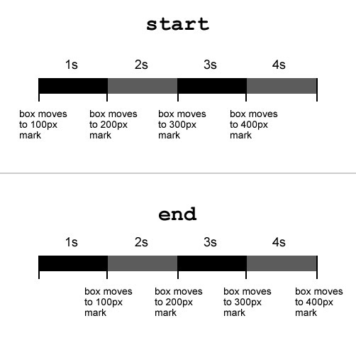
The difference between the start and end values in the steps() function.
You can see that with a value of start, the animation begins as soon as it is triggered, whereas with a value of end, it begins at the end of the first step (in this case, one second after being triggered).
And just to ensure that this overview is truly comprehensive, there are also two predefined keywords for the steps() function: step-start and step-end. The former is equivalent to steps(1, start), and the latter is the same as steps(1, end).
Creative Use Cases For Stepping Functions
OK, so you probably don’t have much of a need to animate a moving box in steps very often, but there are plenty of other cool uses for the steps() function. For example, if you have all of the sprites for a basic cartoon, then you could use this technique to play it through frame by frame, using just a couple of CSS properties! Let’s look at a demo and the code that makes it function.
See the Pen tuvfp by Stephen Greig (@stephengreig) on CodePen.
div {
   width: 125px;
   height: 150px;
   background: url(images/sprite.jpg) left;
   transition: 2s steps(16);
   /* The number of steps = the number of frames in the cartoon */
}

div:target {
   background-position: -2000px 0;
}
First, we have a small rectangular box (125 pixels wide), which has a background image (2000 pixels wide) containing 16 frames side by side. This background image is initially flush with the left edge of the box; so, all we need to do now is move the background image all the way to the left so that all 16 frames pass through the small rectangular window. With a normal animation, the frames would just slide in and out of view as the background image moves leftwards; however, with the steps() function, the background image can move to the left in 16 steps, ensuring that each of the 16 frames snaps in and out of view, as desired. And just like that, you are playing a basic cartoon using just a CSS transition!

This GIF demonstrates the concept of the background image passing through the “window” in steps, so that each frame snaps in and out of view. (Large version)
Another creative use of the steps() function that I’ve found comes courtesy of Lea Verou (who else?), who has come up with a particularly clever typing animation, which I’ll break down for you now.
See the Pen Blbcs by Stephen Greig (@stephengreig) on CodePen.
First, you need some text, and — unfortunately — you need to know exactly how many characters you’re working with because you’ll need to use this number in the CSS. Another requirement is that the font must be monospaced, so that all characters are exactly the same width.
<p>smashingmag</p>

.text {
   width: 6.6em;
   width: 11ch; /* Number of characters */
   border-right: .1em solid;
   font: 5em monospace;
}
The text we’re working with has 11 characters. With the help of the ch CSS unit, we can actually use this figure to define the width of the paragraph, although we should specify a fallback width for browsers that don’t support this unit. The paragraph is then given a solid black border on the right side, which will become the cursor. Now everything is in place; we just need to animate it, which is extremely simple.
Two separate animations are required: one for the cursor and one for the typing. To achieve the former, all we need to do is make the black border blink, which couldn’t be simpler.
@keyframes cursor {
   50% {
     border-color: transparent;
   }
}

.text {
   /* existing styles */
   animation: cursor 1s step-end infinite;
}
As intended, the black border simply switches between black and transparent and then loops continuously. This is where the steps() function is vital because, without it, the cursor would just fade in and out, rather than blink.
Finally, the typing animation is just as simple. All we need to do is reduce the width of the paragraph to zero, before animating it back to full width in 11 steps (the number of characters).
@keyframes typing {
   from {
      width: 0;
   }
}

.text {
   /* existing styles */
   animation: typing 8s steps(11),
              cursor 1s step-end infinite;
}
With this single keyframe in place, the text will reveal itself one letter at a time over 8 seconds, while the black border-right (the cursor) will blink away continuously. The technique is very simple yet extremely effective.
Just to add to this excellent use of the steps() function by Lea Verou, reversing the effect and making the text appear to be deleted is also a cinch. To achieve this, just change the keyframe keyword so that it reads to rather than from, and then add an animation-fill-mode parameter of forwards to the set of animation rules. This will ensure that once the text “deletes” (i.e. when the animation has finished), the text will remain deleted. Look at the demo below to see this in action.
See the Pen LmohC by Stephen Greig (@stephengreig) on CodePen.
The downside to both of the examples featured in this section is that you must know the number of frames or characters beforehand in order to specify the right number of steps, and if this number changes at all, then you will need to alter the code as well. Still, the steps() function has shown its worth here and is another fantastic piece of functionality of the CSS timing function.
The Browser Support Situation
We’ve established that you can’t use a CSS timing function unless the browser supports CSS-based animation — namely, the CSS Transitions and CSS Animation (keyframe-based) modules. Fortunately, support is in pretty great shape these days.
Support For CSS Transitions
| Browser | Prefixed support | Unprefixed support |
| Internet Explorer | N/A | 10+ |
| Firefox | 4+ (-moz-) | 16+ |
| Chrome | 4+ (-webkit-) | 26+ |
| Safari | 3.1+ (-webkit-) | 6.1+ |
| Opera | 10.5+ (-o- prefix) | 12.1+ |
Although all current browser versions have dropped the prefix for transitions (which is awesome), you’d be wise to still include the -webkit- prefix to cater to old mobile browsers. I think the need to include the -moz- and -o- prefixes, however, has passed, as long as you progressively enhance, which you should be doing anyway!
Support For CSS Animation
| Browser | Prefixed support | Unprefixed support |
| Internet Explorer | N/A | 10+ |
| Firefox | 5+ (-moz-) | 16+ |
| Chrome | 4+ (-webkit-) | Not supported |
| Safari | 4+ (-webkit-) | Not Supported |
| Opera | 12 (-o- prefix), 15+ (-webkit- prefix) | 12.1 only (not supported since switch to WebKit) |
Again, for keyframe animations, include only the -webkit- prefix alongside your unprefixed code.
Evidently, browser support for CSS-based animation is in excellent shape, but support is slightly more fragmented when it comes to the nuances of timing functions. The following table explains in more detail.
Support For CSS Timing Functions
| Browser | Basic support | cubic-bezier() outside of 0-1 range | steps() |
| Internet Explorer | 10+ | 10+ | 10+ |
| Firefox | 4+ | 4+ | 4+ |
| Chrome | 4+ | 16+ | 8+ |
| Safari | 3.1+ | 6+ | 5.1+ |
| Opera | 10.5+ | 12.1+ | 12.1+ |
Again, although certain browsers have taken a little longer to support the full range of timing-function capabilities, you can see that support is now universal across current browser versions.
Summary
So, what have we learned about CSS timing functions? Time to recap.
- They define where an animation accelerates and decelerates.
- There is a great deal more to them than just the predefined keywords.
- You can create bounce effects with
cubic-bezier()values outside of the 0–1 range. - You can break an animation into any number of steps, rather than tweened motion.
- Browser support is in fantastic shape and ever improving.
Finally, although these techniques are now supported across the board, this wouldn’t be an article about CSS3 techniques if I didn’t mention progressive enhancement. Always work from the bottom up; that is to say, ensure that your work is acceptable and accessible on devices and browsers that can’t deal with this functionality before enhancing for browsers that can cope with them.
Other than that, go wild! Happy curving and stepping!
Other Resources
- “Cubic Bézier,” Lea Verou A playground for creating and comparing Bézier curves
- “Timing Functions,” Mozilla Developer Network A more technical overview of Bézier curves.
- “Bézier Curves,” Wikipedia More information
Further Reading
- 53 CSS-Techniques You Couldn’t Live Without
- An Introduction To CSS3 Keyframe Animations
- The Guide To CSS Animation: Principles and Examples
- Level Up Your CSS Skills With The :has() Selector


 Agent Ready is the new Headless
 SurveyJS: White-Label Survey Solution for Your JS App


