Hands On The Sigmund Freud Typeface: Making A Font For Your Shrink
Handwritten text shows a personal side of its author, a side that is not easy to put into words and that contrasts with the standardized look of digital communication. This contrast and “aura” is perhaps what makes handwriting fonts so popular.
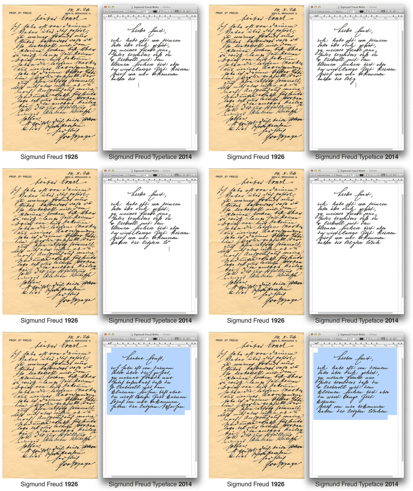
Over the past four years, I’ve completed three typefaces inspired by handwriting. I started with the digitization of Albert Einstein’s handwriting and continued with Conspired Lovers, a font based on my own love-letter writing. In 2013, I ran a Kickstarter campaign to fund the creation of a font based on Sigmund Freud’s handwriting. The public interest in the project was overwhelming, and the Sigmund Freud typeface became the first typeface to be reviewed in the Wall Street Journal:
As a typographer, I love handwriting, and in this article I’d like to share a hands-on overview of my creation process of creating a handwriting font inspired by the Sigmund Freud typeface, assuming that you’re familiar with illustration software or font-creation software or both.
Freudian Zombies
I am aware that the prospect of creating a typeface based on Einstein or Freud’s handwriting introduces a lot of questions — specifically, issues of authorship and authority, originality, copyright, personality and identity. I never thought I’d find myself in an archive in Vienna, wearing white gloves, confronted by the relics of a great thinker.
To me, “relic” was a religious term. Suddenly, the idea of resurrecting Freud’s handwriting raised questions about the death of the author, and the religious dimension came in through the back door. Would this font be a Freudian zombie or vampire? Despite these interesting questions, I am going to focus on technical and aesthetic aspects in this article, but if you have a thought to share, I would love to hear it in the comments.
Now, let’s get typographical.
How Can A Font Look Like Handwriting?
Fonts are very different from handwriting. One letter connects to the next in handwriting, but not in a regular typeface. When I type the word “look” in a regular font, the two “o”s look the same. Handwriting has a vivid character because you never write the same letter twice.

In a handwriting font, the letters do two things:
- connect organically;
- vary so that the same two “o”s never appear next to each other.
A font can be programmed to render alternates during writing. Two different “o”s have to be drawn and stored in the font’s memory. In the next step, the font is programmed to replace the second “o” with the alternate “o”. I will focus on creating digital drawings of connecting letters and how to turn them into a font, rather than the creative possibilities of OpenType programming. At the end of this article, I will briefly introduce my thoughts on manipulating the appearance of type through code.
I’ll be working with Adobe Illustrator and FontLab, but the principles apply to any vector-drawing or font-creation software. You’ll find a list of such software at the end of this article.
Now, before we start working with famous people…
- Legal issues, personal rights, licensing and clearance. Whether a person is living or dead, famous or not, their name and handwriting are protected. If you plan to reference another person’s hand in your design, make sure to clear the rights beforehand. Before working with Sigmund Freud’s letters, I contacted the Freud Museum in London and the Sigmund Freud Museum in Vienna, asking for written permission to create an artistic yet commercial product based on Freud’s writing. The easiest way to avoid problems is to start with your own handwriting: You already own the copyright.
- Where to find manuscripts? Most online archives offer only transcripts of written letters, focusing on the content rather than form. A good place to start is the Psychoanalytic Document Database. Some handwritten letters are available on it as high-resolution PDFs. The Einstein Archives Online offers scans of all documents, but not for downloading. Vincent van Gogh: The Letters offers transcripts and even translations of all letters. If you know of other good archives, please link to them in the comments.
1. Inspecting The Letters
1.1. Collecting
I went through hundreds of Freud’s letters and intuitively compiled the documents in a way that appeals to me. You could organize it according to the quality of the handwriting, as well as distinctive qualities, such as a special uppercase letter or number.
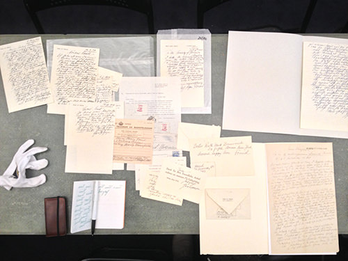
Inspecting the letters in the Sigmund Freud Museum. (Large preview)
1.2. Copy
"Copy, copy, copy, copy what you love. And at the end of copying, you will find yourself." – Yōji Yamamoto
One technique to become familiar with the hand of a writer is to copy characteristic letters, letter combinations and words. Learning the movement that a writer made to create a letter is essential to creating its digital counterpart. I keep these exercises in a little notebook. The sketches do not go into the final design but are an important step in understanding the script.
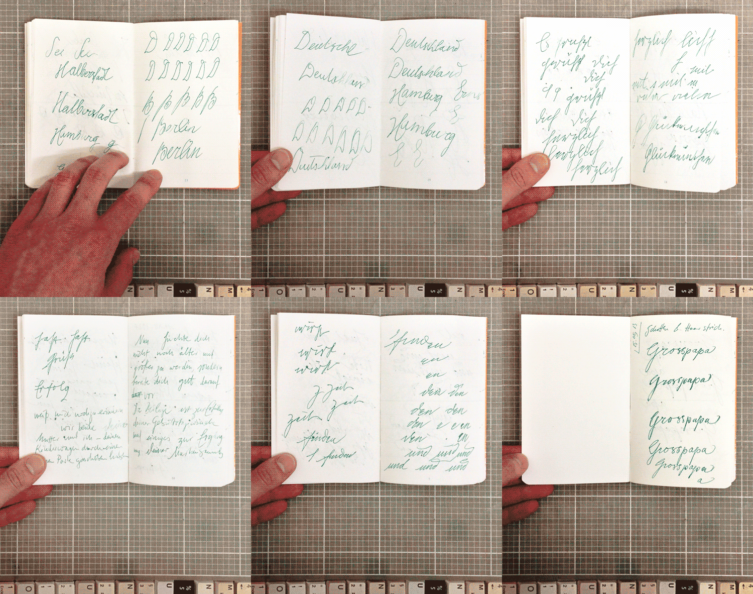
My notebook with studies of Freud’s handwriting.
Don’t be surprised if studying how another writer makes the bow of an “l” or the slope of a “g” also affects your own handwriting. Suddenly, I found myself writing my grocery lists with Freudian loops and hoops.
A cinematic example of this process of copying movement or, as Criterion calls it, “Identity Theft” can be found in René Clément’s “Purple Noon”, starring Alain Delon (Note: four minutes of film, without one spoken word).
1.3. Select
From the collection, I chose eight sample letters as a starting point for the typeface. The specimens were representative of different time periods, ranging from the 1880s to the late 1930s, and different purposes, ranging from scientific reports to personal letters and notes. This variety gave me an overview of how Freud’s writing changed over the years and according to formal and informal occasions.
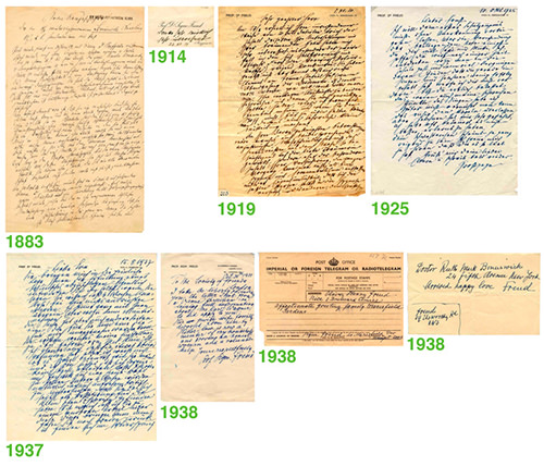
Eight specimen spanning from 1883 to 1937. (Large preview)
1.4. Focus
The next step was to look further for details and find documents to focus on. I marked exceptional letters on prints of the manuscripts, which I kept in a binder.
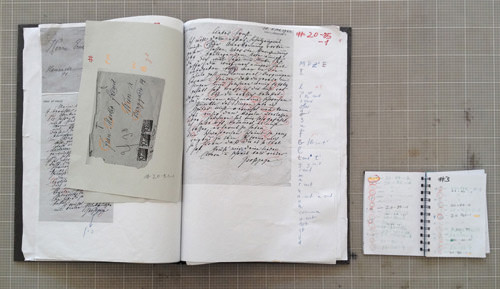
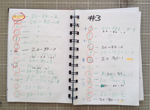
To keep track of the markings, I noted the particular letter and its file name and page number in another notebook.
I ended up with two documents to focus on: a letter from Freud to his grandson in 1925, and a letter from 1919 containing English and German text.
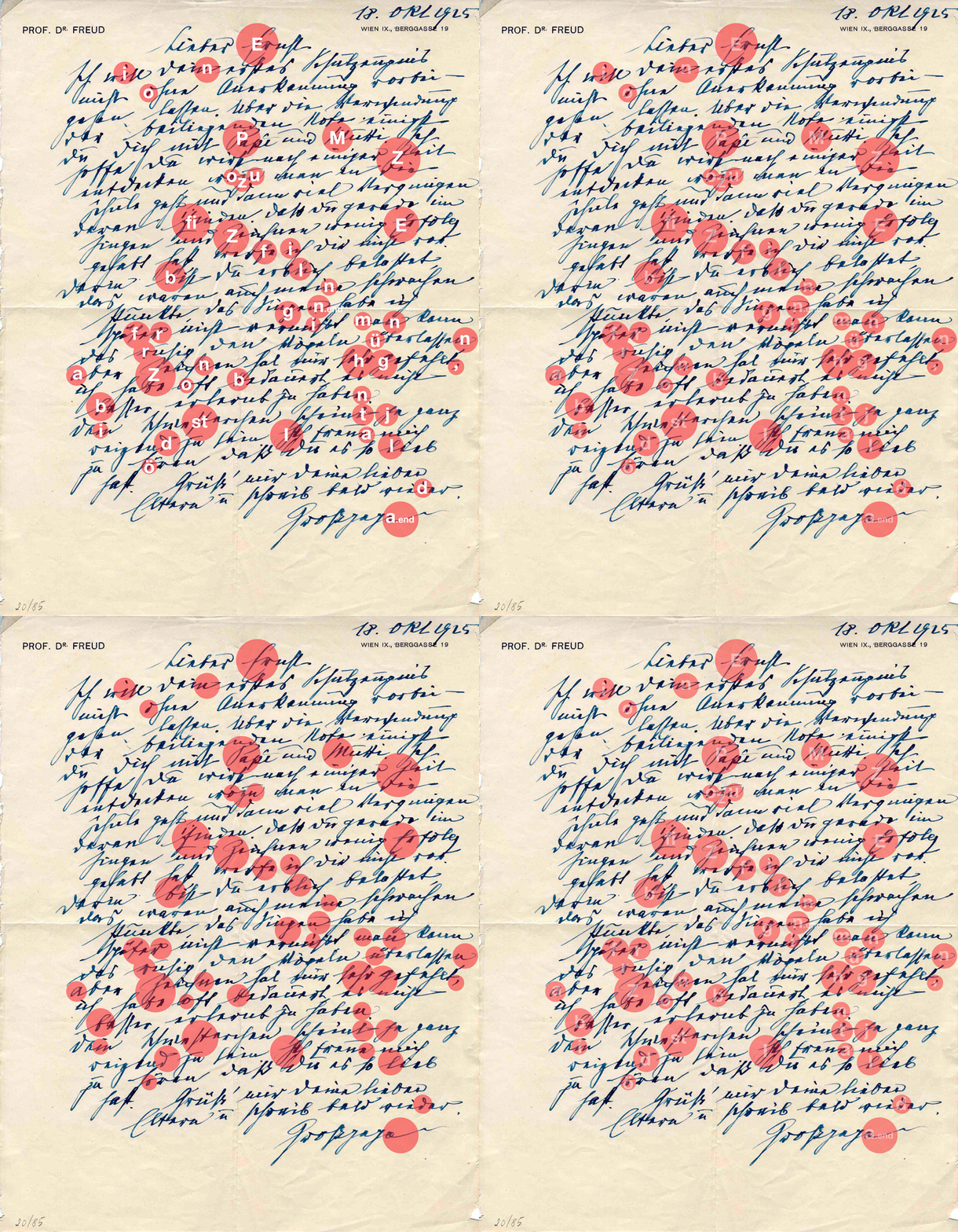
The letter to his grandson was full of beautiful letterforms.
The combination of German and English is important because until the late 1950s, the custom throughout German-speaking countries was to practice a German script called Kurrent. This form of handwriting was used only to write German; every other language (such as Latin, English and French) was written in a cursive still readable today. This passage was an important reference because I wanted to create a typeface that is true to the original but also readable today.
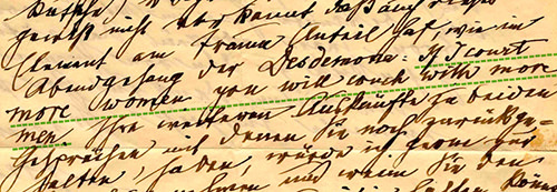
An excerpt from Freud’s letter of 1919, mixing German and English, reading “If I court more woman, you will couch with more men.” (Large preview)
2. The ABCs, Letter By Letter
Size matters. Digital type scales to any size, whereas handwriting exists only at a particular size. The size of one’s handwriting varies little from day to day and depends on the tool and surface being used. This is key to the digitalization process. If you are gathering scans and images, matching all DPI settings to the dimensions of the original scanned document is critical. So, an image file that is 1000 × 1000 pixels, scanned from a piece of paper that is 1 × 1 inch, should be set to 1000 DPI.
2.1. Preparing Illustrator
Before importing the material, we have to set up the Illustrator file. We’ll create a PostScript font, which stores letters (i.e. glyphs) on a 1000 × 1000 grid. Later we will copy the drawings to this format. To make the conversion accurate, select Illustrator → Preferences → Units, and set the file-size unit from millimeters or inches to points. Double-click the Artboard tool, and set the canvas’ size to 1000 × 1000 points.
2.1.1 Layers
We’ll work with four layers:
- Guides A layer to place guides that mark, for example, the baseline on which all letters will sit, the height at which letters connect, etc.
- Angle A layer with mobile guides regarding the angles used in handwriting
- Drawing Where the drawing happens
- Template A layer to place our handwritten originals
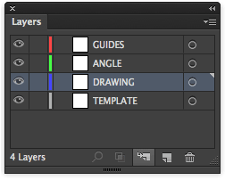
Our Layers panel in Illustrator.
2.2. Adjust The Templates
I’ll place the scanned documents on the template layer. Scale the letter that you’re working with (“e” in the screenshot below ) until the glyph comfortably fills the workspace.
Keep in mind that some letters, including “g,” “p” and “j,” have long ascenders and that some uppercase letters have wide swashes. Leave some extra room for them.
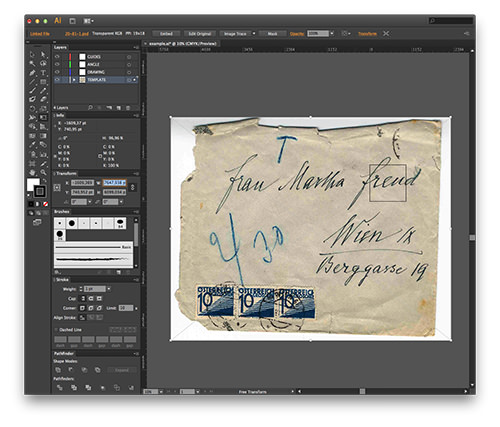
Positioning the template in Illustrator. (Large preview)
Tip (optional): If you’re working with more than one template, instead of individually scaling each template, just adjust the DPI of the template itself.
Now that we’ve positioned and sized the template, copy the size of the scaled document (in this case, we’ve scaled the envelop to 7647,938 points wide). Open the document in Photoshop. Select the menu item Image → Image Size. Adjust the picture’s width to 7647,938 points, and uncheck “Resample Image.” This way, the document’s DPI value will be adjusted accordingly — in this case, to about 19 DPI.
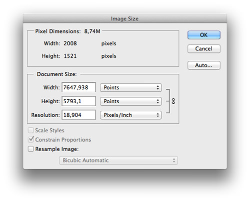
Adjusting the DPI in Photoshop. (Large preview)
Adjust all of your templates so that all of your documents will appear in the correct size as you place them on the template layer. (If your templates were scanned with varying DPI values, insert some math here.)
2.3. Guides
I work with three guides: the baseline, the x-height guide and the connecting-height guide.
The letter sits on the baseline. It’s like the line that one writes on in a notebook. The x-height marks the average height of lowercase letters. The connecting height marks the height at which the letters connect.
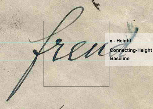
The guides in the Illustrator template.
2.4. Finding The Right Angle
Every writer has their own angle at which one letter connects to the next. Not all letters connect at the same angle, but you will find that an average exists. Compare a few words and find that sweet spot that matches most letters. The guides in the angle layer represent the average angle at which most letters connect. Not all letters will have the same width, so move these left and right to match the width of each letter.
Placing the guides on the angle layer.
2.5. Finally, Drawing
Lock the template, guides and angle layers, and activate the drawing layer. Select the Brush tool and reset all settings (i.e. 1-point width, no shape, etc.). Because I had practiced the movements and rhythm in my notebook, the forms of the letters are familiar to me. Now, let’s draw.
I am fascinated by how good people can draw with a mouse. I can only draw with a pen, which is why I recommend using a graphic tablet for digitizing.
Drawing letters on a graphics tablet with a screen.
The position of the line should be centered to the letterform and should represent the movement of the pen, not the outline of the letterform.
With the Direct Selection tool, adjust the position and Bézier handles of each point until you are satisfied.
2.6. Max Width And Min Width
Before using the Width tool to expand the stroke, we have to determine three width values:
- maximum width,
- minimal width,
- connection-point width (i.e. the part where the letters join).
The handwriting in our example was written with a fountain pen. A traditional nib makes thick strokes when moved downward with pressure and thin lines when moved upwards without pressure. I look for downstrokes to determine the maximum thickness. The minimum width can be found by looking at upstrokes.
In this example, the minimal and connecting width is 18 points, and the maximal width is 39 points.
2.7. Forming The Line
Select the line and adjust the stroke’s width to the minimal width, also setting the stroke cap to “round” and the corner to “round join.”
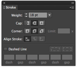
Adjusting the stroke’s width.
Using the Width tool, expand the line to the desired form.
Tip: Reducing opacity makes it easier to adjust the stroke’s width to the template.
Working with the Width tool.
Double-click a width’s point to adjust its values precisely.
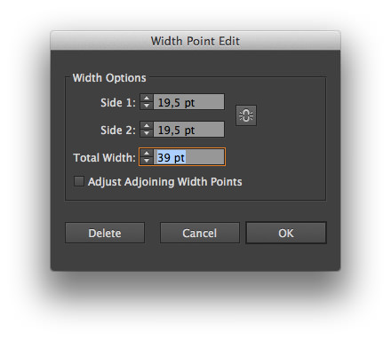
The dialog to edit a width’s point.
The writing in different documents will sometimes appear thicker or thinner than the defined range of the maximal and minimal width. Keep calm and carry on: Stick to the defined values. The width is not entirely controlled by the writer, but also depends on the nib, the ink’s flow and the paper. But a writer can’t deviate from his unique movement patterns.
Even if the forms of individual letters look whimsical, they have been whimsically formed by that particular writer. Capturing this originality, rather than the “scanned” form, is important.
2.8. Setting Up FontLab
Create a new project in FontLab. At the bottom of the font window, select a code page: Type 1 Basic → ISO 8859 - 1 Latin 1 (Western).
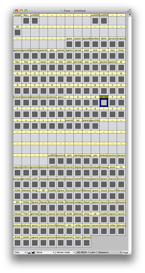
The font window in FontLab. (Large preview)
Double-click the prepared letter to create the glyph. Double-click again to open the glyph window.
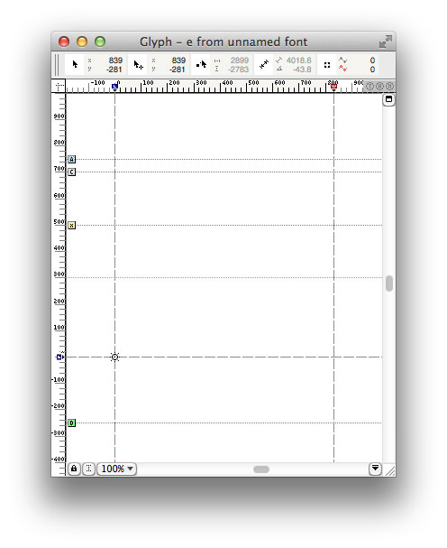
The glyph window in FontLab.
2.9. Copy And Paste
Let’s go back to Illustrator and prepare the drawing that will be used as a Glyph.
Here is the conventional way:
- Duplicate the object that you have just created.
- Select the path, and execute
Object → Expand Appearance. - Open
Window → Pathfinder, and click “Unite.” - Cut the expanded drawing to the clipboard.
- Switch to FontLab, and paste in the drawing.
And the unconventional way:
- Copy the drawing to the clipboard.
- Switch to FontLab and paste in the drawing.
- In FontLab, select
Contour → Transform → Merge Contours.
Surprisingly, the unconventional way can lead to a better rendering in FontLab. Why? Illustrator works with decimal coordinates (like x=111,95438 y=-90,451), whereas FontLab only supports integer coordinates. The coordinates we’ve copied would convert to x=112 y=-90.
Copying and pasting is never just copying and pasting — it is an interpretation. Drawings that look smooth in Illustrator can end up looking bumpy. Copying the line with the width data probably triggers a different algorithm in FontLab, leading to a better result. In case you run into trouble here, you now have an idea of where it might come from.
2.10. Bringing It Together
Making a joined script has a huge advantage over making disconnected fonts: no kerning. Kerning is the art of adjusting the space between all possible letter combinations. The drawback of a joined script, however, is that all letters have to join.
When you write with your hand, the letters will naturally join. In the following steps, we’ll prepare the form to connect seamlessly with all letters.
After pasting the letter, place it on the solid baseline (y=0):
Pull a horizontal guide out of the rulers at the height where the glyphs connect. Right-click on the guide and select “Convert to Global.” The guide will turn from blue to red and will now be fixed in all future glyph windows.
The next step has to do with overlapping. Move the letter a bit beyond the dashed line on the left. The dashed line marks the left 0 position of the glyph. Placing the letter beyond that line ensures that other letters will join seamlessly from the left. Now, let’s pull the dashed line on the right over the letter a bit to make the joints seamless on the right.
2.11. Our First Letter Is Ready. Let’s Make It A Font!
Before simply exporting the font, we have to fill out some lengthy and technical forms, which is a good time to introduce you to FontLab’s Diamonds. Open the the Font Info dialog at File → Font Info.
All of the important information regarding the font is shown in this window. In the first dialog, enter a name and click the green diamond; magically, all mandatory fields will be filled in with the necessary information. Head to the next page by clicking the right arrow. Again, click the diamond and continue until you reach the first page again. Only press the diamonds; never enter any information that you do not understand. You will find extensive information about all of these details in the User’s Manual (ZIP’ed PDF).
After you are done with the Font Info dialog, close it with “OK.”
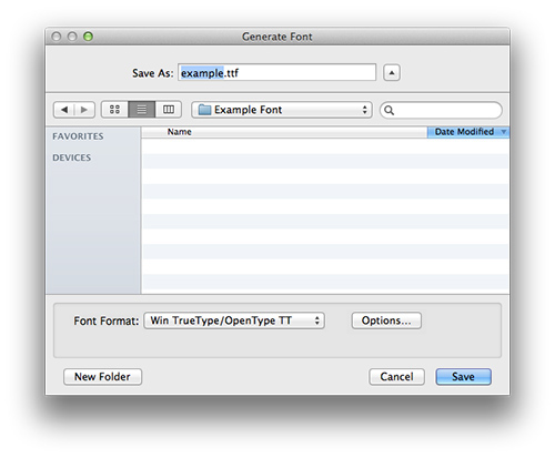
To export the font, select File → Generate Font.
Win TrueType/OpenType TT is the preselected output format. For now, I recommend using this format because it is easier to handle and outputs fewer errors.
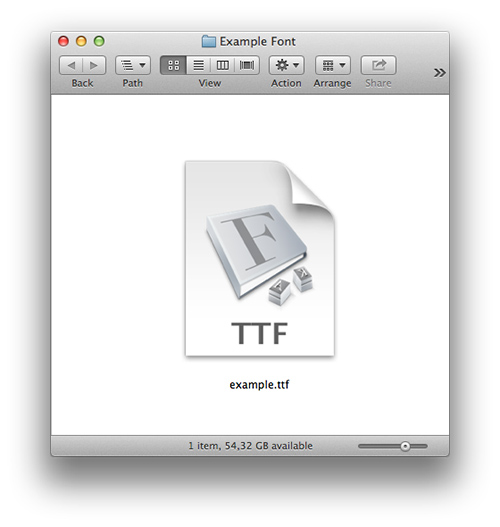
Congrats! Here it is, your font! Double-click to install.
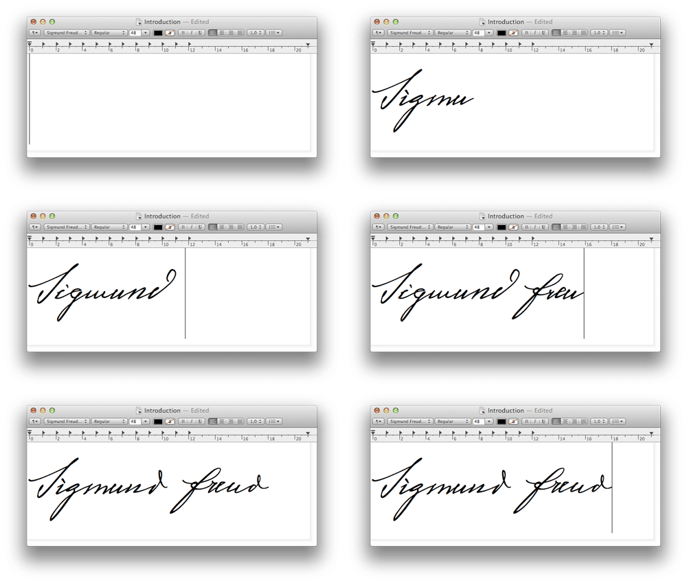
After installing the font, you can select it under the given name in your font menu. For example, in TextEdit:
Now, continue to draw all letters from a to z and A to Z, as well as punctuation, numbers, diacritics, dingbats, etc. You’re halfway there.
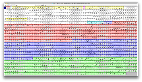
Overview of all 1467 glyphs in the Sigmund Freud Pro typeface. (Large preview)
2.12 What Is Freud’s Take On The @ Sign?
By now, you are probably asking yourself how to deal with missing glyphs. Freud probably never drew an “@” sign in his life or the letter combination “www.”
In the beginning of this article, I emphasized the movement of creating a letter, rather than the form of a letter. Once I get a feel for the way a writer moves to write a loop or a hoop, I can improvise with that knowledge. You, the artist, have to fill in the gaps by improvising based on what you’ve learned.
To dance means to move to a model in your head — is a possible conclusion to the research of Neuroscientists studies about beat perception and synchronization. They’ve also found that only humans, a few birds, whales and probably elephants are able to move to a model in their heads. (Sorry, apes are playful but do not dance.) This act of moving to a model in one’s head is an interpretation. The more intensely one studies and internalizes the movements that a writer made to draw letters in their manuscripts, the more profound this interpretation will be.
2.13 Tip For InDesign Users: Rapid Testing
Depending on the complexity of your typeface, you will export the font hundreds or thousands of times to test it outside of your development environment. If you are an InDesign user, here’s a tip on how to speed up testing.
In the “Export” dialog, navigate to the InDesign application folder. There you will find a folder named Fonts. Export into this folder, and Indesign will instantly make the font available to you. As soon as you overwrite the font file with a new version, InDesign will update all open documents, and you can observe the change immediately on screen. This only works in InDesign.
2.14 What Is The Right Size For A Handwriting Font?
Looking at your own handwriting, you will find that it is always about the same size. Digital type, however, can be reproduced at any size, from fine print to a billboard lettering.
If it’s a print project and you’d like to give the rendered text a natural look, I would suggest finding the size of the original handwriting. And how does one find this original size?
Open a new document in Illustrator (letter or A4 size), and place a template with the original DPI setting in the background. Input the opening lines of text in the newly created typeface on top of the template. Modify the size until the text aligns with the template.
The size of written text will vary from sample to sample, and the size of a digital handwriting font is a range, rather than fixed. The size that renders Sigmund Freud’s handwriting correctly is between 18 and 24 points. The same rules apply to line-height settings.
Conclusion
I hope you’ve found this to be a helpful introduction to creating handwriting fonts. Creating a typeface in a day is possible, but usually it takes months or even years to finish all of the glyphs and for testing and production. When one writes by hand, every letter is a little different. At the beginning of this article, I mentioned the possibility of altering the appearance of type through code. In my opinion, this is a necessity for contemporary handwriting fonts.
A font can be programmed to render alternates during writing. Two different “o”s have to be drawn and stored in the font’s memory. Then, you would program the font to replace a second “o” with the alternate “o.”
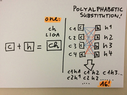
With the Kickstarter funding, I was able to make the Sigmund Freud typeface the first handwriting font that holds four separate lowercase alphabets, and programmed the font to continuously alternate between the four glyphs. With every key pushed by the writer, the sequence of letters will alter to create a unique look.
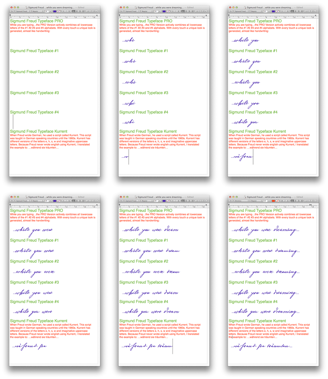
Overview of the Sigmund Freud typeface.
I refer to this alternating mechanism as polyalphabetic substitution — “polyalphabetic” because it includes multiple alphabets, and “substitution” because the letters are being replaced.
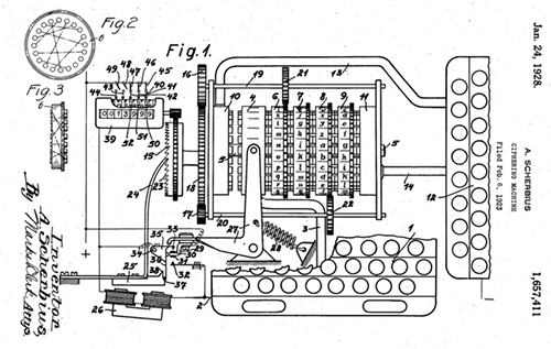
If you are familiar with encryption, you might think of a polyalphabetic cipher. Indeed, what happens in the font is inspired by the encryption of the Enigma machine, which used a combination of rotating barrels to encrypt a message.
My intention is not to encode the message, but to hide its computerized origin. Of course, this hiding does not make the rendered result more human; it is an obvious matter of hide and seek.
Original and digital side by side.
The loss of the art of handwriting is an ongoing discussion among typographers and enthusiasts of the written word, a discussion that could easily be mistaken as an attack on increasingly inhuman technology. Fonts cannot make up for the cultural value of handwriting, but I do hope that this project enriches written communication and shifts the focus of typography-related discussions from loss to the creative possibilities of new technology.
In the beginning, I quoted Japanese fashion designer Yōji Yamamoto. Fashion and typography are an interesting pair. One can look at words as if they wear a typeface, just like humans wear clothes. The word is not the typeface, and we are not the clothes we wear. Type designers are often confronted by the question, “Don’t we already have…
Looking at the 2014-2015 fashion runway, staged between supermarket shelves (great music, by the way — I hope they use that soundtrack in my supermarket soon), the obvious question springs to mind, “Don’t we already have enough clothes?”
The clothes we wear and the type we use do not have to express personality, but rather indicate our circumstances. We can have a wide or narrow range of brands to choose from. Some people know how to fabricate their own clothes. Fabric is, by definition, material. Writing, meanwhile, has been digitized to a great extent. My own written communication is almost completely digital.
The Future Of Writing: A Lifetime In Fonts
This digitized circumstance can be an opportunity and a space for future cultural development. When I think of the future of written communication, it would be wonderful if everybody had his own font and could continually refine the appearance of his/her own digital personal typeface. In elementary school children would learn how to draw their own typeface, and over years one builds, develops, adapts and extends the design to ones needs and…
If we think of a typeface being continually refined and designed over a lifetime, would this make up for the cultural value of handwriting? I would love to hear your thoughts on this.
Are you interested in learning more about the creative possibilities of coding fonts, ligatures, contextual alternates, polyalphabetic glyph substitution or the future of personal fonts? Write a comment below, and let me know what you’re interested in.
You can support the author by getting the Sigmund Freud typeface on his website. Also, thanks again to the Sigmund Freud Museum in Vienna who kindly provided Harald with the digital images of Freud’s manuscripts for this project. — Ed.
Related Resources
FontLab
FontLab Studio is the industry standard for font creation. A free trial is available.
Glyphs
The software most talked about (but only for Mac OS 10.6 to 10.9) is Berlin-based Glyphs. A free trial, an extensive manual, tutorials and a video demonstration are available, too. Glyphs has a much more modern look and feel than FontLab. The quick responses to feature requests and regular updates are making more and more designers switch to Glyphs. The app has a presence on Twitter, too.
Prototypo
This intriguing Kickstarter campaign by Yannick Mathey and Louis-Rémi Babé gives us a glimpse of a possible future of tools for designing type. According to the founders:
"Prototypo is an open-source online application that allows to control the design of a complete typeface using sliders, and refine spacing and outlines manually. Hobbyists and professionals alike can use twenty-plus parameters to create a wide range of fonts. We’re building our own language on top of SVG and JS. The syntax is still in its infancy, but the idea is that a glyph is made from a list of segments and components. Those are made of points whose coordinates are calculated using the parameters manipulated by the users and the drawing of Genèse as a reference. In the future, we might explore alternative ways of drawing glyphs, such as a skeleton based approach."
FontForge
FontForge is a free and powerful font editor. Its developers describe it as:
"An outline font editor that lets you create your own postscript, truetype, opentype, cid-keyed, multi-master, cff, svg and bitmap (bdf, FON, NFNT) fonts, or edit existing ones. Also lets you convert one format to another. FontForge has support for many macintosh font formats. FontForge’s user interface has been localized for: (English), Russian, Japanese, French, Italian, Spanish, Vietnamese, Greek, Simplified & Traditional Chinese, German, Polish, Ukrainian and Catalan."
This software is available only as a source package, not a binary package. If you know how to handle that, then try it out (and check out the video tutorial).
Inkscape
According to Kay Hall’s video, creating a font with the open-source vector-graphics editor Inkscape is also possible.
FontArk
An online editor for fonts also exists. FontArk is currently in beta and free to try. Check out the introductory video. It is described as:
"A professional browser-based font editor under development, featuring the most versatile real-time multiple glyph editing system, with the mission of making type design faster and easier than ever. No download, No installation, Any OS."
iFont
Yes, font-creation software for the iPad exists, too. And yes, I recommend it. iFont is fun, as the video demo shows.
Typophile
Typophile is a good forum for all type-related questions.
Further Reading
- Reviving A Historic Typeface
- Hands-On Experience: The Rehabilitation Of The Script
- Beautiful Handwriting, Lettering And Calligraphy
- Weird And Wonderful Typography – Yet Still Illegible


 Agent Ready is the new Headless
 SurveyJS: White-Label Survey Solution for Your JS App


