How Limitations Led To My Biggest App Store Success and Failure
Look at your calendar. If you’re anything like me, all you see are meetings, places to go, things to do, people to meet and not a lot of white space. Few people love their calendar. So, my team and I set out to change that, and we learned a lot in the process.
The app itself has been around since 2011, but the story of how it came to be and what our team ultimately learned is one that I have been wanting to tell for quite some time. It’s the story of how limitations led to my biggest success in the App Store — and my biggest failure.
Embracing Limitations
At its core, the app (called “Free Time”) is all about exactly that, free time. But, as most software projects tend to go, while it was conceived in simplicity (answering the question, “When am I free?”), Free Time came into the world with a few more features than expected and a lot more complexity.
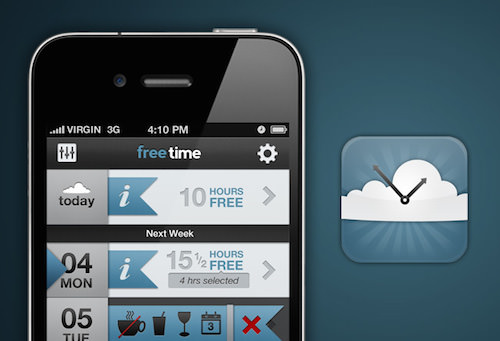
We were in college when I came up with the idea. I was bouncing back and forth between classes, alternating schedules from one day to the next, and trying to find time to get together with my friends. In 2010, more than a few companies were trying to solve the same scheduling problem (Tungle.me, Doodle, When Is Good, Scheduly, etc.). Everyone was grappling with the same fundamental issue: When are people free and how do we get them together?
Most of those companies spent or continue to spend millions of dollars building complex infrastructure to support in-the-cloud calendar scraping and mutual time resolution (i.e. figuring out when two people, in potentially different time zones, are both available). It sounds simple but it really isn’t, and thankfully we didn’t know that.
This brings me to my first major takeaway: Embrace your limitations. At the time, our limitations seemed significant:
- We didn’t have any funding.
- We didn’t know how to build a server.
- We had no idea how complex calendars and time-based calculations were.
- We had never sold an app in the App Store.
Limitations can be tricky, but they can also hold hidden benefits. I couldn’t pay anyone, so my friend and designer Houston learned to design for mobile; my freshman roommate, Nathan, learned about calendrical calculations and C++; and I learned Objective-C. We were scrappy and bootstrapped, but we made it work.
Because the three of us didn’t have any money and we didn’t know how to build a server, we built everything within the app (even the mutual time resolution), and we launched a product that is infinitely scaleable and that, to this day, has no inherent costs other than Apple’s annual developer fee. Not many app developers in this day of hyper-connectivity can make this claim.
Because we had no idea how complex calendars are, we actually thought this app was going to be a walk in the park. It wasn’t, but if we had known the ins and outs and complexities of time, I have no doubt we wouldn’t even have started.
So, if you’re feeling limited or constrained, don’t. Limitations can make a big difference and could ultimately lead to your most creative moments.
37signals likes to think of constraints differently:
"Constraints are often advantages in disguise. Forget about venture capital, long release cycles, and quick hires. Instead, work with what you have."
The Launch
We launched roughly eight months after we started building the app. It was nights and weekends mostly for the three of us, but we finished it, put it up in the store and breathed a momentary sigh of release.
The Calm Before The Storm
We were in review for seven long painful days. I had submitted a few small apps before, so I knew the drill, but this time the wait was excruciatingly long. On the seventh day (coincidentally, the same day we were graduating from college), I got a push notification from iTunes Connect: Free Time had been approved and was in the App Store. There was a lot of high-fiving and celebration; we told our friends to download the app, and we posted about it on Facebook and Twitter. At the time, we didn’t really have a marketing plan; we had talked to a few people but hadn’t really drummed up a lot of interest thus far. As far as we were concerned, graduating from college and launching an app was plenty for one week.
We graduated on a Thursday, and by Friday three hundred people had downloaded the app. We were blown away and went to sleep that night convinced that this was a first-day fluke and that no one else would find it. The next day, the same thing happened, another three hundred people. This kept up until Apple featured it as a “New and Noteworthy” app one week after it hit the store.
Being featured in the App Store is like throwing gasoline on a fire. It set off an explosion of downloads, support emails (both positive and negative), media requests, etc. It was one of the most exciting and terrifying experiences: packing up our belongings, thinking about “the real world,” and getting emails from people in Qatar who were using the app and finding a lot of bugs.
The next few weeks were chaotic as we pushed out new updates, responded to media inquiries and tried to figure out what had just happened.
The Results
Eventually, things quieted down. We kept pushing out updates to address user concerns, and a few years later, here we are. I like when developers share numbers, so here are some fun ones from Free Time:
- Downloads. To date, more than 200,000 people have downloaded the app. Other than our website and social pages, we haven’t done any marketing.
- Countries. The app has been used in more than 150 countries around the world (and we still only support English). Surprisingly, the US accounts for only 48% of all revenue and 35% of users.
- Time spent. Since we started tracking anonymous session usage two months after launching, users of Free Time have spent a combined two years using the app — a little ironic considering that it’s all about saving people time.
- Accolades. The app has been written about and profiled by CNN, ReadWriteWeb, Lifehacker and AppAdvice and has been featured by Apple a handful of times.
- Money. The app was free when we started out, which is part of the reason why it was downloaded so much. Even so, through in-app purchase and eventually a paid model, revenue from Free Time has paid for a cup of coffee for the three of us every day for the past three years — certainly not enough to sustain any of us, but something to be proud of nonetheless. In addition to revenue, our work on Free Time helped each of us find a job that pays the bills.
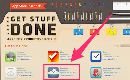
So, we did a few things right, but I’d rather tell you about what we did wrong, and what we learned in the process.
Throughout the process of building the app, launching it in the App Store and dealing with the onslaught of users (and complaints) from across the world, we learned a great deal about the shortcomings of the app and about the reality of the way people think about their apps and their calendars.
1. Changing Perspectives And Letting People See Between The Lines Is A Great Way To Stand Out
When we started prototyping the app, we built it to be a really fast way to dispatch an email to a friend or colleague who wants to know your availability on a particular day. That was it, nothing more. To enable this behavior, the time between your events became a button that you could tap to share. That actually ended up inverting the weight of the calendar’s UI and placing more importance on the inverse (the free time).
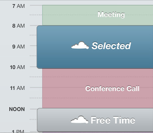
By inverting what was traditionally expected of a calendar UI, we stuck out, and every time we showed off the app, we got the same response: “That’s really neat and makes a lot of sense.” To be honest, we stumbled upon it, but that changed perspective enabled us to see something we all knew in a new and interesting way. As a result, we garnered a lot of attention with a relatively simple change to something that everyone takes for granted.
Drew Olanoff of The Next Web said:
"Free Time will completely change the way you look at your calendar."
Apps don’t need to be new and novel ideas, and they don’t have to create an industry out of thin air. The way to build a great app is to focus on something simple, even something that everyone takes for granted, and then make it better. The transportation app Uber is novel and unique for a lot of reasons, but at the end of the day it’s just a better way to hail a cab. All that the developers did was change people’s perspective and make something better.
2. Get Ready To Iterate
Initially, we designed and redesigned the app more times than our designer Houston would have liked. When building your own app, learn to embrace this, because iteration and refinement are key ingredients of a successful app.
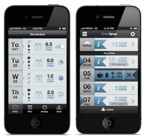
Don’t be afraid to start in one place and end up somewhere completely different. With each iteration, we tried to incorporate new learning and new feedback. By getting a rough proof of concept out to beta testers early, we were able to identify some key flaws in our presentation and concepts.
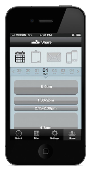
Our First Notion Of Sharing
In our early iterations, sharing was a separate activity, and since we had started with a tabbed architecture, putting sharing in its own tab made sense. Through early beta testing, we quickly realized that you mustn’t let a user act on their day without the context of what is happening on that particular day. The view we started with only showed availability, but without the surrounding events, our testers were confused and unable to correlate their availability with the calendar.
A New Inline Approach
This second iteration not only adopted a new color scheme to provide better contrast between free time and busy time, but also incorporated free time right on top of the regular calendar.
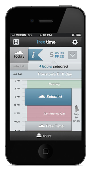
This improved context, and it gave users the information they needed to act on their free time without having to change tabs and switch context. It also enabled users to see their calendar in a new way and gave many the value they were looking for even if they didn’t want to act on that free time.
The Final Product
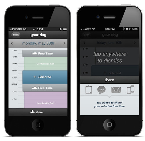
In our final iteration, we increased the calendar space to show as many events as possible. We also made sharing a modal activity that users could toggle from any screen. By focusing more on the calendar’s UI, we were able to incorporate the notion of selectable free time right inline and in a way that would be comfortable for users who are familiar with Apple’s Calendar app.
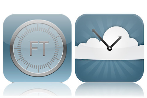
But iteration never stops. Now that we were done with the app, we had to update the icon.
3. Iterate Doesn’t Mean “Add More”
We also failed to realize in our iterations that we could have (and should have) removed features and functionality that our testers found less compelling. We never identified a minimum viable product. Ultimately, we focused our iterations on evolving the product, when we should have spent time refining the core value proposition, “When am I free?” This led to an inevitable bloat of features, which diluted the product and ultimately required us to create a lengthy user walkthrough that explained the nuances of the app and what it does. The walkthrough was six screens, and when we launched we forgot to include a “Skip” button (a big mistake).
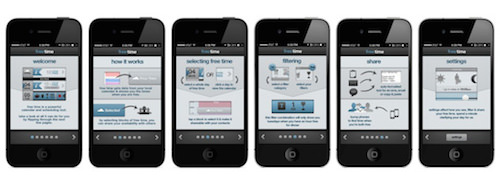
In the last year, only 42% of new users made it through this initial walkthrough on first opening the app. All of these users had consciously decided to purchase the app and waited for it to download and install; so, this walkthrough is disastrous in its conversion numbers.
Holding back when you’re passionate about something is extremely hard, but it is equally important to recognize that a lack of functionality (more favorably referred to as simplicity) is as impressive as breadth of functionality. While our initial concept was to enable users to focus on the free time in their day, we ended up launching with the following features:
- People could see their availability on top of their calendar.
- A quick filtering tool enabled people to use custom availability searches to find free time during particular meals, days and durations. To support this, we allowed users to specify the time of each of their meals.
- Users could specify work hours, in addition to their waking hours, in order to narrow down their free time.
- People could change the calendars that affected their Free Time.
- People could specify the lengths of the blocks of time that were displayed, and we built complex algorithms to determine how to split up particular blocks of time to fit user preferences.
- People could see a quick view of their availability for any given meal.
- People could search for free time during particular time ranges, on particular days, during particular meals and for specific durations.
- People could share their free time by dispatching an email, copying it to their clipboard, composing an SMS-specific version with shortened text and — yes — bumping phones (that was a thing then).
- Once two users had shared time, a certain file type allowed them to see each other’s availability and view a dedicated screen of their mutually available times.
- Oh yeah, and we supported all of the actions you’d expect a calendar app to support, like editing events, creating new events, displaying all-day events, handling events that overlap and appear on top of one another, and so on and so on.
It turns out only one feature really mattered: letting people see their availability in a new way. According to our analytics, 95% of the time, people just want to look at their calendar, see their availability and act on it in their own way. They don’t really filter (only 8% of users did that), they don’t share (only 2% of users did that), and they certainly don’t bump phones to find out when they’re both free (only 0.002% of users did that).
4. Solve A Worthwhile Problem, But Don’t Expect Your Problem To Be Anyone Else’s Problem
Being passionate about what you’re creating is important. If you can’t build a product that you would use, you’ll never be able to build a product that anyone else would want to use. So, build something that solves your own problem, scratches your own itch or satiates your own need. This will give you the passion to do what it takes to create something valuable. At the end of the day, even if it doesn’t take off, you’ll have something that you can use.
But don’t expect the problem you are solving to be anyone else’s problem. When we started, we thought the app’s ability to resolve two calendars and present mutually available time would be a game-changing feature for offline use. We wanted to displace the big players in the space, the Tungles and Doodles of the world that force users to broadcast their availability all of the time and that require expensive servers and deliver a lackluster experience. I can’t even begin to tally up the amount of time we spent building the database structure and modifying the app to allow for this mutual time resolution. It easily took up an entire month of the eight-month development process. Since launch, 179 of those 200,000+ users have used it, many only once. In case you don’t want to do the math, that’s 0.000895% of users.
For comparison’s sake, while 179 people have used the mutual free time feature, 2900 users have shared their free time in some way, shape or form; 15,000 have filtered for their free time, most only once; and the other 150,000+ seem content just to see their free time laid out on top of their calendar.
This is a tough point to get across and an even harder one to avoid. So, what do you do? Trust your instincts, but temper your excitement. Build something that you love, but don’t expect others to love it the way you do. When push comes to shove, let go.
5. Build For The World, Not Just Your World
We never internationalized the app to support any languages other than English. This was our second biggest mistake. Two years ago, launching an app that doesn’t support the rest of the world might have been acceptable. Today, if you are building your own app for the App Store, build it for the entire world from the start.
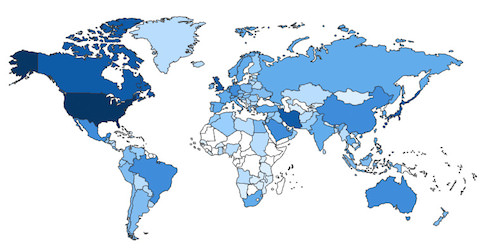
Even today, the US accounts for only 48% of Free Time’s total revenue and only 35% of our users. Had we decided to translate and support other locales, our financial return would have been higher.
Be Careful With Time, A Strange And Complicated Concept
We always thought of Free Time as a cross-platform app, and we originally thought that the mutual time resolution was its biggest feature (remember?). So, we adapted our strategy to accommodate that use case. As a result, we built the underlying calendar-parsing engine in C++, a language that compiles to both iOS and Android. It also didn’t hurt that Nathan knew more C++ than Objective-C, so it was a natural fit for him as well.
Without the help of any system libraries like NSDate or NSCalendar, we set out to build our own cross-platform calendar database and reinvent the wheel in the process. Never do this. The inherent complexities of time make this sort of endeavor a monolithic challenge equivalent to rebuilding an entire city brick by brick just because you don’t like the location. If you can leverage someone else’s work and not reinvent the wheel
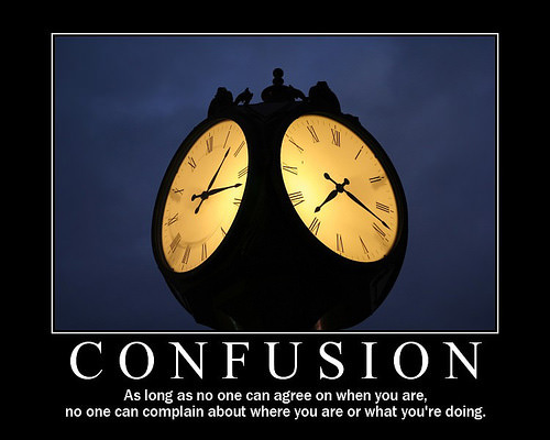
You need to think of a few scenarios if you are building an app that has anything to do with calendars or time-based calculations.
30 + 20 is easy, basic math. Day 30 of this month + 20 days isn’t so easy. OK, maybe you think that that calculation is relatively easy and that the answer is probably the 19th or 20th of the next month. It seems easy until you think about people in Egypt and find out that their next month is Pi Kogi Enavot (“the little month”), which is only five days long!
Another fun thing we found out was that midnight on certain days in certain countries never exists. Most of the all-day events we stored began at midnight on a certain day and ended at 11:59:59. We thought that this was a pretty logical and straightforward way to store an event, but we forgot about daylight savings time in Brazil, which jumps from 12:00 am to 1:00 am, instead of 1:00 am to 2:00 am as it does here in the US. Therefore, midnight never exists, and as a result, for at least for one day each year, the app would crash on launch for users in Brazil.
Oh, and Leap Day in 2012 was one of my favorite days. Almost every active user sent us an email or tweet letting us know that the app was off by a day (as it remained for a month).
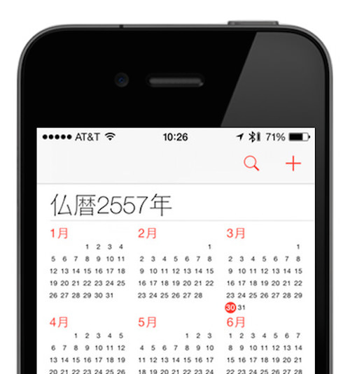
We also had a lot of trouble with different international calendars that differ not just in their translations, but fundamentally in their current year, month and day. We have a surprising amount of users in Saudi Arabia and Qatar, and one issue with Free Time is that it doesn’t support the official calendar there very well (the Islamic Hijri calendar). The current year in that calendar is 1435, and the days of the month are all completely different because it is a lunar calendar, not a solar calendar. I can tell you with a high degree of certainty (even though I haven’t tried it myself) that mutual time resolution between someone on the Gregorian calendar (the most common of calendars used) and someone on another calendar will fail spectacularly. Thankfully, no one seems to use that feature!
Languages And Dates Are Only Part Of The Problem: Culture Makes Up The Rest
Building for the world isn’t just about internationalizing your app, though. Consider also different use cases for populations and cultures around the world. When we launched Free Time, we baked in the concept of weekdays (Monday through Friday) and weekends (Saturday and Sunday). We also assumed that most users work Monday to Friday and have different waking hours on weekends than on weekdays. In hindsight, this was an obvious oversimplification, but at the time we weren’t thinking about the world —we were only thinking about our world, and that is exactly how our world works.
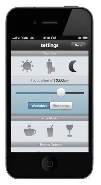
We soon discovered that this assumption was entirely incorrect in many countries throughout the Middle East, where the weekend starts on Thursday and ends on Saturday (Qatar and Saudi Arabia are two such countries). As a result, we had to allow users to specify their work week and selectively enable work hours.
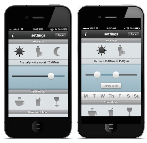
Inadvertently, in building for our world, we also alienated another part of the population, people who work the night shift. Because we required users to tell us when they wake up and when they go to sleep (so that we could infer their number of free hours), we built a control to select those hours that extended only from 12:00 am to 12:00 am. We didn’t think of the people who work the graveyard shift and need to set their “day” and working hours somewhere between 12:00 pm and 12:00 pm.
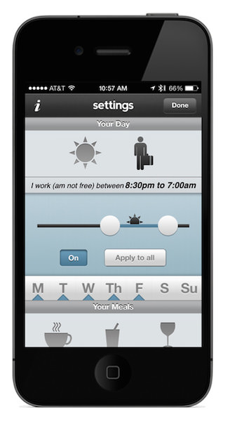
These are just a few of the eye-opening edge cases that calendars, time-based calculations and a diverse and international audience made us think about. Apple does a lot to help developers support these use cases out of the box and directly from the operating system, but only if you let it.
Build for the world, not just your world, and don’t reinvent the wheel.
6. Invest Time In Subtle Details — People Will Notice
Here’s something we did right. We spent a lot of time improving and perfecting the loading animation and other subtle animations throughout the app (such as for updating settings, filtering, etc.). This level of polish was ahead of its time and really set the user experience apart.
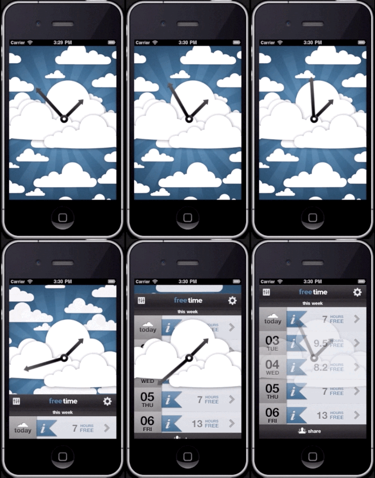
Animations in apps are more commonplace these days and are becoming more of a requirement with the new UI paradigms introduced in iOS 7. Still, a well-crafted animation is still a fantastic way to set your app apart from the pack. Finding the right balance between features and subtleties that surprise and delight users is an important step in creating a memorable experience. When I speak with people about Free Time, many of them remember the spinning cloud and the clock hands and nothing else. They vaguely remember that it has to do with calendars, but they always remember this animation.
Think critically about what kinds of memorable experiences you can create, and make them wonderful.
7. Keep Pushing — Great Ideas Deserve To Live
This was our biggest mistake. Great ideas deserve to live, and giving up on one too quickly does a disservice both to your users and to the idea. While full-time jobs and nascent careers took precedence for all of us after graduating, our lack of continual refinement and updates over the years is one of my biggest regrets.

With only six updates since 2011, usage has fallen dramatically due to application bugs, OS updates and a loss of faith in our ability to maintain the product:
- Only 50% of people use the app for more than six days.
- Only 15 to 20% return after one month.
- Between 2012 and 2013, sessions declined by 59%; the average session length declined by 55% (down to 1 minute 34 seconds); and users declined by 61% (down to 20,000).
People form an emotional bond with the software they use. Throughout Free Time’s life in the App Store, we have continued to receive emails from people who go out of their way to express how much they love using the app and how it has completely changed the way they look at calendars. When building an app that people will use every day, think about how you will evolve it over time and adapt to your customers’ needs.
Just last week, we got this email:
"Are you ever going to update Free Time? I work two jobs and scheduling is tough, but this app helps. Just letting you all know the app is great and I would love to see it continue!"
Recap
So, we did a lot of things right and a lot of things wrong, but the real disappointment for us and our users is that we never really improved the app beyond the initial few months. We could have built an Android version, an iPad version, a web version and a Mac version, and we could have experimented with our pricing model to better suit our users, but we didn’t. For various reasons, life got in the way and we gave up too quickly. I’m sure we could have turned it into a viable business, but we opted to pursue other things.
Thankfully, we aren’t done with the app, and we’ll be launching version 2 in the coming months after a long hiatus. We’ve learned quite a bit, and we’re changing a lot: the calendar view is now front and center; the focus is on finding Free Time, not sharing it; and the number of features has been drastically reduced (much to our chagrin).
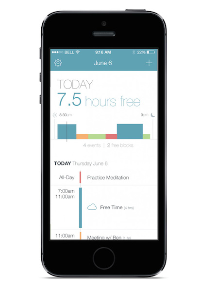
As you build your next great idea or even build an idea that just scratches your own itch, remember the following:
- Embrace your limitations and use them to your advantage.
- Create something that changes people’s perspectives, so that they never forget you.
- Don’t be afraid to iterate often, but resist the urge to add more during each iteration.
- Trust your instincts and build something that you will love (even if others might not).
- Build for the world, not just your world.
- Don’t give up.
Oh, and think twice about building a calendar app. It could be a real drain on your free time! You can sign up to hear more about Free Time 2, or check out Free Time in the App Store.
Further Reading
- How To Succeed With Your Mobile App
- The Last Goodbye: How To Shut Down A Failing Product
- So You Want To Crowdfund Your Startup App?
- Tale Of A Top-10 App, Part 1: Idea And Design


 Agent Ready is the new Headless
 SurveyJS: White-Label Survey Solution for Your JS App


