A Quick Tour Of WordPress 4.0
Today, WordPress has released the first release candidate (RC) for the upcoming 4.0 version. According to the official version numbering, WordPress 4.0 is no more or less significant than 3.9 was or 4.1 will be. That being said, a new major release is always a cause for excitement! Let’s take a look at the new features the team at WordPress has been working on for us.
Installation Language
Since I’ve always used WordPress in English, it took me a while to realize how important internationalization is. 29% of all WordPress.com installations use a non-English language which is huge and not that far from more than a quarter of all installations. Version 4.0 makes it much easier to get WordPress to speak your language. In fact, the first installation screen asks you to choose your native tongue. Nice!
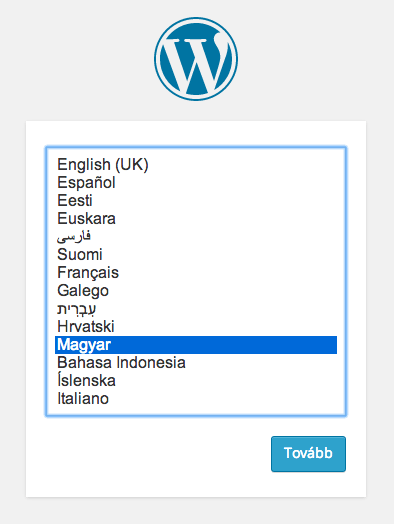
This is a big step up from either having to download in your own language, or grabbing language files manually and modifying the config.
Embed Previews For URLs
Embedding content into posts has also become a much nicer process. One of my irks with the visual editor used to be that it wasn’t visual enough. Not that long ago, you just got a grey box in place of a gallery or other media/embed items. The “Smith” release took care of galleries and 4.0 is taking care of a host of other items. If you paste a YouTube URL in text mode, it will render as a video in visual mode. How handy is that?
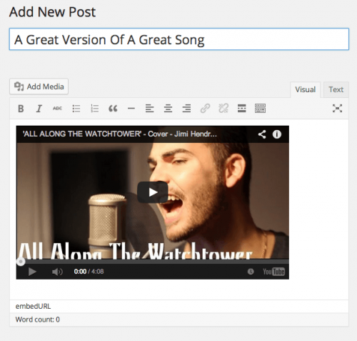
I find this a lot more pleasing to work with — I see exactly what I’m going to get. The media modal’s insert from the URL feature is getting the same upgrade. As soon as you’ve entered a URL, the video will load — playable and all! The good news is that it works with all the services you’d expect, from Vimeo to Twitter, Hulu and Flickr. Scott Taylor (who is a core contributor working on this) has kindly gathered some test URLs. I recommend checking out Trac ticket to find out more in this regard.
Media Section Grid
The media section now has a grid view by default. This isn’t a groundbreaking coding feat by any measure, but it does introduce a sleeker UI which is perhaps a glimpse of what is coming up in the future.
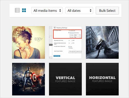
While this is a minor change, it does give you a way better overview of your media files than the default view of 20 images in a list.
Plugin Discovery And Installation
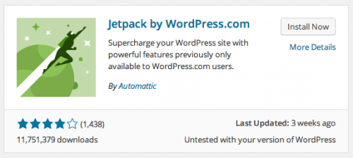
In my opinion, the plugin “Add New” page got a much needed makeover. The top navigation looks a lot like the new navigation in the media section — another indication of a slightly more modern interface creeping into the system. Plugins in the list view are displayed in a much more visual fashion, and it looks like it’s time for developers to start making thumbnails! While the plugin details screen could use a makeover as well, I’m sure this is a work in progress and will be explored further.
Better Post Editing
One feature I’m particularly happy with is how the editor height has been changed to use screen real estate better. Mark Jaquith painted a great picture of the problem:
"The post editor feels like it has been relegated to a box of medium importance on the edit/compose screen."
UI Improvements For Widget Customization
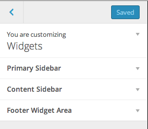
It’s great that widgets have been included in the theme customizer. Usually, if you had more than five to six widgets, things became a bit too crowded. Fortunately, the new WP version has now put all widgets into a sub-section of the customization screen. This essentially minimizes them when not needed — a welcome UI improvement for sure!
Join The Fun
As always, the latest development versions can be tried out pretty easily. By installing the WordPress Beta Tester plugin you can update to the latest beta builds or nightlies and play around with the brand new features.
If you happen to find any bugs, you can add them to the WordPress Trac and you can even fix them and contribute to the core! WordPress is a community project, and every little bit helps!
Conclusion
While I agree that WordPress 4.0 isn’t the same leap as 3.0 was, I disagree with this being a problem. Instead of adding more and more features, the team is consolidating existing features and working hard to bring us a better user experience.
The features above will actually affect how I use the day-to-day features of WordPress in a positive way. While I may not be able to post from my Google Glass (partly because I don’t have one), the ability to use WordPress better is far more important.
Further Reading
- How To Speed Up Your WordPress Website
- A Look At The Modern WordPress Server Stack
- Secrets Of High-Traffic WordPress Blogs
- Do-It-Yourself Caching Methods With WordPress


 SurveyJS: White-Label Survey Solution for Your JS App
 Agent Ready is the new Headless


