Design Responsive Websites In The Browser With Webflow
This article is the first part of a series of articles on emerging responsive design tools. Today, Richard Knight explores the advantages of Webflow and how you can use it today to build responsive websites — perhaps a bit faster than you would build them otherwise. – Ed.
New tools have emerged to address the challenges of responsive web design — tools such as Adobe Reflow and the recently released Macaw. Today, we’ll look at one that I have tested extensively in the last few months. Though not perfect, it’s been a leap forward in productivity for the team that I work with. Its name is Webflow, and it could be the solution to the problems you face with static design comps produced in Photoshop and Fireworks.
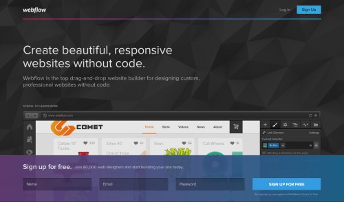
This article will take you step by step through the process of creating a responsive website layout for a real project. As we go along, we’ll also identify Webflow’s advantages and where it comes up short.
Getting Started
Getting started in Webflow is a relatively simple. Head over to the website, create an account, and give the free trial a go. Make sure to open the interface in the latest version of Google Chrome because it is currently the only browser that is fully supported.
Before beginning a design, decide whether to start it from scratch or to work with one of the many templates. For this tutorial, we’ll choose the blank website template.
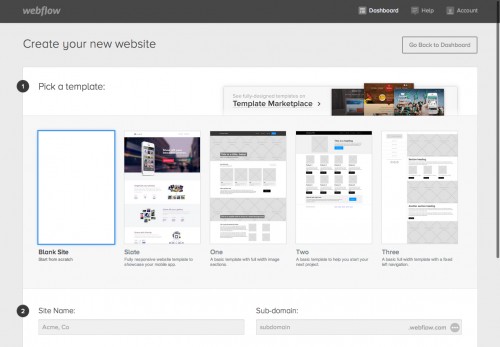
Take a minute to mouse over the tooltips in Webflow’s interface to become familiar. There are no shape tools or layers in the traditional sense. There are also no filters or effects or even brushes. Webflow keeps everything focused on what the browser can do; so, knowing the basics of HTML and CSS is enough to get up and running.
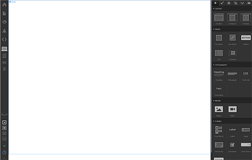
Toolbar Overview
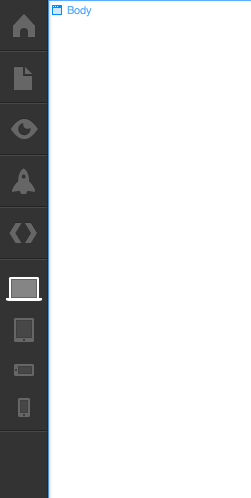
The left toolbar handles various functions, such as publishing your website to be shared with a live link and switching between device views (using the laptop and phone icons). You’ll use this toolbar mostly for the latter and for entering preview mode, which hides Webflow’s interface and shows what your website will look like when published.
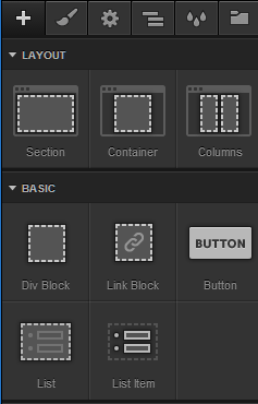
The right toolbar (shown below) consists of six tabs. The first tab (“+”) lets you add structure and HTML content elements to the page. Each item you add to the body of the page comes with default styles that you may overwrite. Whenever you need to add content, you’ll come back here. I always start with a section, a container and columns because they all have predefined behavior that changes according to the breakpoint.
A section is a div set to the full width of the viewport. A container sits centered within a section and constrains the widths of elements such as headings and paragraphs, while columns divide containers evenly in percentages.
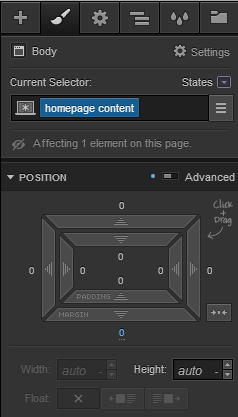
Next is the CSS tab, where we’ll spend most of our time. Here, we can assign classes to the element that is currently selected and then style it as we see fit. All of the CSS that you would normally write by hand is shown here. As soon as you change a class, the CSS will update immediately without your having to refresh. Be sure to examine the advanced toggles, which allow for control of other things such as positioning and the behavior of background images in their div.
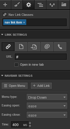
The third tab is for settings of the element that you select. Here, you can control things like the visibility of content at certain screen sizes, and you can add link elements to other pages in your project. This panel has to do mainly with non-style-related aspects and is especially handy when you’re working on complicated elements, such as the navigation menu.
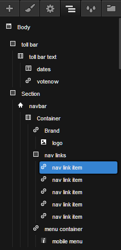
Fourth from the left is a useful structure navigator that visually displays the contents of your website in a folder-like tree. If you need a heading to sit in a different div or container, just click and drag it to where you want it to be. I often refer to this panel as I go to make sure that certain items are in the right divs and that my styles cascade appropriately. It’s also useful for selecting content that might be hard to click with the mouse because it is behind other elements.
Next up is the class manager, which shows all of your CSS classes at once. You can use it to edit a particular class (see the small wrench icon) and to quickly remove any class that isn’t being used. It’s handy, but you will usually just use it to clean up classes that you’ve discarded or to quickly change a class that’s used multiple times in different places.
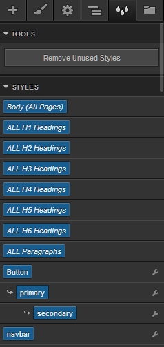
Last is the symbol library. Complex items, such as the primary navigation and the footer, can be created as symbols, which can be reused on other pages in your Webflow website. This is a great time-saver, but know that symbols are usable only in the project they were created in.
Regarding Web Fonts
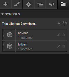
Before we begin with the project, it’s worth mentioning that Webflow supports web fonts to a certain extent. All of the usual standbys, including Arial and Verdana, are available, and you can use any font in Google’s library, as well as any you have in TypeKit. However, any font not provided by either Google or Typekit cannot be integrated in Webflow’s design view (an obstacle that my team faced).
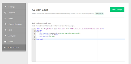
Applying your own font using Webflow’s custom code area is possible. Do this by linking to it in the head of your website and then using a style tag to specify where to use it. However, the font will appear only after you’ve published the website, making it frustrating to refine your typography for different breakpoints.
Designing In The Browser
For this tutorial, we’ll work from the desktop view down to mobile. This is deliberate: In Webflow, every style that you create in the desktop view will cascade down. It’s weird at first, but you do get used it. The rationale is that when you change a style in the tablet view, it will change for everything below. This saves time when something is broken in one media query because it will often be broken in the narrower views.
We’ll find what we need to begin in the “+” icon (the tab to add elements). First, add a section, and then drag and drop a “navbar” into that section. Then, select the image element under “Media,” and drag it over to the logo area of the navbar. Once it’s highlighted, let go of the mouse, and Webflow will drop in a placeholder image. I’ve replaced the default image with my company’s logo. Essentially, what we’re doing here is using divs and HTML pieces that have a predefined behavior in Webflow; while empty and lacking any notable styles, they will form the basic structure of the website.
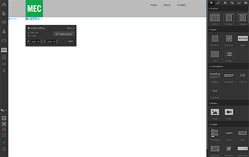
Now, let’s add the rest of the navigation, give it a background color, and change the fonts. My company uses a standard gray for the background of its navigation. Add a background color easily by selecting the navbar section with your mouse and then going down to the background area in the style tab. Once you’ve chosen a color, click “OK” to confirm.
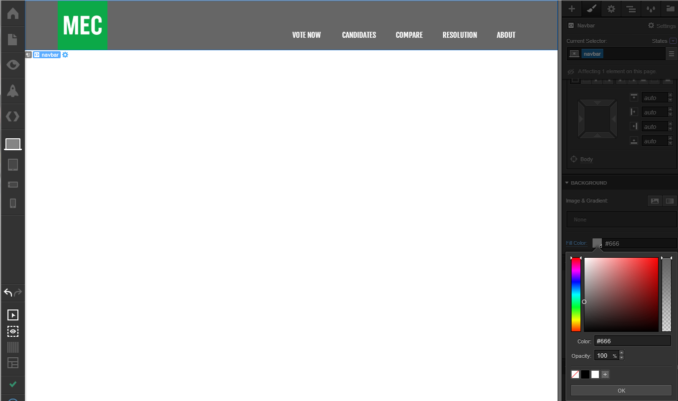
Next, we need to add a section that sits above the navbar. This will have a link and some copy. Click and drag the section so that it sits above the navbar, and then add a container so that our new content stays centered in the browser window, like the navigation below it.
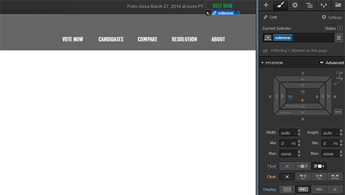
Above, I’ve added a plain-text block for the deadline copy, as well as a text link for our call to action. Both are assigned separate classes, set to display as inline-block and with the text aligned right. I’ve also adjusted the padding by dragging with the mouse on the arrows under “Position,” so that they both appear vertically centered. Finally, I’ve given this new section a background gradient.
Notice under “Position” how the padding values are blue. This lets us know that we’ve changed the default styling of 0. If it were a yellow number or a label, this would mean that the selected element’s style is inherited.
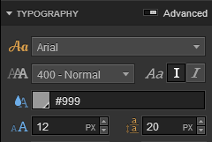
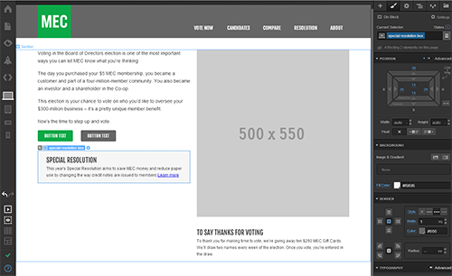
With the styling done for the header, let’s set the structure of the main body. Our website needs copy on the left and an image on the right for tablet and desktop views. Again, add a section and a container, and define a grid by adding the column element to that container. By default, we’re given two columns. You can change this to a different number at any time by tweaking the column’s setting.
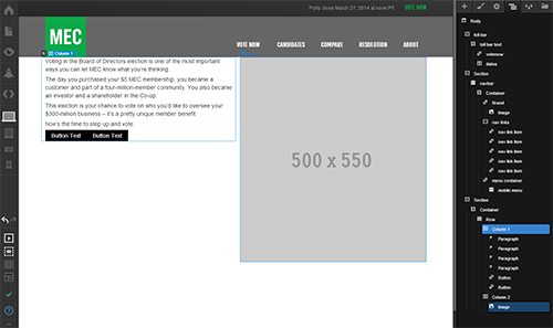
I’ve gone ahead and added a large placeholder image to the right column and paragraph copy to the left. I’ve also added two buttons. Working with long copy in Webflow gets tedious because each paragraph has to be added as its own element. It would be nice just to work with one text-box element, in which you can paste all of the copy at once and proceed to style it, as in Macaw.
For now, let’s adjust the paragraph’s line height, add style to the buttons and add the remaining content.
Last, we’ll add the footer by adding a section to the bottom of the page. We’ll apply a background color and throw in one last container to house our new text links and copyright. Another annoyance is that Webflow doesn’t yet allow for descendant selectors. I’d much a prefer a visual way to target links in the footer section with styles akin to the following:
.footer a {
   text-decoration: none;
   font-size: 12px; }
Webflow currently requires everything to be assigned a class, even if it’s already in a div that has a class that you could reference. While not a deal-breaker, a little more finesse would be nice.

With the footer done, our desktop layout is in pretty good shape. Now it’s time to tackle any presentation issues that we find at the other breakpoints.
Fixing Breakpoints In Webflow’s Responsive Views
One of the main differences between Webflow and its competition is that you cannot define your own breakpoints. Webflow is a custom framework based heavily on Bootstrap, so a lot of the automatic behavior for content elements derives from that. You could view this as a hindrance or an advantage, depending on your situation and your project’s needs. Our current e-commerce website leverages Bootstrap, so using Webflow to prototype makes sense for us. If your website requires unique breakpoints or you already use another framework, such as Foundation, then you might have to try something else.
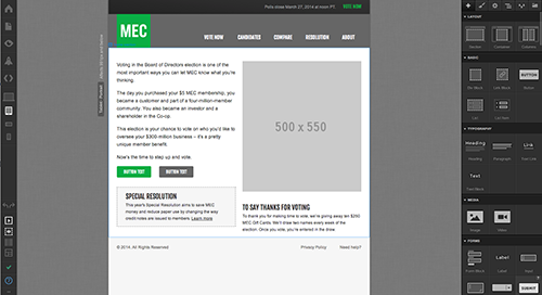
Let’s look at the tablet view first. Nothing completely breaks, as you can see below, although we might want to add more space between the footer and the rest of the page.
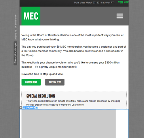
Next up is the phone view in landscape mode or, as I like to think of it, a very wide phone breakpoint. As you can see in the first screenshot below, things are getting messy. Our image in “Column 2” collides with our callout box. Also, that image is pretty large for mobile phones, so let’s shrink it by changing its width to 40%, leaving the height set to auto. For our last change, I’d prefer that our buttons appear on small screens as block elements, with widths of 100%. Check out the before and after:
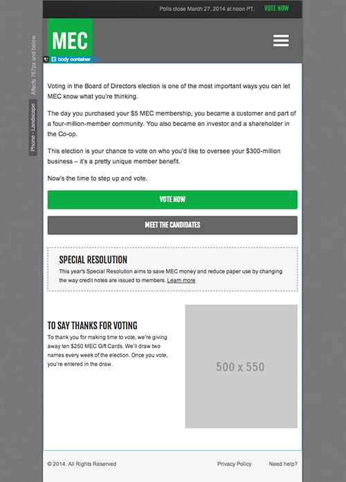
That’s a bit better. As you become familiar with Webflow, you might decide to abandon columns altogether in certain instances because they dictate the order of your page. Suppose we wanted the image to be the first visible item below the primary navigation on phones. Because we’ve used columns and thrown the image into the righthand column, we cannot reorder it on mobile; the left column will always be stacked on top.
If we used our own divs with our own CSS rules, we could easily circumvent this order with some floats. So, even though columns are easy to work with and they come with predefined padding and their widths switch to 100% at low breakpoints, they can also be limiting.
Before moving on, let’s look at the default styles for the navigation menu when expanded. We get there by selecting the navbar and going to the settings tab. Once you’re in settings, click “Open Menu,” and you should see something like this:
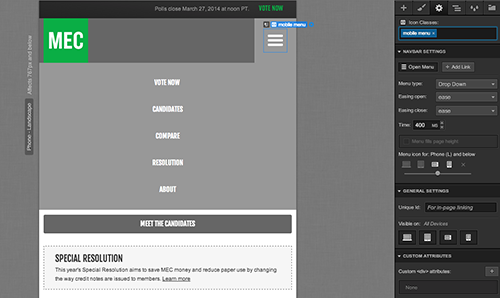
That’s a lot of dark gray, with no indication of the boundary between menu items for users of touch devices. Select a link and proceed to change the style. Let’s also separate the links with a bottom border. Other options are available to play with animation, but I’m happy with the defaults for now.
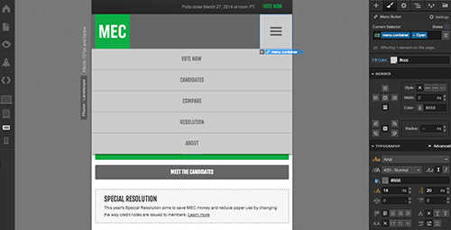
Much better. I’ve inverted the colors somewhat to make the menu items stand out more, and I’ve added a box shadow to give a sense of depth in case it overlaps with elements like buttons. Of course, you can refine it further, specifying hover states and pressed states, but for now let’s look at the smallest breakpoint and see how our changes cascade down.

Not bad but the header takes up a lot of space. Considering that browser chrome will take up space, too, let’s shrink it a bit.

There we go. You can view the result on the demo page. If you’re on a desktop machine, resize your browser to see how the layout changes. One of the last items we’ll look at is Webflow’s code-exporting feature.
Exporting The Code
In the left toolbar is an icon that allows you to export your work as a full ZIP file, with the HTML, CSS and all images that you’ve used. At this time, there are no options to tweak how your website gets exported. Having the option to choose between LESS files and one master style sheet would be nice in future, as would an option to point to the paths where images are publicly hosted.
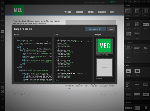
Webflow’s code is relatively clear and straightforward enough. Being design-focused, it does throw just about anything it can into a div, and you’ll see a lot of custom classes that look akin to Bootstrap 3. It also includes a separate style sheet for various fixes, so your website should work in most browsers. Your mileage with the exported code may vary, depending on what you need to do with it. The developers on our team found it easier just to replicate my interactive mockup in Bootstrap 3, rather than try to build on top of the code.
We did this for two reasons. First, our website is a Backbone application that needs functionality such as timed user sessions, Google Analytics and an administrative back end. Secondly, Webflow’s code does not support Internet Explorer 8, which is a requirement for our user base, unfortunately.
Conclusion: A New Tool For Designers
Webflow is a tool targeted at designers who are looking for an alternative to Photoshop and Fireworks for responsive web design. It’s not an all-encompassing solution for creating websites — at least not yet — but by enabling me to focus on layout, interaction and content behavior without having to code, it sped up our team’s design phase immensely.
And while we didn’t use the code that Webflow generated, we still found it to be more collaborative, allowing the developers who I work with to see the work I was doing on their actual phone, tablet and desktop browsers. They could ask questions any time, and I was able to iterate on the fly. Sitting down to actually build the website was easier because we had an interactive prototype to refer to.
I still use Photoshop as I believe it was intended — to crop and retouch images — but when I’m asked to make a new page or a new website, I’ll start working in Webflow. And I’ll continue to refine and expand the visual prototype until we feel we’ve taken it as far as we need to. Then, we’ll move into development, still using Webflow to prototype or test ideas if needed.
On today’s responsive web, a static comp raises more questions than it answers. Sure, you’ll be able to convey the look and feel, but so many questions remain that both designers and developers can get frustrated. As designers, we try to resolve these questions by creating accompanying documentation, such as a web style guide or even sometimes by building a basic page ourselves.
Developers who receive static comps to build from either have to infer missing details or go back to the designer. How does the navigation adjust? What are we envisioning for hover states or for pressed states for buttons? How will the typography change to accommodate different screens? How do we denote an active page? The list goes on and on.
Webflow fills this gap. Details can be inferred because they’ve been realized and are viewable in the browser. It enables you as the designer to experiment and prototype interactive ideas on the fly. How the tool fits in your process will depend on you and the needs of the project. However, I strongly recommend giving it a shot. It might surprise you.
Other Resources
- “Video Tutorials,” Webflow Help This free series of videos walks you through the UI and how to build websites in Webflow.
- “Forums” Webflow Community An active and knowledgeable community of people already use Webflow.
Many thanks to Shawna Jones, Jeffrey Love, Shawn O’Neill and David Belangér for supporting my use and testing of Webflow throughout our projects.
Further Reading
- Responsive Web Design: What It Is And How To Use It
- Design Process In The Responsive Age
- Device-Agnostic Approach To Responsive Web Design
- 12 Factors In Selecting A Mobile Prototyping Tool


 See the full picture →


 Celebrating 10 million developers
 SurveyJS: White-Label Survey Solution for Your JS App

