Wayfinding For The Mobile Web
When designing mobile first, navigation takes a back seat to content, and ruthless editing paves the way for more focused experiences. The pursuit of simplicity, combined with the tight spatial constraints of mobile viewports, often leads us to strip away elements in an attempt to minimize the interface. But the space-saving convenience we gain through clever editing and a compact UI can come at the expense of the very navigational aids our users rely on.
To help balance the craving for visual simplicity with the need to keep websites easy to navigate, we can borrow some concepts from the world of wayfinding. This article shows how you can apply these concepts to the mobile web.
The Importance Of Wayfinding
As the name implies, wayfinding is how we make sense of our surroundings and navigate the space around us. We continually rely on cues in our environment to orient ourselves and figure out where we’ve been and where to go next. If you’ve ever flown, recall the experience of stepping off the plane in an unfamiliar airport. It may have gone something like this:
- You pause at the gate and glance around to quickly survey your surroundings.
- You observe which direction most people seem to be walking in and start heading in that direction.
- As you begin walking, your attention darts from one sign to another, scanning for any symbol or text that resembles “baggage claim” or “ground transport” and ignoring anything that doesn’t match either of those.
- Once you feel like you’re headed in the right direction, your attention relaxes and you begin to pay attention to any shops or restaurants that you might want to return to the next time you’re at the airport.
The way that people orient themselves in digital spaces is not so different from how they find their way around in the real world. Our ability to focus shifts according to whether we’re on the hunt for information or recreationally browsing. We even experience the same emotion and sense of frustration when we’re lost or struggling to reach our intended destination.
Following are three wayfinding concepts that can be incorporated into mobile and responsive designs to help your visitors navigate with more ease.
- Circulation systems The infrastructure that allows people to move around within a space
- Spatial cues The observable qualities of a space that help people make sense of their surroundings
- Signage Instructional signs, symbols and iconography to guide people
Circulation Systems
When moving through a town, the streets and sidewalks are the pathways we use to get from one point to another. Within a building, we might rely on stairways and corridors to make our way around. A variety of routes often coexist, giving people multiple options for reaching their destination. The network of available pathways forms the circulation system of a space. On the web, circulation systems are shaped by navigational structures. The most familiar one is the hierarchical tree menu, a model synonymous with widescreen desktop design.
Hierarchical Tree
This type of top-down categorical tree is the de facto convention for information-rich websites. Users can access top-level (parent) navigation and local (sibling) content. This is advantageous in that it provides many different routes for users to explore.
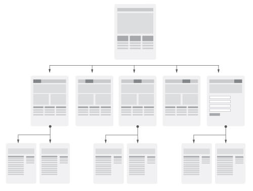
This model has the tendency to become link-heavy, making it well suited to large screens but potentially cumbersome when packed into the confines of a small screen. Rather than trying to squish expansive menus onto itty-bitty mobile screens, designers have been exploring the concept of unfolding experiences, a term designer and researcher Rachel Hinman uses to describe systems that progressively reveal information to users. As you plan a circulation system for your website, consider how you might be able to incorporate the following “unfolding” patterns:
Nested Doll
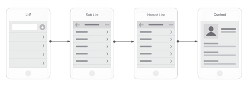
Nested doll navigation is a linear menu pattern that is conventional in mobile web apps. Users incrementally tap or swipe to reveal additional menu options as they traverse up and down through the site map. Funnelling users from broad overview pages to detail pages helps them hone in on what they’re looking for and focus on content within an individual section. This approach is well suited to small screens, but comes at the expense of easy lateral movement across sections.
Hub And Spoke
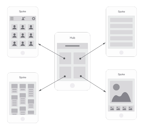
This model utilizes a central screen that acts as the launchpad for exploration. Links point outward to other sections of the website or independent applications, each siloed from the others. To move from one section to another, you must first jump back to the hub. This home-screen approach eliminates the need for global navigation on each page, making it a popular choice for task-based applications that benefit from focus and minimal distraction.
Bento Box
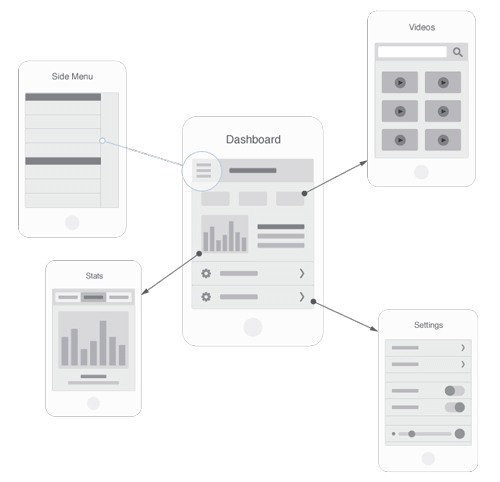
The bento box model is a dashboard-style application that pulls in dynamic components and information. Most interactions occur in the context of a single multi-purpose screen that unfolds to reveal layers of additional information. This is a popular choice for websites on which users interact with data aggregated from a variety sources.
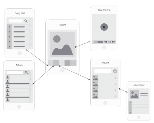
Filtered View
Unlike dashboards, which provide a control center for interacting with a variety of data, filtered view systems deal with a single data set. Information may be explored from multiple perspectives, with a variety of views and sorting options controlled by the user.
Combining Systems
Even with nice styling and transitions, the bulkiness of traditional navigation systems can feel kludgy on small touch-enabled screens — especially when compared to the elegant, immersive interactions associated with native applications. Trying to shoehorn an information-rich website into an app-like navigation system might be too constraining, yet adopting a fully hierarchical model might be overkill. Fortunately, the models need not be mutually exclusive.
One of our recent projects involved working with a healthcare organization to centralize their content and online tools under a single website. We initially started down the path of building a hierarchical site map that included a section for all of the members-only content. We also toyed with the idea of introducing an additional menu on the website: the public navigation as well as navigation that appears for logged-in members.
This felt more complex than it needed to be and would have been tricky to organize on small screens. Recognizing that current members have very little need for marketing-heavy public content, we ended up dropping all public menus from the members section. And because members were coming to the website primarily to access a few key applications, they benefited from moving away from a hierarchical content structure and toward a hub-and-spoke model with a home screen that would launch their various online tools.
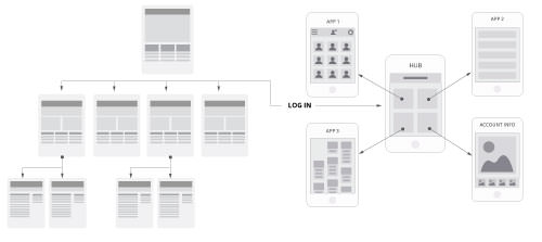
This turned out to be a big departure from our original plan to create a global header and footer that spanned the entire website, but it permitted us to design a system that was both lean and simple to navigate. This still left us with the challenge of making the transition between public and members content as seamless as possible. We turned to spatial cues to build continuity across the interface.
Spatial Cues
If circulation systems represent the paths that enable people to get to where they want to go, spatial cues are the recognizable qualities of the space that help them orient themselves and that illuminate available paths. Designers rely on a few powerful spatial cues to help users find their way.
Landmarks
A landmark is any remarkable, unique or memorable object you observe in your surroundings. Some landmarks are visible from a distance and help you figure out where you are based on your position relative to them. For example, Chicago is home to one of the world’s tallest skyscrapers, the Willis Tower. If at any point you become disoriented while exploring the city, you need only scan the skyline and compare your relative position to the tower to get a sense of where you are and which way is which. Other landmarks just line your route, helping you find your way to and back from a particular place. Landmarks help us define and make sense of space. The degree to which we rely on landmarks is evidenced by how we offer directions: “Turn left at the fork in the road,” or “Continue straight three blocks until you reach the Starbucks, and then hang a right.”
In UI design, a landmark is any consistently positioned or notable element that helps visitors orient themselves. Some examples of global elements (i.e. visible throughout a website) are:
- Logo. For returning to the home screen easily
- Primary navigation. Quick access to primary landing pages, enabling users to pivot and explore other sections.
- Breadcrumbs reinforces current location within the system and acts as a ladder to traverse up the site map
- Search. Provides reassurance and an alternate way to seek information when users don’t want to backtrack or continue browsing
Other landmarks might appear only in certain places, helping visitors distinguish where they are within a particular section of the website:
- Section banners. Reinforces which section user is in
- Section navigation. Access to similarly categorized content
- Unique templates or components (slideshows, galleries or event calendars). Visually identifiable points that users might remember passing and try to return to
This alone is pretty straightforward stuff. It gets interesting when you factor in multiscreen behavior and adaptive design. You see, as website visitors peruse your website, they are constructing a mental map of all the identifiable landmarks they encounter. Data shows that many interactions occur over time and across devices. If the landmarks in your interface appear drastically different from one breakpoint or device to another, then you risk disorienting users. On the other hand, if you intentionally build continuity into the UI, persisting recognizable qualities of those landmarks across all screen sizes, then you’ll foster a more familiar, intuitive experience for returning visitors. You can increase continuity of landmarks in your design by examining how UI elements adapt across breakpoints:
- Position. Do they retain their relative page position, or do they jump around?
- Form. Do items retain their form or transform into something totally different?
- Color. Do foreground and background colors stay the same or switch?
- Priority. Do the most prominent page components retain their proportional visual weight across screen sizes, or does the hierarchy change?
- Visibility. Are visible things still revealed and hidden objects still concealed?
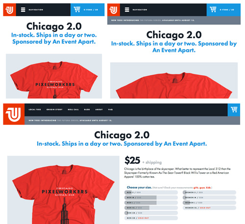
Cleverly adapting the UI to best fit the available screen size or viewport is a worthy goal. Just keep in mind that each adaptation creates a new environment that your users must orient themselves to. While adaptation is a necessity, balance it with an equal focus on continuity.
Edges
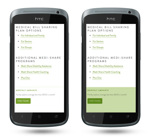
Edges demarcate the end of one object or section and the beginning of another. In the world around us, we are surrounded by geographic boundaries, like mountains, shorelines and tree lines, as well as man-made ones designed to compartmentalize our environment, like fences and walls. In UI design, clearly defining the edges of regions and objects can more quickly familiarize users with an interface. Boundaries help to demarcate things on a website, such as chrome from content, primary navigation from secondary navigation, and global tools from page-specific functions. At a micro level, edges help define the boundaries of tap targets and separate individual blocks of content.
When designing for wide screens, we can rely on white space and columns to delineate content boundaries. When dealing with narrow viewports, we have less space to compose columns and to utilize white space to effectively differentiate sections of a page. We can reclaim the usable benefits of edges in small-screen scenarios by:
- providing obvious visual cues to suggest the active tap target area of links and buttons,
- using shifts in background color or strong borders to distinguish template regions.
Signage
Signs are visual aids that provide instruction to people at decision points within a space. Signs communicate through pictographic or typographic elements. In our interfaces, most non-content elements play the role of signage. Elements such as labels, buttons, pagination, menus and calls to action all act as signs. Because symbols tend to take up less space than written text, they are heavily used in mobile design. Because people process images and text differently, designers need to consider certain factors when deciding how and when to use one or the other. Let’s take a quick look at how to use icons effectively.
Using Icons
Icons can be an effective way to communicate information and highlight navigation options while conserving space within the tight confines of a small screen. Universally recognizable symbols can also overcome language barriers, making an interface more globally accessible.
While icons might appeal to aesthetic sensibilities and provide a great solution for visually organizing your interface, they also have the potential to introduce impediments to usability.
Icons work great when they are familiar and obvious, leaving no room for misinterpretation. But even many of the most commonly used icons have multiple meanings. Consider the following icons, which at first seem innocent. What does each represent?

- Pencil. Write or edit?
- Plus. Add item or expand?
- Minus. Remove item or collapse?
- x. Close or delete?
- Magnifying glass. Zoom or search?
- Caret. Play, go or slide right?
As we see, even in simple scenarios, icons can be ambiguous. Meanwhile, the allure of a minimal UI tempts many a designer to use icons to represent far more complex concepts. This again challenges us to weigh the value of saving space against the importance of comprehensibility of the interface. Even if the icons are ultimately decipherable, the act of interpreting them increases the cognitive load on the user. This introduces friction to the decision-making process and could impede navigation.
Text Labels
In contrast to icons, well-written text labels can leave less room for misinterpretation, thus resulting in less cognitive load on the user.
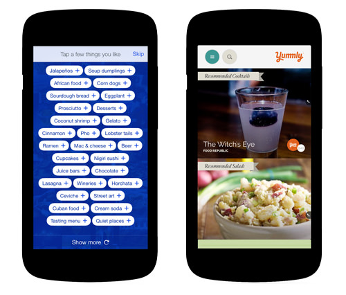
Compare the following two screenshots, both of which pair icons with text. The first example focuses first and foremost on the icons, whereas the second places emphasis on text labels.
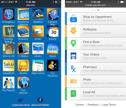
The abstract nature of the graphics demands a fair amount of interpretation, and the accompanying text is harder to scan, partially because of the grid arrangement and partially because of the type’s size. Keep in mind that, with mobile devices, the text is likely to be viewed at arm’s length and with the person and device possibly in motion. In the second example, labels assume focus. The left alignment of text provides a straight reading line down, making it easier to scan and compare navigation options. Here, icons are used to supplement text. Because we process images quickly, once a user has learned what a symbol means, their future interactions will be expedited through recognition (i.e. associating the image with the link it represents).
The previous example also assumes two things. The first is that the text labels are indeed well written. Unclear text can be just as detrimental to navigation as ambiguous iconography. The second assumption is that the visitor is a first-time user. Once a person has learned the positions and meanings of the icons in the first screenshot, the cognitive load will decrease and the interface will have become familiar and, therefore, easier to use.
This aligns with research conducted by User Interface Engineering, which found that:
- text and images work better than just text;
- text alone works better than images alone;
- icons are learned, but icon positions are learned faster (so, if your favorite app gets a new icon, you won’t be confused; but if someone jumbled the positions of apps on your phone’s home screen, you’d be driven crazy).
Visibility And Decision-Making
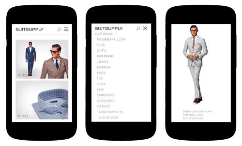
Another conflict between graphics and text arises when you’re determining how to present a list of products. An advantage to displaying images is that they help the user visually differentiate between options. Because product images take up more space than their text counterparts, the number of items visible within the viewport will be reduced. So, which is more important, showing more detail for each option or showing more options in a single view?
When category distinctions are obvious, the addition of visual cues (such as product images) minimally benefits usability. The main objective is to show options and make it easy for the user to scan and compare those options. In these scenarios, titles alone might be the best choice because comparing items is easier to do when you can see all (or most) of your options at once. If visitors must scroll or swipe to see their options, they’ll be forced to rely on memory, comparing what’s currently in view with what was previously in view.
On the other hand, for products that are similar to each other, images would help users to better distinguish between them. In this case, differentiating between items might be more important than comparing items within a single view.
Paving Your Paths
What’s in and out of view is critical to how people find their way. The answer to “Where can I go from here” is shaped by the routes that the user can easily perceive. The most highly trafficked routes (or the ones you want to drive the most traffic through) should be made most visible. Less-traveled routes can afford to be less overtly marked. Whether a navigation system is the primary or secondary one is an important consideration, and it needs to be prioritized as such in the UI. Does the visual prominence of your navigation map to the navigation’s actual priority?
Route Visibility And Hidden Menus
Many popular mobile navigation conventions involve hiding and showing menus. This technique relies on a menu button (often the infamous hamburger icon) that triggers the appearance of a menu, either by toggling open a panel or pushing in navigation from off canvas. Debate persists about whether the hamburger icon is universally recognized as a symbol to represent a menu. It’s potential ambiguity aside, the debate overlooks a larger concern: Even if people recognize it as a cue to summon a menu, the menu options are initially hidden, and so those routes are obscured.
Users following the scent of information will scan the screen for trigger words: text that maps to the words or phrases in their mind that describe what they’re looking for. On wide screens, when navigation is exposed, those trigger words are visible and increase the likelihood that users will spot them and click through. Assuming that your primary navigation menu has concise, mutually exclusive and familiar labels, by storing them out of view, you are concealing those powerful trigger words and in effect obscuring the primary navigation routes.
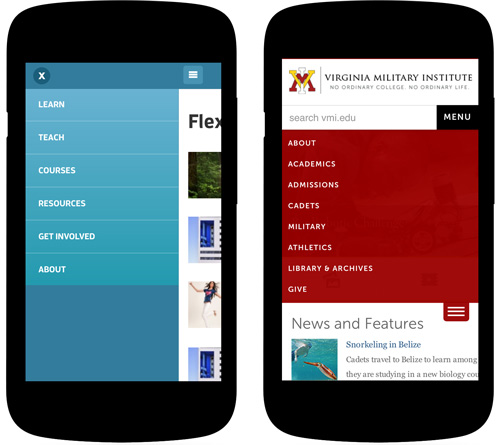
Compare this to the “skip to nav” pattern, in which a menu icon scrolls the user down to a menu anchored at the bottom of the page. In this model, the button still affords quick access to the menu via a tap or click, but those trigger words still exist within the visible canvas. Users who scroll or swipe past the main content will discover in plain view the menu options laden with trigger words.
When evaluating which elements to make visible and which to tuck away, consider the following questions:
- How are your users seeking information? If a large number of your visitors are “known-item seekers,” meaning they arrive with a clear idea of what they are looking for, then they will more likely want to search; so, making the search field visible would be an excellent prompt. If most users will have only a general idea of what they want, then they might be more apt to browse and, therefore, would benefit from exposed trigger words.
- What are your users looking to do, and how else could they get there? Compare what’s visible on screen to key content that your target audience is looking for or tasks they intend to complete. Do the content and links you make visible provide an easy enough path for users to accomplish what they came for? Or must they rely on navigation. If the navigation is a supplemental tool, serving as shortcuts to get around the website, then it might benefit from being tucked handily away. On the other hand, if a menu is the primary (or exclusive) means of navigating the website, then it might need greater visibility (or be visible by default).
- What is your hidden content competing with? On a page with minimal content, clicking on an icon to reveal a list of hidden menu options is a no-brainer. But as more content and links are added to the screen, the menu icon has more to compete with. Compound this with the fact that visible links are filled with information scent (i.e. some graphical or textual cue that suggests what content exists behind the link). Meanwhile, an abstract symbol has relatively poor information scent, hinting only that “more options” can be found behind it.
Conclusion
Despite the incredible difference between the physical and digital worlds, the similarity in how we orient ourselves and decide where to go in both spaces is uncanny. The same cues that architects and urban planners rely on to help us process our location, know where to focus and choose our way could be applied in our day-to-day work on the web. Keep in mind that every person who browses an application is making their way through a space — often an unfamiliar one. As the user embarks on their journey, what types of wayfinding assistance are you providing to guide them?
Further Reading
- The Golden Rules Of Bottom Navigation Design
- Responsive Navigation On Complex Websites
- Implementing Off-Canvas Navigation For A Responsive Website
- Responsive Menus: Enhancing Navigation On Mobile Websites


 SurveyJS: White-Label Survey Solution for Your JS App
 Agent Ready is the new Headless